NHL Tournament of Logos

Entries in jerseys (477)

Saturday
Sep222007

Design Help For Michigan Roller Hockey

Today I'm calling on all graphic designers. The roller hockey team at the University of Michigan is in need of some assistance. They're looking to redesign their uniforms and if you've got an eye for design, maybe you could help them out.

The VP of the club wrote this in his email to me.

I'm a student at the University of Michigan, and have become a fast fan of the Jersey Blog, and absolutely love the concept gallery.

I'm also the Vice President of the school's roller hockey club, and am in charge of the purchase of new jerseys. Unfortunately, the companies we are dealing with to get the jerseys haven't been great (One company presented us designs with an outrageous look that isn't traditional enough, another too boring, another wasn't even consistent with the school colors). Anyways, they don't want to re-pitch designs for free and are trying to charge us for any more development, which we can't justify.

This in mind, I was wondering if theres any way for me to get in contact with your concept community to try and work out some designs with me. I don't know how/if at all would be the best way to do that, and figured an e-mail to you couldn't hurt.

So basically, this is the perfect opportunity for those of you who like doing concept art to potentially see it realized. Here are the specifications of the design.

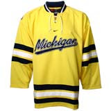
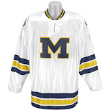
The most important images are the M, and the Seal. Also are Michigan's Ice Hockey jerseys. And the team colors are "Maize and Blue", with white being used as well.

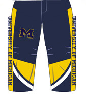
The roller hockey uniforms, are slightly different than ice hockey, in that rather than a pant and socks, we have a pant that is a full pant (down to the skate).

We really like the tradition of having the seal on the shoulders, and either an M, or some sort of michigan text as the logo on the chest (Theres a few variations such as the script michigan, and the block text michigan). As for everything else, we are open.

We are looking for a traditional hockey look (Not a flashy roller hockey look or anything hideous like the RHI Jerseys), but really want something to differentiate our look from Michigan Ice Hockey. Its tough to define what we mean, which is why I guess its hard to get the design.

He sent along some images including logos for you all to work with.

These are the ice hockey team's jerseys.

Here are the school logos.


And finally, here's a sample template of the pants he was talking about.

You can email your design ideas to Ricky at michiganrollerhockey@gmail.com. If you send them along to me as well, they might even end up here on the blog. Good luck!

Friday
Sep212007

Just To Freak You Out VII

I've decided to make the Freak Out series into a weekly feature to be posted on Fridays from now on as long as crazy artwork keeps landing in my inbox. And man, do I have some stuff for you this week.

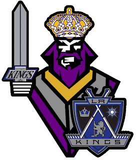
We'll begin with our friend Pfizer who's created mish-mash logos for the likes of the Vancouver Canucks, Buffalo Sabres and New York Islanders (check out the Freak Out series for those if you haven't yet). Now comes another shot at logo merging for the Los Angeles Kings.

For my money, it's not his best effort, but it makes me laugh no less. I'm a little disappointed he couldn't find a way to work in the current crown logo. But then it does feel a little thrown together. You have to admit, though, that king face is a great logo. Don't mess with that son of a bitch.

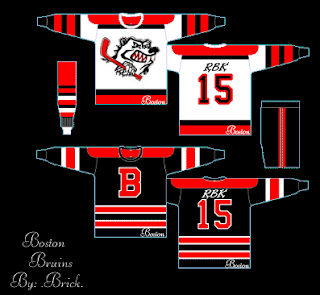
Meanwhile, I've got some completely new takes on a couple of team logos and uniforms. Imagine the Boston Bruins swapping out the yellow for red. Then imagine a cartoon bruin the likes of which might be owed money by Yogi Bear.

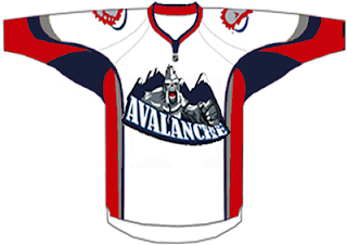
He's come to collect. Then imagine the Colorado Avalanche adopting a yeti for their primary mark. Might it frighteningly go a little something like this?

We should hope not. Lest ye bear the brunt of the abominable snowman's ever-clenched fist. And what's up with the upside-down feet on the shoulders?

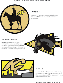
Speaking of what-ifs, let's say the Kansas City Scouts were to make their glorious return to the NHL. Let's also say their return was marked by the uprooting of the Pittsburgh Penguins. Yes, this design was made in the days when the Pens' future was uncertain. I point that out merely to explain its color usage.

If you enlarge the image, you can read the designer's explanations of the three logos, so I'll spare you the details here. What I will say is that I like Patch 2. I'm a big fan of city skylines in logos, though you don't see that a whole lot. What's cool about this one is the new Sprint Center being placed to look like a puck. Clever.

The horse's eyes are freaking me out, by the way.

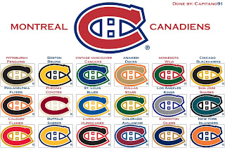
This next image is probably best viewed while high. I don't condone drug use, but chances of one having an "experience" are rather great. See for yourself.

Someone with a good deal of free time and an inability (or not) to cure boredom came up with this. He basically recolored the Montreal Canadiens' logo in the colors of various teams around the league. Conspicuous is the absence of the Tampa Bay Lightning's colors. But I guess not everything is about the Lightning.

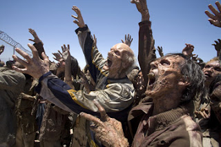
Now I want to show you some of the scariest things of all — because they're real! Okay zombies aren't real, but movies are real. A reader emailed me a production still from the new Resident Evil movie. One of the zombies appears to be wearing an old Nashville Predators sweater.

Talk about foreshadowing. That's not even right.

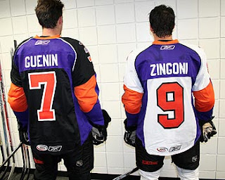
And finally, a reason for all those NHL fans out there bemoaning the arrival of the new Rbk EDGE jerseys to quiet themselves. It could have been so much worse. A fact proven by the AHL's Philadelphia Phantoms.

AHL fans, continue your bemoaning. It's perfectly warranted.

Freak.

Out.

Friday
Sep212007

Elusive Rangers Jersey Appears

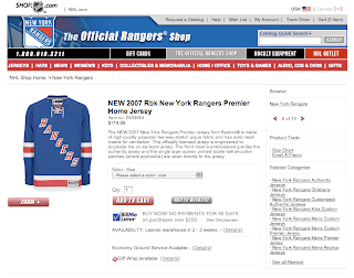
Just so as to put the matter to rest, I thought I'd point out that the elusive New York Rangers Rbk EDGE jersey has now made its long-awaited appearance on the NHL.com Shop.

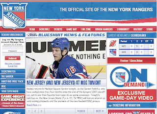
As a corollary to that, the Rangers have said on their web site that the new uniforms will be debuting in tonight's preseason game against the Devils.

I guess, technically that means today is the "official" unveiling of their new uniform. However, I'm still going to count July 26 as the date because they first released pictures on their web site that day — despite the fact that they were removed only hours later.

Anyway, all this nonsense is for nothing because they're exactly the same as they've always been, adapted to the Rbk EDGE style and cut. I say "exactly" but I should clarify before I get a horde of comments about how the letters create a narrower diagonal than before. I think it's hardly noticeable, but then I'm not a Rangers fan.

So it'll all be cleared up tonight and photos from the game will be available soon enough. And we're probably just about finished with Rbk EDGE news. It's kind of sad. I've gotten so used to it over the last few months.

Thursday
Sep202007

Sizing Your New EDGE Jersey

Earlier, I posted photos of my new Lightning Rbk EDGE jersey that just got delivered to me today. Since then, I've been getting lots of questions about sizing. So here's what I know.

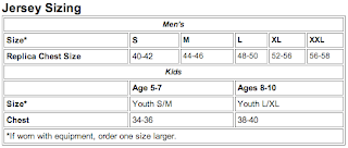
The Philadelphia Flyers have a great FAQ posted on their web site regarding the Rbk EDGE jerseys. Specifically, they have a sizing chart that seems like it would give you a decent idea of what size jersey to buy for yourself.

Basically, it suggests jersey size based on chest size. So wrap a tape measure around your chest or something and figure out which jersey is right for you.

Obviously, the numbers above are in inches. I didn't realize they had a sizing chart until after I'd purchased my jersey, but as it happens, my chest measures out to about 43 or 44 inches, meaning medium was the suggested size for me. And it worked out because, as I've said, my jersey fits me perfectly.

And might I add, if you do end up buying a jersey and feel like supporting NHLToL, click on one of my IceJerseys.com ads and place your order with them.

I'm going to add this information to my Rbk EDGE FAQ. Let me know if this works out for you guys. Good luck!
Thursday
Sep202007

Rebranding The Panthers

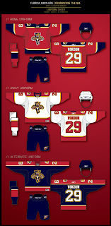
We've seen some great work from this guy in the past. He's redesigned images for the Ottawa Senators and Boston Bruins as well as the New York Islanders, Atlanta Thrashers, and Anaheim Ducks.

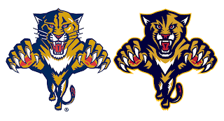
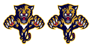
GhettoFarmBoy has now posted his Florida Panthers redesign. In this instance, however, his concept isn't so much a complete overhaul, as a rethinking of that which we already know.

He simply reworked the current primary logo a bit. Sharp work if not familiar. He basically simplified it in areas and added more curved lines to replace straight ones.

He kept the secondary logo, essentially, the way it was. Overall, though, the biggest issue I had with the logo was that the panther itself seemed a little cross-eyed compared with the old one. Others on the SportsLogos.net message board felt the same, so he reworked the eyes a bit.

A great improvement. The new eyes make the animal feel more cat-like.

The jersey designs are also pretty nice. Again, they still feel more familiar to me than anything else. Certainly an improvement, but not to the point that they're downright amazing the way his earlier Ducks redesign was.

I commend the work being done by this artist though. I think he has a real talent and it's a shame the NHL doesn't hire peole like him to handle uniform and logo designs. I think it would be a much better looking league if they did.

I should also point out that he's said his next "rebranding" will be the San Jose Sharks and that we should expect the New Jersey Devils soon as well.

Personally, I'm pulling for the Lightning, just to see what he comes up with.

Now the floor's open to you all. What do you guys think of this work?

Thursday
Sep202007

Wash With Like Colors

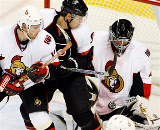
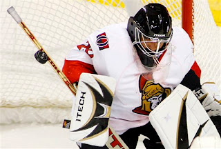
Got an email today with some interesting photos. Now that all the Rbk EDGE jerseys have been unveiled, it seems like all we have left to do is nitpick. So here's something we didn't anticipate.

It looks a little like the red on Martin Gerber's Senators jersey running on the front?

It could just be the photo, but it sure looks strange to me. I hope it washes out or else he's going to go through a lot of sweaters this season. Just thought you all would enjoy that.

Thanks to Joel for the pictures!
Thursday
Sep202007

My Jersey Has Arrived!

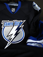
What kind of person would I be to spend months writing about the new Rbk EDGE jerseys and not purchase one myself? Well, in fact, I pre-ordered my new Tampa Bay Lightning jersey the very day they were unveiled. It was sitting in my mailbox when I got home this afternoon.

And here it is!

Let me just say that it is very nice.

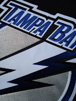
It's just like all the pictures and things I've been recording all summer. Though to be fair, these pictures are my first real exclusive contribution to the blog. And here's a close-up of the new collar style.

It's so cool to finally own one. It's just a shame I probably won't make it to any games this season.

The only small thing that disappointed me a little about my replica is the shoulder logo. It's not embroidered, but is rather a faux leather-like piece that is stitched on. The good news is that nothing is ironed on.

Anyway, it's really cool and I'm wearing it to work tomorrow! Everyone should get a good laugh out of that.

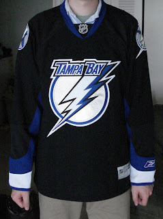
UPDATE (2:25 PM): Some valid questions were asked in the comments regarding how my new jersey fits. So this picture to the left shows you.

I'm about 5'11" and pretty thin. I ordered a medium jersey and it fits perfectly, as you can see. I couldn't be more thrilled with that.

Like most people, I wasn't sure what size to order at first, but I figured I could exchange it if I absolutely had to. And medium seemed like a smart choice.

So there you go. Probably go with a large if you're taller or just like a jersey that's a little bigger.

Let me know if you guys have any other questions about it. Now that I own my own jersey, I can actually answer them.

Wednesday
Sep192007

What's Up With The Rangers?

A reader noted in the comments on an earlier post something interesting with regard to the New York Rangers new Rbk EDGE uniforms.

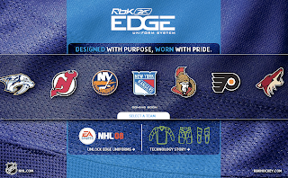
I was noting that the New York Rangers were the only team in the league which doesn't have images of its new uniforms available online in the NHL.com Shop or any other site that is selling the new Reebok jerseys. Then this official Reebok site came out and it had the first official photos.

Suddenly, as Gabe pointed out, those phoos disappeared from the site and were replaced by a "coming soon" graphic.

What's stranger is that way back when the Rangers first began taking orders back in July, photos were posted on their web site. Within hours, the photos were removed. Now this.

Luckily, I was able to grab both images before they mysteriously went away, so we've all been able to see them. But I'm just curious as to the reasoning behind these decisions. As Gabe mentioned, are the Rangers planning some big unveiling ceremony they have yet to announce? And if so, for what reason? The jerseys, much like Detroit's remain entirely unchanged — merely adapted to the new EDGE cut.

Regardless, we'll find out for certain what the deal is no later than Friday, as that is the night of the Rangers' first preseason game and they'll surely be wearing them. I'll keep on top of this if anybody is interested. And if you hear or read anything, do let me know, either by email or in the comments of this post.

Wednesday
Sep192007

Concepts For Oilers, Blues, Coyotes

I've got a few concept designs for you to check out this afternoon. We'll start way up north in Alberta and work our way south to Arizona.

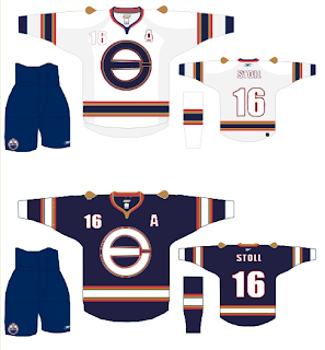
Here's what one designer had in mind for reconfiguring the Edmonton Oilers' logo and uniforms.

It's an "E" merged with an "O" that, quite frankly, might work better as a secondary logo. That isn't to say that the logo found on the shoulder of this jersey wouldn't work just as well. The one big thing that struck me with the Oilers' new Rbk EDGE jerseys is the plainness. I know a lot of people have been commenting on how some of the new sweaters look like practice jerseys, but for the Oilers, that couldn't be more true. The fact that the elbow stripes don't even go completely around the arm just adds to that.

But anyway, we're talking about this concept. And overall, I like it. The logo could use a splash of creativity, I've seen worse. And the oil drop might be a nice addition to the plain uniforms they have now.

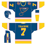
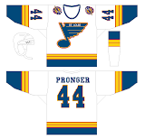
We're moving along to St. Louis now where one fan is mixing the old with the semi-old with the new. Usually when you throw to much stuff in a pot and cook it, the end result is less than delicious. That isn't necessarily the case here, but I don't think the red ever really worked for the Blues.

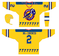
I think those would be solid designs if the red was removed entirely. Now, here's what you don't want to do — with a third jersey or otherwise.

That'll give a person nightmares. It doesn't go the horrifying length as the alternate Blues sweater Mike Keenan vetoed in the '90s, but it sure is trying. Look at those blue notes across the waist.

I like the idea of a trumpet for a secondary logo, but this really isn't the way to go. And how can a team called the Blues have a dark jersey that's anything but blue?

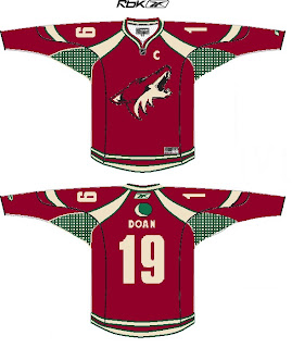
But I say we move on. A Phoenix Coyotes fan recommends reintroducing green into the color scheme. Here's how.

First off, I'm not sure you can put a team logo above the nameplate and have it look good. Secondly, I'm not sure it's even allowed. However, I think it would look just fine on the shoulder. I still like the PHX patch more, but the moon isn't terrible for the other side.

That's all I've got for now. I plan to have more later. Plus, don't forget to check out the Concepts Gallery where you'll find all the work I've posted plus some I haven't.

Wednesday
Sep192007

In Response

Sometimes when I post concept art, I'll make suggestions here or there that speak merely to my own personal preferences. It's cool that every once in a while, someone listens to my suggestions and gives them a shot.

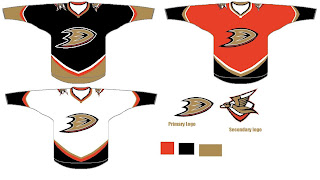
Yesterday, I posted an Anaheim Ducks design I thought was pretty cool, suggesting that instead of gold, the alternate jersey in the set might be better suited for orange. Well today in my email I find that someone gave me what I asked for.

I guess it just proves that some of you out there are actually reading what I write. And I appreciate that.

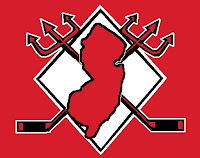
Then, just last week I posted a neat logo concept somebody came up with for the New Jersey Devils. I suggested that it needed something behind it to tie it together better. Then I was emailed this shortly after.

Looks a lot better if you ask me.

Anyway, I guess I just wanted to thank you guys for reading and show you that I do in fact read all my email. By the way, if you've ever written to me and are still awaiting for a response, chances are my feeble memory has forgotten. Just keep bugging me. You can get a hold of me at nhllogos@gmail.com.