NHL Tournament of Logos

Entries in jerseys (477)

Wednesday
Sep192007

EDGE Hindering Players?

Interesting story from Tom Gulitti writing about a recent New Jersey Devils game where new Rbk EDGE jerseys torn in fights may have led to player injuries. I'll let you make your own judgments. You can find his post here.

September 17, 2007

Janssen injures shoulder

Enforcer Cam Janssen might have injured his shoulder tonight because of the league’s new Reebok Edge sweaters. His sweater ripped during his two first period fights with Philadelphia’s Jesse Boulerice. That might have helped Boulerice pull Janssen’s jersey over his head in both altercations and win both decisively. Arron Asham also had his sweater tear during his fight with Riley Cote.

"These new jerseys are supposed to make you faster, but what good are they if they tear that easily,” Mike Rupp said.

"The Devils did not say tonight which shoulder Janssen injured. He missed 12 games last season after dislocating his right shoulder in a fight with Anaheim’s George Parros.
David Clarkson (win over Jason Smith), Asham (loss to Cote) and Rupp (draw with Ben Eager) also fought for the Devils in the first period.

Odds and ends: No one wore the captain’s C or the alternates A’s for the Devils. Patrik Elias, who was captain last season, remained home with Dainius Zubrus, Brian Gionta, Paul Martin and Martin Brodeur…Although Vitaly Vishnevski had been practicing with Colin White, he was paired with Karel Rachunek tonight. White played with Johnny Oduya. The Devils’ AHL team lost, 3-2, to the Flyers’ AHLers Monday afternoon in Trenton.

Tuesday
Sep182007

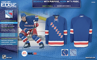
Official Rangers EDGE Photos

One other thing I meant to mention with regard to Reebok's new EDGE uniform web site that I wrote about earlier is that it's offering us our first official photos of the new sweaters for the New York Rangers.

Not even the NHL.com Shop has photos of the jerseys. In fact, the Rangers are the only team without official photos on that site. But regardless, I just wanted to make mention of that.

That's all I've got for today. Expect loads more stuff tomorrow!

Tuesday
Sep182007

Concepts From The Coast

My concept art posts are making their glorious return this week with all the Rbk EDGE jerseys finally released. Today we're taking a trip out West.

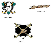
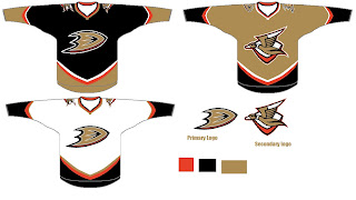
This one was interesting. It's a hybrid of the old logo with the new. I think it would be millions of times better if they just dropped the "ucks." How many times have I said that?

I mean consider how the wordmark logo actually looks on the jerseys. It's even got fewer letters than "capitals" yet it still seems smaller across the chest. I was really hoping for a change this year. Let them get the whole Ducks rebranding thing out of the way last season and then try something real this season.

I guess we can only ask for so much.

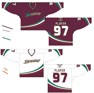
Here's something I don't love but thought it was an interesting idea. It's the current jersey with the old Mighty Ducks colors. Probably not a winner.

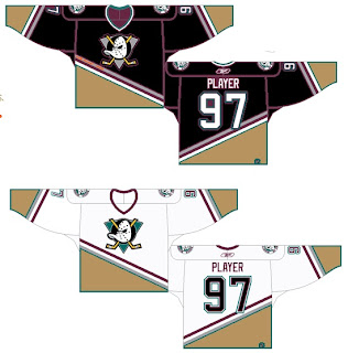
And then going all the way back we've got a simple recoloring of the old jersey and logo. Once again, it's not awful, but it just doesn't seem to fit.

Here's the winner.

I think if it were orange, that third jersey would just kill. The Ducks could be among the best-looking teams in the league if they wanted to. But the NHL doesn't hire designers like this. That would be too much to hope for.

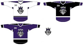
So let's move along to Los Angeles. A while back I'd written a post suggesting using the old King head third jersey logo with some modern-day recoloring. The purple beard blended in too much on the dark jersey so I wondered what it would look like in silver. And I got my answer.

I'm sorry, but why isn't that the primary Kings logo anyway? That says "kings" to me! (Not that a crown necessarily doesn't.) Oh and as a personal aside to the designer, what's the deal with stealing the Lightning's armpit stripes?

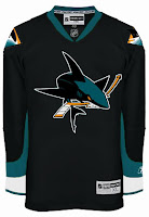
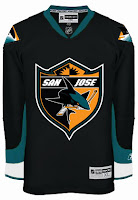
Anyway, let's head up the coast to San Jose and check out some other Lightning-related designs. One Sharks fans created these concepts based off Tampa Bay's Reebok jersey design, replacing the blue with teal.

Actually, I'm a big fan of the one on the left. The full shark makes for a much fiercer logo if you ask me — not that you were. As for the shield logo, I don't feel it makes a very good crest. It's a little much. I think it looks great on the pants and might even look nice on the shoulder — maybe for a third jersey one day.

The other thing I like is the diamond fin logo found on the shoulders of these designs. I'm a little surprised and disappointed it was left out of the actual uniform design.

What do you guys think of these? And remember, if you've made an concepts or seen any around that I haven't already posted, feel free to send them along. You can email me at nhllogos@gmail.com.

Tuesday
Sep182007

Comparing The Old With The New

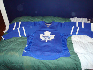
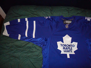
I got an interesting email a couple days ago from a reader who just bought a new Toronto Maple Leafs Rbk EDGE jersey. Matt compared the old sweater with the new one the old-fashioned way — laying one on top of the other. His pictures offer a great look at the differences between the two uniforms.

This shot shows the overall difference in the cut of the sweater itself. The biggest differences are shapes of the sleeves and the hem line across the waist.

Both are authentic jerseys. More photos can be found in the Rbk EDGE gallery.

Monday
Sep172007

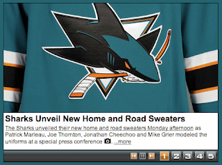
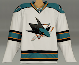
Sharks Unveil New Uniforms!

The San Jose Sharks have become the final NHL team to unveil their new Rbk EDGE uniforms today.

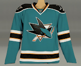
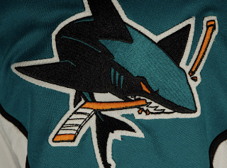
How about those! To echo some other folks, we're definitely looking at a fancy new logo on a very retro sweater. What surprised me was the shoulder logo.

I was expecting a fin logo so I was a little shocked to see the full shark logo. And I'm pretty sure the shield logo will make its way onto the pants, leaving the fin logo homeless. The logos I'm referencing can be found here if you're interested.

That teal looks really great on these uniforms, by the way. What totally sells it for me is the orange. I know a lot of fans aren't too keen on it, but I think it brings a great new dimension to a look that in recent years had been kind of monochromatic.

The cool thing is that the stripes around the elbows and waist are reminiscent of the original uniforms from 1991 which had grey in place of orange. And who here doesn't love retro? You know you guys do.

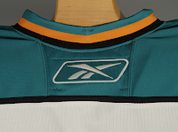
And then here's your close up of the collar. That teal looks really, really great.

Overall, I'm a fan. I think they could've gone with some more curvy lines and vertical piping to match, but they chose something a bit daring as far as these new Reebok sweaters. I'm impressed. I still prefer my Lightning jersey... which is coming in just a few days!

Monday
Sep172007

Hurricanes, Caps In Action

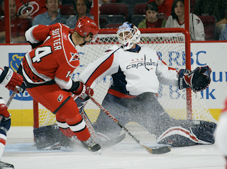
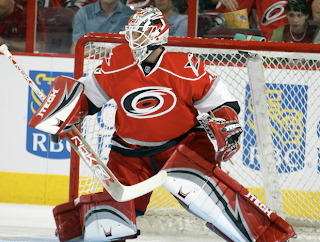
Last night, the Carolina Hurricanes defeated the Washington Capitals in overtime in each team's first game of the preseason. Both teams wore their brand new Rbk EDGE uniforms and I thought I'd share some photos.

The Capitals jersey has grown on me a little, though I don't like the wordmark posing as a logo.

Anyway, I really feel like these new sweaters look great on the ice. I may stand alone in that belief, but I'm all right with that.

Also wanted to point out that I've been collecting game photos from as many preseason games as I can for the Rbk EDGE gallery. Hope you guys are enjoying that. And if you come across any photos I don't have, please let me know. I'm trying to compile as many as possible — just for the hell of it, I guess.

Sunday
Sep162007

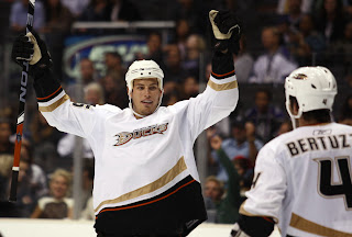
Ducks' Stripes Stop

You know I'm bored when I write a post about something like this. In perusing photos from last night's preseason game between the Los Angeles Kings and Anaheim Ducks, I noticed something odd about the new Anaheim sweaters.

It's the tiniest of details, but the curved stripe doesn't extend all the way around the bottom of the jersey. The panel down the side is solid. Like I said, it couldn't matter less, but it was just something unusual I noticed.

That reminds me, I just uploaded a ton of photos from that game to the Ducks and Kings albums in the Rbk EDGE gallery. They're different from that first preseason game because while that one was in Anaheim, this one was in L.A., so you can see the Kings in black and Ducks in white.

Sunday
Sep162007

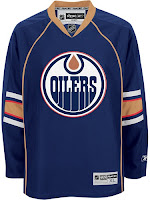
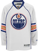
Oilers Unveil New Uniforms!

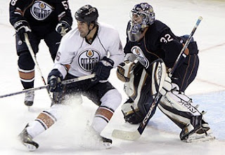
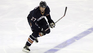
The Edmonton Oilers have unveiled their new Rbk EDGE uniforms today at the Joey Moss Cup. There are a couple of photos up on the team's official web site.

As far as the elbow striping, I'm still at a loss. But that's all right. Like all of the new Reebok sweaters, they look great on the ice and that's what matters.

I'll have more photos here once they are available. If you were there and took photos, please send them along and I'll post them here for you.

Sunday
Sep162007

Preview New Oilers Jerseys

The Joey Moss Cup should just be getting underway in Edmonton but the Oilers have yet to post any photos of their new Rbk EDGE uniforms on their web site. But thanks to our pal Wayne, we have a preview courtesy of the NHL.com Shop.

I've really liked the designs of most of these new Reebok jerseys, but I just can't figure out the half-stripe thing going on at the elbows here. It at least made some sense for Florida because of the red stripes going down the arms. But here, I just don't really understand.

We'll continue to wait for official word from the Oil. Hopefully they don't take as long as the Coyotes did yesterday.

Sunday
Sep162007

Thinking About Minnesota

We're waiting for the Edmonton Oilers to show of their new uniforms today, the least I can do is offer up some Minnesota Wild concept art. Let's get right to it.

I don't think this design is trying to prove anything. Probably just a bored artist having a little fun. For those who didn't recognize it initially, that's the new Rbk EDGE home sweater for the Montreal Canadiens. The colors and crest have been changed. It's not bad, but I definitely think the Wild went with the right look.

With this concept, the designer was just trying to see what the crest on the home sweater would look like on the road. Once again, I think the Wild got it right by using the large bear head logo over this circular one.

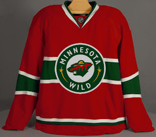
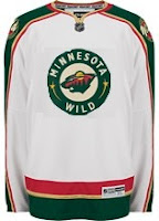
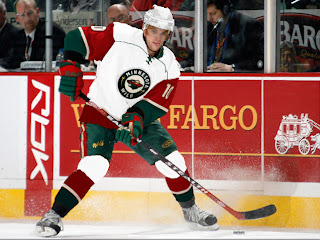
Quite honestly, I really like the Wild's logo and uniform design. Some folks have lodged Christmas-related complaints with regard to the color combination, but I find fault with that. I think the wheat color

But let's mix it up a little. What if the Wild just recolored the home pattern white and called that the road jersey. Might it look a little something like this?

It just might. Anyway I've also got some concept logos that were sent to me by John.

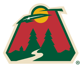
This redesign morphed the bear head into an "M," keeping the major elements from the original. I'm a huge fan of the bear head, but this is not a terrible idea.

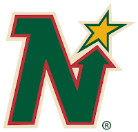
This logo is simply the Minnesota North Stars logo in the colors of the Wild. Personally, I think it was best like it was. But this does make me laugh.

So while we wait on the Oil, I might even have another concepts post at some point today. Hope you've enjoyed what you've seen here.

By the way, get ready as tomorrow I plan to open a poll where you all will get to decide on the subject of the next logo tournament.