NHL Tournament of Logos

Entries in jerseys (477)

Friday
Sep142007

Early Photos Of New Blues Jersey!

Courtesy of my friends over at The Checking Line, we have photographs of replicas of the St. Louis Blues' new Rbk EDGE uniforms. The actual unveiling by the team will come tomorrow at FANfest.

The new jerseys look sharp! I'm a huge fan of the shoulders. I wouldn't be surprised if the Blues make off with one of the best new Reebok designs here. Quite impressive.

Keep in mind that these images are replicas and not authentics so if the material doesn't look quite right, that's why. But as for the overall design, expect to see just that on the authentics.

We'll likely see Blues players modeling them at FANfest tomorrow. I'll have pictures posted from that event when I can.

Here's the back of the road sweater. I think the nameplate and the numbers are a little too close together here but that may have to do with the fact that's it's a replica.

Overall, I like it. And if I were the kind of person who could reconcile giving money to a team other than my Lightning, I might actually buy the home sweater. What do you guys think?

Friday
Sep142007

Flyers Unveil New Uniforms!

The Philadelphia Flyers officially unveiled their new Rbk EDGE uniforms today.

At the moment, the team doesn't have any photos up on its official web site, but I was emailed a couple photos of the new road sweaters.

If the tag on the front is any indication, this particular example is a replica. But it does have the giant numbers we've grown to love.

As more photos become available I'll post them here and at my official Rbk EDGE photo gallery where you can find oodles of photos of the new jerseys both in action and on mannequins.

UPDATE (7:50 PM): As noted in the comments, the Flyers have posted photos from the unveiling event that took place today along with the AHL's Philadelphia Phantoms. Grabbed a couple to post here.

Two uniforms you'll never see on the same ice again. Here's something else you'll never see on the ice again.

That just reminds me of that episode of The Office where Michael brought in the Ben Franklin "stripper" for the ladies. Anybody watch The Office? That shit is funny! But I digress.

Nice uniforms on the Flyers. Can't be displeased with those. Minor alterations, but they fit in nicely with the progression of sweaters over the years. I'll leave you with a photo reconciling the past with the present.

Friday
Sep142007

Thrashers Unveil New Uniforms!

The Atlanta Thrashers unveiled their new Rbk EDGE uniforms at a press conference today.

There were no real surprises or alterations from last year's uniform set.

Alexei Zhitnik and Pascal Dupuis modeled the new sweaters for cameras this morning. One interesting note is that they managed to make the left sleeve element work with the new Reebok jerseys. I always liked "ATLANTA" down the arm. It's something unique that no one else has done.

By the way, you can't see it here, but on the photo above, the secondary overhead thrasher logo has been added to the blue jerseys. It wasn't there last year, but it's a great logo. Glad to see they put it back.

And here's a close-up of the collars. They're pretty much sticking with what they know here.

And that's what the back looks like. Same lettering and numbering — just with much larger numbers. What do you guys think? Do the Thrashers have a winner here?

Thursday
Sep132007

Ducks Unveil New Uniforms!

Even though they were already on the web site, I'm calling this the official unveiling as the Anaheim Ducks wore their new Rbk EDGE uniforms on the ice for the first time in a preseason game against the Los Angeles Kings. That game was also our first look at two teams in action wearing the new threads.

Here you see Maxim Kondratiev sporting the new look on the ice. He scored a power play goal for the Ducks in the league's first exhibition game of the season.

Looks very much the same as last year's jerseys. I still can't get over the wordmark for the logo. I like the jerseys. I think they're great. But really, get rid of the "ucks" and just use the "D" as your logo, all right?

But that's not all. I've still got more pictures from last night's opener.

I hope no one is complaining anymore. These new Reebok uniforms really do look awesome on the ice. I know it was hard to tell since they were all draped over mannequins. We're used to seeing them in action. Now we are and it's quite a sight.

My one beef is the oversized "C" and "A" on the captains' sweaters. I don't really think they need to be that big. In the Ducks' case, it sort of overtakes the logo on the front of the sweater.

These action photos will also be a good chance for us to keep a tally of which teams are wearing the numbers on the front as well. As of yet, we still don't know how many teams are doing that.

By the way, later on today, I'll be adding these photos to the Rbk EDGE gallery. I'll try to do that for as many teams as I can find photos for as we go through the preseason and beginning of the regular season.

Thursday
Sep132007

Devils Unveil New Uniforms! (Sort Of)

All right, so Lou Lamoriello has already said there will be no unveiling ceremony for the New Jersey Devils new Rbk EDGE uniforms, but they've got a picture of the new home sweater on their official web site.

There you see Patrik Elias getting his picture taken prior to training camp. Exact same design. Lou didn't lie.

It's not earth-shattering but I felt it was worth posting. Thanks to Jeff for the tip!

Thursday
Sep132007

Random Concepts To Share

Aside from the NHL 08 news, it's been a rather slow day so it would be wrong of me to leave you without a concept post to get you through the night. But before I do that, I wanted to thank you all for continuing to visit and read this blog. Yesterday, we passed the two million hit mark. For those keeping track, it was over 1,000,000 hits in just two weeks. I'm still in shock.

But moving along now. We'll begin with an amazingly cool concept logo which was emailed to me yesterday. It originates from the SportsLogos.net message board. It combines the tradition of the Colorado Rockies and the symbol on the flag of the state itself.

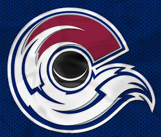
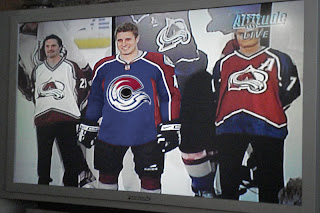
For my money, I'm sure it's just the thing hockey conservatives love. But the thing is, it's actually really good. Personally, I'm still partial to the "A" logo, but this could serve as show-stealing secondary mark for sure. I mention it because shortly after Altitude had the new Avs jerseys, somebody reworked it.

I never cease to be amused by people. Speaking of amusing — the New Jersey Devils have never had a secondary logo. Here's what one might look like.

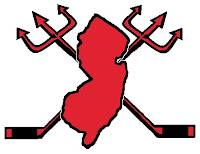
Needs something to hold it all together, perhaps a circle or something. But I don't think it's half bad. Too boring for a primary but it's exactly what secondary marks are supposed to be.

But while we're busy altering logos, I was emailed this Tampa Bay Lightning design.

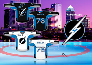
While the silver and blue on black make a solid color combination, there really isn't anything to the logo. It's just... dull. I know we all like simple over busy but there's something to be said for finding a happy medium.

But let's not stop now. What if the Oilers were to don a redesigned logo at some point in the future? The riots in Edmonton's streets aside, it could look something like this if the right people were on the job.

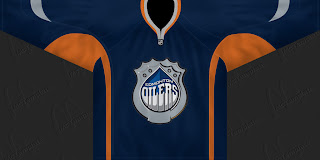
I can't speak for Edmontonians, but I like it, myself. What I don't like is an orange — and I do mean orange — jersey.
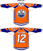
Like this one.

Yes it's a little busy but I can look beyond that. What I can't get past is all that orange. I'd take a copper jersey over that. What does that say?

Anyway, that'll do it for tonight. Leave your comments below as the designers who email me often peruse the feedback on their work. I'm sure they'll be interested in seeing what you all have to say.

I'll have more tomorrow if I don't get too bogged down in the four different teams unveiling jerseys.

One last thing... HOCKEY SEASON IS ALMOST HERE!!!

Thursday
Sep132007

'Hawks Show Off Unis With Season Tickets

Yay for photos! All right, I know we've all seen EA Sports' renderings of the new Rbk EDGE uniforms, but it's time for some photos. Chicago Blackhawks season ticket holders were treated to the new home sweater.

It says the jerseys will be released tomorrow — the date we already have. Hopefully I'll be able to share more photos with you then.

Thursday
Sep132007

EA Unlocks Unreleased Jerseys?

Got several emails today about EA Sports' NHL 08 which was released this week. We kept hearing an unlock code would be provided for the new Rbk EDGE uniforms.

Apparently, that code was released today, supposedly unlocking all of the uniforms in the game. Here to the left you can see the unlock code available at official Rbk EDGE web site.

I've seen screen grabs for only a handful of team jerseys so I don't know that they're necessarily all available at this point. (Someone correct me if needed.)

The teams I've seen via stills from email and around the web are the Thrashers, Sharks, Coyotes, Stars, Oilers, Blackhawks, and Blues. And while they are from video games (which you know I'm opposed to), I'll post a few here just for fun. I'm still going to wait for teams to show off the uniforms themselves to count it as an "official" unveiling.

Many Thrashers fans may be happy to see the "ATLANTA" retained on the left sleeve of the home jersey. Of course, I'm just guessing it's there since we can't actually see it.

The Blues and Sharks sweaters look nice — if not like they've been swapped. I like the sholders of the Blues sweater and the striping on the Sharks.

And the conservatives among you will probably like the fact that nothing much has changed for the Chicago Blackhawks.

Just remember that while there's no reason to doubt the designs here are accurate, I won't call them "official" until we see it from the team or the league. That's just how I roll.

Thanks for all the emails on the subject, everybody! I'll try and get some more images up later on.

UPDATE (12:36 PM): Here's a great photo gallery featuring all the new AHL and NHL sweaters. Enjoy!

Wednesday
Sep122007

Ducks To Debut New Unis

The Anaheim Ducks previewed their new Rbk EDGE uniforms on Wednesday evening via their web site, saying the debut will come tonight during preseason action against the Los Angeles Kings. That means hockey is officially back tonight everybody!

We did get a first look at the new home sweaters via a Maine newspaper yesterday. We still have yet to see the road jersey.

I'll post pictures from tonight's game as soon as I can. Be aware, however that since it's a west coast game, I won't be able to post anything from it until after 2 AM (Eastern). I will add those photos to this post.

Wednesday
Sep122007

Oilers Tease New Sweater Online

Just a minor note but worth posting nevertheless. The Edmonton Oilers have a small teaser graphic of their new Rbk EDGE uniforms on their home page.

Like I said, it's not much but it does tell us that copper is sticking around a while along with the navy blue. This appears to be the road sweater. If I were to guess though, I'd say the home sweater will be blue and also have a blue collar.

The Oil will unveil the new jerseys to everyone on Sunday at the Joey Moss Cup at Rexall Place.