NHL Tournament of Logos

Entries in jerseys (477)

Sunday
Sep022007

Sun Says Leafs Jerseys Coming 9/12

I got an email from a reader named Desmond today, pointing me toward some new information in the Toronto Sun. The newspaper is holding a contest where you can win the new Toronto Maple Leafs Rbk EDGE jersey.

The team has not unveiled the uniforms or made any official announcement about doing so, as far as I know. Still, the following was posted in the Contests section of the web site.

The Toronto Sun wants you to win a newly designed Toronto Maple Leafs Jersey. Plus the winner and a guest will attend the unveiling at the ACC Wednesday September 12.

Apparently we can expect to see the new Leafs Rbk EDGE uniforms a day sooner than I'd initially posted — and at an event hosted at the Air Canada Centre. Now, this doesn't come from the team directly, so anything is possible. But I'd consider a newspaper to be a reliable source of information — as that's their job.

I'll let you know if I hear anything else.

Sunday
Sep022007

Dipping Into The Oil

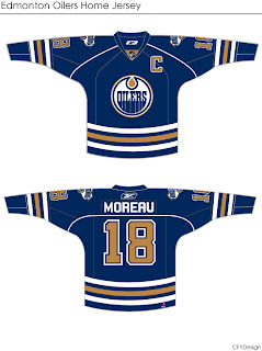
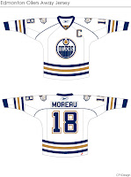
More concepts! These fan-designed works of art were created for the Edmonton Oilers.

These concepts were created by the same artist who brought us the Chicago Blackhawks jerseys I posted earlier today.

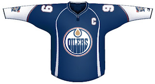
They're very clean designs and would make great uniforms for the Oilers. I especially like the use of the shoulder patch from the third jersey on this set. I don't think it should necessarily replace the crest, but I do like it a lot. I could definitely see them going with something like this.

But I'm not an Oiler fan so it's not really my place to say.

If you're not a fan of the copper, you might enjoy this.

I'm not sure the secondary logo would work at the wrist — being hidden by the gloves. The curvy stripes up the sides are reminscent of the Buffalo Sabres' current sweaters, but not all bad. You could do a lot worse.

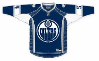
I've got one final design for you that eliminates both the copper and red, replacing it with the silver from last year's third jerseys.

I think that's a little too plain. Oiler fans, what really matters is your opinion. See anything you like here? Or does the Oil need an extreme makeover?

Sunday
Sep022007

Concepts For 'Hawks, Ducks, Devils

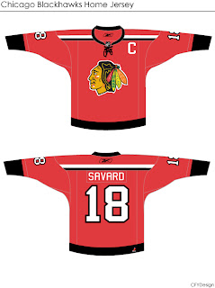
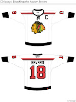
I'm curious to see the reaction in this one. A lot of you profess the Chicago Blackhawks to have the "most beautiful" uniform in all of sports. I don't see it but that's only me. However, I could very much get behind a design like this.

Even the white one is awfully sharp. The striping is clean and very minimalist. But would something like that result in an upheaval of the hockey world? Do things always have to stay the same?

Either way, the design work is very clean and I'm curious to see comments on this set.

This next one will be met with nothing but hate I'm sure. The striping is one thing. The name above the logo is another.

I'm sure that would result in even more blowback than 'VANCOUVER" across the front of the Canucks' jersey. But of course, these are all just fan-created concept designs. A bunch of what-ifs.

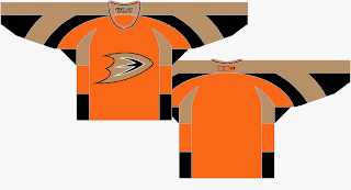
Here's a thought for the Anaheim Ducks.

It's the orange sweater Flyers fans have been begging for. Personally, I think it's too much for the Ducks. I think orange needs to be an accent for them. Let gold be the main color. As much as I don't like black jerseys, I think the Ducks' look sort of requires it. Thoughts on that?

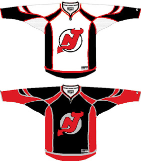
And then we have a look at all-star template-based New Jersey Devils concept.

You know you love the piping. I like the idea of a black Devils jersey — despite that fact that I just said I don't like black jerseys. The reason here being that too many teams have red jerseys now. You can add the Wild and Capitals to the fray this season. Red's a good color until it gets overused. Which is right about now.

I'll have more later. By the way, I have tons of Canadiens and Flames concepts for tomorrow — they day before their big unveilings!

Saturday
Sep012007

Seeing Stars!

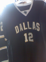
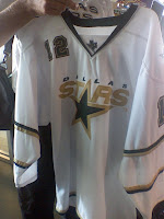
Hot off the presses at HFboards.com come photos of the Dallas Stars' Rbk EDGE uniforms...

...or so we'd be led to believe.

As many have stated, what stands out most is the lack of an NHL shield at the collar — a feature on all the new EDGE uniforms. But that's not the only reason why I'm leaning toward the belief that these are fakes. Look at the material. We've seen lots of photos of the new sweaters at this point. These seem too thin.

Check out the back of the collar where the tag is supposed to be. Nothing. And not a Reebok logo in sight. Another good question: Why is "DALLAS" written across the home black jersey? Shouldn't the home crowd know where their team is from? And why the lack of color and such thin striping around the sleeves?

You think you know where I'm going with this? No, it's not a Photoshop job. While I cannot state to an absolute certainty that is true since I've only been looking at these pictures for five minutes, I'd bet real money on it.

My feeling: Somebody actually made a mock-up of a Dallas Stars jersey — then took photos of it to pass off as a "leak." When Photoshop skills lack, tailoring skills can be money in the bank. Someone with a sewing machine and some extra fabric went out of their way to create a concept so much better in quality than any of the concepts I've ever featured on this site. You can actually touch that sucker.

So color me impressed. I don't want to sit here and tell you for a fact these aren't the jerseys, but there's too much wrong about them for me to believe it. And I've been looking at these jerseys for a long time while running this blog.

Now is your turn. Are these real or are we seeing stars?

UPDATE (8/2 2:03 PM): The general consensus seems to be that these uniforms belong to a junior team in Dallas which has traditionally worn the same sweaters as the Stars. Makes more sense than somebody creating a prototype just to have a little fun with people.

Anyway, it's not clear if that practice will continue and these are close to what the Stars' uniforms will look like or what. We'll have to wait until September 14 when the Stars are supposed to unveil their jerseys.

Saturday
Sep012007

What To Expect In September And Beyond

Just wanted to pop in with some quick news and notes relating to the blog. As you know, September is upon us and that means 18 teams have about two weeks to unveil their new uniforms. It's going to be hectic this month but I mention it because this means I'll be more focused on actual jersey news than concept art. Not to worry though, I'll fit it in where I can and I'll keep adding stuff to the gallery.

Which brings me to my next point. I haven't written a lot of posts today, but I've been busy behind the scenes adding loads of new images to the two galleries I've set up. I've added at least one new image for every team in the Concepts Gallery. That's definitely worth a look. You'll find lots of new stuff all the time. I've been updating it nearly every day.

I've also been adding pictures to my official Rbk EDGE gallery — including the Philly and Minnesota leaks from the last couple of days. Even though the two teams haven't "officially" unveiled them, I'm counting them because they came through official team channels — the respective season ticket books.
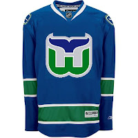
It would be cruel of me to publish an entirely text-only post, so look at this. Somebody slapped a Whalers logo on the new Canucks unis. They forgot to write "HARTFORD" above it.

Anyway, I also wanted to let you guys know what I'm working on for the future of the blog. As you know, the primary focus of the site is the logo tournament. As of right now, nearly 225,000 votes have been cast. So I'd call it a success. A lot of you have emailed in asking what's next. The tournament ends on October 3 — opening night for the NHL. And as for the jersey news, they'll all be unveiled within the next few weeks.

Not to worry, though, NHLToL shall have life in October assuming you all want to keep coming back. Beginning on October 1, I'm going to start a month-long feature wherein I review all of the new Rbk EDGE uniforms. You'll be able to rate the uniforms and comment on the reviews.

On the tournament side, there will be plenty more where that came from. A new tournament is in the works. Beginning on September 17, you'll be able to vote on what the next one will determine. We can see who has the best vintage logo, secondary logo, even new uniform, or anything else you guys come up with. The new tournament will begin on Saturday, October 6.

I'm also working on a couple of spinoffs. We can do logo tournaments for the AHL, ECHL or any of the Canadian hockey leagues. That'll start some time later in the year at a new location. Expect to see the new Tournament of Hockey Logos coming soon. We'll have to get the word out to all our minor league friends.

I hope you'll all stay involved with the blog. I've really had a blast making it and I've been thrilled by the response. On the day the Canucks unveiled their uniforms, this site had a whopping 110,000 hits — the same day it crossed the one-million overall mark.

Anyway, keep reading and keep emailing me. I enjoy hearing the feedback and getting all your awesome concept jersey designs. Thanks so much for visiting!

Saturday
Sep012007

Concepts From Dallas

I've got loads of Dallas Stars fan artwork to share with you on this Saturday afternoon. So let's get right to it.

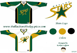
We're all well aware the Minnesota Wild decided to leak their new home jersey to valued season ticket holders. Based off that design, someone came up with this idea for the Dallas Stars.

I'm one who likes the "star" jerseys they wear now. They've got one of the league's most unique looks. Unfortunately, I don't think that would translate to the EDGE. It's a language Reebok doesn't quite understand. To be fair though, it's a limitation of the design that, if the players like it, who are we to judge?

Someone else had the idea to transfer the Iowa Stars look to Dallas. Here's how that might manifest itself.

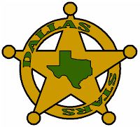
I don't know. Feels like a lateral move to me. I say we go back to the drawing board. What if they went all Old West on us in the great state of Texas? Might it look a little something like this?

I feel like the Stars haven't done enough to differentiate themselves from the North Stars — this, despite the secondary logo with the outline of Texas. They still wear the same crest as the North Stars did during their last year in Minnesota. Personally, I'm hoping for a change when they finally show off their new uniforms.

I'm not necessarily saying this concept is the way to go as all I can see is Chuck Norris' reflection in the shiny badge. But Chuck's pretty bad ass so I'm not so sure it's a bad thing.

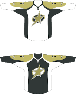
But while we're on the topic of design overhauls, check out this one.

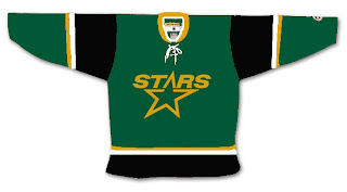
It's sharp in a classic sort of sense. I think it could use a greener green as muted colors don't make for good sports uniforms, generally speaking. I do like the logo idea but it feels a little plain. It's like you just keep staring at it waiting to notice something. But nothing comes. Obviously, nothing's perfect but I think someone needs to get on a Stars overhaul.

The best Stars concept logo I've ever seen was this one I posted a month ago. For those who appreciate simplicity in NHL logos, you can't complain about that.

Anyway, go visit the Concepts Gallery to see these designs and others that I haven't posted. You can also see that first logo set I posted in green and silver (rather than green and gold).

Saturday
Sep012007

Habs Unveiling Date Is Official

The Montreal Canadiens have confirmed the unveiling date of their new Rbk EDGE uniforms via their official web site. The date will be Tuesday, September 4 (just like the Calgary Flames) as I'd previously reported. That date is already in the sidebar countdown. Here's the graphic from their site.

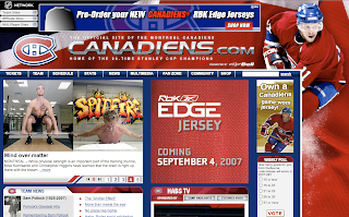
Since that graphic doesn't actually reference the Habs specifically, here's a shot of their web site. You can see they're also taking pre-orders of the new sweater via the NHL.com Shop.

I doubt they'll do much to change it — just merely adapt it to the new cut like the Detroit Red Wings did. Looking forward to seeing on Tuesday. It'll be another big day in Canada.

Saturday
Sep012007

Flyers Leak Like Wild!

Including this one, the last five consecutive posts have involved the Philadelphia Flyers. Guess it's a good time to be a Flyers fan.

Yesterday, I posted a photo of a page in the Minnesota Wild season ticket holders book which featured a shot of the new uniform. Well — excuse the pun — but now it seems the Flyers have taken a page out of their book.

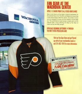
Season ticket holders were treated to this photo of the new Rbk EDGE home sweater. It's a much better look than the cell phone photo I posted yesterday. Looks good, Flyers fans. The changes are small but insignificant.

Thanks to everyone who emailed me this image!

And as far as the Reebok "templates" we've seen, this one doesn't appear to match any of them. What do you guys think?

Friday
Aug312007

Just To Freak You Out, Part 5 of 5

I know you'll all be sad to see it go, but today I'm wrapping up my week-long series of whacked-out and crazy images. So let's get this final show on the road. Our first stop is Pittsb— er, Kansas City. Or, well, I don't really know. You figure it out.

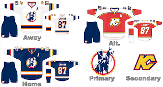
I know we've seen a lot of crazy shit, but wow. A Kansas City Scouts Rbk EDGE jersey with Sidney Crosby's name and number. I'm sure this design was concocted in the days when the Pens' future was largely uncertain. With KC looking like a predator ready to pounce, you never know. Just, wow. I don't really have any other words. Maybe you guys can find some.

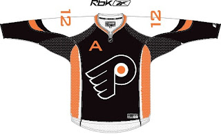
Over in Philly, there's a consortium that can't tell the logo forms a "P" unless it's cockeyed.

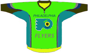
My neck hurts from looking at that. My eyes hurt after looking at this.

Ha ha. Now your eyes hurt too. I promise I won't do that anymore.

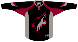
Oops, gotcha! You guys are easy. Anyone want to see a black coyote?

Probably not anymore, huh? Seriously, though. Charlie, from SabresNotSlugs.com really needs to see this. It could be the new logo for his site.

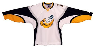
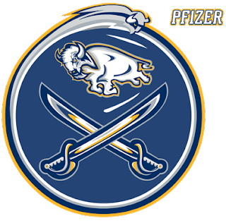
Somebody didn't like the slug. Showed it what a sabre is. Then gutted it. Sad story, really. But you guys haven't seen the half of it yet. Remember the amazing composite logo Pfizer created for the Canucks. He dropped the Sabres logos into the same blender. It produced this.

Maybe that should be your new logo, Charlie. Sometimes we just don't recognize how good we have it.

I hope I've been successful this week in freaking you all out a little bit. My goal is to show you that what you have, despite what some of you think, isn't that bad. We all like to moan and complain about changes but just remember, they could've done so much worse. And then where would we be?

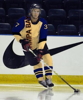
I'm going to leave you one last little nugget, though. On Tuesday I posted a crazy concept for the Tampa Bay Lightning. I also asked if someone might be able to show me what it would look like on a player. As I close out this series, let me leave you with that image. Let me burn it into your soul.

Big time thanks to Russ for that one!

Friday
Aug312007

Flyers Jersey Leaked?

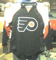
Flyers fans, you've been asking for it. I finally have potentially credible evidence of the new Rbk EDGE home jersey of the Philadelphia Flyers thanks to Adam. Behold!

I know we all just love those grainy cell phone pictures, but this is what I've got. Take it for what it's worth. If it is real, it's pretty sharp. You guys could do a lot worse. Comment away!