NHL Tournament of Logos

Entries in jerseys (477)

Wednesday
Aug292007

Official News On Pens' New Threads

Damn, there's really too much going on today. I nearly forgot to post this nugget. Mike sent in a link to a question-and-answer session featured on the Pittsburgh Penguins' official web site.

The column was written by Bob Grove who's apparently a regular writer on the site. He didn't give a specific date, although we have heard September 5 will see the unveiling. The Pens are not changing their logo — but we already knew that — and will only see "slight modifications" to the jersey. Read it verbatim here.

QUESTION: I just wanted to know if the Penguins are keeping the jersey and logo the same or are they going to make changes like some of the other teams who have already released their uniform designs?
-Matthew in Butler

BOB GROVE: The mail just continues to stream in about the Penguins' new Reebok Edge uniforms. Look for the Penguins to unveil the new uniforms prior to the start of camp. But to reiterate: no new logo. There are no major changes to the uniforms, no changes requested by the team. The slight modifications to the uniforms will be the same as those made to the uniforms of every team. While some other NHL teams (including Washington, San Jose and Ottawa) are making logo changes, the Penguins are not.

If you're totally lost on this subject, catch up here (to see the post about the unveiling date) and here (to see the potential new uniforms).

Wednesday
Aug292007

Just To Freak You Out, Part 3 of 5

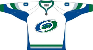
So this week I'm running a series of crazy concept designs meant to freak you out a little bit. Let's get to it now.

I have to start with the colors we've all grown fond of this afternoon. Yes, you know the ones. But beware, you're about to see them on a jersey that will make you blink a few times and perhaps tap the side of your monitor. No need, though.

Being of generally slow wit, it took me a moment to realize that this Carolina Hurricanes jersey was being recolored based on the team it used to be. Yes, friends, the Hartford Whalers. But just look at that blue and green hurricane. Scary.

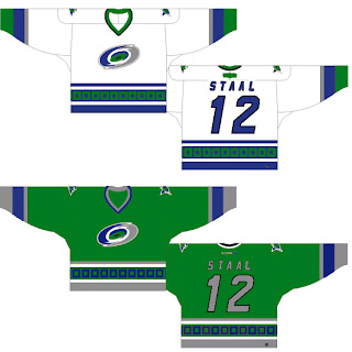
Somebody else had a similar idea. Look at that thing.

And then somebody with a twisted soul had an idea. Let's go all the way back to the New England Whalers... and kill Pucky... on a jersey... made by Reebok.

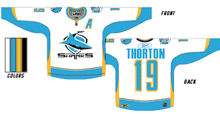
Yeah. And while we're on the topic of creatures of the deep, let's see what could've happened if certain fans had been asked to design the new uniforms and logo of the San Jose Sharks.

Huh? Wait, that one's actually kind of good. Dude, I like that logo. What is it doing here? Oh I remember. It's serving as a segue to this.

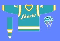
I can hear the screaming all the way from here. But before you go all thinking this design is completely without merit, don't forget about our friendly California Seals. Yes, this design is based on that old '60s uniform.

Completely and utterly crazy if you ask me. And I know no one did, but I'm sharing my thoughts anyway.

Let's roll on, now. Because before I go, I need to show you this logo someone emailed me for the Dallas Stars. Yes, the Stars need a logo redesign, but is this really the answer?

There's only one way to find out. Comment now and come back tomorrow for Part 4.

Wednesday
Aug292007

Mixed Reaction To Canucks Makeover

It's officially official. At the time I'm writing this, there have been almost 150 comments posted on the previous post. Vancouver Canucks fans mostly seem to be upset by the new Rbk EDGE uniforms unveiled today at GM Place.

A lot of you guys seem quite unhappy. Specifically, you seem to loathe the wordmark above the crest. As a non-Canucks fan, I think it's great and that these jerseys are very sharp. Honestly, I don't have a single complaint. But I'm one voice against thousands. As a Lightning fan, I can somewhat understand your distress though. I've never been a big proponent of "TAMPA BAY" in the logo. At least the got rid of "LIGHTNING" in the new design.

Anyway, this post is about the Canucks.

The "C" on Markus Naslund's sweater is a little close to the wordmark on the chest, but it's not the end of the world.

The stylized stick-in-the-rink logo is an excellent touch that moves the uniform forward. And those colors — you can't beat them. I also find interesting the choice to put green on the jersey but not in the logo itself. A little unusual but that wouldn't be the first time.

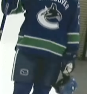
That shot should offer a better look at the rest of the uniform as a whole. Nice touch with the logo on the pants. I'm adding all of these images and many more to the official Rbk EDGE photo gallery. Go check it out!

Wednesday
Aug292007

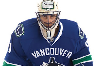
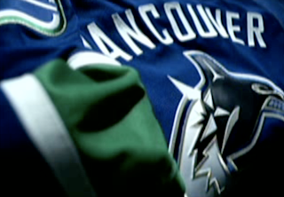
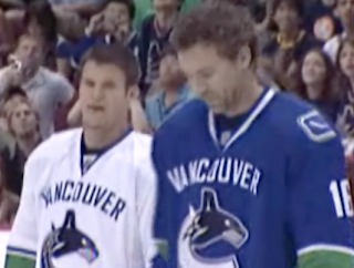
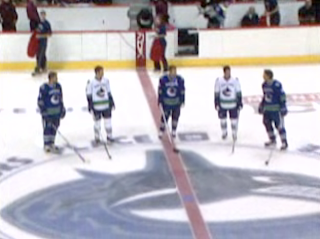
Canucks Unveil New Colors, Uniforms!

Take your first looks now. I'll have more in a little while. These images are from the streaming online video of the launch that took place this afternoon at GM Place in Vancouver.


Tuesday
Aug282007

Reminder: Big Day For Canucks Fans

Just a reminder that tomorrow the Vancouver Canucks unveil their new uniforms. Hopefully once that happens, I'll be able to go more than a day without posting Canucks concepts.
Here's what we're expecting: The new uniforms will likely don the orca logo in the traditional colors of blue and green. Some evidence has suggested green will be a uniform color but not found in the logo itself. We've also heard the old stick-in-the-rink logo may be a secondary mark — a shoulder patch. And there's also the possibility that the orca logo will feature different colors for the home and road sweaters (like the Calgary Flames, for example). Nothing is confirmed and it all remains to be seen, of course.

Fans will first set their gazes upon these new sweaters at 12:30 PM — which is 3:30 PM my time as I'm on the east coast. As has happened in the past, as soon as photos surface on cyberspace, I'll do my very best to have them right here for you.

Also, if you haven't voted on the Sharks vs Canucks poll in the tournament, I'll be changing the logo over to the new color scheme just as soon as I can. So you might want to hold your vote until we see what the new logo looks like.

Good luck, Canucks fans! I hope your day turns out as well as mine did. I was really happy with the new Bolts jerseys. Hopefully you'll be thrilled with yours.

Tuesday
Aug282007

Just To Freak You Out, Part 2 of 5

I'm back with more weird and wacky designs from the world of hockey art. Prepare yourself.

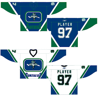
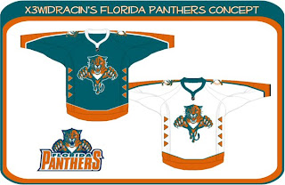
What sports franchise first comes to mind when you think Miami? The Dolphins, right? Well what made them famous? Was it their colors or the fact that football is one of the most popular sports in the U.S.? Well, the colors, obviously! So to help out the Florida Panthers in becoming more famous, one designer swapped out their colors. Take a look.

Go ahead. Rub your eyes. You aren't seeing things. Can you believe that? One incredible design after another, I tell you. Still, I can do better.

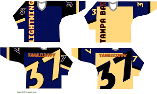
You'll have to look closely to tell, but that, my friends, is another fascinating concept for the Tampa Bay Lightning. No crest. Crazy numbers. The most original design I think I've ever seen. Here's my question: Can anybody Photoshop this jersey onto a picture of a player? Because I totally want to see how that bad boy looks on the ice.

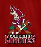
The Phoenix Coyotes had a great logo when for some reason they decided to throw it to the wolves in 2003. They dropped out what made their logo unique and colorful. Guess bland is back. Or not, so this designer thinks. Check that out. It's a wonderful combination of old and new.

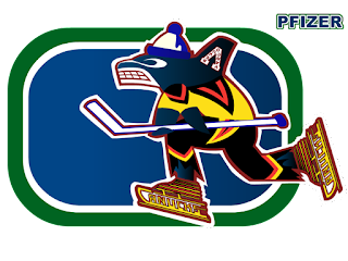
Kind of like this. And while we're on the subject of that crazy Canucks logo. What you really need to see is the fully-colored version.

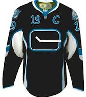
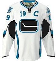
How can you improve upon something like that? It's like finding pure gold in the Black Hills. Oh, and while we're still on the topic of Vancouver — all you Canucks-haters — feast your peepers on these.

Yesterday we had black and neon green. Today we've got black and sky blue. If I haven't freaked you out enough yet today, just wait until you see this. I'm going to make this lousy post come full circle right before your very eyes. Behold.

From Panthers to Canucks. And I don't even have the words to describe it. No words would be worthy of describing it.

You'll tell your grandchildren this story. And you know it. Stay tuned. More is on its way tomorrow.

Tuesday
Aug282007

Blues Uniform Concepts

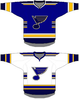
There's so many teams to choose from. I'm thinking I'll go with the St. Louis Blues next. I've been emailed some great concept art for their new Rbk EDGE uniforms. You should see them.

For those who fear change, this might be a good option. It's got the same colors and overal jersey design, save for the small stripes on the sides. Not much to complain about. But then by the same token, it's rather unremarkable.

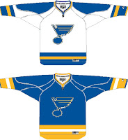
If it's the retro look that suits you, perhaps this is the way to go. Simple blue and gold with the horizontal stripes we all know and love.

Again, plain and unremarkable but not necessarily bad. The Bruins went with plain and easily have one of the best Rbk EDGE jerseys at this point — and that's unlikely to change if you ask me.

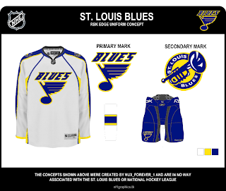
Now, if something new-fangled is what you seek, peer below at final concept I have to offer you.

I wouldn't necessarily like to see the Blues undergo a logo change, but if they had to, I'd be all for the trumpet logo. I think it's great! But then I'm a Lightning fan, not a Blues fan. However, I don't feel like the musical note logo is improved by the text above it. I'm also a big fan of the two-toned blue of the uniforms. I hope they don't lose that in the new designs.

Any thoughts? Don't forget, any concepts I post here on the blog will also go straight into the Concepts Gallery along with many other concepts I haven't posted. I add several new designs every day so keep an eye on that.

One more post planned for today then I'm calling it a night.

Tuesday
Aug282007

Something To Circle In

My headlines seem to be getting more and more obscure. I guess there's only so many times you can say "New Concept Art For [insert team name here]" before going out of your mind. Whatever. I'll roll with it.

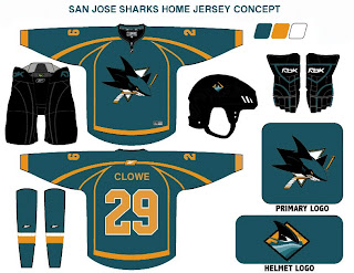
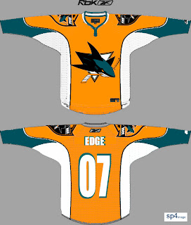
Anyway, the team to insert now is the San Jose Sharks. They unveiled their new logo just over a month ago but left us wondering what the jerseys would look like. Just one more thing to ponder this off-season. As expected, I have concept art to share.

First up is my personal favorite. If the Sharks wore something like this, they'd be among the sharpest-looking teams in the new Rbk EDGE jerseys. Boston's got some game so don't get too worked up. But these I like. The horizontal striping and traditional look totally clashes with the new-fangled, curvy-line logo but I don't know. I still like it.

This uniform set is based in large part off of the Panthers' new sweaters. I like them, but not as much as the ones above. And I really think those elbow stripes need to go all the way around the sleeve to work right. Still, not too shabby.

Nor is this. But I think this design takes most of its cues from what the Sharks have been wearing the last few years. I really did like the silver, but the orange works too. This design needs a black accent though, I think. It's very, very teal. Very teal. With some teal on it.

But before you go thinking that's all I have to offer, Sharks fans, wait until you see this. The addition of orange to the primary team colors has met a somewhat mixed response. Though to be honest, I have heard anyone love it so much that they'd want to see a jersey like this.

My eyes, my eyes! What a work of art. I'll tell you what makes me like it a little bit — the big shield logo on the shoulders. First of all, I like big shoulder logos. Second of all, I like that shield logo the Sharks came up with. So it's got a lot going for it in my opinion. Unfortunately, too much orange, not enough teal might well spell disaster.

Now I'm done. Take me to task with your comments.

For those who still haven't worked it out: Sharks circle their prey in the water. Get it? Something to circle in? No? Okay. It was a long shot anyway.

Tuesday
Aug282007

Concepts For Blueshirts

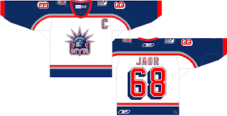
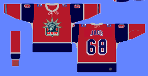
One team I haven't posted a lot of jersey concept designs for is the New York Rangers. I guess there just aren't a lot out there. Regardless, I have some today.

Rangers fans probably aren't loving the Flyers template in this design. I love the use of the Lady Liberty logo as a primary for the Rangers, but I think a lot of teams are so afraid of losing traditionalists with the introduction of the new Rbk EDGE jerseys, that they won't even attempt something with a little "edge" — with all the pun I could possibly intend. I think the response to that fear is to make something that looks traditional on a "non-traditional" sweater.

Well what I have to say to that is this: If your support for your team hangs in the balance opposite the uniform or colors they choose to wear, how can you possibly consider yourself to be a real hockey fan or a sports fan of any variety? It's about the game, remember? The puck gliding across the ice. The teeth-breaking body checks. The one-timers. The hat tricks. The amazing saves that precipitate no possible response other than sheer awe.

I know those thoughts have slipped through the cracks on this site because we're all so delirious from the lack of hockey this off-season — fretting the changes being imposed by a controversial commissioner — but don't forget that this site is all for fun. When I read comments here about how self-proclaimed "fans" suggest cheering on another team if their team's new jerseys suck, it just saddens me.

Anyway, look at that. I just went off on a whole thing there. Moving on. More Rangers stuff to look at!

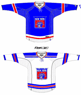
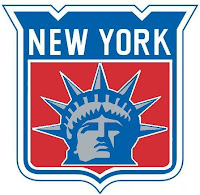
That design is actually in the Rbk EDGE cut. And the logo used can be seen at a larger size here to the left.

It's pretty cool but I'm partial to the NYR version. It's got a better color scheme and overall feel. This one feels like it's trying to be too retro while attempting something new.

Check out this next design.

While it may be considered blasphemy to put the Rangers in anything but blue, it's certainly an interesting concept. The first thing you might notice is its striking similarity to the Minnesota Wild's third jersey from last year.

So what do you guys think? Rangers fans, are your boys due for a change or should some things always stay the same?

Monday
Aug272007

Just To Freak You Out, Part 1 of 5

Today I'm starting a weeklong feature I hope you all will enjoy. As the title implies, the images I post here are meant to freak you out a bit so don't be surprised if you see the weird and wacky in what follows.

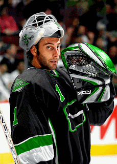
I've gotta kick it off with this photo because it's what gave me the idea for this series.

This photo comes from a bored fan at a Vancouver Canucks message board. Talk about identity crisis. How about those colors? Black, silver and neon green. Don't miss the recolored flying skate logo on the shoulder and the neon green Johnny Canuck on the side of Roberto Luongo's helmet. Stunning. Absolutely marvelous.

It gets better.

Now speaking as a Lightning fan, I can honestly say that is one color scheme I would have never dreamed up. It's not a horrible design on its own, but I'm afraid I wouldn't be able to recognize Vinny, Marty and Brad underneath all that... whatever it is.

But let's not stop there.

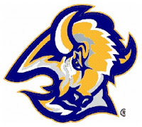
Sabres fans, have you ever considered going with a blue and gold goathead for your primary logo?

Part of me wants to think someone was just trying to prove how silly a yellow buffalo would look (see the current "Buffaslug" logo). But the part of me that attempts the use of logic fears someone honestly considered that to be a decent option.

Take me now!

If none of that has given you nightmares, then I'm not doing my job. Read on.

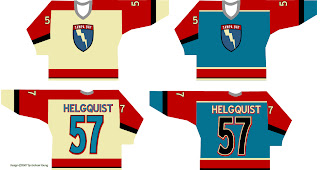
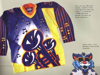
Friends, you won't believe the scariest thing about this beast. It's real. This sweater — if we can call it that without sullying the name of actual hockey sweaters everywhere — was actually produced for the St. Louis Blues. I'm not kidding. Surnames and numbers were stitched onto it. But with thanks to the holiest of gods, it was never actually worn during an NHL game.

Mike Keenan may have made some bad decisions in his life, but his refusal to allow his team to wear this monstrosity in 1996 is not among them. Can you imagine? Blues fans, you dodged a bullet and you will forever be in Keenan's debt. And do not ever forget that!

All right, now it's your turn. What do you guys think of these designs? Comment below.

I'll have more crazy designs all week. And as always, if you've seen any crazy designs or have some of your own, I'd love to see them. Email me at nhllogos@gmail.com.