NHL Tournament of Logos

Entries in jerseys (477)

Saturday
Sep082007

On A Western Swing

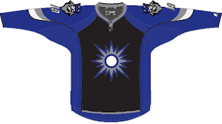
California is the running theme of today's concept art. We'll kick things off in the City of Angels. This first concept jersey for the Los Angeles Kings makes use of the original 1960s logo with silver replacing yellow.

Not terrible, but my personal favorite was the king face logo used on the mid-'90s third jersey. While the jersey sucked, I thought the logo was the strongest in the team's history. Once again, the gold is changed to silver producing a jersey that might look something like this.

I'm not a Kings fan, but I'd buy that jersey or one like it in a heartbeat. As a great alternate to a set like this, there's this design.

I like the silver in the beard of the king face logo on the shoulders. I think that would work better on the purple jersey above. Maybe it could be one of those logos where the colors change depending whether the jersey is light or dark — like the Flames and Canucks.

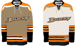
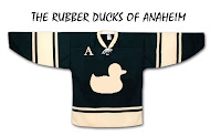
Moving along now to Anaheim, we have a Ducks jersey that isn't black.

Unfortunately, if it's gold, the logo (read wordmark) almost completely disappears. And I'm not sure it could be orange without looking like the Flyers. So black it is.

This concept might well turn out to be what the Ducks' new jerseys actually look like. I'd expect to see the team change the logo to the duck foot only, but that may just be wishful thinking.

My only other issue with this design is its lack of gold. That's an important part of this color combination and they should make good use of it.

And now we'll finish off this post with a trip up to San Jose. Got some interesting Sharks concepts to share.

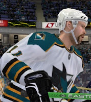
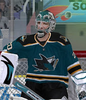
These next images are renderings from a video game — not NHL 08 — featuring a concept someone created for the Sharks. Very simple and classic. Shouldn't garner many complaints.

This cool jersey concept utilizes the shield logo unveiled by San Jose back in July. I really like that idea and it's not completely unheard of to use two different logos on NHL uniforms. Look at the new Wild sweaters.

The white one feels a little plain but not terrible.

Now Californians, let us all know how you feel about these concepts.

We've already seen the Kings' new uniforms, but we're still waiting on the Sharks and Ducks. Word out of San Jose is we should expect to see the new jerseys on September 17 while Anaheim has a preseason game on September 13. So at the latest, we'll see the new Ducks duds on Thursday if they don't unveil them sooner.

Friday
Sep072007

Just To Freak You Out... Some More!

Yes, you read that title right. Back by popular demand, I'm going to get your weekend off to a kicking start. I have the weird and crazy; a whole slew of new and wacky concept designs just meant to freak you out. So buckle in, it's going to be a long one.

I'm going to have a theme of red and black tonight. You'll see what I mean, but first I need to show you this.

From the brilliant creator of the Sabres and Canucks mish-mash logos comes this gem. True art in its rawest form. I dare anyone to attempt to improve upon that.

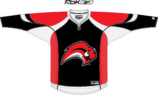
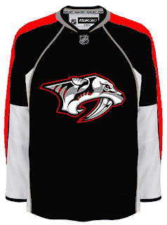
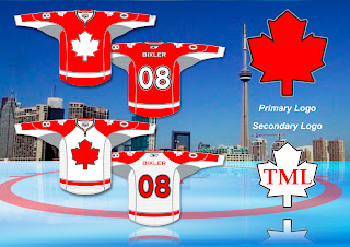
But since you can't, we'll move along. Do you like the color combination of red and black? Sure, if you're a Devils, Hurricanes, Senators or Coyotes fan. But what about Sabres, Predators and Canadiens fans? What about Leafs fans? Look on if you're brave enough.

It's a little blinding, isn't it? You might be surprised to discover that these designs all came from different people. Bad enough to have one disturbed mind out there Devil-ifying all these jerseys. There are at least four.

This Canadiens concept just scares me so I want to stop looking at it. The Sabres one just looks like a bloody slug (I knew that comment was coming so I wanted to head it off). And the Predators... well that doesn't look half bad if you ask me.

But imagine what kind of disturbed mind I must be to posting this stuff.

Wait. You need to catch your breath before you see this. Maple Leafs fans, ready your eyeballs for this one.

Wow, you're still here. I'm impressed.

All right, now I'm going to ease off a little bit. These designs are not so much horrifying as funny.

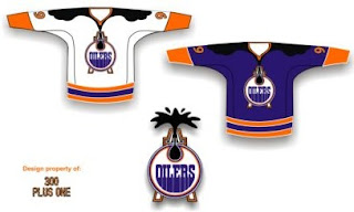
Dude, you spilled some oil on your— oh, wait... I see... yikes. Yeah. Oilers fans, I'm genuinely interested to know how you feel about this particular concept. I know it's been floating around a little, but it's just so... out there.

So what if the Rangers did this?

We probably ought not think about it.

Someone spent at least 30 seconds making this.

A missed opportunity, I say.

As a tribute (or not so much) to what I'm going to start calling the "VANCOUVER Incident," someone had some fun with other jerseys.

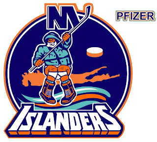
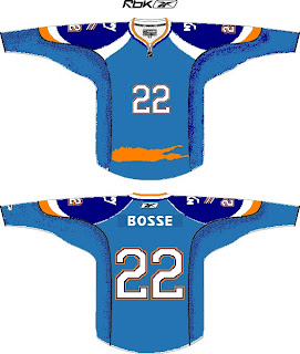
Similar work on the Sens, Isles and Jackets can be found in the Concepts Gallery. Now I'm going to wrap up where I began — Long Island. Imagine if Reebok decided the NHL should go the way of basketball.

Check out that outline of the island in place of a horizontal stripe. All is well.

Just remember, you guys asked for this. Let this be an object lesson in the notion of being careful what you wish for. Actually, if this keeps up, we'll make it into a weekly feature. So if you've made or found crazy crap like this, feel free to send it my way at nhllogos@gmail.com and who knows, you just might freak somebody out.

Friday
Sep072007

Pens' 250 Patch Is Only Right

Quick note for anyone interested in this aspect of the new Pittsburgh Penguins Rbk EDGE jerseys. I came across some definitive proof that the new "Pittsburgh 250" shoulder patch is only worn on the right shoulder.

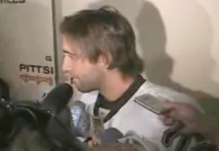
The Pittsburgh Post-Gazette has posted a video from the unveiling event on its Empty Netters blog. Frankly, I'm surprised we didn't see it sooner. Following the ceremony, the video shows players being interviewed by the press. The cameras are on the left side of the players, clearly showing that there is no patch on that shoulder.

I'm almost positive that this is of absolutely no consequence or interest to anyone aside from Pens fans, but so be it. Have another look.

So to anyone who was still wondering, you can now put the thought from your mind. Right shoulder only. Now get ready for next week when the whole rest of the NHL unveils their uniforms. We're going to see 26 different new jerseys in the span of about a week. It'll be busy times.

UPDATE (8:03 PM): By the way, I'm not sure I've ever actually stated the significance of the "Pittsburgh 250" patch. And a few of you have indicated you weren't sure of it. The patch commemorates the 250th anniversary of the city of Pittsburgh, which was founded November 25, 1758. This is odd because the 2007-08 season will be over by the time that anniversary actually comes around.

If you ask me — and nobody is — I think they should've waited until the 2008-09 season to wear the patch and get the league to schedule them a game on that night... perhaps against Philly? Any takers? In any case, that's what it's there for, for better or for worse.

It is bland though. Isn't it?

Friday
Sep072007

Shooting Stars... With Cell Phones

I was recently emailed a handful of cell phone photos (that we all just love so dearly) that alleged show Dallas Stars players on an ice rink during a video shoot wearing their new Rbk EDGE jerseys. I'm going to post those pictures and leave it up to you guys to make heads or tails of them. I will say this much: They bear a strong resemblance to the junior team jerseys we saw last week.


Here's some of what was told to me in the email.

... he and a friend snapped these at the star center in Frisco a few days back. They were apparently filming something about the new jerseys.

And if you can see in that blur- thats Krys Barch wearing Bill Guerin's old #13!

we cant seem to make out who the star in the dark uni is- but that short girl is Selena Rae.
And it appears to be Andy Moog out there too.

Just thought id pass this info on! Thanks!

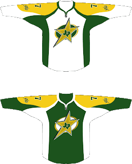
Something for Stars fans to gobble up. That's all I really have as far as news goes. However, remember the neat concept design I posted last week? (Last one on that post.)

The designer tweaked it a little and sent it to me again. And it only got better. Check it.

All but for the yellow, which needs to be more gold like in the current uniforms, you can count me as a fan for this idea.

Anyway, one week from today, the Dallas Stars will supposedly unveil their new uniforms. It's all speculation until then.

Friday
Sep072007

No Change Is Word From Avs, Devs

We have news today regarding the new jerseys for the Colorado Avalanche and New Jersey Devils — who you might have noticed are absent from the sidebar countdown (along with the Anaheim Ducks).

Let's start with the Colorado Avalanche news. You might notice that the Avs have been added to the sidebar countdown with a jersey unveiling date of Wednesday, September 12. This information comes from The Denver Post. Beat writer Adrian Dater said yesterday in a blog post not to expect any big alterations.

We're anticipating an adaptation of the old sweaters to the Rbk EDGE style and cut. Here's an excerpt from Dater's post.

September 6, 2007

NEW UNIFORMS COMING

The Avalanche will unveil new uniforms on Wednesday, in a press conference. The uniforms will not have a newly designed logo or colors, but are representative of the new prototypes sponsored by Reebok that will be worn by all NHL teams this season.

The new uniforms are made of a different material that is supposed to absorb sweat better, are tighter on the bodies of players and allow them faster skating speeds.

In addition, the New Jersey Devils will apparently not be holding any unveiling ceremony or event for their new Rbk EDGE jerseys. According to The Record writer Tom Gulitti's blog, the jerseys will first be seen publicly in their first preseason game on Monday, September 17 against the Philadelphia Flyers.
Gulitti quoted Devils GM Lou Lamoriello as saying that the jerseys will not change. Basically what we were expected from the Devils. Here's the post.

September 6, 2007

No new jersey unveiling

Unlike most of the rest of the teams in the NHL, the Devils will not hold a press conference to show off their new Rbk Edge jerseys before the opening of training camp. All teams in the league will switch to the lighter, form-fitting uniforms (which also includes new, lighter socks) and some teams have taken this opportunity to make some cosmetic alterations, too, but Devils general manager Lou Lamoriello said that his team's jerseys will look essentially the same.

"Our jersey will still be our jersey," he said.

Fans can get their first look at them when the Devils play their first preseason game on Sept. 17 in Trenton against Philadelphia.

So to sum up, the Avalanche and Devils will simply convert their old sweaters without really changing anything. We'll see the Avs' on Wednesday and the Devils' five days later.

So to the fans who have been asking, there's your news. (Ducks fans, along with you, I'm still waiting for something.)

Friday
Sep072007

Wild Unveil New Uniforms!

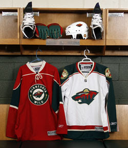
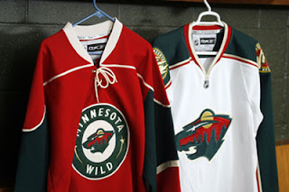
The Minnesota Wild have unveiled their new uniforms via their web site, today. Look at them here.

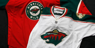
Same as we expected. No big changes. The old alternate is now the new home sweater. I also like the fact that they didn't use the circle logo on the road jersey. The bear head is awesome.

This is another shot of the jerseys hanging in the locker room.

You can see the detail of the jerseys a little better in this photo. Sorry they're so small, but the Wild have yet to post a photo gallery like most of the other teams have done. If I see better quality pictures elsewhere, I'll be sure to post them for you. In the meantime, any thoughts on these new sweaters?

Thursday
Sep062007

Hurricanes Unveil New Uniforms!

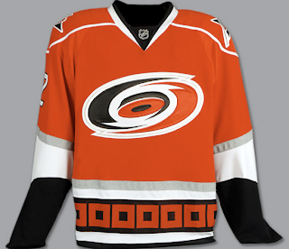
This afternoon, the Carolina Hurricanes officially unveiled their brand new Rbk EDGE uniforms! Photos follow!

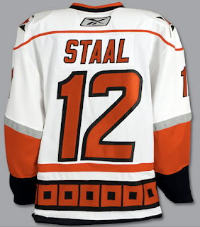
It's pretty much what we saw in the NHL 08 renderings from EA Sports — only in physical form. I like them. Not sure about the shoulder piping. Seems unncessary, but what do I know. I do like the hurricane flags around the bottom of the jersey. Glad they kept that element from the old uniforms. Check out the back!

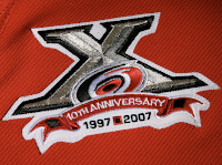
Also unveiled today was the club's 10th anniversary patch.

As you can see here, it will be worn on the front of the sweater on the right side — where a potential Stanley Cup Finals patch would go.

It's a very nice logo. One nitpick I have though is the flag between the 1997 and 2007 at the bottom. That's a tropical storm flag. A hurricane flag is two of those side-by-side. But that's only minor. You'll notice the banner that reads "10th Anniversary" has the flag on both ends.

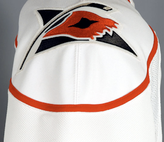
The 'Canes also kept their secondary shoulder logo which features a torn hurricane flag ripping in the wind.

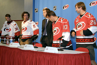
And here you can see Cam Ward, Justin Williams, Ray Whitney and Erik Cole modeling the new sweaters before the press today at the RBC Center.

As always, you can find these and as many more photos of the new jerseys as I can find in my official Rbk EDGE gallery.

Thursday
Sep062007

Kariya's New Blue Pants

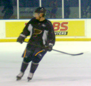
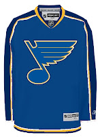
This isn't earth-shattering news, but a new photo has been floating around of Paul Kariya practicing in St. Louis Blues gear. Blues fans might be interested in checking out this photo.

While he's wearing the Blues' practice jersey, he's got on what appears to be the new pants. I don't know, make of it what you will. It's pretty blurry. My favorite thing about this photo is the giant "BS" on the boards behind him.

Anyhow, seeing as I'm here talking about the Blues anyway, I've got a concept design for you.

This is a recoloring of the Columbus Blue Jackets' new EDGE uniforms. For what it's worth, I highly doubt the new Blues jersey will look anything like this.

We saw one image last month that appears to be a photo of the jersey. But it doesn't have the ring of truth to me. You be the judge.

Either way, we'll find out at FanFest on Saturday, September 15 when the St. Louis Blues will unveil their new Rbk EDGE uniforms to the public. Looking forward to that.

Wednesday
Sep052007

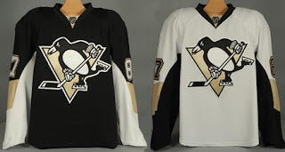
Penguins Unveil New Uniforms!

The Pittsburgh Penguins have officially unveiled their new Rbk EDGE uniforms tonight!

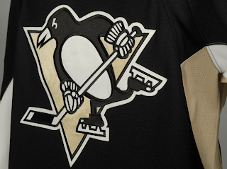
The first thing you'll notice is the shoulder patch featured the recolored '90s logo is absent. I think some Penguins fans find that to be an upgrade. Though the general consensus seems to be that the jerseys are an overall downgrade.

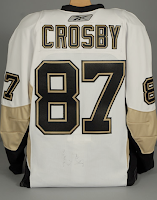
From the side and back views, you can see the striping along the sides that coincides with the leaked images we saw back in July. Even the giant numbers on the back match. And maybe it's just me but those numbers do seem awfully large. Not a complaint, just an observation.

Not a bad uniform set, overall, if you ask me. Plain but elegant. And no matter what, you can't please everybody. You'll always have your critics. But personally, I offer kudos to the Pens for not going overboard.

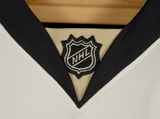
Before I take off, have a close-up look at the road jersey collar complete with the NHL logo.

And as always, you can find more photos of these new sweaters at my official Rbk EDGE gallery. Enjoy your night, Pens fans!

UPDATE (7:07 PM): A lot of you have been wondering what the new special shoulder logo looks like. This photo of Maxime Talbot modeling the new road jersey shows there's a patch there but doesn't offer a very good look.

When I come across a better photo, I'll post it right here.

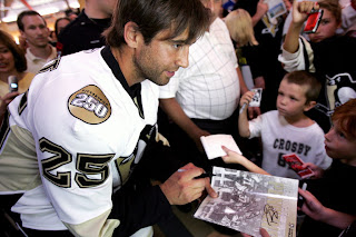
UPDATE (9/6 2:21 AM): Thanks to everybody who emailed in this photo while I was asleep last. For anyone who hasn't seen it yet, have a look for yourself.

Here you see Talbot signing an autograph with a shoulder patch that reads "Pittsburgh 250" — not a 40th anniversary logo. Though I'm not even sure I'd go so far as to call it a logo. That's not a dig, I'm just saying.

Anybody know if that patch is on both shoulders or just the right? Seems like every photographer there was confined to the left side of the room because all the angles I've seen only show the right shoulder clearly.

Wednesday
Sep052007

Preview The New Pens Threads

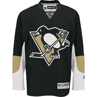
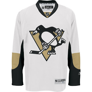
The Pittsburgh Penguins will unveil their new Rbk EDGE jerseys in just over an hour. But we have them early! Big thanks to a reader who found a couple of links via the NHL.com shop. Take a gander!


They're a little plain compared to the pictures we first saw — likely prototypes Reebok pitched to the team that were ultimately turned down. Overall, they're sharp and very clean looking. For those of you keeping track, they're dead ringers for the new Senators jerseys as far as basic design.

Thanks to Wayne for the links! More to come tonight!