NHL Tournament of Logos

Entries in jerseys (477)

Monday
Jul302007

New Sharks, Canadiens Jersey Design Concepts

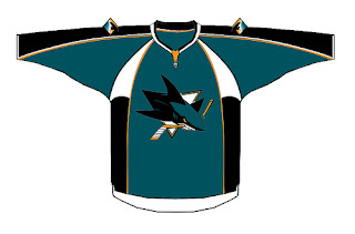
I was pointed the way of another fan-made jersey design concept for the San Jose Sharks. The designer doesn't seem to be a big fan of the orange being added to the color scheme as its used very sparingly here.


It's neat and I think it could probably work. Though I'd expect to see something rather different when the Sharks actually unveil their new jerseys in September.
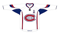
And while we're looking at fan-designed jersey concepts, I've got one for Montreal Canadiens fans. Like many others, it's based off of this year's all-star jerseys so the real deal probably won't look anything like this. The one thing I wouldn't be surprised to see is the giant logo on the front. That seems to be a theme among all the jerseys that have already been officially unveiled.

Anyway, I haven't heard anything official from the Canadiens regarding an announcement or unveiling date, so we'll keep our ears and eyes peeled until we do.

Monday
Jul302007

Yes, More Canucks Stuff

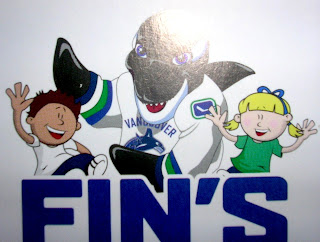
I saw this graphic on the Canucks Central message board. Aren't you guys impressed I remembered? I even snatched a link just to prove it. It's apparently artwork on some new kid-oriented promotional material from the Vancouver Canucks. It's called "Fin's Friends" as I understand it.

You see Canucks mascot Fin wearing a rather unique jersey. I can't speak to its veracity, but so far I haven't determined a real reason to doubt it. It has a lot of what we've heard including: dropping the maroon from the logo, the word "VANCOUVER" appearing over the crest on the road white sweaters, and the return to vintage colors blue and green.

Also, on the shoulder of Fin's jersey is this logo. It's kind of an edgier version of the vintage stick-in-rink logo. I think it works.

So... Canucks fans? What do you think of all this? You think this could be the real deal for your uniforms come the fall? Or is it just more annoying speculation?

Though the Canucks have made nothing publicly official, we've been hearing that a new logo/jersey unveiling is set for Wednesday. Whether or not it will actually happen remains to be seen.

Sunday
Jul292007

New Blackhawks Jersey Design Concept

We haven't been hearing much about the Chicago Blackhawks lately, but I came across this design on the 'Hawks official message board. Have a look.

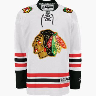
Now, have a real good look. I mean get out your fine-tooth comb and really go over that puppy because I have my doubts as to the veracity of this image. It sure does look like a Blackhawks Rbk EDGE jersey, but the first thing that caught my eye was that familiar horizontal striping pattern on the sleeves and bottom of the sweater. Remember this?

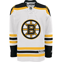
Now compare it to the Bruins jersey to the left. Dead on. So I'm sorry if I got anybody's hopes up. It is just a very good Photshop job based on the B's road Reebok sweaters. Wondering what tipped me off? The stripes on the Blackhawks' white jerseys go black-red-black whereas the ones in this image go red-black-red.

Anyway, I'm continually impressed by the work people put into these jersey designs. You gotta think I'm pretty interested in the subject on account of writing this blog but I'm not sure I'd really go to the extent of coming up with my own design concept. Kudos to the folks that do, though. They give me something to write about.

The Blackhawks have yet to give word of plans for any sort of formal or official announcement, so until we hear something, it's a cool idea to muse on. Any Chicago fans reading? What do you think?

Sunday
Jul292007

New Stars Uniforms Coming September 14

According to an administrator on the Dallas Stars' official message board, we can expect to see their new Rbk EDGE jerseys on September 14. So I've added that date to the countdowns in the sidebar. Thanks to Josh for the tip!
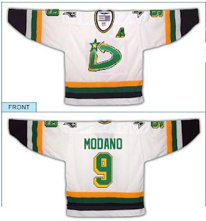
While we're on the subject though, I ran across a fan design on that same message board that I thought was kind of funny.

It's a play on the Minnesota North Stars logo with a "D" for, you guessed it, Dallas. For those of you who don't know your hockey history, the Dallas Stars moved from Minnesota in 1993.

Anyway, thought it was a funny design and felt like sharing it along with the news of the unveiling date.

Sunday
Jul292007

Some Flames, Flyers Jersey Design Concepts

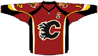
One fan designed this Calgary Flames concept based off of the infamous all-star jerseys. It has the horse shoulder logo though we've heard that's no more, but I thought we'd all might like to have a look anyway.

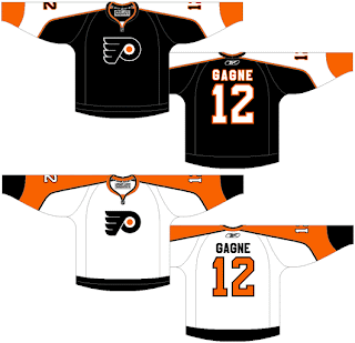
If not, I've still got more. We got a little sneak peek of the new Philadelphia Flyers Rbk EDGE jersey last week and a few fans have taken it upon themselves to make designs based on that.

So here's one.

I think it's more wishful thinking than anything from a fan who doesn't want to see the jerseys change very much if at all.

One other thing I've noticed. If the jerseys that have already been unveiled are any indication, the crests are growing on all these new jerseys. So expect to see a much bigger Flyers logo on the front of that bad boy when it finally gets unveiled.

And for what it's worth, I like the logos on the chest being bigger. Let's make sure we can all see it from the nosebleed seats.

Sunday
Jul292007

Islanders New Uniform Update

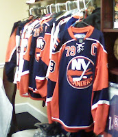
Remember those frightening mock-ups we first saw a while back for the New York Islanders? The image on the left should jog your memory. It's scary.

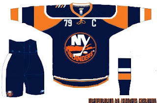
Then somebody put that into a jersey template which turned out like this. And it didn't leave any of us feeling any better about it.

Well anyway, I was surfing around yesterday and came across something that appears to substantiate that blurry photo. But again, we don't know anything for sure as the Isles have yet to make any sort of official announcement.

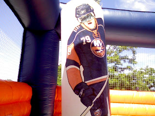
It looks to me like one of those moon bounce things kids play on at church carnivals and the like. Inside it is a painting of a giant New York Islanders player (#79, Yashin?) wearing a jersey with a new style — one that looks an awful lot like the jerseys in that photo.

So take that photo for what it's worth. The person who posted it said he saw it at Stony Brook University. For more on that, go here.

By the way, I found another template designed based on that infamous photo above over at Islanders Castaway.

That's all I've got for the Isles today. Thoughts, comments?

Saturday
Jul282007

Panthers Unveil New Uniforms!

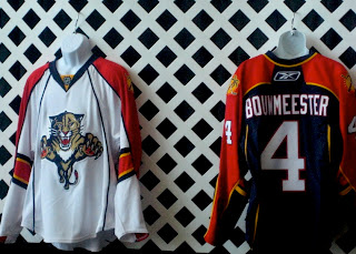
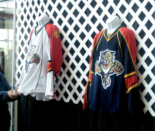
It's finally here everybody! The Florida Panthers unveiled their new Rbk EDGE jerseys tonight at the Year of the Rat Alumni Game. A generous reader pointed this image out to me so I'm posting it to share with everybody.

My initial reaction is very positive. These are sharp-looking uniforms with a great color scheme. I think I almost like the red sleeves better than a red sweater for the home duds, by the way.

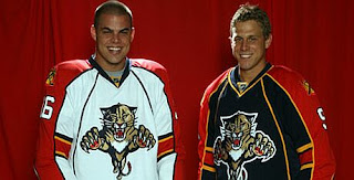
These two images give us different views of the uniforms. The one to the left is a little out of focus (hey, better than nothing, right?) but you can get an idea of how they look on the players at least. Like I said, I like them. I think if anything they're an improvement on what they were wearing.

I'm still dying to see what the Lightning will be wearing this fall.

Big thanks to jrzman for pointing us to the original photos! You can find links to the original message board posts below in the comments if you're interested. When the team or the press make official photos available, I'll have them here as well to perhaps offer an even better look. What are your feelings?

UPDATE (11:49 PM): Nothing major, just got home from work and saw the Florida Panthers had a photo up on their web site of Nathan Horton and Stephen Weiss in the new Rbk EDGE jerseys.

They really do look good and that panther on the front is bigger than I've ever seen it. Now we know what dynamic meant.

Saturday
Jul282007

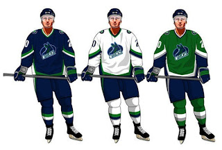
New Sharks Jersey Design Concept

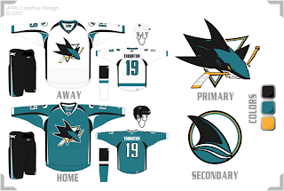
With San Jose Sharks having just recently unveiled a brand new logo, we've got another fan-made concept design for the uniforms. First off, I'm going to take a wild guess and say this artwork was generated prior to the official unveiling of the new series of logos since it makes no use of the actual new secondary logo but rather a recolored version of the old shoulder patch. For your viewing pleasure.

I think the overall jersey design is pretty cool. I'm curious as to how it would look on a player. The only thing I'm not wild about is the lack of orange in the design. If used right, I think it could be a great and welcome addition to the Sharks' new look.

Saturday
Jul282007

Fans Design Canucks Concept Logos

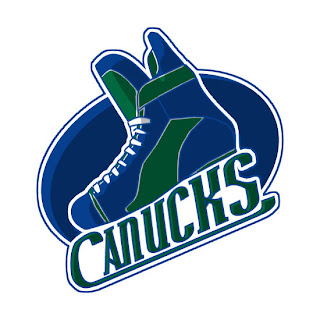
I came across this fan-made design on a Vancouver Canucks message board. The artist put a new spin on the flying skate logo and combined it with the traditional blue and green color scheme. What do you think?

That's a skate all right. If you're curious to see what it would look like on a uniform, the designer took the liberty of putting it on the jersey template designed by John Slabyk to go with his logo redesign (which, frankly, I like a lot better).

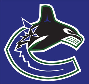
Incidentally, with all this about the colors being altered for the Canucks logo in the coming season, another fan toyed with the idea of bringing in the green to go along with the blue. He also trades out silver for black. Have a look.

Anyway, that's all I've got for the Canucks today. Comment below if the spirit compels you. (By the way, I apologize for the late posts today. Got a late start due to prior commitments.)

Friday
Jul272007

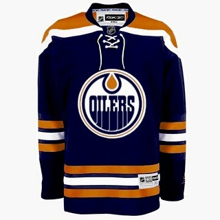
New Oilers Jersey Design Concept

Thanks to another reader who came across this image of a dark jersey for the Edmonton Oilers. At first, it seems to be the real deal, but as with all jerseys yet to be publicly unveiled, you have to look at the ones that have been unveiled to compare. Take a look.

As far as changes, this one is rather different from what the Oilers have been wearing. It dumps the bronze and red altogether for a return to straight-up orange and blue like in the old days. The one thing I did hear prior to this post is that they'd be doing away with the oil man shoulder patch logo and this design does take that into account.

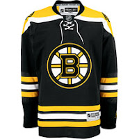
However, now that you've had a minute to look at that design, compare it to the Bruins jersey here to the left — a jersey which has already been unveiled to the public. See any similarities? How about the fact that the entire layout is verbatim, the stripes and everything — the only alterations being the colors and logo. But the designer did one thing cleverly to try and throw us off the path. The strings hanging from the collar have been slightly modified. Compare the strings hanging on the right side.

Anyway, take this image for what it's worth, but it seems clear to me that this is the work of one of our friendly Photoshop artists.

For the record, the Oilers have yet to make an official announcement regarding uniforms. I'll let you know if I hear anything. In the meantime, what do we think of all this?