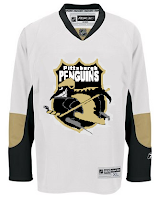
I really feel bad for having gone so long without a concept art post. It's not as if I didn't have anything on deck, either. A friend of mine would say if I really felt bad, I'd stop doing it. I just wish I had more time to dedicate to the blog the way I did over the summer when most of you started visiting.
But it's a tough job, finding the time to add new content daily and I just want you guys to know I'm giving it my best. I'm lucky to get polls up every day so I just wanted to say I appreciate your understanding. And eventually I know I skipped the Freak Out Friday last week (we should have one this week) and I will update the bracket as soon as I have a chance. (By the way, keep the emails coming. It's the only way I know whether anyone is still interested in the site.)
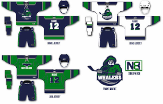
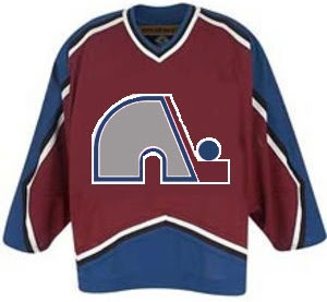
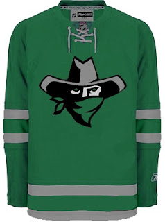
Anyway, I have some fan made logo and jersey designs to share from my inbox. Allow me to take you on a trip to California in what will be one of the longest concept posts in a very long time.


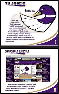
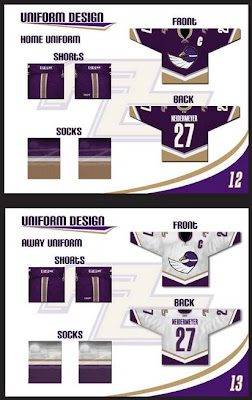
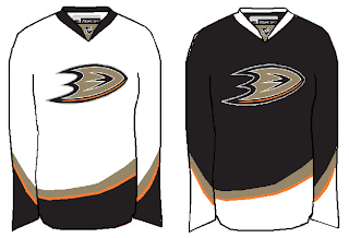
I wanted to start with something really well-designed. As part of what I understand to be a school project, this designer painstakingly created an entire identity for the Anaheim Ducks — whose current logo was, to my surprise, eliminated from competition in the first round of the Quest for the Worst.
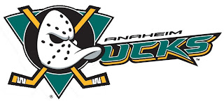
At least tell me you guys would vote this one down.

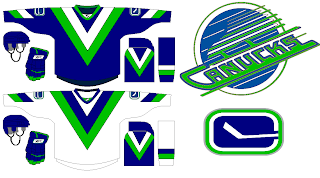
But while I mock the current logo, it does have its redeeming qualities. For instance, a simple improvement would simple call for a dropping of the "UCKS." As such.

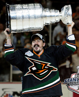
My favorite logo still has to be this one, though.

One of a kind, I tell you. Obviously, they would've looked so much better raising the Cup in that sweater.
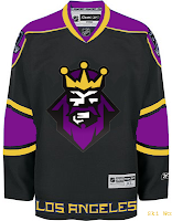
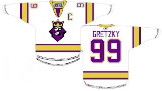
Now let's head to L.A. where we've got a couple of options. The first one keeps the colors while simplifying the uniforms.
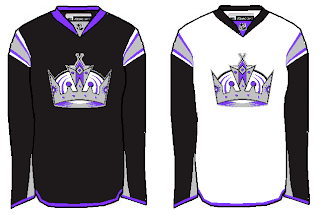
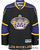
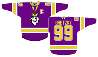
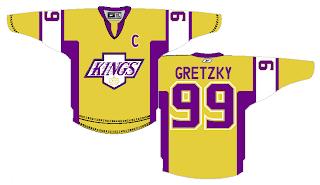
The second suggests switching the silver to gold and toying with past logo designs.


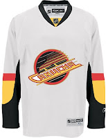
I know you guys tend to mock it, but I love that king logo. I love everything about that logo! Especially it's subtle asymmetry. But for what it's worth I hated the jerseys it was worn on. Yes, they were different and interesting, but at some point you have to realize you've got a gray gradient wrapped around your jersey. And then it just get weird.
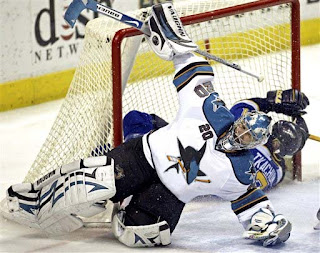
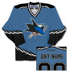
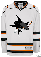
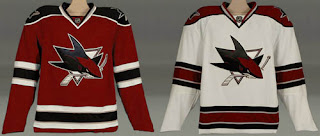
Speaking of weird, I could never understand why the San Jose Sharks unveiled a "full shark" logo and consigned it to the shoulders. My feeling is you put it front and center.

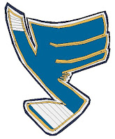
Then you take the new fin logo and put that on the shoulders, which this artists did not do. And staying on the weird tack, check out this blue jersey.

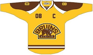
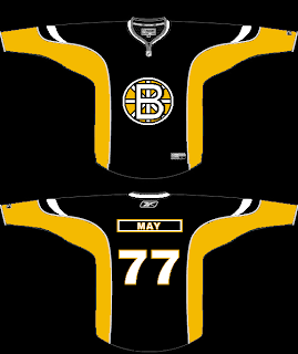
Yeah, it didn't work for the Bruins. It certainly doesn't work for the Sharks. Consider the effort applauded, but really, no.
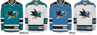
However, this brings up a good point. In the digital age, the hue is often mistranslated and sometimes the Sharks look like they're we're a greenish teal and sometimes they don't. What about a complete switch to blue?

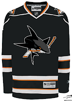
Now for a little something out of left field. A lot of folks bemoaned the introduction of orange but few have even considered letting go of the teal. Until now.


Notice too how the diamond-shaped fin logo appears on the shoulders of these sweaters. I like it but it's very lackluster in the color department. Maybe some teal accents or something to go along with that orange. I don't know.
Anyway, I thought we had a nice Californian crop of artwork tonight. As always, I welcome your thoughts below in the comments.
 Thursday · Feb 7 · 2008 | 4:27 PM PST
  5 Comments




.jpg)
