Speaking Of The Sabres...
 Tuesday · May 13 · 2008 | 2:47 PM PDT
  18 Comments
 First thing: don't forget to vote to help Matt choose the color scheme for the Sabres rebranding. Second: I have Buffalo concept art to go along!
I know you guys have been eagerly awaiting the new batch of concept art and I apologize for the delay. I've been focusing my attention on the launch of Icethetics. I'm anticipating having it ready at some point in the next few weeks. At some point I should probably explain how that's going to work but that's not what this post is about.
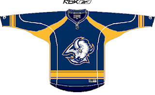
We've got a very nicely designed blue sweater there with the old "goathead" logo on the chest. Nice color/logo mix there but probably not something we're apt to see at any point the future.
We've also got a nice shield which accents the "sabres" part of the design a little better.
And this would be a great throwback concept if Buffalo didn't already have the perfect vintage jerseys with the 1970s look.
Then, going totally off the beaten path is one of the coolest looking jersey concepts I've seen in a long time.
I know it's out there and it's contrast makes it difficult to place as a home or road sweater, but I love this idea. It's done so well. The design is based off of a logo created by John Slabyk.
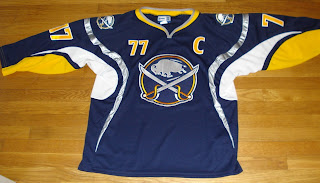
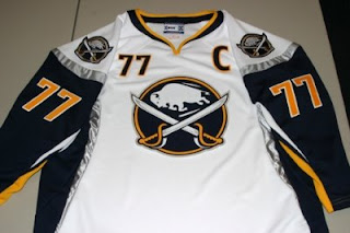
All of these make for great artwork but will likely never see the light of day. However, that hasn't stopped a few fans from making their dreams come true. Recently, if you did an ebay search, you might have come across this gem.
You could even find it in white.
I'm not sure that what you see here is available anymore or even legal under copyright laws. But it's a beautiful design and I'd be willing to bet there are countless Sabres fans who would die for that logo to don that jersey on NHL ice.
So I hope you guys enjoyed the return of the concept art. I plan to have more up this week. You guys have been submitting some really great work! And stay tuned for a Freak Out Friday at the end of the week!





 Got an email from a reader this afternoon regarding a new third jersey for the Los Angeles Kings. Blogger Rich Hammond has word that the new sweater will be introduced in November incorporating "several looks from the past." Apparently all season ticket holders will receive one. You can read more at
