NHL Tournament of Logos

Entries in news (596)

Monday
Apr072008

Pre-Playoff Concept Art

The Stanley Cup playoffs kick off on Wednesday night. Tomorrow I figure I'll post my predictions and so forth for anyone who might be interested. In the meantime, I've got concept art for you tonight. Not a lot but just a few things I thought were especially interesting.

First, a big set of third jerseys. Pretty much every team with rumors floating about. And then a special treat.

I told you it was a lot.

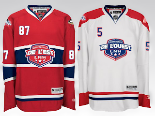
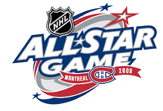
Then, with the recent surfacing of the 2009 All-Star Game logo, one reader came up with a concept for a Habs-based jersey design.

In French, no less.

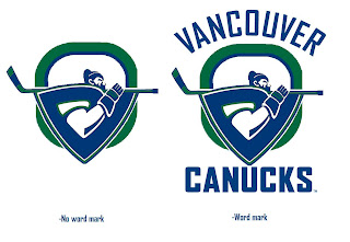
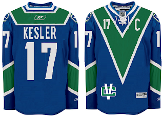
And finally, a Canucks concept I thought was interesting given the current logo tournament going on at ToHL.

Obviously a take on the WHL's Giants.

Enjoy your night and let's get set for some playoff hockey! My favorite time of year!

Saturday
Apr052008

2009 All-Star Logo Surfaces

Quick note tonight. An NHLToL reader ran across the 2009 NHL All-Star Game logo while browsing NHL.com today. Figured I'd share it with you guys. The game will take place in Montreal to celebrate the Canadiens' 100th anniversary.

I'm a fan. It seems a little odd to have the actual Habs logo in the design, though. Usually, the host team's logo is in the all-star logo but altered in some manner. Guess nobody wanted to alter the CH. Makes sense to me.

What are your thoughts on it?

Tuesday
Apr012008

Happy April Fools' Day!

It's safe now. So just to clarify, you guys got it right. Yesterday's post about the Rbk EDGE uniforms going away was obviously too good to be true. My version of an April Fools' joke. Hope I didn't get anybody's hopes up. Come on, Project Runway? Really?

But I've always been a fan of the jokes and, well, I couldn't resist this one. I'm weak. Hope you guys won't think less of me. But I did try to make it obvious that I was kidding while at the same time trying to still keep it just this side of believable.

I did mean what I said at the end. I appreciate you guys for continuing to come back to visit the site. You're the reason I write here at all. Thanks!

Monday
Mar312008

Rbk EDGE Being Dumped!

As you know, I hate to post rumor and gossip. I prefer actual facts to back up my information so naturally I was unsure about posting this at all. But since I started this blog, I've made contacts with a lot of great people inside the NHL and Reebok. (Honestly, how do you think I was able to get much of the information I did over the summer?)

I was asked not to write about this, but I can't do that to you guys. As NHL fans, you have the right to know. I've been told the league will be dropping the Rbk EDGE uniforms entirely next season and is cutting all ties with Reebok. Naturally, this news comes as quite a shock considering all the time and money that was put into the project in the first place. My Reebok rep called it a "failed experiment" and said the split with the NHL was "best for both parties."

What might be most surprising is the league is discussing redesigning all 30 uniforms once again! (Like once wasn't enough.) A new deal is still being worked out, but right now it appears league commissioner Gary Bettman would consider having the folks at Bravo TV series Project Runway design the new sweaters in one of next season's new episodes. Manufacturing would then be handled by Nike, believe it or not.

My source (who I unfortunately can't name due to legal issues) inside the league says Bettman is "delighted" at the prospect of getting the league this sort of national television recognition. I'm tempted to take him at his word as that sounds just like Bettman to me. Not surprisingly, this is going to make the NHL look like a complete joke on the national stage.

Personally, I really think they should have just stuck it out for at least one more season. Sure, the Rbk EDGE system had its issues, but so do most new things. On the other hand, the prospect of new uniform designs is kind of exciting. But we just went through it last year. This is just overkill and rather annoying.

Finally, I just wanted to take the time to thank you guys for continuing to visit the blog. Without you, I certainly wouldn't be where I am. News regarding these uniform changes will supposedly start trickling out as the playoffs wind down. Looks like we'll be doing the uniform re-design watch for yet another summer.

I'll post more information on this as I get it.

UPDATE (4/2 2:12 AM): Happy April Fools' Day! I love you guys!

Sunday
Mar302008

Fan Art To Finish Your Weekend

I think I promised you guys a concept post before the weekend was out, so here it is. I've assembled some of my favorite designs from my stash. There's a lot of quality work, so let's dive in.

First, an interesting new look for the Toronto Maple Leafs.
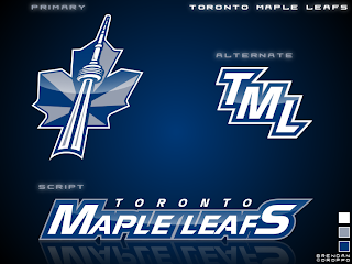
I'd like to see the jerseys that go with it. If nothing else, the production value is through the roof on this one.

But if you want to talk excellent concept logos, look no further than this one for the Washington Capitals.
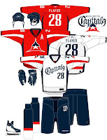
I admit I had to stare at it a while, but there it is, a "W" and a "C." And I don't know why it took us so long to realize that if you put those two letters together the right way, it forms a star! However, I'm not sold on the wordmark. I get the whole Declaration of Independence thing (been watching John Adams today), but for a sports team it's not a good idea.

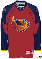
I like that Thrashers jersey as well. With much thanks to Jacob at We're Revolting! for that one.

You guys always give me trouble for my aversion to yellow jerseys, but I've come across a bunch that I actually like — despite their resemblance to what I can only assume is Hillary Clinton's favorite suit.
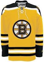
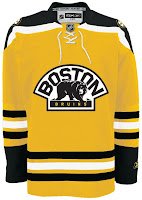
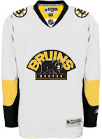
Well, it's the Boston Bruins of course. Can any other team really do a yellow sweater?
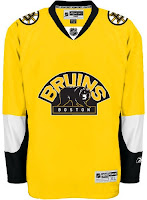
This second set wouldn't work because yellow is still a light color. It wouldn't work as a dark home jersey. However, I am intrigued by the use of the secondary logo with a black background and yellow text.

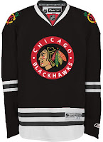
Up next are the Chicago Blackhawks.
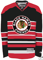
All those stripes do weird things to my brain. And there's not enough contrast in the other one. But I don't know, either could work as a temporary third jersey.

Finally, it's the Buffalo Sabres.
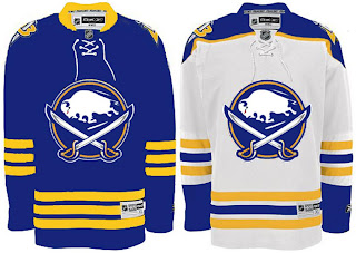
It's a nice logo on a traditional uniform design. I think you'd be hard-pressed to find nay-sayers.

That's good for now. Stay tuned for new polls going up tomorrow both here and at ToHL. Here, we'll have Cam Ward and Josh Harding going head to head and for the WHL Tournament of Logos, it'll be the Calgary Hitmen and the winner of the Americans/Thunderbirds poll which closes tonight.

Friday
Mar282008

Just To Freak You Out XXXII

Can you believe this is already the 32nd installment of the Freak Out series? Who knew it would go this long? What's interesting about this week's post is what comes at the end and the fact that it's real and not concocted in the freakish mind of one of the many readers of NHLToL. No, it's quite real and that's what freaks me out the most.

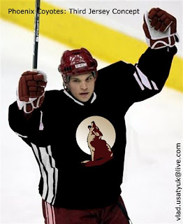
But first, let's talk third jerseys. We know they're making their big comeback next season after having taken a year off. We'll begin in Vancouver.

But wait, there's more!

And I'm sure this was just a case of colors lost in translation.

Doesn't make me feel any better. I'm all right with the purple on the Kings' uniforms because it's partnered with black and silver.

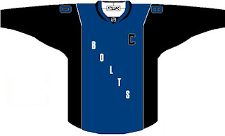
Here's a Lightning jersey even I wouldn't consider buying.

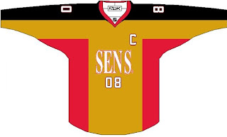
And a Sens sweater absolutely no one would.

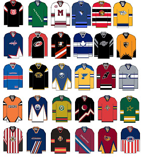
But hold on, why one team at a time? Let's go for all 30 all at once.

A good try to be sure, but I'm afraid a few too many of these missed the mark in terms of what one might consider, you know, aesthetically pleasing. (What the hell kind of sentence was that?)

It's worse when you make it look real by painting it onto a player.

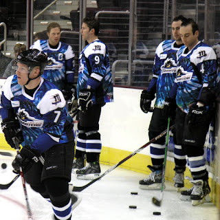
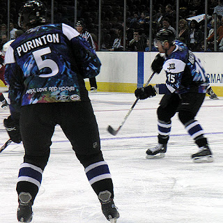
And now for the little thing I was teasing at the beginning of this post. I know it's not NHL, but I'm making an exception. The AHL's Lake Erie Monsters, this season, actually wore jerseys that... I'm sorry, there's no other way of putting this. They were tie-dyed. Behold the horror.

Because one photo wasn't enough...

Peace. Love. And hockey.

And now I'm just going to go put forks in my eyes. Until tomorrow, friends.

Thursday
Mar272008

Third Jersey Ideas

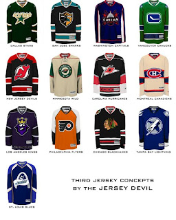
I haven't written a concept art post since the weekend so I think we're due. But it's going to be a short one. One reader came up with 13 different jersey designs he'd like to see implemented for various teams at some point in the future.

I told you it'd be short, but we've got 13 different teams covered. Hope you enjoy it.

We've got a Freak Out Friday post coming tomorrow and hopefully some more concepts for the weekend. I've been keeping pretty busy with the Goalie Mask Tournament. Voter turnout is great so far. Keep 'em coming!

Wednesday
Mar262008

New Rebrand On The Way

Thought I'd let you guys know our friend Matt is hard at work on his next rebrand. His series has impressed a lot of people and shown us in a dramatic way what many teams are missing in terms of good logo and uniform design.

Back to the point, though. His next team is... (drum roll)... the Tampa Bay Lightning. Yes, my team! Expect to see the design posted here some time in the next few weeks. In the meantime, feel free to check out his previous work.

Sunday
Mar232008

Mask Madness Match-ups

Yes, I'll refer to it as Mask Madness every once and a while just for you guys. But here we go with the preliminary- and first-round match-ups for the 2008 NHL Tournament of Goalie Masks. I'm having a little bit of difficulty building the actual bracket. So until I figure something out, you'll have to deal with it in text format.

First, there will be the Preliminary Round, made up of 4 polls. They will start Monday and be as follows:
1 | TURCO (black) vs TURCO (white)
Here you'll choose between Marty Turco's home and road masks.
2 | RAMO (a) vs RAMO (b)
Here you'll decide on which of Karri Ramo's two masks goes into the full tournament.
3 | DENIS vs CLEMMENSEN
4 | HOWARD vs RASK

Then comes Round One. There are 32 polls comprising that group, divided into two sides. The first list is the group on the left side of the bracket.

1 | MILLER vs HALAK
2 | ROLOSON vs ERSBERG
3 | BRYZGALOV vs TELLQVIST
4 | KOLZIG vs GRAHAME
5 | BRODEUR vs THIBAULT
6 | HUET vs NORRENA
7 | CONKLIN vs HEDBERG
8 | EMERY vs RAMO
9 | TOSKALA vs ELLIS
10 | KIPRUSOFF vs HASEK
11 | LUONGO vs CLOUTIER
12 | JOSEPH vs VALIQUETTE
13 | FLEURY vs ANDERSON
14 | NIITTYMAKI vs HOLMQVIST
15 | LECLAIRE vs MASON
16 | THEODORE vs DENIS/CLEMMENSEN

And on the right side of the bracket is this group:

1 | BACKSTROM vs RAYCROFT
2 | WARD vs HARDING
3 | TURCO vs OSGOOD
4 | KHABIBULIN vs DUBIELEWICZ
5 | VOKOUN vs SANFORD
6 | GARON vs GERBER
7 | LALIME vs TOIVONEN
8 | GIGUERE vs AULD
9 | LEGACE vs WEEKES
10 | DiPIETRO vs HILLER
11 | LUNDQVIST vs BUDAJ
12 | BIRON vs SMITH
13 | THOMAS vs LaBARBERA
14 | PRICE vs SABOURIN
15 | NABOKOV vs BOUCHER
16 | LEHTONEN vs HOWARD/RASK

Remember, totally random!

When I get the bracket completed, I'll post it. In the meantime, get ready to start casting your votes! And do me a favor, start spreading the word around. Let's get as many people involved in this tournament as possible!

Sunday
Mar232008

Another Goalie Masks Update

All right, I've been listening to you guys and I have some quick changes to make before announcing the match-ups for the NHL Tournament of Goalie Masks.

I'm updating the graphics for Grahame and Budaj who both have new masks which I didn't know about until today. So much for doing my research. Same goes for Cloutier who's returned to the Osgood-esque helmet. All of those updates will be made at some point this morning.

I'm keeping Holmqvist's mask the way it is because, first, he has yet to play a full game for the Stars and so has no mask painted for that team. Second, he carried the Lightning goaltending most of the season and that shouldn't go unnoticed. He played all year, so to drop him out now just because he got traded at the 11th hour isn't right, if you ask me.

I'm adding Ersberg today as well. He'll be replacing Fernandez, who hasn't played a game since October. I like Manny Fernadez and I hate to drop him, but somebody had to go. I'm not getting rid of Osgood and Cloutier just because their helmets are plain. That'll be for the voters to decide.

Otherwise I think that's everybody. So if you've noticed anything else that needs adjustment, speak now or hold your peace.

Page 1 ... 5 6 7 8 9 ... 60 Next 10 Entries »