NHL Tournament of Logos

Entries in news (596)

Friday
May302008

Just To Freak You Out XXXVI

Time this evening for a Freak Out post. I know you've been waiting eagerly for two long weeks. We'll kick things off in New York. What do you say we mix all three NY clubs? And then do it all over again?

The things people come up with. Now if we head west you might find the odd Mighty Ducks jersey with interesting striping.

But staying out west things only get stranger.

I don't think I even need to say anything about that. It's just weird.

Got a couple of crazy logos to share as well. It's Phoenix — in its mythical sense, I suppose.

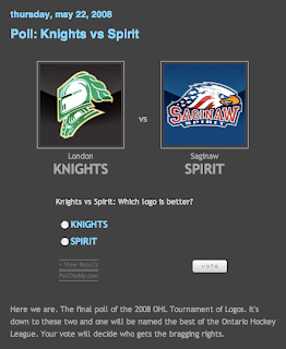
To finish off tonight's Freak Out Friday, we'll dive into the Stanley Cup series and look at the only two clubs still playing hockey this season.

Folks often try to "update" the Red Wings logo yet it never seems to take.

I can't imagine why. And I'm all about the powder blue Penguins jerseys allegedly making a return in the fall...

...but make up your mind at least. It's gold or it's blue. It obviously can't be both.

Join me again in two weeks for another edition and keep sending in your freaky artwork and I'll keep posting.

Thursday
May292008

Popularity Experiment

The word "popularity" has been getting tossed around in the comments a lot lately. Every poll I post is an opinion poll. I want a consensus of opinions on various topics like logos and goalie masks. So the idea that folks are saying you should vote based on aesthetics or any other specific element is, well, wrong in my mind.

In every poll I ask "which is better?" If there were set guidelines to make this determination by, a poll would be irrelevant. We'd simply gather data per the guidelines and come to a logical conclusion. But this is art, for lack of a better term. There is no good and bad, there's only the opinion of the person looking at it. The line about beauty being in the eye of the beholder comes to mind.

That being said, I want to try out an experiment. I want to do a series of "popularity contests" to prove a point as the Tournament of Goalie Masks winds down. I'm starting with the obvious question for a hockey blog. What's your favorite team?

About halfway down the sidebar is a ginormous poll with 30 possible responses. You're to simply select your favorite team and cast your vote. That's it. I'm curious to see who has more fans visiting the blog. So go VOTE NOW!

Wednesday
May282008

GFB Exclusive: Unused Lightning Marks

Earlier this month, I posted Matt's new Tampa Bay Lightning logos as part of his Rebranding The NHL series. They were met with much admiration. But there is a logo you haven't seen yet.

It was left out of the final design but as part of my partnership with Matt (aka GhettoFarmBoy), he's made some of his unused work available for your viewing pleasure.

I'm not sure what to make of it myself, so I'm looking forward to your comments. Post them below!

Don't forget, there's a Freak Out Friday coming at the end of the week. Get your wacky artwork in by tomorrow night if you want it included! Email me at nhllogos@gmail.com.

Sunday
May252008

Albertan Art

No new poll today (first time in weeks, I know). Instead I've got concept art all for our favorite two clubs from Alberta. We'll start in Calgary and work our way north.

It's a flaming horse. I was a fan of the original black third jersey, but I'm not so sure on this one. Especially on a black sweater. But speaking of black sweaters, one might make for a nice, if not predictable third jersey.

This one's even got the provincial and national flags on the shoulders. But if your tastes are more suited to the traditional striping patterns, well we've got that as well — in red and white.

Next we head to Edmonton for a nice pair of jerseys.

The secondary on the shoulders of the white one is cool. But both of them work really well and have stripes that are actually stripes.

In this next set, we reintroduce the rigger in an updated version of the original logo as well as revisiting the old third jersey.

Believe when I tell you it could be worse. And if you don't, here's proof.

That thing should definitely always be silver. Never orange. Ever.

The next poll in the Goalie Mask tourney is coming up tomorrow. It's Luongo against the winner of the Fleury-Theodore match-up. At the moment, Fleury is ahead. Enjoy what's left of your long weekend — for those of you not in Canada.

Thursday
May222008

OHL Logo Tourney In Final Round

Not sure if you guys have been keeping an eye on the OHL Tournament of Logos over at ToHL the past few weeks. We're down to the final two. It's between the London Knights and Saginaw Spirit for the title.

GO VOTE!

We're also into the final 16 of the NHL Tournament of Goalie Masks here at NHLToL (soon to become Icethetics). So keep on voting.

Wednesday
May212008

Sharks May Get Black Third Jersey

The San Jose Sharks held their "State of the Sharks" event on Tuesday night. It's essentially an informational session for fans. Sharks President and Chief Executive Officer Greg Jamison addressed the question of a third jersey for next season.

There is a good chance it will be black. It is still being decided on. I can tell you we get input from the fans, staff and the players. The players were very involved in the jerseys for this year. I think the third jersey will be very neat.

That's the same as the rumors that have been going around, so no big surprise. You can see the rest of the story right here.

Thanks to Ben in Sacramento for the tip.

Tuesday
May202008

Back To The Canucks

It occurs to me I haven't posted any Vancouver Canucks concept art lately. Figured I ought to rectify that.

This design or a version of it has been floating around for a while as a dream third jersey for the Canucks. Unfortunately, the rumors have the stick-in-rink logo on the chest of the new alternate. On that same tack, how about another green one?

It's hard to deny they would look good in green. Or somebody would. Between the Stars and Wild, it's almost like someone in the NHL is deathly afraid of the color.

But if neither that nor the stick-in-rink is your cup of tea, how about stick-in-pond? A perfectly circular pond, that is.

There are even some folks partial to the good ol' whale — with the new colors.

Or you could just go way back and mess with everything.

I think we can safely count that one out as a potential third sweater contender.

More to come this week. And by the way, the images above, as with all images posted here, are the work of readers like you. To have your work posted on the blog for all to see, email it to me at nhllogos@gmail.com.

Saturday
May172008

4 Million!

As I've mentioned, last week was NHLToL's first birthday. Just wanted to let you guys know that in this past year, we've exceeded 4 million hits. That's astronomical in my book considering I never meant for this blog to do anything.

So I thought I'd take the opportunity to thank you guys for visiting each day. I'll do my best to continue doing whatever it is I've done to keep you coming back. Thanks again. Looking forward to 5 million now!

Friday
May162008

Just To Freak You Out XXXV

I know you've all been waiting for two whole weeks, but I'm all set just to freak you out now. And some of these should really get the job done.

We'll begin in none other than the Windy City with a couple of logos that almost had tears coming out of my eyes I was laughing so hard.

Yeah, it's a Blackhawk and two tomahawks. I'm not saying the idea was over-the-top clever, but the execution had me on the floor.

Then there's this.

Which looks a bit more like a goose than a penguin. I guess that's what they were going for.

Not entirely sure what's going on there but the guy with the stick and... the eyes... that guys creeps me out.

We'll transition now from logo designs to jersey artwork. First, a completely new concept for the New York Rangers.

Yeah, they're the Broadway Blueshirts all right, I suppose. Which is a good reason why this should never happen.

Also, a not entirely unexpected result of naming your team the Ducks could be the nickname "mallards" — a completely harmless and ridiculous looking bird, let's all just be glad they didn't go with uniform colors to match.

Because as you can see, it could have been way worse.

Or you could just put a bug on your sweater.

I don't recommend it. However, if you're a Pens fan, I do recommend a trip to The Pensblog for some of the most entertaining coverage of Pittsburgh hockey. Their series of site logos during this playoff season has cracked me up. Enjoy this one (unless you're a Sens fan).

Unfortunately for them, there'll be no broom-clad penguin sweeping away wings of some sort.

Hoped you enjoyed this edition of the Freak Out Friday. Keep sending in the craziest artwork you can find/make and join me again in two weeks for another riveting episode.

Thursday
May152008

Capital Conceptualizing

I've got some third jersey concepts for the Washington Capitals to share tonight.

The first one is based off the current uniform with colors and logos swapped.

Not bad at all but I'm partial to this next design.

The striping and style fit in with the current sweaters while also being different in their own right. Really, they could do a lot worse.

And I know a lot of people like the eagle secondary logo, so much so that they've asked to see it as the primary. Well here you go.

I think it could be smaller on that jersey, but I certainly like it better than the wordmark. The Ducks could learn a thing or two from this but we'll save them for another day.

And don't take this last item too seriously.

I was going to save it for tomorrow's Freak Out post but it fit with the Washington theme today. Anyway, check back tomorrow for the 35th installment of the Freak Out Friday.

Page 1 ... 2 3 4 5 6 ... 60 Next 10 Entries »