NHL Tournament of Logos

Entries in stars (60)

Friday
Oct192007

Poll: Stars Franchise Logos


NORTH STARS
STARS


Place your vote and then feel free to leave a comment as to how you came to your decision. Tell all your friends to drop in and vote! The more voices heard, the more accurate the results!

Poll opening date
Fri Oct 19 @ 4:37 AM
Poll closing date
Tue Oct 23 @ 11:59 PM

07BONRF | RFDAL

Saturday
Oct132007

Stars, Sharks Fan Art

Some days I just love the concept art I get to post. I've got some well-designed stuff to show off today that I'm predicting will be met with an overall negative response. But that's never stopped me before, has it?

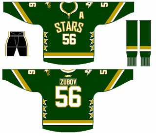
Personally, I like the Dallas Stars' new home sweaters. I know I'm among the minority on that. But here's something I would consider to be a great alternate in a year or so. I like that the shoulders have the primary and secondary logos. The Columbus Blue Jackets did that for a while prior to this season.

My favorite thing is the fact that it's a green jersey. My least favorite thing is that it has no black. I like the black. I think the jersey should be green overall, but I like the black.

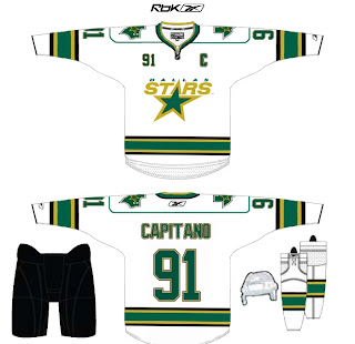
And here's another idea for the road sweater. It's pretty much just an alteration to the striping, but it works well. It's not quite as boring as the current jerseys. I don't really understand the shoulder piping though. Carolina did that and I feel like it just bogs down the whole uniform.

Maybe that's just me.

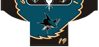
Another reader sent in this concept for the San Jose Sharks.

Before you tell me it looks like a roller hockey jersey, let me stop you. It is. He said the design was based off of his own roller hockey team's uniform. And while NHL teams tend not to wear things like this anymore, I totally could've seen it back in the late '90s alongside the Tampa Bay Lightning's storm jersey.

Oh and about that, speaking as a Bolts fan, I loved those jerseys. The regular ones were so boring. There may have been a lot going on with those blue sweaters, but at least there was something going on!

Enough about that. Feel free to leave your comments about these concepts. What are you thinking?

Wednesday
Oct102007

Odd Art, Part II

First off, if you missed Part I then click here. Now that you know what's going on, let's dive right in. You know you like the weird stuff I post here.

We'll get things going with some imaginative Original Six designs.

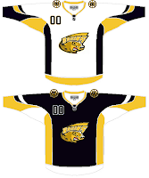
Let me begin by saying the new Bruins jersey is not something you'd be wanting to mess around with. Trust me. It's that awesome. Now, as far as this concept goes, history has taught me that logos like this were probably not originated by the creator of the jersey design itself. If anyone would like to explain from where this particular Bruins logo is derived, leave a comment.

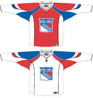
The Rangers jersey is interesting because there's actually a logo on it. A novel concept, not exactly, but it's something I feel the Rangers have struggled with. The 1970s taught us that this might not be the best use of the logo. I'm also concerned about the whole Broadway Blueshirts thing. For those of you lacking the ability to tell one color from another, that is red.

I will say this though, I am a huge proponent of the Lady Liberty logo and those jerseys. They've used a blue one and a white one and both looked better than anything the Rangers have ever worn. I might even go so far as to say it's the best any team has ever worn. But my suggestion to the Rangers is go with the NYR logo full time, and save the current sweater as a third jersey — beginning next season of course.

But who would want to listen to me anyway?

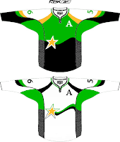
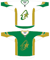
I haven't yet been able to fully grasp what's going on here but near as I can figure, we're looking at a couple of concepts for the Dallas Stars/Minnesota North Stars franchise. I get the shooting star thing in the one on the left, but I really can't work out what's going on in the one on the right. If you have any ideas I'd be happy to hear them. Comment away.

But that's not all. I'll leave you with one more today.

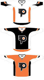
I understand what the designer is trying to do here, but I don't think the "P" in the real logo is that difficult to see. It doesn't jump out at you, but it shouldn't. Logos are meant to be looked at over and over again, so they're more effective when you discover something new every time you see it.

I know a lot of folks would disagree with me on that, but I think it's the reason the Minnesota Wild's logo is so spectacular.

But back to this. The striping is not great and the logo doesn't really need a change. But I feel like an ass for having nothing good to say about it. It's not like it's the worst thing in the world, I'm only thinking that Philly fans would revolt.

But that's all just my opinion. Feel free to share yours below.

And if you or someone you know has been afflicted by the concept art disease and would like help with public dissemination, you know how to reach me. Send an email to nhllogos@gmail.com.

Friday
Oct052007

Reworking Some EDGE Jerseys

I've gotten some pretty decent artwork this week I feel like sharing today. We've got a handful of various Rbk EDGE jerseys that have been modified. I wouldn't necessarily categorize them as "fixes" but they're worth a look.
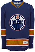
I actually like this one, but probably only because the elbow stripes go completely around the arm and don't stop inexplicably. But it could be anything.

It's a recolored Canucks jersey, obviously and the stripes aren't proportional to what the Oilers typically wear. Not that that's a bad thing entirely, but I'm not really a fan.

Otherwise, the Edmonton jersey's odd piping and lack of, well, anything visually appealing makes anything an improvement upon the present.

So it should be clear how I feel then.
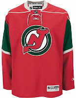
Had to laugh at this one. Imagine the Devils reintroducing the green.

And then imagine them putting it on a Minnesota Wild jersey. It's definitely one of the more interesting concepts I've posted here. But it looks horrible if we're talking about the New Jersey Devils. That does not look like them at all.

I do like Christmas though. So maybe I can find a way to use this in my favor. It needs a Santa Claus logo on the front. I wonder what that would look like.

Then some minor league team could wear it as a specialty jersey for a holiday game.
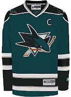
This San Jose Sharks concept is only interesting because it does away entirely with the orange in the jersey. And I have to say, I don't really like it. I think the orange is all right. It really works.

I did like the old jerseys but I like that striping pattern better for those colors than this one. This one needs brighter colors.

This design also features dark cuffs that extend down from the elbow stripes vis-a-vis the Canucks' new duds.

Finally, it's the Dallas Stars we're going to take a look at. Their whole marketing thing was "black is the new green." But what if, as some of you believe, Reebok hadn't brainwashed team management into going all black with no logo?

Might it look like this?

It might. I actually like that a lot. But as one of you humorously stated — the NHL has banned jerseys that aren't white, black, red or blue this season. (And while you could argue the Sharks aren't blue, I'd argue that they're more on the blue side than the green side. Beside the point.)

I like the new Stars' uniforms the way they are and there's nothing wrong with that. But this isn't bad either. Perhaps something to consider for a future third jersey.

So now's your turn to tell me what you like and don't like. Leave me a comment.

Wednesday
Oct032007

Fan Art For Ducks, Stars, Coyotes

I've been getting some really awesome concept art sent to me lately so let's dive right into some of it, starting in alphabetical order with the Anaheim Ducks.
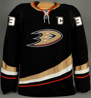
If this had been sent to me sooner, it would've been part of the Ducks, Here's How You Fix It post from a week ago. That team would look so good in this jersey and I'd eat all my words.

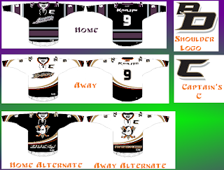
Then I was sent another set that I'm having some difficulty with.

That was making my head spin a little. So as to save me from having to explain it, a description straight from the horse's mouth:

I really wanted to pull together the Ducks' history in the jerseys. I tossed around a lot of ideas but landed on this set of home/away and two alternates. The home and away follow the current script years in Anaheim and I took a page from baseball for having different scripts for home and away. The home jersey features the 04-06 Anaheim script with Ducks in place of Mighty Ducks. The road is basically the current road jersey with an updated name font, captain's "c" and the script/oval logo. Both home and away jerseys feature and interlocking "AD" shoulder patch in the team script as well as front laces.

For the alternate I just changed the current sweaters up a bit but the new shoulder patch, front laces, a recolored Disney logo, and Anaheim, and Ducks wordmarks on the bottom of the home and road jerseys respectively. Just something a little different.

I like the jerseys independently of each other, but together they don't make a good set. I've heard of teams using different logos for their home and away sweaters, but never completely different color schemes. I think your team starts losing its identity when that happens.

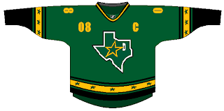
I've also got a Dallas Stars concept that puts the state of Texas right on the crest. Not a bad idea, but it should be the white logo. It needs more contrast.

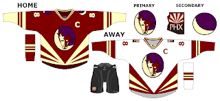
And finally, someone went a little nutty with the look of the Phoenix Coyotes. It's a harsh mix of the old and new.

I'm not really sure I have the words to describe it. Perhaps you do so feel free to leave a comment.

Tuesday
Oct022007

Stars, Here's How You Fix It

Now that I'm posting the ninth part of this series, I think I should note that, by and large, I'm a big fan of all the new Rbk EDGE jerseys so don't let the fact that I'm posting so-called "fixes" make you think otherwise. I just think it makes for an interesting feature to ponder what might have been.

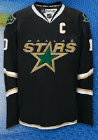
That said, let's see what we can do about the Dallas Stars. I think the home black jersey — which now features the city name as its crest — is very cool and unique. I like it if only because no one else has done it.

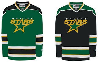
I think this is probably the easiest and most obvious fix — essentially the white jersey in black.

It uses the primary logo on the crest and the secondary logos on the shoulders along with a bit of piping at the bottom of the sweater. The current black jersey has the word "DALLAS" arched above the jersey number on the front and the primary logo on the shoulders. It's also solid black all the way to the bottom.

Personally, I like the real one better.

Moving along, we have a completely different design. Imagine more green and more apparent striping.

Obviously that's not a home-and-away set as neither is white, but it would make a good home-and-alternate set. While I do like the new black jerseys, I was always a fan of the Stars wearing green. Seems like teams aren't liking that much these days as the Wild also recently ditched their green sweaters.

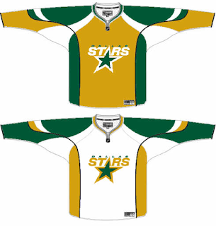
So if green's not your thing, what about gold?

While it's a decent concept, I don't think it would translate well to a uniform. I can't imagine that looking very good on the ice.

How do you feel about it? Do the Stars need to rethink their new duds? Or will keeping the jerseys make them look like studs? Har.

Coming up: Toronto Maple Leafs.

Friday
Sep142007

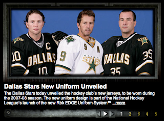
Stars Unveil New Uniforms!

Add the Dallas Stars to the list of teams that have unveiled their new Rbk EDGE uniforms this summer. That was done today and they're exactly what everyone feared.

The first thing I'll say is that I was never behind this whole idea that manifested itself in the form of these new home sweaters. But after seeing these photos, consider me a convert.

In a "new" NHL where cookie cutters are being doled out for even the smallest of things (i.e.: web sites and the like), I find it comforting if not overwhelmingly reassuring that one team managed to step outside the prescribed boundaries and come up with something — wait for it — different.

Now many of you will respond to that superfluous thought with the suggestion that in choosing to be different, they've ruined something good. Obviously I disagree but am always open to a good argument.

Oh and to the next person who suggests that the reasoning behind "DALLAS" being written across the chest is anything other than to remind fans where they are — a giant gold star. From me to you. I really don't understand the number of people seriously under the impression that any NHL doesn't know where the teams are from. Dallas and Vancouver do not have text on their jerseys because their residents lack cognitive function and at various points during a three-hour period forget where they are. Now I'm done with that...

Even if I were the kind of person who could spend money on anything hockey-related that didn't have a Lightning logo, I still probably wouldn't buy a Stars sweater. But that doesn't mean I don't like them. I think the designers knew what they were doing and hit the nail on the head.

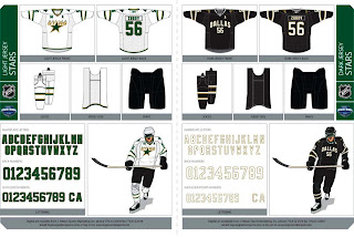
Which reminds me, the Stars did a cool thing and posted on their web site the entire graphics package for the uniform set. It's pretty cool.

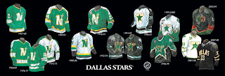
Finally, the Stars also gave us a look at the history of their uniforms. I'll leave you with that.

Tuesday
Sep112007

New Stars Home Sweater?

Just as a follow-up to my earlier post, we've got a screen shot from the NHL 2k8 commercial featuring goalie Marty Turco in what appears to be the Stars new home sweater.

As far it being from a video game ad, this seems to be an actual photo/video as opposed to a video game rendering. Thoughts?

Tuesday
Sep112007

NHL 2k8 Apparently Has New Stars Jersey...

...so you can stop emailing me now! Thank you to the more than 25 people who emailed me saying they saw the Dallas Stars' new Rbk EDGE uniforms on an NHL 2k8 commercial that aired on TSN last night.

For what it's worth, the people who have emailed in have said the images we've seen already match what was in the commercial. However, fittingly enough, no one had a picture or screen shot to share so I'm only writing this post to let you know I got all your emails.

Also, I'll mention again that I really don't like writing about video games so if screen shots do surface in the next day or two I may not even post them. Simply put, video game renderings are not fully accurate images (in my opinion) to show actual jerseys. I prefer actual photographs.

(That's also why I haven't posted the Gagne statuette that's been floating around.)

Real live photos are coming directly from the Stars on Friday. I'll have them here.

Sunday
Sep092007

Stars Drop Clues To Invitees

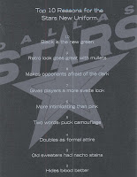
All right, I take it back. One more post and then I'm going to bed. Turns out the Dallas Stars have sent out invitations for their new uniform unveiling ceremony to season ticket holders. The invites drop some subtle hints as to what we might expect for the new uniforms.

First off, let me give a nod to snlsmith at The Goalie Store message board. I snagged this information from his original post.

The inside apparently states the number 1 reason as being, "It's a great excuse to throw a party." It also indicates the event will be held Friday, September 14 at American Airlines Center and the uniform unveiling will happen at 6:02 PM.

This all is according to the post I referenced above.

The number 10 reason listed on the mailer seems to indicate that the black jerseys we've been seeing with "DALLAS" plastered across the front are more than likely the real deal. Sadly. What I'm saying is, prepare to see the Stars unveil something very similar to this on Friday.

Any Stars fans out there? Are you worried? Are you excited? Indifferent? Tell us in the comments. Good night!