NHL Tournament of Logos

Entries in stars (60)

Friday
Sep072007

Shooting Stars... With Cell Phones

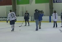
I was recently emailed a handful of cell phone photos (that we all just love so dearly) that alleged show Dallas Stars players on an ice rink during a video shoot wearing their new Rbk EDGE jerseys. I'm going to post those pictures and leave it up to you guys to make heads or tails of them. I will say this much: They bear a strong resemblance to the junior team jerseys we saw last week.


Here's some of what was told to me in the email.

... he and a friend snapped these at the star center in Frisco a few days back. They were apparently filming something about the new jerseys.

And if you can see in that blur- thats Krys Barch wearing Bill Guerin's old #13!

we cant seem to make out who the star in the dark uni is- but that short girl is Selena Rae.
And it appears to be Andy Moog out there too.

Just thought id pass this info on! Thanks!

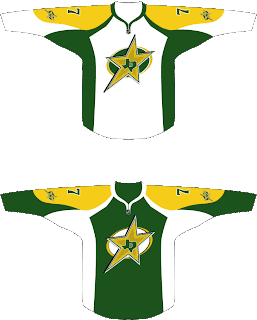
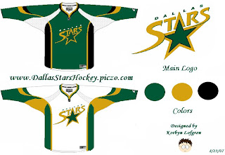
Something for Stars fans to gobble up. That's all I really have as far as news goes. However, remember the neat concept design I posted last week? (Last one on that post.)

The designer tweaked it a little and sent it to me again. And it only got better. Check it.

All but for the yellow, which needs to be more gold like in the current uniforms, you can count me as a fan for this idea.

Anyway, one week from today, the Dallas Stars will supposedly unveil their new uniforms. It's all speculation until then.

Saturday
Sep012007

Seeing Stars!

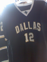
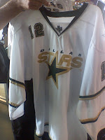
Hot off the presses at HFboards.com come photos of the Dallas Stars' Rbk EDGE uniforms...

...or so we'd be led to believe.

As many have stated, what stands out most is the lack of an NHL shield at the collar — a feature on all the new EDGE uniforms. But that's not the only reason why I'm leaning toward the belief that these are fakes. Look at the material. We've seen lots of photos of the new sweaters at this point. These seem too thin.

Check out the back of the collar where the tag is supposed to be. Nothing. And not a Reebok logo in sight. Another good question: Why is "DALLAS" written across the home black jersey? Shouldn't the home crowd know where their team is from? And why the lack of color and such thin striping around the sleeves?

You think you know where I'm going with this? No, it's not a Photoshop job. While I cannot state to an absolute certainty that is true since I've only been looking at these pictures for five minutes, I'd bet real money on it.

My feeling: Somebody actually made a mock-up of a Dallas Stars jersey — then took photos of it to pass off as a "leak." When Photoshop skills lack, tailoring skills can be money in the bank. Someone with a sewing machine and some extra fabric went out of their way to create a concept so much better in quality than any of the concepts I've ever featured on this site. You can actually touch that sucker.

So color me impressed. I don't want to sit here and tell you for a fact these aren't the jerseys, but there's too much wrong about them for me to believe it. And I've been looking at these jerseys for a long time while running this blog.

Now is your turn. Are these real or are we seeing stars?

UPDATE (8/2 2:03 PM): The general consensus seems to be that these uniforms belong to a junior team in Dallas which has traditionally worn the same sweaters as the Stars. Makes more sense than somebody creating a prototype just to have a little fun with people.

Anyway, it's not clear if that practice will continue and these are close to what the Stars' uniforms will look like or what. We'll have to wait until September 14 when the Stars are supposed to unveil their jerseys.

Saturday
Sep012007

Concepts From Dallas

I've got loads of Dallas Stars fan artwork to share with you on this Saturday afternoon. So let's get right to it.

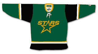
We're all well aware the Minnesota Wild decided to leak their new home jersey to valued season ticket holders. Based off that design, someone came up with this idea for the Dallas Stars.

I'm one who likes the "star" jerseys they wear now. They've got one of the league's most unique looks. Unfortunately, I don't think that would translate to the EDGE. It's a language Reebok doesn't quite understand. To be fair though, it's a limitation of the design that, if the players like it, who are we to judge?

Someone else had the idea to transfer the Iowa Stars look to Dallas. Here's how that might manifest itself.

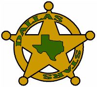
I don't know. Feels like a lateral move to me. I say we go back to the drawing board. What if they went all Old West on us in the great state of Texas? Might it look a little something like this?

I feel like the Stars haven't done enough to differentiate themselves from the North Stars — this, despite the secondary logo with the outline of Texas. They still wear the same crest as the North Stars did during their last year in Minnesota. Personally, I'm hoping for a change when they finally show off their new uniforms.

I'm not necessarily saying this concept is the way to go as all I can see is Chuck Norris' reflection in the shiny badge. But Chuck's pretty bad ass so I'm not so sure it's a bad thing.

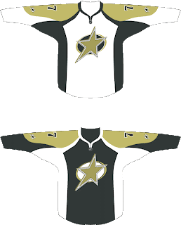
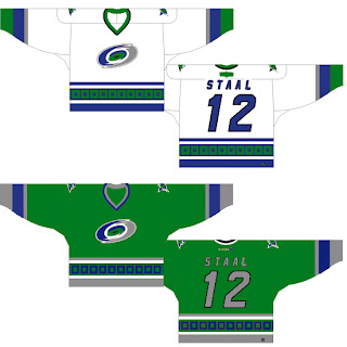
But while we're on the topic of design overhauls, check out this one.

It's sharp in a classic sort of sense. I think it could use a greener green as muted colors don't make for good sports uniforms, generally speaking. I do like the logo idea but it feels a little plain. It's like you just keep staring at it waiting to notice something. But nothing comes. Obviously, nothing's perfect but I think someone needs to get on a Stars overhaul.

The best Stars concept logo I've ever seen was this one I posted a month ago. For those who appreciate simplicity in NHL logos, you can't complain about that.

Anyway, go visit the Concepts Gallery to see these designs and others that I haven't posted. You can also see that first logo set I posted in green and silver (rather than green and gold).

Wednesday
Aug292007

Just To Freak You Out, Part 3 of 5

So this week I'm running a series of crazy concept designs meant to freak you out a little bit. Let's get to it now.

I have to start with the colors we've all grown fond of this afternoon. Yes, you know the ones. But beware, you're about to see them on a jersey that will make you blink a few times and perhaps tap the side of your monitor. No need, though.

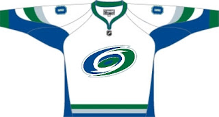
Being of generally slow wit, it took me a moment to realize that this Carolina Hurricanes jersey was being recolored based on the team it used to be. Yes, friends, the Hartford Whalers. But just look at that blue and green hurricane. Scary.

Somebody else had a similar idea. Look at that thing.

And then somebody with a twisted soul had an idea. Let's go all the way back to the New England Whalers... and kill Pucky... on a jersey... made by Reebok.

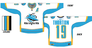
Yeah. And while we're on the topic of creatures of the deep, let's see what could've happened if certain fans had been asked to design the new uniforms and logo of the San Jose Sharks.

Huh? Wait, that one's actually kind of good. Dude, I like that logo. What is it doing here? Oh I remember. It's serving as a segue to this.

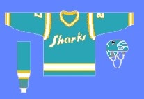
I can hear the screaming all the way from here. But before you go all thinking this design is completely without merit, don't forget about our friendly California Seals. Yes, this design is based on that old '60s uniform.

Completely and utterly crazy if you ask me. And I know no one did, but I'm sharing my thoughts anyway.

Let's roll on, now. Because before I go, I need to show you this logo someone emailed me for the Dallas Stars. Yes, the Stars need a logo redesign, but is this really the answer?

There's only one way to find out. Comment now and come back tomorrow for Part 4.

Tuesday
Aug282007

Result: Stars vs Coyotes

Phoenix
COYOTES

58% 5,706 votes

Dallas
STARS

42% 4,150 votes

9,856 total votes

Phoenix Coyotes
Advancing to Quarterfinals to face St. Louis Blues

Dallas Stars
Eliminated


Poll opening date
Aug 21 @ 4:29 AM
Poll closing date
Aug 28 @ 11:59 PM

07CHTRN | #W1E | DALvPHX

Tuesday
Aug212007

Poll: Stars vs Coyotes


vs
Dallas
STARS
Phoenix
COYOTES


Place your vote and then feel free to leave a comment as to how you came to your decision. Tell all your friends to drop in and vote! The more voices heard, the more accurate the results!

Poll opening date
Aug 21 @ 4:29 AM
Poll closing date
Aug 28 @ 11:59 PM

07CHTRN | #W1E | DALvPHX

Thursday
Aug162007

Stars, Bruins Concept Art

A while back I posted this idea for a redesigned Dallas Stars jersey. Well, another fan put a twist on that design by doing a little reworking of the current Stars logo.

The 3D effect in this version of the logo is pretty cool, though personally I'd prefer to see a complete overhaul of the Stars logo. Keep the colors but come up with a new symbol for the team.

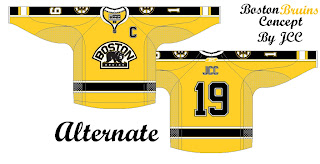
I also have some Boston Bruins concept art to share. These sweaters were designed after the B's unveiled their new logo back in June.

Not too bad, but I'm a big fan of the Bruins' new Reebok uniforms. I can't see any reason to alter them. Classic. Regal. The same designer also came up with an alternate in yellow.

As usual, if you've got an opinion on any of these designs, feel free to post them in comments area.

Friday
Aug102007

Mailbag: Some Radical Jersey Concepts

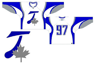
Um... it's a slow day so I apologize in advance, but this is pretty much all I have to offer. Forgive the image and design quality, but I was emailed this fan art. I'll try to find some good stuff before I call it a night.

For those who haven't deduced it, this is a radical concept for the Toroto Maple Leafs. It's interesting. Can't think of much to say beyond that. It looks like it makes use of the leaf on the Canadian flag in place of the team's logo. I like the extra silver, but on the whole, what do you guys think?

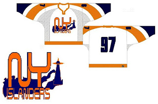
The next one is another radical concept for the New York Islanders.

Many of the Isles concepts we've seen have incorporated a lighthouse in some way and I'm a big fan of that. I don't think we need to lose the classic crest from the jersey, but could it hurt to add a secondary on the shoulder?

This next design is pretty far out as well.

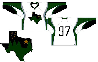
If you hadn't guessed, that would be a concept for the Dallas Stars. You've got a starry night scene set in the forest inside the outline of the state of Texas. It's a very interesting concept but Texas doesn't seem to me like a forest state. Those trees make this feel more like the Minnesota Wild logo.

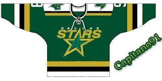
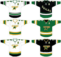
Why don't we take a look at less-radical idea. I kind of like the notion of the Stars going with "DALLAS" written across the crest on the road jersey. These are backwards if that's the case, but it's interesting to look at nonetheless. What do you think of the green jersey in the middle? Too North Stars or should Dallas adopt something in that vein veering from the black?

Anyway, hopefully I'll have more to offer later. I know this isn't spectacular artwork, but still worthy of looking at I thought.

Monday
Aug062007

Avalanche vs Stars


vs
AVALANCHE
STARS
11-2
8-5

The Aesthetics
This is the end of the line for both of these logos in this tournament. But its just the qualifying round. You will get to decide how good they really are. But I'll make this short and sweet. No logo has ever been helped by incorporating the text of the team name.
Avalanche

The Nickname
An Avalanche of snow has nothing on a Star of fire. Forget the snowslide, a big one could incinerate the planet. Then there's no snow to fall on anybody.
Stars

The Analysis
The giant avalanche across the "A" is a classic logo, not that you asked me. I see it being around a very long time. However, I can think of better ways to deal with a logo for the Dallas Stars. Maybe one day we'll get one. Until then, I like the "lone star" element, but not more than the Avs logo.
Avalanche


WINNER
2-1


Sunday
Aug052007

Stars vs Oilers


vs
STARS
OILERS
7-5
1-10

The Aesthetics
All right, so both of these logos feature the team name as a main element, I'm sorry to say. The Oilers name appears to take up more of the logo than anything else but the the Stars logo also has the city name on it. Which is worse? A single drop of oil is meant to graphically symbolize the Oilers so we'll go with the Stars logo since it at least has a giant star on it.
Stars

The Nickname
Remember that giant ball of fire. Imagine a Star coming in contact with an oil pit. All of the Oilers would be toast. Or, incinerated, rather.
Stars

The Analysis
I thought the Stars logo looked great on all the Stanley Cup champion merchandise back in 1999. It's been a while since we've seen the Oilers logo on that stuff. All right, cheap shot. I apologize. I think despite its tradition, the Oilers might be better served by something like the logo they've been wearing on their third jersey. That was very sharp. The Stars should never ever reconsider their third jersey logo. I recently read where someone called it a "mooterus" which had me laughing out loud for a moment. Sweep for the Stars.
Stars


WINNER
3-0