NHL Tournament of Logos

Entries in thrashers (54)

Saturday
Sep012007

Poll: Thrashers vs Flyers


vs
Atlanta
THRASHERS
Philadelphia
FLYERS


Place your vote and then feel free to leave a comment as to how you came to your decision. Tell all your friends to drop in and vote! The more voices heard, the more accurate the results!

Poll opening date
Sep 1 @ 7:31 AM
Poll closing date
Sep 8 @ 11:59 PM

07CHTRN | #E2D | ATLvPHI

Friday
Aug312007

Southeast Concept Designs

I know a lot of people — Tampa Bay Lightning fans included — aren't in love with the new logo and uniforms. Speaking as one of the biggest Bolts fans out there, I can say I love the designs. It's miles better than what we had even if it's not perfect yet. You have to admit that much. And hell, I already pre-ordered my black jersey. I can't wait until mid-September.

Anyway, on to the subject at hand. I've got concept art from across the Southeast Division today (except for the Stinkin' Panthers). And I'm starting with the Lightning.

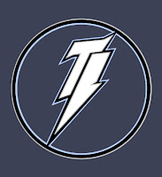
Like I said, I like the new logo but I'm open to new ideas as well. This logo is cool in that it forms a lightning bolt out of the letters "TB." That sort of thing is why I wake up in the morning.

Unfortunately, as drawbacks go, there sure is a lot of negative space in that design. Maybe we don't need such a large circle. Let the bolt overlap the bounds of the circle sort of like the new logo does. And the muted colors don't market well. And whether we want to think so or not, that is an important element.

So let's see what that logo looks like on a jersey.

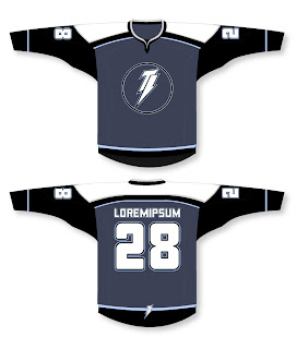
I like the lettering style but it doesn't really seem to go with the jaggedness of the logo. Loving the bolt on the bottom of the back. And the black sleeves with a blue body is pretty cool. Another one I'd be curious to see on a player. Overall, it's not horrible, but it could still use some touching up.

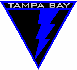
We talk a lot about simplicity in logos. Check this out.

You can find these designs and many others in the Concepts Gallery. I highly recommend a look through what's there.

Moving on now northward to the Atlanta Thrashers. I got emailed a couple of cool Reebok-style concepts worth a look.

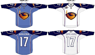
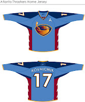
The design above is very sharp. You'll notice the all-star logo on the shoulders which was a nice touch. Also this concept does away with the overhead Thrasher logo, opting instead for the head from the primary logo on the shoulder. Overall, Atlanta could do worse. Personally, however, I'm partial to the design on the left.

I think the red sides are very nice. I think that is a very smart accent color and there's no reason to do away with it. However, it seems the red pushed out most of the gold. I think it could use a little more. But my favorite thing about both designs is the retention of the sky blue used for the home sweaters. I think that was a great move by the Thrashers and I wouldn't want to see it go away.

How do you Thrasher fans feel about it?

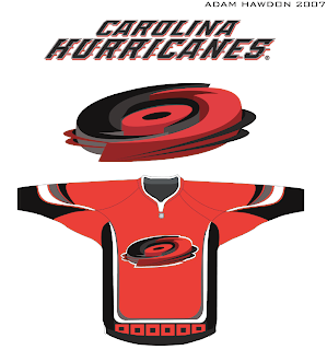
Continuing up the east coast, we have some Carolina Hurricanes fan art. Check out this guy.

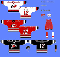
How about that logo?

This design here to the left is a rendering of the 'Canes unis based off of what we've seen from EA Sports in NHL 08. The black jersey is merely a suggestion at what could be done in the future for an alternate. I like the black and the hurricane flag is growing on me as a crest. I wasn't a fan at first.

Anyway, what really matters is what Carolina fans like. Any feelings on the matter, guys?

We'll wrap up our Southeast Division tour with the Washington Capitals. I agree with the above design almost whole-heartedly. That "W" eagle should definitely be the new primary. The wordmark "logo" should be relegated to the shoulders if you ask me. The stars on the shoulders are nice, but stolen from the Columbus Blue Jackets and that's not acceptable.

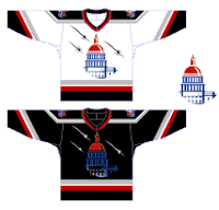
But this design fascinates me. That's a very nice use of the Capitol dome. Very impressive. I also like the black, silver and red jerseys. The blue being used sparingly works in its favor, I think. I'd like a better look at the shoulder logos to see what's going on there. Too small in this graphic.

Any Capitals fans out there to share an opinion? Because we know I'm certainly not one.

That does it for the Southeast today. Apologies for the long post. I know that irks some of you. If someone's holding a water gun to your head forcing you to read this blog, let me know and I'll see what I can do to shorten them.

Wednesday
Aug292007

Result: Thrashers vs Sabres

Atlanta
THRASHERS

54% 6,427 votes

Buffalo
SABRES

46% 5,417 votes

11,844 total votes

Atlanta Thrashers
Advancing to Quarterfinals to face Lightning or Flyers

Buffalo Sabres
Eliminated


Poll opening date
Aug 22 @ 4:20 AM
Poll closing date
Aug 29 @ 11:59 PM

07CHTRN | #E1F | ATLvBUF

Sunday
Aug262007

Suggestions For Atlanta

You asked and I was listening. You want Atlanta Thrashers concepts? I've got them. Let's dive right in!

I'd imagine this design to be the one most Thrasher fans are hoping for. It keeps the light blue and the "ATLANTA" down the sleeve. It's pretty sharp. But based on what we've seen so far, don't get your hopes up.

I was also sent this jersey. But don't worry, this would probably be a little too much for Reebok. Very colorful, that's for sure.

So Thrash fans, you got your wish. What do you think? Do you like these fan-created concepts or should your team go with something entirely different? Comment below.

Wednesday
Aug222007

Poll: Thrashers vs Sabres


vs
Atlanta
THRASHERS
Buffalo
SABRES


Place your vote and then feel free to leave a comment as to how you came to your decision. Tell all your friends to drop in and vote! The more voices heard, the more accurate the results!

Poll opening date
Aug 22 @ 4:20 AM
Poll closing date
Aug 29 @ 11:59 PM

07CHTRN | #E1F | ATLvBUF

Sunday
Aug122007

Thrashers Uniform News

I'm a little behind the curve on this one. The Blueland Blog at the Atlanta Thrashers' official web site posted news on the new uniforms last week. Have a read.

August 7, 2007

New Uniform News

Ben Wright
Blueland Blog

First off- my apologies for the lack of posting lately. Things have been pretty quiet on the Thrashers front, and I was on vacation. I'm back though and hopefully things will pick up soon. On to a bit of uni news.

Plenty of people seem to be wondering what the new Reebok Edge Thrashers uniforms are going to look like and multiple people have asked me when they're going to be unveiled.

Well, I have some answers, but no pictures. Despite rumors to the contrary there are no major changes planned for the uniforms. Naturally they're going to look a bit different to keep them in line with the league-wide look being rolled out by Reebok, but the logo, colors and general design are staying the same. Some of the trim and accents will change but it's not a uniform overhaul.

So when do you get to see the new threads for yourself? During training camp, which begins in mid-September (on the 13th I think, but I'll have to confirm that).

So stay patient and relax. There are no secret plots to do away the blue uniforms.


There you have it, Thrashers fans — semi-official news on your team's new uniforms. Anyone who was worried about big changes may now have their minds put at ease.

Big thanks to Mike for emailing in this information. I'm going to go ahead and place September 13 in the sidebar countdown. If the date changes, I'll update the countdown to match.

Thursday
Aug092007

Thrashers vs Senators


vs
THRASHERS
SENATORS
7-6
7-6

The Aesthetics
This match will serve as the finale for each of these teams. Is it weird they're both facing the same direction? I'm not bothered, I guess. What I am bothered by is the stick the bird is holding. Why? It's so unncessary. It's a cool-looking logo, but that stick takes a lot away in my eyes. Let's go with the Sens.
Senators

The Nickname
Senators set aside special reserve land decide whether or not the Thrasher is worth adding to the endangered list. So they've got some power over the little bird. And I think that's all the evidence I need.
Senators

The Analysis
Nothing about the Thrashers logo really says Atlanta to me and that's a shame because it could — and should. The Senators logo just about screams Ottawa and Canada. If you don't know what I'm talking about, check out a recent Sens match and you'll understand. Looks like we've got a sweep on our hands today.
Senators


WINNER
3-0


Wednesday
Aug082007

Thrashers vs Lightning


vs
THRASHERS
LIGHTNING
6-6
6-6

The Aesthetics
These two logos are very evenly matched at this stage of the tournament. One of the things I hate almost as much as text in hockey logos are things like blatant hockey sticks that serve no real purpose. Take the stick out of the logo and it only improves it. But even with it, I think it's one of the league's better modern marks. And it doesn't have all that text.
Thrashers

The Nickname
If a Thrasher got struck by Lightning, he would then only serve as someone's lunch.
Lightning

The Analysis
Despite its performance in this tournament to date, I think the Thrashers have one of the best logos in the league. The Lightning have one of the worst, which is why I'm glad to hear they're changing it this summer. One game left for each of these teams.
Thrashers


WINNER
2-1


Monday
Aug062007

Cool Sens Concept, Bruins Too!

A lot of people responded well to the Islanders concept art I posted yesterday. It came from the artist who also designed the Thrashers concept art from Friday. (NOTE: I updated that post with higher-resolution graphics if anyone's interested.)

Anyway, I have some more work from that same artist who posted his work on Chris Creamer's Sports Logos Community. As a disclaimer, I need to point out that none of this is official team artwork, but I thought it was fun to look at just the same.

This logo set appears to be merely a revision of the current look of the Ottawa Senators. Personally, I prefer leaning more toward the yellow-gold over the beige color seen here. That's not to say that this color scheme doesn't work well, though.

Do you guys like this designs, the current one, or the one rumored to be taking over in the fall?

Next, we have a look at some logos that are irrelevant when you consider the Boston Bruins just changed their logos back in June. But have a gander anyway, if you're inclined.

If you ask me, that's a pretty sweet Bruins logo, setting aside the fact that a drastic change like this would likely send the Boston faithful into a frenzy. I'm not sure how I feel about the re-imagining of the spoked "B" though. It isn't sitting well with me.

I'm loving the bear, though no one's asking me, and wondering whether I like it more than the new one that was unveiled a couple months ago.

And then for those of you longing for the days of the yellow and brown, our talented designer leaves us with this other alternate uniform design.

Friday
Aug032007

Thrashers Fan Artwork

Get excited, Thrashers fans! You asked for it yesterday and some among you responded. I reader linked me to the following designs for a new Atlanta Thrashers jersey. Keep in mind they are only concepts and as far as I know, no change in logo is being contemplated at this time by the team.


How about them apples? It's certainly a unique take on branding for the Thrash. The designer certainly took "Blueland" and ran with it. He dropped the maroon altogether. They're sharp designs but I don't think there's really anything wrong with the current uniforms.

But if that wasn't enough for you, he also came up with an alternate jersey design, as seen below.

I really just think the color combination and jersey design of the current home uniforms work so much better. These are cool, but more like something I'd expect to see on the backs of a minor league club — that's certainly no offense at all. Still, Thrashers fans, we finally have something new for you to look at. What do you think? Go? No go?

UPDATE (8/6 5:30 PM): Good news for those of you who liked these Thrasher designs. I found better quality images. You can click on the images to enlarge them. These are the same jerseys posted above.

I also found graphics with a better look at the logo designs. If anyone else is seeing the Baltimore Ravens resemblance, I'm with you. It's a great set of logos, though. And any team would be lucky to wear them.

The second graphic features logos the designer created but ultimately did not use for this concept. They're all very sharp though with a very nice and clean color scheme. Thrashers fans, do you like these? Or do you prefer what your team wears right now?