NHL Tournament of Logos

Entries in thrashers (54)

Saturday
Jan122008

Just To Freak You Out XXIII

I've been pretty bogged down with getting this next tournament ready. I really hoped I'd have it posted by now, but obviously it hasn't happened yet. Patience. In the meantime I've got some other cool stuff for you guys to enjoy.

First thing, a reader emailed in a link to a site called MG's Helmets — specifically to a page where the designer has come up with a bunch of NHL concept football helmet designs. It's quite clever actually. My favorite thing is how any references to hockey have been removed from the logos. You'll find no hockey sticks and no pucks. Haters of the "Buffaslug" might notice at a quick glance how ridiculously appropriate that logos looks on a football helmet. The only other logo that even comes close to looking good on a helmet is the Flyers.

It's just weird.

Now you're good and prepared for the freak out stuff. I would've done this yesterday, but I didn't. This one is all wacky logos.

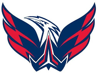
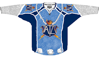
First, the Atlantington Thrashitals.

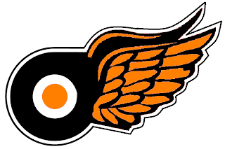
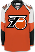
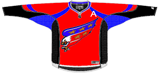
Then the Phitroit Flyer Wings. I know, creative names.

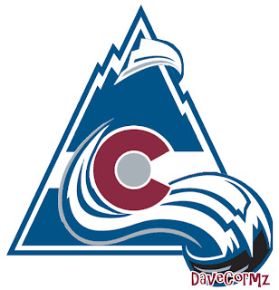
This next one here is a combination of the two Colorado clubs that have graced the NHL — the Rockies and Avalanche.

Not too horrible. I haven't quite figured out how the avalanche of snow has passed directly through the mountain, but I've found in my life it's best not to ask questions.

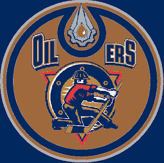
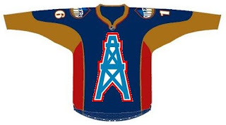
Here, I think we've got an amalgamation of just about every Edmonton Oilers logo ever used.

Learn what it means to be freaked out. Learn it well.

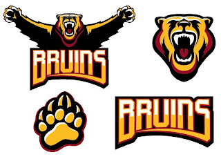
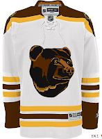
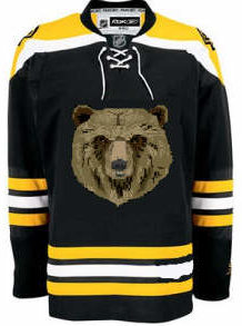
And finally, a weird generic Bruins logo design that could be used for absolutely any team called the Bruins whether they happen to be located in Boston or not.

Thanks, but I'll keep the spoked B.

Saw Charlie Wilson's War tonight. Philip Seymour Hoffman is my hero. Enjoy the other half of your weekend. The Quest For The Worst is imminent.

Saturday
Jan052008

Concepts In Photos

It's my favorite thing. Concept renderings in pseudo-photographic form.

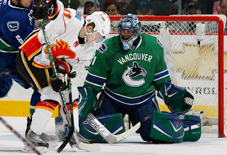
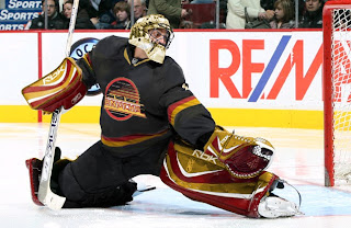
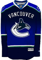
The most commonly used player for these jersey redesigns has overwhelmingly been Roberto Luongo. And it hasn't just been Canucks concepts for him, either. But tonight, yes, they are both Canucks concepts. Here's one.

Seriously, I would buy that. That green looks phenomenal. I don't know why his teammate isn't also wearing green over there on the left, but that team would still look a million times better if only Luongo wore a good sweater. While I'm thinking of it, are there still people left who liked the old '80s logo and colors?

Don't be fooled, though. It's not the jersey. Luongo can make anything look good.

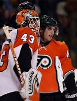
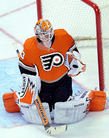
Next we're moving on to the Philadelphia Flyers.

It's a simple redesign that incorporates orange and a bit of silver. But if you want to see the goalie wearing it, well you'll have to look at the image on the right (not the left).

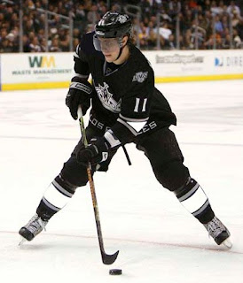
Back to the days of black-and-white Kings here.

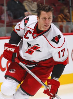
And hurricane flags that are actually hurricane flags.

Now we see why the team didn't do that in the first place. The shoulder thing is cool because it incorporates both of the Carolina-named states. I don't think a dividing line at the border would be too much to ask for clarification's sake.

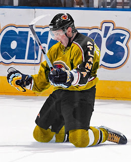
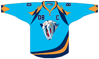
Lastly, if you hated those mustard-colored jerseys once worn on special nights by the Nashville Predators, then you're absolutely going to adore this.

And one final note (which may or may not explain the late hour of this particular post) if you are into things that are funny but not necessarily hockey-related. First, go see Juno. Great film. (In one scene there's a guy wearing a Minnesota Wild jersey. The green one you all like.) And buy a copy of Stephen Colbert's "I Am America (And So Can You!)". (I'm pretty sure he's all about the OHL's Saginaw Spirit.) These two things will complete your life. If they don't, you have no soul.

Thursday
Dec272007

Poll: Capitals vs Thrashers


vs
Washington
CAPITALS
Atlanta
THRASHERS


Place your vote and then feel free to leave a comment as to how you came to your decision. Tell all your friends to drop in and vote! The more voices heard, the more accurate the results!

Poll opening date
Thu Dec 27
Poll closing date
Mon Dec 31

07SCTRN | #3B | WSHvATL

Thursday
Dec202007

Poll: Thrashers vs Kings


vs
Atlanta
THRASHERS
Los Angeles
KINGS


Place your vote and then feel free to leave a comment as to how you came to your decision. Tell all your friends to drop in and vote! The more voices heard, the more accurate the results!

Poll opening date
Thu Dec 20
Poll closing date
Mon Dec 24

07SCTRN | #2D | ATLvLAK

Thursday
Dec132007

Poll: Thrashers vs Wild


vs
Atlanta
THRASHERS
Minnesota
WILD


Place your vote and then feel free to leave a comment as to how you came to your decision. Tell all your friends to drop in and vote! The more voices heard, the more accurate the results!

Poll opening date
Thu Dec 13
Poll closing date
Mon Dec 17

07SCTRN | #1F | ATLvMIN

Wednesday
Dec122007

Concept Art Grab Bag

I don't really have a theme for tonight's concepts post. Mainly, I just thought these were different and interesting. Kind of curious to see what sort of feedback they get.

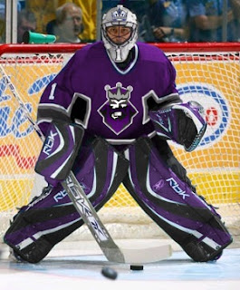
One of my favorite things is seeing really nice concepts painted onto game action photos. So I'll start with those. There's this one Kings design from a while back that I liked a lot.

I think it's kind of funny that Roberto Luongo is wearing it. I guess L.A. fans can dream, right?

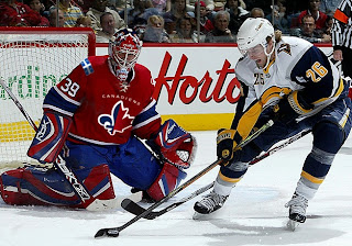
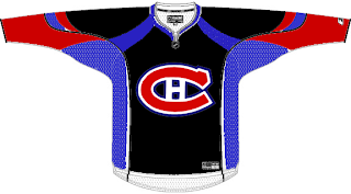
There was also a bit of Canadiens artwork that I made part of a Freak Out post that a lot of people responded rather well too. Here you can see what it looks like on Cristobal Huet.

I wonder why both designers decided to paint fake jerseys onto goalies. Hmm.

Anyway here are a few more wacky designs that don't quite warrant being included in the Freak Out series.

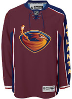
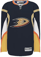
For those who don't care for the sky blue, how about maroon? Doesn't look terrible either. I'm sure the asymmetry is still driving you nuts though. And how about the Ducks' logo and colors on a Sabres jersey? That's pretty weird.

I thought the colors were interesting on the Bruins jersey. That logo really did wear out its welcome, though, didn't it? And for a complete change of pace, I've got a Flyers jersey with a redesigned set of logos.

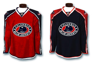
And to finish things off, as far as ironies go, I thought this was a pretty good one.

The Columbus Blue Jackets wearing red sweaters. Don't get me wrong. I think it's a really nice-looking jersey, but blue is in their name. It's one of those no-brainers.

Anyway, let me know what you guys think of those. I'll try to have more posted tomorrow.

Monday
Dec102007

Connected By Blue

So what do all of tonight's jersey concepts have in common? The color blue. That's it.

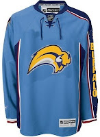
We'll begin with the Buffalo Sabres and a design that despite its stripes is actually rather cool.

Yeah, the striping does ruin it though, doesn't it? I like the logos and the colors (though I'd go with a white circle on the blue jersey) but I don't really understand the weird stripes. In case you can't really make it out, the logo on the shoulders appears to be the buffalo from the original '70s logo sans the swords beneath it.

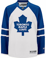
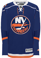
These two deal with some simple modifications. The white Leafs jersey with the blue stripes leaves me wondering whether this would be a home or away jersey. It seems to have too much blue to be a road sweater yet it has too much white to be for home games. The Isles jersey, however, is a nice adjustment. Not great. But better.
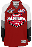
Here are a couple of dark Thrashers jerseys. Your pick as to which is home and with is an alternate.

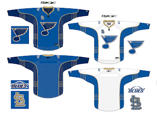
And finally, I promised a Blues fan I'd get this one posted tonight.

You know what to do now. Comment away. I'm interested in seeing what you guys have to say about these.

Thursday
Nov152007

This One's All Atlanta

As the title implies, this post will stick to an Atlanta-based theme. We'll start with the team currently in that town — the Thrashers.

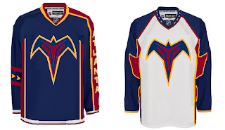
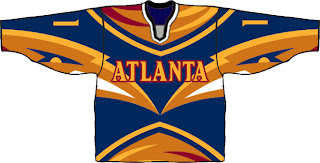
A reader emailed in this concept which calls for a return to the days of going heavy on the dark blue and maroon. Don't get me wrong, I don't think it's a bad look. I just prefer the light blue jerseys. One of the best in the league, if you want my opinion — which I'm sure many of you don't.

I bet the asymmetry of that blue jersey is causing aneurysms for a good number of you. I think it's a winner. Not really feeling the sleeves on the white jersey, however. I know what's being attempted, but it just isn't working. Thoughts?

Now let's take a blast from the past with the Atlanta Flames.

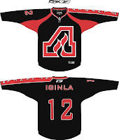
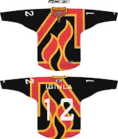
You might notice Jarome Iginla's name on the back of these sweaters. Try to ignore the Calgary connection. I really am trying to write an Atlanta post. The one on the left is a little plain but I like the city name down the sleeve. The crest is awkwardly large however. What I like is the one on the right which is oversized just right — if that makes any sense.

I think this is a really cool idea. The giant logo basically becomes the jersey design. I think it provides a really cool effect. Not sure how great it would look on the ice, however. But by itself there, I'm a fan.

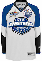
And finally, we'll top things off with the 2008 NHL All-Star Game which is being hosted by the great city of Atlanta. The jerseys for that game were recently unveiled to the general disappointment of a lot of the readers here. One fan emailed in a couple of concepts for the big game. They're not bad, but they do borrow heavily from the Philadelphia Flyers.

Oh, and before a handful of you start needlessly jumping up and down on the designer, let me point out that we know a design like this prohibits the use of a "C" or "A" on the chest. And I do think the all-star and team logos should be left on the shoulders. Other than that, I think they work. Perhaps we'll see something similar in the future.

Until then, we have what we have.

Friday
Nov092007

Just To Freak You Out XIV

It's the end of another work week and we all know what that means — Freak Out Friday! A series, which by the way, has become very popular. So as long as you guys keep sending in crazy crap, I'll keep posting it every week. I'll start things off tonight in New York.

I felt I couldn't properly begin a Freak Out Friday without involving the Buffalo Sabres somehow.

See? This is what happens. What is that anyway? Somebody call Paul Bunyan. We found his ox. Yay.

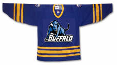
Easily the most maligned logo in the NHL, imagine the "Buffaslug" on what's been one of the most maligned jerseys here at NHLToL. How much do you guys love this concept right here?

Not that much? Just when you thought it couldn't get any worse. Anyway, while we're on the subject of the Atlanta Thrashers, see if you can endure this monstrosity.

I know that wasn't easy, but don't worry, it's over now. Let's not let this happen again, all right?

Gradients on jerseys is a personal pet peeve of mine. Who was it that thought these looked good?

Oh yeah, those guys did.

Have you ever tried to use red, blue and black together? Here's why you don't.

And here's another reason.

Finally, I'll leave you this evening with one simple concept and a profound statement.
Only you can prevent forest fires.

Until the next time, try not to freak out too much.

Friday
Nov022007

Just To Freak You Out XIII

It's lucky number 13 tonight on Freak Out Friday. Hope you guys get weirded out by what I have to share here.

I don't quite know where to begin.

Wow, I don't know what you did to deserve that, but it must've been pretty bad. Now if you're thinking that looks somewhat familiar, consult a post from last month.

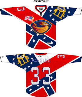
And the hits just keep coming. Flames, take a clue from the Thrashers. This is how you do it up if you really want your provincial/state flag on your jersey. The scary part is that half of it is what seems to be the Confederate flag. Yeah, 'cause rednecks and hicks just dig hockey.

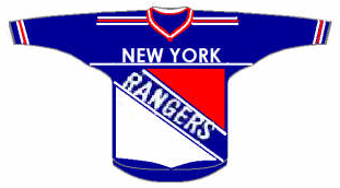
All right so let's head up north where they can really claim the sport. Scary thought alert. Imagine the Rangers and Flyers swapping colors.
On second thought, don't. It's too horrible. Speaking of horrible, check out this Rangers jersey concept.

That's what scary is. I know the new EDGE jerseys are supposed to have larger crests, but somewhere a line's been crossed.

Anyway, let's head west. Here's a color combination that doesn't work on a jersey.

The Nashville Predators are a hockey team, not a figure skating team.

Right?

Yikes! That logo. And while we're on the topic of bad logos, consider the following.

Oilers fans, you think you've got it bad now with your half-a-stripe elbows and practice-jersey looks. What if this happened? Don't even think about it too much. Your head will explode.

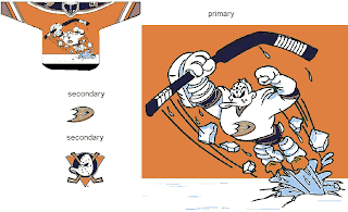
We'll wrap things up in California now, if you don't mind. And sometimes you have to reintroduce a winner — like the 1996 Mighty Ducks third jersey. Only the Ducks have new colors now.

That is something.

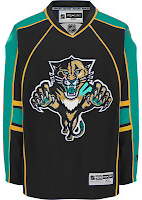
What we're finishing the night off with might be hard to look at. Remember the old Lightning third jerseys from the mid-90s? They had the rain pouring down, lightning bolts down the arms and — the selling point — the wild waves of the bay around the bottom. Well Sharks live in the water.

The waves have been stolen. And so has what little dignity might've been left in the new Florida Panthers uniforms when an attempt to create a San Jose concept went horribly awry. This is what happens when folks have too much time on their hands.

Well I hope you all got freaked out enough on this Freak Out Friday. If not, accept my apologies. Better luck next week. Until then, I'm waiting to see what you guys have in store for me next in terms of crazy artwork. Email it along.