NHL Tournament of Logos

Wednesday
Nov142007

Poll: Mighty Ducks vs Sabres


vs
Anaheim
MIGHTY DUCKS
Buffalo
SABRES


Place your vote and then feel free to leave a comment as to how you came to your decision. Tell all your friends to drop in and vote! The more voices heard, the more accurate the results!

Poll opening date
Wed Nov 14
Poll closing date
Sun Nov 18

07TJTRN | #2A | ANAvBUF

Tuesday
Nov132007

Atlanta All-Star Jerseys

Don't know if you guys have seen these, but the new All-Star jerseys are out for the 2008 game in Atlanta.

Not too shabby.

By the way, Round Two of the Third Jersey Logo Tournament begins tomorrow so keep an eye out for that. Mighty Ducks and Sabres.

UPDATE (11/14 2:16 AM): My apologies on not providing a source. I think in my rush I just forgot. But as a few people pointed out in the comments, the images are available on the NHL.com Shop. I snagged them from there so I could show you guys and see what you thought. Sounds like most of you just like to be negative but to each his own. It's a hockey jersey, not a Renoir.

Monday
Nov122007

Poll: Kings vs Panthers


vs
Los Angeles
KINGS
Florida
PANTHERS


Place your vote and then feel free to leave a comment as to how you came to your decision. Tell all your friends to drop in and vote! The more voices heard, the more accurate the results!

Poll opening date
Mon Nov 12
Poll closing date
Fri Nov 16

07TJTRN | #1H | LAKvFLA

Sunday
Nov112007

Concepts In The Stars

Every so often, I get emailed a concept design that just looks simply amazing. Let me share the most recent piece I'd categorize that way.

Obviously, we're talking about the Dallas Stars today. And while I'm a fan of their new uniforms and the simplicity seen there, I would be among the last to object an overhaul. For instance, I feel a green jersey is exactly the way for this team to go. And while I don't think the logo seen here is perfect, it's a step in the right direction. I really like the secondary logo, though.

Anyway, this is what I like. Sharp graphics and folks getting creative. It almost makes me want to do a concept contest of some sort. The winner would get nothing but bragging rights, but I bet we'd see some amazing work along the way. Let me know in the comments if that sounds like something you guys would be interested in.

Continuing with today's theme now.

This is a nice set. I like the idea of using the bull/consellation logo on the shoulders of the black jersey. The red seems a bit out of place though.

And finally, here's a nice way to improve on the road sweater.

Just a little more color makes the jersey seem a lot less ... white. A bit more interesting to look at, to be sure.

Overall, I like what all of the artists have done here. Top notch work.

Sunday
Nov112007

Poll: Predators vs Rangers


vs
Nashville
PREDATORS
New York
RANGERS


Place your vote and then feel free to leave a comment as to how you came to your decision. Tell all your friends to drop in and vote! The more voices heard, the more accurate the results!

Poll opening date
Sun Nov 11
Poll closing date
Thu Nov 15

07TJTRN | #1G | NSHvNYR

Saturday
Nov102007

Mailbag: Canucks Logo

I got an email this morning that really made me think.

Hey, love your website,
Do you think that the canucks have a good logo?


That question is so simple yet the answer is so complicated.

Whether you consider the logo to be the orca alone or with the city name arched above it, the long and short of it is I don't really have an answer.

From a personal standpoint, while I do think it is a strong logo, at the same time I feel it could be so much better and so much more representative of the city and the team name.

Having said that, I think the person asking this question would be better served by getting a response from the readership here at NHLToL. For the most part, you guys know your stuff and have very strong opinions. I think they should be heard now.

Let the debate begin!

Saturday
Nov102007

More On The Sabres, Pens Topic

Since we're on the subject of the Buffalo Sabres and Pittsburgh Penguins today, I thought I'd share a few concept designs I thought were especially cool.

I'd consider the Sabres to be one of the best-looking teams in the league if they wore something a little like this. For one thing, the logo actually has sabres in lieu of a buffalo. Always a welcome change of pace if you ask me — you know, the whole thing about having a logo that actually represents the name of your team.

That being said, it should have a buffalo logo on the shoulder. My vote is for the white one you see in the vintage logo. Wrap a red outline around that buffalo and stick it to the shoulders and you've nearly got your winner. The other big change I'd make is to change the circle behind the swords to red. Either that or make the dark sweater red instead of black. Too much blending in there.

With those changes, I'd almost buy one myself and I'm not just saying that.

As for the Pittsburgh Penguins, this would be an improvement. This logo needs a bit of work, but it's got a ferocity lacking in the skating penguin. It's even got a nice shoulder patch with that hint of vintage. Any thoughts on this?

Or perhaps we could inject a little more of a retro feel.

Not only does this design reintroduce the blue sweater, but the designer even went so far as to add the city crest to the shoulders — taking a page out of Calgary's book. But actually, I don't hate it. My only hope is that the gradient thing is just for this graphic and wouldn't have any part of an actual jerseys.

We can dream, can't we? Anyway, leave your thoughts below. I'd like to see what the consensus is on all of this. It's pretty drastic compared to a lot of the work I post on a regular basis. And as always, my thanks to the artists.

Saturday
Nov102007

Another Look At The Retro Winter

I keep getting emails from you guys about the news that the Sabres and Penguins will be donning retro uniforms for the Winter Classic on New Year's Day. Don't get me wrong, I appreciate you guys sending in information, but I did address it last weekend.

Regardless, I thought I'd write up another post considering the league has now made that official — which wasn't the case on Sunday. Here are some images that the clubs posted on their web site this week.

The deal is that Reebok is apparently making them in the same "cutting edge" materials used for the EDGE jerseys.

As you might've noticed, the teams will be wearing their old 1970s logos and uniforms. Most notably, the Pens will be donning blue for the first time since 1980. Should be a fun game to watch, no doubt, if for no other reason than the throwback uniforms.

So anyhow, there it is. It's official. The Buffalo Sabres and Pittsburgh Penguins will wear retro sweaters for the Winter Classic.

By the way, in case you were wondering, the week of this game, be sure to stop by NHLToL as you'll be able to vote on the two logos being used on these jerseys. So stay tuned for that.

Saturday
Nov102007

Poll: Senators vs Coyotes


vs
Ottawa
SENATORS
Phoenix
COYOTES


Place your vote and then feel free to leave a comment as to how you came to your decision. Tell all your friends to drop in and vote! The more voices heard, the more accurate the results!

Poll opening date
Sat Nov 10
Poll closing date
Wed Nov 14

07TJTRN | #1F | OTTvPHX

Friday
Nov092007

Just To Freak You Out XIV

It's the end of another work week and we all know what that means — Freak Out Friday! A series, which by the way, has become very popular. So as long as you guys keep sending in crazy crap, I'll keep posting it every week. I'll start things off tonight in New York.

I felt I couldn't properly begin a Freak Out Friday without involving the Buffalo Sabres somehow.

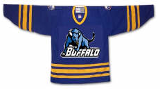
See? This is what happens. What is that anyway? Somebody call Paul Bunyan. We found his ox. Yay.

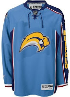
Easily the most maligned logo in the NHL, imagine the "Buffaslug" on what's been one of the most maligned jerseys here at NHLToL. How much do you guys love this concept right here?

Not that much? Just when you thought it couldn't get any worse. Anyway, while we're on the subject of the Atlanta Thrashers, see if you can endure this monstrosity.

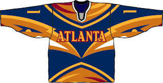
I know that wasn't easy, but don't worry, it's over now. Let's not let this happen again, all right?

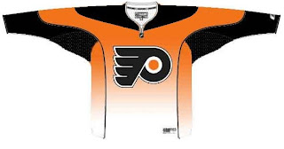
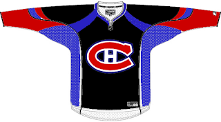
Gradients on jerseys is a personal pet peeve of mine. Who was it that thought these looked good?

Oh yeah, those guys did.

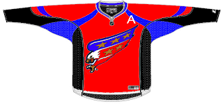
Have you ever tried to use red, blue and black together? Here's why you don't.

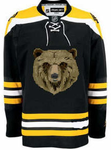
And here's another reason.

Finally, I'll leave you this evening with one simple concept and a profound statement.

Only you can prevent forest fires.

Until the next time, try not to freak out too much.