NHL Tournament of Logos

Wednesday
Nov212007

Poll: Sabres vs Rangers


vs
Buffalo
SABRES
New York
RANGERS


The third round of voting has begun! Place your vote and then feel free to leave a comment as to how you came to your decision. Tell all your friends to drop in and vote! The more voices heard, the more accurate the results!

Poll opening date
Wed Nov 21
Poll closing date
Sun Nov 25

07TJTRN | #3A | BUFvNYR

Tuesday
Nov202007

Decide On The AHL's Best Logo!

If you haven't been following the AHL Tournament of Logos over at ToHL, now is the time to get involved! We're down to the final two. In the championship round it's the Manitoba Moose against the Bridgeport Sound Tigers. But only one will walk away with the victory and bragging rights as the AHL's best logo.

And as I've mentioned, the third round of the Third Jersey Logo Tournament here at NHLToL will begin tomorrow. At the moment, it's looking like we'll have a Battle of New York on our hands for that first poll. Should be interesting.

Monday
Nov192007

A Third Jersey For The Wings?

The third round of voting on the Third Jersey Logo Tournament will begin on Wednesday so keep an eye out for that. In the meantime, I've managed to break away from Super Mario Galaxy (80 stars) if for only moments to share with you some Detroit Red Wings concept art. This, of course, coming on the heels of the Motor City being named the most dangerous city in America. Kudos on the whole gas station owner feud thing.

Crazy.

All right, so moving right along into the hockey stuff now. We'll begin with what you'd probably consider your basic throwback alternate.

I don't think many Wings fans would lodge a lot of complaints over something like this. It's still got that traditional look and feel but at the same time it's something new.

For a change of pace, how about a new logo entirely? Get it en-"tire"-ly. I should stop that now.

Personally, I'm not the biggest fan but it's definitely got the old-time hockey feel.

Now, if it's something completely and totally different that you're after, look no further. I've got you covered there as well.

The designer described his work this way: "As you can see, the skyline wraps around the base of the jersey. I'm sure you're wondering about the logo. It is an image that has been familiar with Detroiters for decades. It's a statue called the 'Spirit of Detroit.' If you google it I'm sure you'll find a good photo. I think it's a great representation of Detroit that many Detroiters would appreciate."

So Detroiters, how do you feel about these? I'm interested to get some feedback here.

But just so you guys don't think I've gone completely crazy, I've got a couple of very conservative redesigns as well.

So now let's hear it. Could any of these pass muster for a potential Red Wings third jersey? Or is Hockeytown destined to never join the alternate sweater club? Post comments below.

Sunday
Nov182007

Hurricane Of Concept Art

There's no new poll today so it'll just be this post all by itself. I've had a bunch of Carolina Hurricanes concept art sent to me over the last couple of weeks so I thought I'd gather it all up to share.

We'll start with a pretty cool rebranding that involves a lighthouse as the Canes' primary logo as well as some slight changes to actual primary.

I don't know, for me, a lighthouse will always say Islanders. I don't know if I'll ever be able to shake that. I do like this logo and uniform set, though. Very nice quality.

While we're on the topic of redesigned logos, here's an interesting re-imagining of the current secondary mark. I know the team is based out of North Carolina, but does South Carolina also consider the Hurricanes their team since they go by just the Carolina name? Am I thinking about this too much?

It's a nice logo, but it needs some tightening up where the outline of the state is concerned. Way too much tiny detail in their. This would be like a six-inch patch. No need for all that detail. But even if it were the crest, it should still be cleaned up.

Here are a couple of third jersey designs.

And we'll finish things off tonight with another third jersey concept I found quite interesting.

Classic and what have you. Definitely a Colorado knock-off, but nice on its own merits. You be the judge. Let us know what you think about these in the comments.

By the way, I made wholesale updates to the Concepts Gallery this weekend so be sure to check that out. Added about 50 new images.

Saturday
Nov172007

More Habs Anyone?

On Thursday, I ran an Atlanta-themed concept post. Tonight, it's all about the Montreal Canadiens. I have several concepts I feel like sharing.

Last week I posted a bunch of third jersey artwork which included a half blue, half red Habs sweater. I wondered aloud what such a thing might look like on a player. And because you guys are just awesome like that, someone took to Photoshop and here is the result.

I'm thinking that's probably a no. But as far as a blue Canadiens jersey goes, we shouldn't toss out the idea altogether should we? The AHL's Hamilton Bulldogs handled a similar jersey effectively — as proven by the club's mascot.

Here's what that would look like in Rbk EDGE template form. They could do a lot worse. That's all I'm saying.

Though there is one element here that doesn't work well. The white stripe across the middle makes it difficult to put contrasting numbers on the back. The cure for that is running a red stripe in its place.

I'm posting both of these graphics to show different possibilities for the shade of blue. Personally, I'm more a fan of the darker blue.

Overall, I think blue would be a good direction for the Habs if a third jersey is in their future. I never cared much for the white ones they used to sport. What do you guys think? Post your comments below.

Saturday
Nov172007

Poll: Senators vs Panthers


vs
Ottawa
SENATORS
Florida
PANTHERS


Place your vote and then feel free to leave a comment as to how you came to your decision. Tell all your friends to drop in and vote! The more voices heard, the more accurate the results!

Poll opening date
Sat Nov 17
Poll closing date
Wed Nov 21

07TJTRN | #2D | OTTvFLA

Friday
Nov162007

Just To Freak You Out XV

We were a little thin in terms of new Freak Out art this week, so forgive me if today's post is a little light. Still, nothing pleases me more than trying to freak you guys out with some crazy concept art.

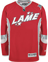
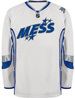
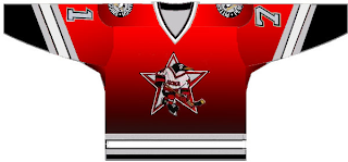
As many of you know, the NHL unveiled the 2008 All-Star Game sweaters this week. Reader reaction here was not great. In fact, I got some very Freak Out-worthy concepts based off of those jerseys.

John sent those in along with a few others. You'll be able to find them in the Concepts Gallery this weekend.

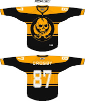
We'll keep things moving with the Pittsburgh Penguins next. Each concept here imagines a drastic change. For instance, the first example suggests renaming the team the Pirates — a club that once existed in Pittsburgh during the early years of the NHL.

And the second suggests that the team keep the name but move to Russia.

That silly penguin even looks Russian.

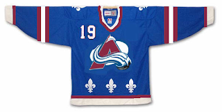
And then, this goes out to all the folks from Quebec. It just doesn't look right. At all.

We'll keep things in the Western Conference now. With all the vanity in the world these days, you had to see this coming.

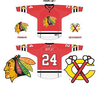
It seems even the Chicago Blackhawks' Indian head wanted a facelift. Either that or he got the Botox. And don't think I'm ignoring the Bears reference in there.

Next we'll head to Detroit where I'm quite concerned.

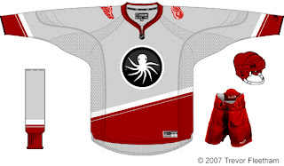
I think the grey jersey is an interesting choice, but I don't think an octopus will ever be anything but scary on a Red Wings concept. That tradition should stay off the sweater. Having said that, as a logo itself, it's not bad. But I'm still very, very concerned.

And finally, with Christmas just 39 days away, I thought I'd start my decorating now.
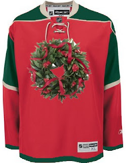
Ho ho ho!

If you've made or run across any concepts you think might be worth posting for Freak Out Friday, don't be shy. Send them along! You can email me at nhllogos@gmail.com.

Friday
Nov162007

Poll: Wild vs Rangers


vs
Minnesota
WILD
New York
RANGERS


Place your vote and then feel free to leave a comment as to how you came to your decision. Tell all your friends to drop in and vote! The more voices heard, the more accurate the results!

Poll opening date
Fri Nov 16
Poll closing date
Tue Nov 20

07TJTRN | #2C | MINvNYR

Thursday
Nov152007

This One's All Atlanta

As the title implies, this post will stick to an Atlanta-based theme. We'll start with the team currently in that town — the Thrashers.

A reader emailed in this concept which calls for a return to the days of going heavy on the dark blue and maroon. Don't get me wrong, I don't think it's a bad look. I just prefer the light blue jerseys. One of the best in the league, if you want my opinion — which I'm sure many of you don't.

I bet the asymmetry of that blue jersey is causing aneurysms for a good number of you. I think it's a winner. Not really feeling the sleeves on the white jersey, however. I know what's being attempted, but it just isn't working. Thoughts?

Now let's take a blast from the past with the Atlanta Flames.

You might notice Jarome Iginla's name on the back of these sweaters. Try to ignore the Calgary connection. I really am trying to write an Atlanta post. The one on the left is a little plain but I like the city name down the sleeve. The crest is awkwardly large however. What I like is the one on the right which is oversized just right — if that makes any sense.

I think this is a really cool idea. The giant logo basically becomes the jersey design. I think it provides a really cool effect. Not sure how great it would look on the ice, however. But by itself there, I'm a fan.

And finally, we'll top things off with the 2008 NHL All-Star Game which is being hosted by the great city of Atlanta. The jerseys for that game were recently unveiled to the general disappointment of a lot of the readers here. One fan emailed in a couple of concepts for the big game. They're not bad, but they do borrow heavily from the Philadelphia Flyers.

Oh, and before a handful of you start needlessly jumping up and down on the designer, let me point out that we know a design like this prohibits the use of a "C" or "A" on the chest. And I do think the all-star and team logos should be left on the shoulders. Other than that, I think they work. Perhaps we'll see something similar in the future.

Until then, we have what we have.

Thursday
Nov152007

Poll: Flyers vs Oilers


vs
Philadelphia
FLYERS
Edmonton
OILERS


Place your vote and then feel free to leave a comment as to how you came to your decision. Tell all your friends to drop in and vote! The more voices heard, the more accurate the results!

Poll opening date
Thu Nov 15
Poll closing date
Mon Nov 19

07TJTRN | #2B | PHIvEDM