Tuesday
Nov182008

New Sens, Kings, Sharks Third Leaks!

The leaks just keep coming. The big news tonight is that I can now provide you guys with pictures of the actual jerseys that were leaked during Icethetics Live Chats over the past several days. And I know you're excited about that.

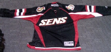
We'll start with the Ottawa Senators. A new photo I have of a replica more clearly depicts the text on the front as well as the striping on the sleeves. You can also make out the tie-up collar.

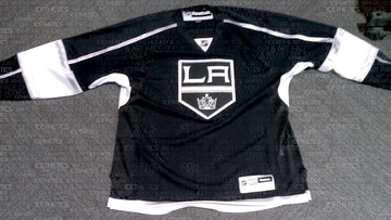
Next, the Los Angeles Kings, whose leak was the most difficult to discern details from. This photo clearly shows the prominence of silver in the sweater design, especially the new logo.

It's obvious the Kings had their Gretzky (and for that matter Melrose) days in mind when when putting this one together.
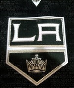
In the image to the right you get a close-up of the new crest. Silver is all over it, trimming the banner as well as the LA. You can even find some in the crown.

Surprisingly, the silver really helps to keep this jersey from looking boring. I think it would've looked very flat just in white. Wait until you see the Kings on the ice with all the bright arena lights reflecting off the silver. They're going to look good.

If you can't make it out well in the picture above, there's silver piping running the length of the sleeve from the collar to the wrist. It's broken up however by a broad white stripe that wraps around the elbow. That stripe is trimmed in silver. And the thin stripe at the base of the jersey appears to be silver as well.

Overall, I think the Kings really got one right. It looks nothing like what they're wearing now, but it totally looks like the L.A. Kings.

Finally, let's have a look at the San Jose Sharks.

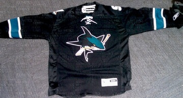
It's a little plain if you ask me. But that's no different from their previous black third jersey. I will say that I'm a huge fan of the full-body shark on the front. That's what needs to be on the regular jerseys. In this picture you can see the teal, white-trimmed stripes around the elbows and the lack of striping at the base.

Another thing to note is the absence of vertical piping that some of us thought we saw. Can't say for sure it's not on the back since we can't see it, but I highly doubt they'd do it on the back and not the front. Symmetry seems to be a common theme on these new sweaters.

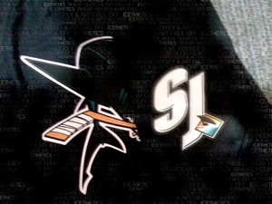
The last thing I want to show you is the shoulder patch of this Sharks jersey. There was some question as to whether the SJ-fin logo was in black and white or color. Now it appears we have our definitive answer.

The SJ is in white and the fin is in color. Glad to see that logo make it onto the uniform. And in case you're confused by what you're seeing, the sleeve has been folded over the front of the jersey in this picture which is why you see the full shark logo.

I'll have the unwatermarked images in the Third Jersey Central galleries at some point in the next few days. And don't bother asking where these pictures came from. You know I'm not going to say. But when have I ever failed you?

So that's it. You've seen them all; pictures of all 18 NHL third jerseys. I'm glad to have been of service to you guys all this time — scratching that jersey itch. And I plan to continue doing so. I'll have complete coverage of each official unveiling through the Bruins next week. Technically, we still have six teams to go.

By the way, I'm still waiting on confirmation that the Coyotes are doing their unveiling during their game on Saturday. Look for more information on that right here tomorrow morning.

Tuesday
Nov182008

Flyers Unveil Third Jersey!

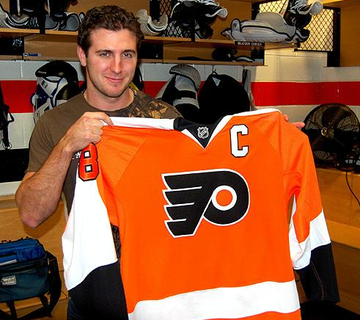
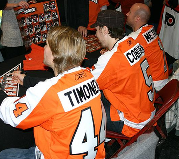
The Philadelphia Flyers became the 12th team to unveil their new third jersey for the 2008-09 season. They did so before season ticket holders tonight in Philadelphia — and then later on their web site.

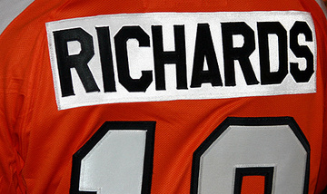
The unveiling confirms Icethetics' previous leaks. The Flyers will go with an orange retro-style alternate sweater with a special white nameplate on the back. Even the striping pattern of the sweater is modeled after the classic '70s uniforms.

Along with the above picture, the Flyers posted a special tribute video on their web site. The throwback jerseys have caused nostalgia to run rampant! And I don't know any fan that isn't loving it.

Great video even if you're not a Flyers fan.

And another great third jersey to look forward to.

Tuesday
Nov182008

Stars Unveil Third Jersey!

Today the Dallas Stars officially unveiled their new alternate sweater for the 2008-09 season. As rumored, it's essentially a white version of their current black jersey.

It features DALLAS in text across the chest in green with the sweater number beneath it on the front. You can read more on the Stars' web site. But first thing's first. Here's a picture.

It pains me to think Brad Richards will have to wear that. So disappointed we let him go.

Anyway, here's how the Stars describe their new threads.

The new third jersey is the same basic design as their current dark sweater, but white. This look was introduced last season as a new design for the Dallas Stars — a word-mark as the primary emblem on the front of the jersey, as the team’s home of “DALLAS” is cleanly presented across the chest accompanied by the respective player’s uniform number centered underneath. The traditional Dallas Stars logo is featured on each shoulder.

According to their web site, the Stars will wear this sweater for the next four straight games. They also released a complete schedule for the rest of the season.

I'll add more pictures as they become available.

Tuesday
Nov182008

NHL.com Talks Third Jerseys

There's a new article now on NHL.com featuring yours truly (and Icethetics) discussing this season's new third jerseys. In it, staff writer Dan Rosen talks about the 18 clubs getting new part-time threads for the 2008-09 season and I'm quoted a few times in the piece.

Nice to see Icethetics getting a mention on NHL.com. Big day for us.

Here's an excerpt from the article.

The history is stitched on the stick.

The one major difference between the jerseys the New York Islanders wore in the mid-1970s and the ones they unveiled last month as their new third jersey is the stick built off the Y in their logo now has four small lines on it.

Why, you ask? Four Stanley Cup championships, of course.

It's a subtle change, but supremely important to the past, present and future of the franchise.

... Six more third jerseys are still to come, the details of those jerseys to be announced in coming days.

"It's terrific that the original uniform is being brought back and celebrated," said Edmonton President of Hockey Operations Kevin Lowe, who scored the first NHL goal in Oilers history in a jersey resembling the one the club debuted last month. "All of the things we take so much pride in today were accomplished in that uniform."

Third jerseys became popular in the late 1990s, and ever since every team but the Detroit Red Wings and New Jersey Devils have sported something unique for at least a handful of games.

In the article, I talk about how most fans seem to be loving the throwback thirds more than anything else.

Chris Smith, who operates the Web site www.Icethetics.info, which is dedicated to the aesthetics of hockey, such as jerseys and logos, said he's been following the development of the third jerseys since the summer.

In an e-mail to NHL.com, Smith wrote, "Overwhelmingly fans seem to love the throwback third jerseys. They don't sound happy about the new-style jerseys we're seeing with Atlanta and Ottawa (what's been leaked anyway) — though fewer complaints for Tampa Bay's. They love what the Oilers, Islanders, Canucks, Penguins and Sabres are doing and I can't say I disagree."

Great article, but then I'm biased I guess.

Tuesday
Nov182008

An Early Look At Stars' Third

Marty Turco was on the local news in Dallas this morning with a sneak peek at the Stars' new alternate sweater. It's exactly what all the rumors have said — a white version of the current black jersey.

It's got DALLAS in green letters arched above the player's sweater number on the front. Both the text and numbers are trimmed in gold on the inside and what appears to be black on the outside.

Tony sent in some pictures of his TV screen this morning.

You'll be able to find the rest of what he sent at Third Jersey Central in the Stars' gallery.

Now as for the leak I was planning this morning, circumstances beyond my control prevented me from getting the Live Chat done, so instead I'm just posting the image here.

This gives you more of an overview of the jersey, but if you've seen the Stars during a home game in the past year, you pretty much already know what they look like.

I have to say I am a little disappointed they didn't opt for a green jersey. I actually don't think I would've minded as much. As I've said before, I think Dallas' black jersey is nice by itself. But now they're adding to it — and so are the Thrashers, for that matter.

Tony, who sent in the picture above, mentioned to me that Dallas fans love their jerseys despite the general "bashing" it's getting around the league. He says, "Go on ahead, we don't need any Red Wings fans buying our sweaters."

It only really matters what Stars fans think of these, though I know we won't be short of opinions from everyone else.

He also said, "I like that the logo is not totally gone. I feel it still stands out on the shoulders. As for the lettering on the front, there certainly is appeal to it. It's a college/vintage vibe that I think is simplistic yet cool. Simple and classic."

Well put. The official unveiling happens later today. I'll post pictures when I can.