Entries from September 19, 2010 - September 25, 2010

Saturday
Sep252010

Penguins Winter Classic Preview

The Pittsburgh Penguins are preparing to unveil their brand new 2011 Winter Classic sweater, according to the Tribune-Review.

An article published this morning goes into little detail about the new threads, except to say that they're blue and the scarf-wearing penguin will finally see its way onto a sweater. The story is more of a retrospective on Bob Gessner, the man who created that original Pens logo.

First, the good bits in a quote box:

A new blue-colored alternate uniform is soon to be unveiled by the team. It will debut at the outdoor game against Washington, and the Penguins plan to adopt it next season as a "third" uniform. Also, the first day of 2011 will mark the first appearance of the Penguins' original logo on a uniform.

If you managed to catch my radio interview last weekend, you heard me make a bold prediction I didn't have much basis for. That being, my guess is the Penguins will go with a mish-mash jersey, like the Bruins did at the last Winter Classic.

Rather than recreating a past look, I wouldn't be surprised if they combined elements of several looks and got a little creative with it. Based on this article's assertion that the 1967 scarfed penguin will be on the jersey, it sounds like I could be right. How rare.

There's no date set for the unveiling, but the story does say the new sweater will "resemble uniforms worn by Mario Lemieux's son's local youth team." If anyone reading is involved with that team, maybe you have a photo or two you could provide to give us an idea of what to expect.

For the record, a quick Google search turns up this photo of Austin Lemieux's team in action from February 2008. They are wearing the Pens' current third jersey — which debuted in the NHL just a month earlier at the 2008 Winter Classic. Perhaps they've redesigned their uniforms since?

Anyway, this post is already getting long so I won't harp on the last bit. If you want the inside scoop on the design of the Penguins' logo, you should really read the rest of the article. Gessner says he never liked the scarfed penguin and he doesn't think he'll be impressed with the new sweater.

Friday
Sep242010

All right Wild, WTF?

Wild shoulder patches, now and thenWhat's going on, Wild?

There was a time not too long ago when I considered the Minnesota Wild to be the pinnacle of NHL uniform and logo design. Among the very best the league had to offer.

But I'm quickly losing confidence in that.

As indicated by EA Sports' NHL 11, it seems the Wild do, in fact, have a new shoulder patch on their white road sweaters for the 2010-11 season. I've thrown together a quick side-by-side comparison in the photos to the right. Additional photos on the Wild's website.

It's rather disappointing considering what they had been wearing. The old logo was relevant to the name and had a distinct and recognizable style — despite the idea that it perhaps didn't fit with the faux retro style the team exudes.

The new patch is still a wordmark, but it's been watered down into oblivion. For a better look at the logo itself, SportsLogos.net is always happy to help.

By the way, if that nonsense wasn't bad enough, check out the pants. Where'd the stripes go, guys? Minnesota, I'm disappointed. That is all.

Friday
Sep242010

On Location in Vancouver

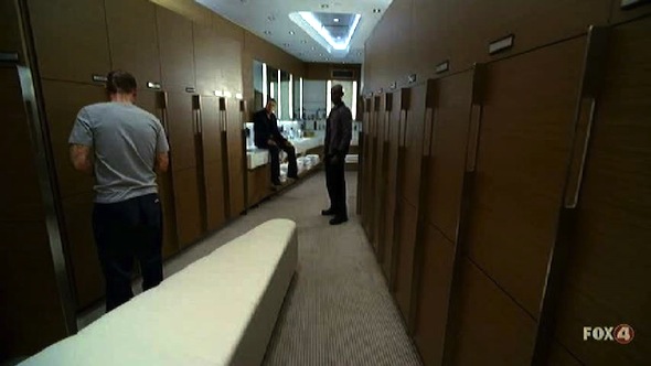
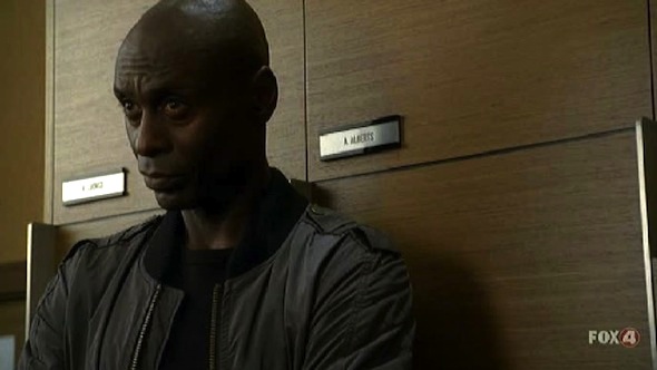
This isn't really jersey-related, but I was watching Fringe last night and noticed they shot a scene in the Vancouver Canucks locker room. Thought it was pretty cool.

You can clearly read Andrew Alberts' and Roberto Luongo's names on their lockers. Well, Luongo's is not so clear in this image, but it was on my high-def TV.

Interestingly, this scene takes place in an "alternate" version of New York, so I wonder if this means Alberts and Luongo play for the Rangers — or if the Canucks even exist. (Also, the FBI's Fringe Division building in Manhattan looks remarkably like the Vancouver public library.)

Thursday
Sep232010

A Trio of CHL 3rd Jerseys

A large chunk of Canadian Hockey League teams are adding alternate sweaters this season. It would be impossible for me to keep up with all of them on my own. So I thank all my awesome Canadian readers for their emails. Today, a trio of new third jerseys for your enjoyment.

WHL: Rebels go for retro feel

Rebels unveil third jerseyThe Red Deer Rebels unveiled their new third jersey on Wednesday morning.

I'm starting with this one because I'm a huge fan. It is by far one of my favorite junior league sweaters, with a great vintage look. And that's what they were going for.

Here's an excerpt from their news release:

The most noticeable change from the previous "R" uniform is the base color. The predominant burgundy has been replaced by a beige color that adds both a retro tone, along with a western feel.

The standalone "cow skull" shoulder patch, taken from the teams primary logo, reinfoces this western concept. The striping has been moved to the middle of the jersey, and a burgundy shoulder "yolk" [sic, I hate it when I get egg on my jersey] added to the top of the sweater.

The most predominant feature of the jersey, the popular "R" logo which the team has worn since 2001, has been made over. The black fill adds strength to the logo, and compliments the neck collar.

The team will wear black pants and black helmets to complete the look. Player socks will be beige with two burgundy stripes through the middle.

The jersey will make its debut on Oct. 2 when the Rebels face the Medicine Hat Tigers.

OHL: Frontenacs add impressive third

Frontenacs unveil third jerseyThe Kingston Frontenacs also unveiled an impressive new third jersey on Wednesday.

I'm really blown away by the uniform designs that come out of the CHL. Their designers really need to take a stab at the NHL because rarely do we find a bad one in the bunch. In fact, a Frontenacs official may have put it best:

“We went for a retro look and they turned out better than what we ever imagined,” said Jeff Stilwell, Director of Marketing and Communications.

Indeed, Jeff. You really don't need to say any more than that. Well done, Kingston!

And here's another picture, because it's just that good.

OHL: Rangers rely on fan favorite

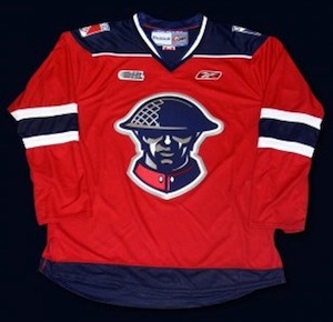
Kitchener unveils third jerseyLastly, the Kitchener Rangers unveiled their 2010-11 third jersey about three weeks ago.

I may be a little late to the party picking this one up but it's still very much worth a mention. This is a sharp sweater that is a big fan favorite. The team's press release has details:

This exciting new jersey was influenced by the Rangers 2008 Commemorative MasterCard Memorial Cup Jersey, and will feature the same highly popular soldier crest.

The crest on the front of the jersey was designed by the Kitchener Rangers Hockey Club in honour of the Canadian Forces. The design was derived from a recruiting poster that was used in England during WWI. This popular recruiting poster was inspired by "Lord Kitchener", the same individual that the City of Kitchener was subsequently named after.

The poster's popularity led the United States to use it as the basis for the creation of their "I Want You - US Army" poster in their recruiting efforts on this side of the Atlantic.

As I said, if only NHL teams were this thoughtful and inspired when it came to uniform designs. Time to stop marketing your slick, flashy jerseys to A.D.D.-addled children and think about what real hockey sweaters are meant to look like. Call the CHL. They can help.

Thanks to Andy for the email on this jersey and to everyone who wrote in about the Rebels' top-notch sweater. Remember, if you see something that hasn't been on the blog, drop me a line and I'll share it with everyone.

Wednesday
Sep222010

Amerks Unveil Third Jersey

Americans unveil new third jerseyThe AHL's Rochester Americans unveiled a new third jersey at a press conference on Tuesday.

The throwback sweater is a replica of what the Amerks wore back in the 1960s. Team president Lewis Staats called it a "symbol of returning to [the team's] roots."

Members of the American Spirit Dance Team were on hand to model the new jerseys. I like how minor league teams always use the pretty girls on staff to launch a new sweater. Almost guarantees people will look at it.

You can find more information about the new alternate uniform in an article posted yesterday on the team's website — it includes a picture of a bunch of dudes holding up the jersey.  Thanks to all the great Icethetics readers who sent this in.

Pirates Prepare for Pink in October

Pirates unveil special pink jerseyThe AHL's Portland Pirates will wear a special pink sweater for Breast Cancer Awareness Night.

This image (right) comes directly from the splash page of the Pirates' official website, which indicates the jersey will be worn on Oct. 23.

It's actually a really neat design that borrows both from the team's history as well as its NHL affiliate, the Buffalo Sabres and their new uniforms.

The jersey design itself is almost an exact replica of the Sabres' new home sweater with some colors replaced — blue changed to black, gold to pink. But the coolest part may be the crest, which is a fusion of the vintage Pirates and Sabres logos. Replacing the white buffalo above the crossed sabers is the primary mark the Pirates wore from 1990 to 2000.

We've seen some bad breast cancer night jerseys on this blog, so this one is kind of refreshing. I have to applaud the designer for a job well done. And thanks to everyone for emailing it in.


That's all I've really got time for today. But just so you know, there's been a lot going on that just hasn't made it to the blog yet — despite these daily posts lately. So I recommend following @icethetics on Twitter, or at least keeping an eye on the Twitter feed in the sidebar for frequent updates of jersey/logo news.