NHL Tournament of Logos

Entries in concept designs (310)

Friday
Aug032007

Design Your Own Lightning Logo

All right, one final post for today and then I think I'll rest for a while. As you may or may not know, it is believed that the new logo for the Tampa Bay Lightning was leaked a few weeks back.

By and large, fan response hasn't been great. So as a way of letting people vent or something, the St. Petersburg Times is asking readers and fans to design their own Lightning logo and submit it for future posting on their web site. You can find more information on Damian Cristodero's Lightning Strikes blog.

I thought this was really cool and I recommend that anyone, Lightning fan or not, who has a concept to submit it. And if it wouldn't be too much trouble, email it to me as well. (I can offer the instant gratification of posting it within hours.) You can email me at nhllogos@gmail.com if you're interested.

Friday
Aug032007

More Thoughts On The Wild

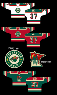
After I posted a Minnesota Wild uniform design yesterday, a reader pointed out another bit of fan artwork that made use of a really cool take on a secondary logo for the club.

If you ask me, that shoulder patch is seriously awesome! Like the Coyotes, I always thought the Wild would be a good team to use the outline of their home state in a secondary mark. This is just one example of how well that can work. This design is of major professional caliber if you ask me. I'd be surprised to discover it wasn't a pro behind it.

Anyway, I wanted to make sure this got posted today because I thought it was very interesting. Wild fans, I'm curious to know what you guys think of this concept. Could you see your team wearing these uniforms or are you happy with what they've got?

Friday
Aug032007

A Peek At The New Leafs Jersey?

While making my rounds on the various message boards, I recently bumped into the image below which is being touted as a sneaky photo of the new Rbk EDGE jersey for the Toronto Maple Leafs.

As we've come to expect, it's blurry and doesn't show very much but for a number on the front of the sweater a la the Buffalo Sabres' new unis. Obviously, it's not out of the realm of possibility that this is the artistic work of a fan.

For one thing, I've been hearing for a very long time that the Maple Leafs are planning to update or modernize the logo. The one we sort of see here appears to be no different from what they've been using. Ah, but fear not, faithful Leafs fans, it won't be a drastic change. They do update it every couple of decades or so, so it's probably due.

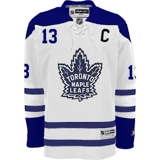
Anyway, while I'm on the topic of fan-created artwork, a reader sent me this image he made based off of the Boston Bruins' new road sweaters.

It's pretty solid. What do you guys think? Would you like to see Toronto in something like this or something completely new and different just to changes things up?

By the way, just as a side note, I added the Edmonton Oilers to the uniform countdown. A reader wrote in saying that the unveiling date is said to be September 17, the day of the team's first preseason game. Despite there being no official word from the team on this matter, I'm tempted to say that date is rather solid considering they wouldn't wear their old uniforms for a preseason game anyway. If it comes sooner, though, I'll surely let you know.

Friday
Aug032007

Thrashers Fan Artwork

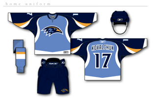
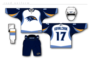
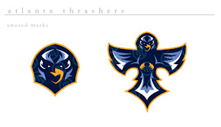
Get excited, Thrashers fans! You asked for it yesterday and some among you responded. I reader linked me to the following designs for a new Atlanta Thrashers jersey. Keep in mind they are only concepts and as far as I know, no change in logo is being contemplated at this time by the team.


How about them apples? It's certainly a unique take on branding for the Thrash. The designer certainly took "Blueland" and ran with it. He dropped the maroon altogether. They're sharp designs but I don't think there's really anything wrong with the current uniforms.

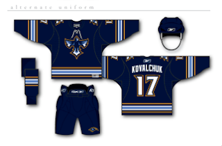
But if that wasn't enough for you, he also came up with an alternate jersey design, as seen below.

I really just think the color combination and jersey design of the current home uniforms work so much better. These are cool, but more like something I'd expect to see on the backs of a minor league club — that's certainly no offense at all. Still, Thrashers fans, we finally have something new for you to look at. What do you think? Go? No go?

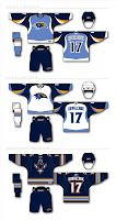
UPDATE (8/6 5:30 PM): Good news for those of you who liked these Thrasher designs. I found better quality images. You can click on the images to enlarge them. These are the same jerseys posted above.

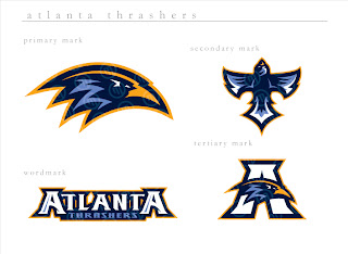
I also found graphics with a better look at the logo designs. If anyone else is seeing the Baltimore Ravens resemblance, I'm with you. It's a great set of logos, though. And any team would be lucky to wear them.

The second graphic features logos the designer created but ultimately did not use for this concept. They're all very sharp though with a very nice and clean color scheme. Thrashers fans, do you like these? Or do you prefer what your team wears right now?


Thursday
Aug022007

Jersey Ideas For The Big D

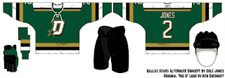
Further proof that this Dallas Stars jersey I posted a few days ago was a fake comes by way of another piece of work from the same designer. As a side note, he also created this Lightning concept jersey.

What gives it away here is the "Big D" logo with the star in the bottom corner of it. Have a gander.

So what do you guys think? It's a little reminiscent of the old North Stars with a touch of cool in the logo. Speaking of which, am I the only one who likes that concept for the logo? Anybody else out there? I thought it was a huge improvement over what they've been using.

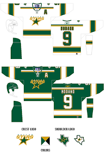
I also came by another fan-designed concept to put out there.

I don't think I really like the lack of black here. Don't put too much stock in either of these designs. Based on what little we've heard, we should expect to see home and road uniforms with two different crests. It may even be that the road jersey says "DALLAS" across the chest like in some of the other fan artwork we've seen.

Anyway, that being the case, what do you guys think about what you're seeing here? I'd also like to hear from some Stars fans as well if any are reading.

Thursday
Aug022007

A Wild Design!

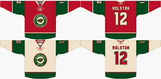
Check this out, Minnesota Wild fans. Some among you seem to think your team can break from the pack and wear something other than white at home. Outrageous! Seriously, though. Check out this fan-created concept.

We have heard that the Wild will be converting their red third jersey to their permanent home jersey, dropping the greens altogether. But this design suggests using the wheat color on the road jerseys. A radical concept to be sure, I think it would be great! All that white... it blends into the ice, you know?

Actually, I like both of these designs a lot. I think they would be among the best in the entire league if the Wild go with something in this neighborhood. But I want to know what Wild fans think. Do you prefer the red or green at home? And would you like white or wheat for the road sweaters?

Thursday
Aug022007

Jersey For New Jersey

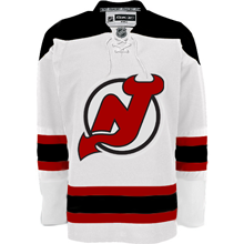
How many times do you think I'll be able to make that joke as we get information about the New Jersey Devils new uniforms? Anyway, today I have a fan-made graphic to share. It comes from a Devils fan message board.

It's not the actual jersey, of course. I mean let's not fool ourselves here. It's merely a manipulation of the Boston Bruins' road jersey which was unveiled back in June. It just gives us an idea of what can be done if the team were to keep its current uniform design on the new Rbk EDGE jersey cut.

I'm not sure I like the collar laces, though. What do you guys say? Should the Devils keep what they've got or go with something completely new in the vein of, say, the Predators?

Wednesday
Aug012007

Mull Over These, Sens Fans

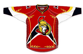
We've already seen the purported new Ottawa Senators logo yet we haven't heard word one from the team with regard to this matter. No worry, because where there's image manipulation software, there's hockey fans to use it. Enter this.

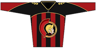
I'm sorry, but what a mish-mash. I applaud the effort but, um... yeah. There's sure a lot going on. And hey, they make use of that new logo we've been seeing. On the shoulder, though, this fan opted for the striped old-time Ottawa logo. Speaking of stripes, how about this puppy?

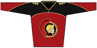
The vertical stripes make it look like a European soccer jersey to me. However, I do like what this designer chose to do with the logo. He dropped the black pointy things from behind the galea and gave the logo an overall 3D effect. For a look at a cleaner version, sans the stripes, see the image below.

Impressions, Sens fans? Do you guys like the potential new logo? Or do you prefer the proposed design in the bottom two concept sketches? Or would you rather not see it change at all?

Wednesday
Aug012007

Covered In Coyotes Concepts

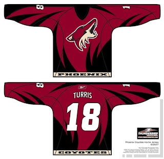
I feel like I've been ignoring the Phoenix Coyotes fans out there. This is certainly not intentional. There just hasn't been a lot of news to post for them. Until today, that is. I've scoured the far corners of cyberspace for a few images you might find beautiful or repulsive — or something in between.

This design was created by someone who designs the outsides of racecars, I believe. Anyway, it's really quite — something. I couldn't see them wearing anything like this because the whole reason they changed their logo was that they wanted to go the classic route and simplify everything.

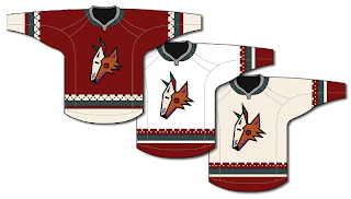
Well, to me, that was a sad thing. One fan designed this jersey set in memory of the old days when the Winnipeg Jets first arrived in the desert.

It's got that desert Indian look that was very cool. This design uses only the head of the original Coyote logo. It was first seen by itself on the green third jerseys they had for a short time. This is closer to what they actually wore in those days.

The big difference being that the Coyotes wore black dark jerseys, not maroon like they wear now.

I haven't seen any Rbk EDGE jersey concepts based on their current logo and uniform design, but haven't you heard, horizontal stripes are so out. Seriously though, don't be surprised if it comes out looking like the Capitals or Blue Jackets new jerseys.

It'd be nice if the league would unveil more of the new uniforms. Chances are we've still got another month ahead of us before we start to see the rest of the teams trickle out. Anyway, Coyotes fans and others alike, what do you all think of these designs?

Tuesday
Jul312007

Last Of The Canucks Surmising (Hopefully)

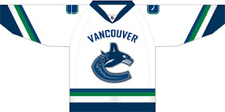
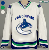
We're anticipating the unveiling of the new Vancouver Canucks uniform tomorrow despite having no official word on that from the team itself. So having said that, there's a little more fan-created artwork I wanted to post prior to that because Canucks fans seem to be the most interested in what's going to happen to their club's uniforms this year.

This design is based off of what appears to be "Fin's Friends" promotional material posted yesterday. The only thing is we've been hearing that the bottom part of the "C" will be white, not blue like it has been in the past. You gotta figure this is at least worth a look anyway and may even possibly be close to what gets unveiled by the team.

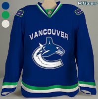
Another fan came up with these designs.

Personally, I'm not a fan of "Vancouver" being written above the logo but I guess it's not for me to say. You Canucks fans have any opinion on that? Tacky? Cool? Doesn't matter?

If I come across anything else, I'll try to get it posted by the end of the day. Meantime, keep your fingers crossed for an official announcement tomorrow.