NHL Tournament of Logos

Entries in jerseys (477)

Saturday
Aug182007

Concept Jerseys For Everybody

I may be playing with fire here, but I've decided to make an Rbk EDGE jersey template available to anyone interested in trying their hand at a creating a uniform concept. God knows I'm not hurting for content, but a lot of people have been asking where to get a template, so I thought I'd try to be helpful for once. If you want to download it, you'll find it toward the bottom of the sidebar on the right.

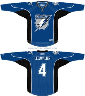
Having said that, I too decided to try my own hand at a concept for my Tampa Bay Lightning. I put only about 10 minutes into it so the quality and overall design might be poor, but I just wanted to show that anyone can do it.

It's not much, but it works in the "leaked" new logos we'll likely see unveiled a week from today at the St. Pete Times Forum. I have a background in graphic design having worked as a newspaper ad designer for about six years (but you might not know it based on that). I know my way around Photoshop, but it is quite expensive and I am quite cheap. So I have to deal with what little I do have.

What I really wanted to do was see how the Bolts' home sweater might look in blue. I've always thought that would be a neat direction to go. Again, very basic and simplistic, but that's been the Lightning's style. I'm rather anxious to see what they've come up with. What would you all think of a blue Tampa Bay uniform? Too much like the Leafs?

So if you've never made a concept, now is your chance to take a stab at it. I mean, just go nuts. And if you think there's something to it, you've got my email address. Send it along.

UPDATE (8:41 PM): Just noticed an oversight on my part. No numbers on the sleeves. Oops.

Saturday
Aug182007

First Photo Of Hurricanes Jersey?

I'm aware of the fact that EA Sports supposedly unveiled the Carolina Hurricanes jerseys earlier this summer, but that stuff isn't for me. I want actual photos. That being said, a couple of people emailed in something I can work with.

Apparently, this photo of Noah Babin was posted on the Carolina Hurricanes web site along with a bunch of other prospects. As far as I can tell, he's the only one donning the new Rbk EDGE apparel, though. You can tell by the collar.

In addition, the jersey also has the thin white striping around the shoulders, seen in the EA Sports images. While this isn't huge news, I thought it would still be worth posting. And for those of you wondering, it won't go on the sidebar until we see the whole jersey. For that, the 'Canes are asking us to hold out until September 16.

Friday
Aug172007

Sens, Sharks Uniform Fan Art

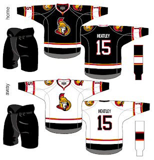
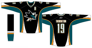
We've seen the new logos (unofficially for one) but we've yet to see the new uniforms that go with them. So why not muse on the Ottawa Senators and San Jose Sharks briefly?

I like the red Senators jerseys a lot, but the black doesn't look half bad. Though in reality, odds are highly in favor of the Sens wearing the red at home this fall. The teaser pic on their web site seems to suggest that. Could be misleading, but I doubt it. I like the larger shoulder patch. More teams should do that. It looks really good.

The only problem I see with these two jerseys is the placement of the numbers on the sleeves. Way too low. Needs to be above the elbows. But wait! There's more!

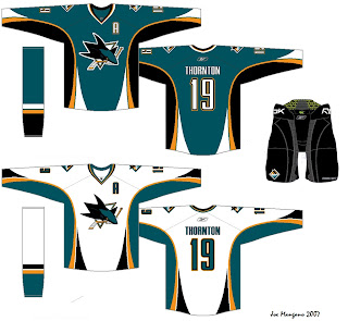
Consider these concepts for the San Jose Sharks.

They're pretty sharp, if you ask me. They could do a lot worse. The new logo looks very good on these. I'd like to see a bigger shoulder logo a la the previous Ottawa concepts. But otherwise I don't have a lot to complain about. Though from everything we've read and heard, I'd lean more towards expecting less curved lines and more straight lines. However, I'm not sure how well that would go with this logo. It's quite curvy.

Anyway, it all remains to be seen. The Sharks have yet to announce a date for unveiling their jersey, but the Sens have said August 22 will be their release date.

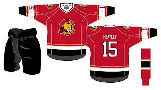
Before I leave you to your own devices for the evening, though, I have a couple of alternates from the same artists who came up with these designs. I know the NHL is dropping the third jersey program for this season, but we can dream, can't we?


Enjoy the rest of your night and don't forget to vote on the Senators-Rangers poll tomorrow morning!

Friday
Aug172007

Mailbag: You Can Stop Sending These Now

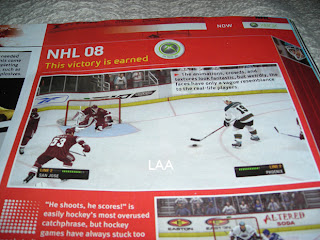
All right, I've said I don't want to get bogged down in the whole video game screen grab thing, but I think popular demand almost requires this one. I've gotten about a dozen emails in the last 24 hours with the following images attached or linked.

From what I've been told, what you're seeing in these pictures is a page from the official Xbox magazine — a yet-to-be released issue I'm assuming. Apparently, the picture above shows a game between the Coyotes and Sharks (a completely new San Jose design we've yet to be treated to officially) in EA Sports' NHL 08. The picture you see here to the left, although blurry, supposedly shows the Oilers and Canucks.

I can't speak to the veracity of these pictures nor really anything else with regard to them. But I just wanted to post them in the hopes that my awesome readers would stop sending me them.

Once again, I don't mind you guys sending in screen grabs from video games, but don't expect me to post them too often. If we're going to see official new jerseys, I'd prefer photos. Thanks everyone!

Thursday
Aug162007

Mailbag: Very Sharp Sabres, Oilers Concepts

Since I've started soliciting jersey concepts from readers, I've gotten a lot. Really. A lot. But sometimes I get designs that really stand out from the rest. Today, I'm sharing a couple of those.

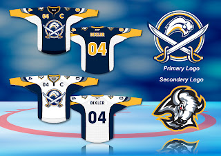
Let's start with the Buffalo Sabres. Some fans were ecstatic over the idea of returning to the traditional blue and gold. They were then left horrified by the "Buffaslug" (I just love writing that). With all that in mind, one talented fan artist came up with an idea that works the past back into the present. Have a look for yourself.

I think it's really cool. The crest logo seems a little busy to me. I think the crossed sabres overlapping the blue circle would be fine. I'm not necessarily sure it needs the buffalo in it — especially with the buffalo logo on the shoulder. What do you think? Is it just because I'm not from Buffalo?

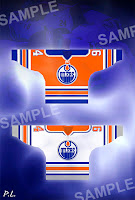
Then we also have a very interesting idea for the Edmonton Oilers. Check out Ryan Smyth in some orange.

Wow. That is orange. Very orange.

But after staring at it for a while, it's started to grow on me. What I really like are the silver accents, especially the silver circle around the Oilers logo crest. It's a very sharp color combination and it would certainly stand out on the ice.

Though just for the heck of it, I'd be curious to see what a blue jersey would look like in that same design.

What do you guys think? I'm sure our very talented artists would love your feedback, good or bad.

Thursday
Aug162007

Stars, Bruins Concept Art

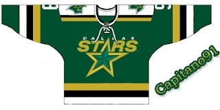
A while back I posted this idea for a redesigned Dallas Stars jersey. Well, another fan put a twist on that design by doing a little reworking of the current Stars logo.

The 3D effect in this version of the logo is pretty cool, though personally I'd prefer to see a complete overhaul of the Stars logo. Keep the colors but come up with a new symbol for the team.

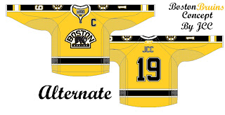
I also have some Boston Bruins concept art to share. These sweaters were designed after the B's unveiled their new logo back in June.

Not too bad, but I'm a big fan of the Bruins' new Reebok uniforms. I can't see any reason to alter them. Classic. Regal. The same designer also came up with an alternate in yellow.

As usual, if you've got an opinion on any of these designs, feel free to post them in comments area.

Thursday
Aug162007

Islanders Unveil New Uniforms!

Today, the New York Islanders made their new Rbk EDGE uniforms official. We got a first look from Newsday yesterday.

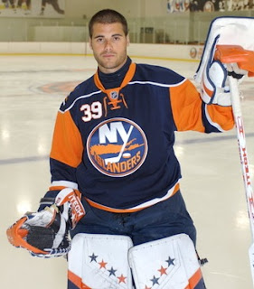
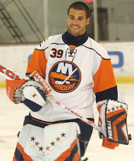
Here is Isles goalie Rick DiPietro donning the blue home threads for the cameras.

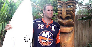
We've also got Brendan Witt posing in the jersey alongside a surf board. I'm not really sure what I should be looking at here. Jersey or surf board? That reminds me, did any of you watch "John From Cincinnati" on HBO this summer? I know it's not hockey related but the surf board reminded me. Weird show but it was awesome.

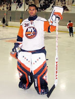
Anyway, moving right along here. If you needed a reminder of what the road jersey looks like. See left.

By the way, I'm adding these photos and more to the great big Rbk EDGE uniform photo gallery. If you've got any photos that I don't that warrant being in this gallery, feel free to send them along. The more the merrier, I always say.

Finally, huge thanks to all the people who sent in pictures and links to me. You guys are awesome and you're why this site works so well! Thank you!

Thursday
Aug162007

Bolts Promo New Logo, Uniform

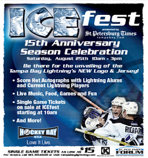
The Tampa Bay Lightning have officially announced on their web site they will be holding ICEfest on August 25 where they will unveil the new logo and uniforms.

I believe this is the first time the team has actually referenced a new logo — even though we've apparently already seen it. But not to worry, despite the fact that I now live 120 miles away from Tampa, I'll be there next Saturday to get video and pictures of my own to bring back and post right here. Can't wait!

Wednesday
Aug152007

Newsday Makes Isles Unis Official

I'm still trying to gather more information, but apparently, Newsday posted a photo yesterday of Rick DiPietro in the New York Islanders' new road jersey.

Even though it doesn't come from the team directly, it's safe to say we can confirm this as the real deal. I'm adding it to the sidebar, making the Isles the ninth team to show off their new duds. If you guys find anymore info or photos, please let me know.

Thanks to the guys that emailed me initially on this photo.

Oh, and yikes. What is going on there? The weird stripes around the shoulders... the sleeves in a different color. I'd definitely like to see some more angles of that jersey. Thoughts?

Wednesday
Aug152007

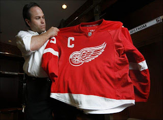
Wings Rearrange Captains' Jerseys

A reader emailed me a link to this article from the Detroit Free Press regarding the Red Wings new uniforms today. Apparently, today the Wings officially unveiled the jerseys to the public (despite having posted images of it online last week).

Notice anything strange about it?

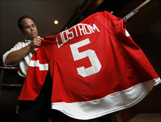
Traditionally, the captain's "C" is worn on the player's left shoulder — this is true across the league. But apparently, because the tip of the wing logo reaches too high, the "C" would have collided with the confluence of three different types of material. So to avoid that problem, Niklas Lidstrom's "C" will swap sides starting this year.

Here you see equipment manager Paul Boyer showing off the new threads. Not too shabby, if you ask me.

Naturally, this will affect Detroit's alternate captains as well. Just like the "C," the "A" will also go on the right shoulder now. What do you guys think of the new location? Does it really make a difference?