NHL Tournament of Logos

Entries in jerseys (477)

Saturday
Aug112007

Sabres, Pens Concept Art

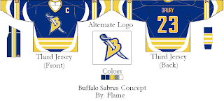
The campaign against the slug trudges on as I can't hit a single Buffalo Sabres fan site or forum without reading the words "death to the slug" somewhere within. That in mind, I stumbled across a few concepts traditional fans should be all right with, barring an all-out return to the 1970s.

If you think the logo looks familiar, look no further than the old red third jersey. Personally, as a non-Sabres fan, I was always of the opinion that the crossed swords would make an excellent primary logo for that team. It could permanently relegate the buffalo to the shoulder where it belongs. Of course that's coming from a Lightning fan

Our designer also came up with an alternate uniform to go with these two. I'm afraid it goes a little overboard with the stripes though. I think we've past the point where it might've looked aesthetically pleasing. As far as the colors, I don't think the blue looks that bad. I think the current blue is a little darker than it needs to be.

Any thoughts, Sabres fans? I know you hate the slug. Is this the way to go? How do you feel now about the red-black-silver days of the late '90s?

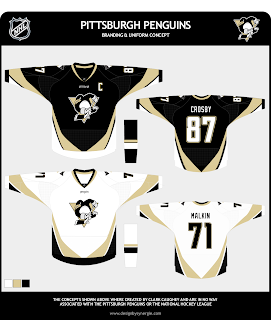
Also, I just thought I'd throw in this nugget. One fan came up with this concept for the Pittsburgh Penguins.

Check out that penguin! That one, I'm afraid of. I'm pretty sure it's culled from a minor league logo and it's a little cartoony.

Penguins fans, would this be a travesty? Would it be that bad to make a return to the old '90s penguin? Should I stop bothering you and deal with the one you've got?

Feel free to leave your opinions below, all. And remember, if you've come across any designs I haven't posted or have any of your own you'd like to share, you can submit them to nhllogos@gmail.com.

Saturday
Aug112007

Additional Ducks Designs

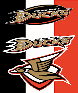
The Anaheim Ducks logo and uniform designs I posted on Wednesday were mostly well-received though a handful of you were wary. So I came across a couple more I thought might be worth considering.

These concepts are in keeping with the current color scheme with some minor alterations. What about using the duck logo from that original design in the new colors and making it a secondary or converting the current logo to secondary.

That's one possibility. Another is more nostalgic, keeping the old Disney logo. It mixes the new colors with the old logo.

Would you buy any of those jerseys or should we just leave well enough alone and stop messing with it?

Friday
Aug102007

Time To Get Your Blackhawks On

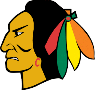
All right, if you've been reading my nonsense in the tournament matches, I have good news and bad news. The good news is, today was the last day of that. Reader voting starts Sunday. The bad news is somebody else, it turns out, thinks the Chicago Blackhawks could use a logo upgrade. (See, I'm not the only person who doesn't think it's the best in all of sports.)

Now I'm not saying this design is totally the way to go. I think it's a good start, but also that it could use a little work. Sneak a peek.

Don't freak out! It's just fan-created concept art. It's not a real 'Hawks logo by any stretch.

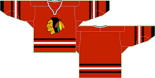
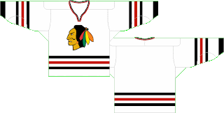
But that, I'm a little more impressed by. I still think a team's logo should be dominated by its primary colors (here: red, black and white), but this wouldn't be all bad. Well, at least as far as I'm concerned, it wouldn't. What do you guys think? Should I take the advice of John Tortorella and shut my yap on this subject or could we have something here? While you consider, check out these jersey designs.


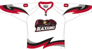
Oh, and just to freak you out a bit, somebody emailed me this concept.

Now lay it on me. I can take it.

Friday
Aug102007

Wild, Lightning Fan Art

Like I said, it's a light day. Sorry about that. Things are going to get interesting this weekend though. I hope everybody drops in to start voting on Sunday. I need you all to decide which team has the best logo. Not me.

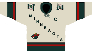
Here's a different sort of design for the Minnesota Wild.

It sort of steals the whole text across the chest thing from the Avalanche — who stole it from the Rangers. I'm not sure how Wild fans will feel. Probably won't be "wild" about it. Get it? Okay, stop. That's enough. Kind of like the "State of Hockey" logo on the shoulder. Thoughts?

This design is a reimagining of this one I posted the other day. It's kind of funny. Not to worry though. Don't expect anything like this to ever seen the light of day.

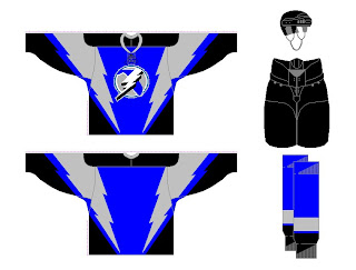
But wait, I have more. I was sent a few designs for the Tampa Bay Lightning. See the following image.

That blue might not be quite the right shade, but I've often wondered what the Bolts would look like in blue. The infamous third jerseys from the late '90s were mostly blue and I sort of liked those. As for the laced collar, I'm not sure that would work well for the Lightning.

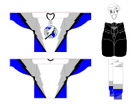
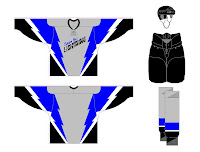
There were also these two designs. A lot of people have commented that a gray third might be the way to go for the Bolts. I'm not so sure, but I guess it would depend on the overall design so I don't really know how I'd feel about it.

How do you all feel about these designs? You think something along these lines would be the way to go for these teams or should we let it be handled another way?

Friday
Aug102007

Mailbag: Some Radical Jersey Concepts

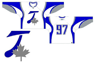
Um... it's a slow day so I apologize in advance, but this is pretty much all I have to offer. Forgive the image and design quality, but I was emailed this fan art. I'll try to find some good stuff before I call it a night.

For those who haven't deduced it, this is a radical concept for the Toroto Maple Leafs. It's interesting. Can't think of much to say beyond that. It looks like it makes use of the leaf on the Canadian flag in place of the team's logo. I like the extra silver, but on the whole, what do you guys think?

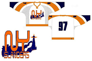
The next one is another radical concept for the New York Islanders.

Many of the Isles concepts we've seen have incorporated a lighthouse in some way and I'm a big fan of that. I don't think we need to lose the classic crest from the jersey, but could it hurt to add a secondary on the shoulder?

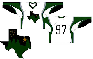
This next design is pretty far out as well.

If you hadn't guessed, that would be a concept for the Dallas Stars. You've got a starry night scene set in the forest inside the outline of the state of Texas. It's a very interesting concept but Texas doesn't seem to me like a forest state. Those trees make this feel more like the Minnesota Wild logo.

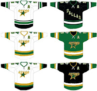
Why don't we take a look at less-radical idea. I kind of like the notion of the Stars going with "DALLAS" written across the crest on the road jersey. These are backwards if that's the case, but it's interesting to look at nonetheless. What do you think of the green jersey in the middle? Too North Stars or should Dallas adopt something in that vein veering from the black?

Anyway, hopefully I'll have more to offer later. I know this isn't spectacular artwork, but still worthy of looking at I thought.

Thursday
Aug092007

Revisiting Some New Uniforms

The designs in this post are for teams that have already unveiled new uniforms so, like the rest of the concepts I post, it's just for fun. Hey, I can't post artwork the caliber of that Anaheim stuff everyday.

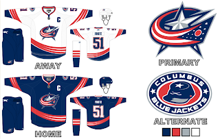
Here is what one fan thought the new Columbus Blue Jackets jerseys should look like.

I really like the curved stripes. Very interesting. I'm a big fan of the real Blue Jackets uniforms, but these aren't bad either. Maybe the team could consider something in this vein for an alternate once that program is reinstated in a year or two.

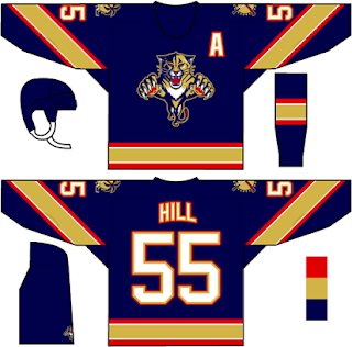
Then I also had a few ideas for the Florida Panthers emailed to me.

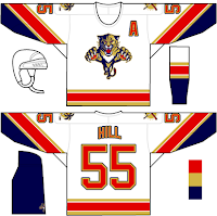
We've never seen that kind of gold on a Panther jersey. I wonder how it would look on the ice. I feel like the Panthers have always been more associated with red than blue, which is why I thought it was strange their home Rbk EDGE jerseys are blue. Then there's these two.

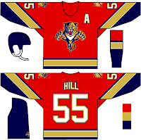
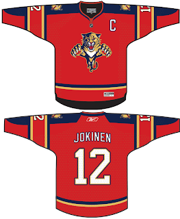
The white jersey seems really familiar and the red is almost how it should be. Speaking of red, one fan based a red jersey off of the new ones just released last month.

They also tried wrapping the elbow stripes completely around the sleeve as opposed to just halfway. I think it makes a world of difference. But I don't really mind the elbow stripes the way they are. I just know there are a number of people who are annoyed by it.

Any thoughts on these designs? Remember, if you would like to send in a design or you own or one you've seen elsewhere on the web, you can submit it at nhllogos@gmail.com.
Thursday
Aug092007

Mailbag: Sens Fan Concepts

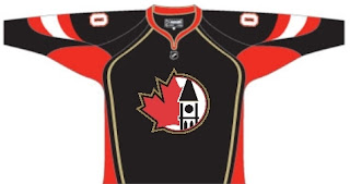
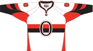
With the news today that the Ottawa Senators will be unveiling their new jerseys in a couple of weeks, one fan has mused on some concept designs. These were emailed to me and I thought I'd share them.

This black jersey makes use of one of the club's secondary marks. It's a nice logo but I can't imagine it being the primary. What do you guys think? Could it work or should we stick with what we know?

We've seen a few concepts with the old-time Sens design but this one is slightly different. Instead of stripes going the length of the sweater, this one goes more along the lines of the Canadiens. Definitely an interesting look.

Comments can be left below if the spirit compels you.

Thursday
Aug092007

It's Official: Expect New Sens Unis August 22!

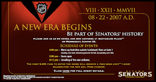
According to the official web site of the Ottawa Senators, we can expect to see new uniforms on Wednesday, August 22. So get excited!

The team doesn't specifically cite the new logo we've been seeing around, but I'm sure it will be unveiled along with the jerseys. We'll wait and see at 6:15 PM on VIII/XXII/MMVII as their graphic puts it.

Sens fans, are you excited?

Wednesday
Aug082007

Red Wings Unveil New Uniforms!

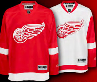
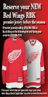
Giant tip of the hat to a reader for emailing in this information. There was no big fanfare or public unveiling event, but the Detroit Red Wings have officially unveiled their new Rbk EDGE uniforms. Check them out.

The Red Wings join the Flyers and Rangers as teams making the new jerseys available for pre-order on the web site. The graphic to the left can be found on the Wings' web site and it links to the order form. Detroit has separated itself from the Flyers and Rangers, however, by making images of the new jersey available.

Anyway, the Red Wings become the eighth team to unveil their Rbk EDGE jerseys and we eagerly await the rest of the league.

Wednesday
Aug082007

Amazing Ducks Concept Art

Earlier in the week I posted some awesome concept art that went over a storm with you guys. We saw designs for the Ottawa Senators and Boston Bruins as well as the New York Islanders and Atlanta Thrashers.

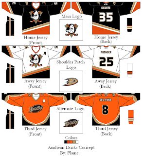
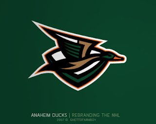
Today we're treated to some work on the Anaheim Ducks. These designs were based on concepts that "leaked" prior to the unveiling of the new Ducks logo last summer. Have a look and be impressed.

If you ask me, that's what the Anaheim Ducks should look like. And it couldn't be further away from the old Mighty Duck look. However, while the green is sharp, tan doesn't make for a vivid secondary color. So what about orange?

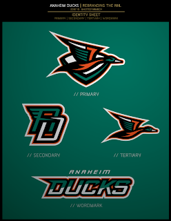
Our favorite designer upgraded his original logo with much more vivid colors. Can anyone deny this would be one killer logo package?

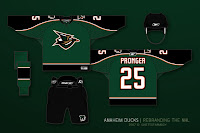
If the logos weren't enough for you, check out the uniform designs. Any NHL team would be lucky to look that good. How come this guy doesn't already work for the league?

Are there any Anaheim fans reading that would be repulsed by something like this? Would that even be possible?

Anyway, it's artwork like this that gets me so excited to do a blog like this. So what do you think? Am I going a little over the top with my glowing praise? Or are these designs really that good?