NHL Tournament of Logos

Entries in jerseys (477)

Wednesday
Aug152007

Flames Post Online Jersey Teaser

The Calgary Flames have formally announced September 4 as the date for their official jersey unveiling. A date I already have in the sidebar countdown.

Unfortunately, the image they posted is merely a teaser and while can't see the finer details of the jersey — such as a shoulder patch — it does appear that the home sweater will be red with a lace-up collar. Pretty nice. Can't wait to see the rest of it.

By the way, big thanks to alltherage for pointing out this information. For a quick link to the order form, check it!

Wednesday
Aug152007

A Few Ideas For Bolts

As is probably more than painfully clear, I am a huge Tampa Bay Lightning fan. So when artwork for my Bolts gets submitted, naturally I'm more than eager to post it. First off, as a reminder, this is allegedly the Lightning's new logo.

Anyway, today I have lots to share. We'll start off with the cream of the crop.

This pair of Lightning logos was designed by a local advertising firm, apparently. I was an overall fan until my girlfriend pointed out that the hockey sticks look more like golf clubs. Now that's all I can see. But if the sticks could look more like sticks, I think this would make for a very strong shoulder patch. Not a great primary, but definitely an awesome secondary. I like the skyline in the one on the left.

Moving along, though. Another designer emailed me some ideas for a new Lightning logo.

Everything there seems like it's about to fall over. I'm not sure why it all needs to lean so far to the right that way. I also can't speak very highly of the secondary mark, which appears to be drawn by hand. I applaud the effort in trying to make the "B" in "TB" look like a lightning bolt, but I don't think it's working out.

And finally, another fan designer sent in these concepts. How about a Lightning jersey in gray?

Same artist also came up with a design borrowed from the Vancouver Canucks' previous third jersey. Have a look at that one.

Any other Lightning fans out there? What do you think of these ideas? Anything worth considering in here or should we tie it all to a kite in a thunderstorm?

Wednesday
Aug152007

Revisiting The Senators

On Monday, we got a preview of the Ottawa Senators' new logo set courtesy of Canada's government trademark web site. They were black and white on the web site, so we had to imagine how the coloring might work (at least for the secondary mark).

The image I posted had the outer circle in gold. Here's how they might look in red or white.

As for the primary logo, one fan ran with that on a jersey concept. See below.

Not sure how I feel about the striping across the chest. Certainly an interesting choice, though. Thoughts on that?

For the part of you that persistently resists change, one fan designer altered the new logo to mix in some of the old.

Truthfully, I'm not a fan. Until we get to the shoulder patch. I think that is pretty cool. I like the old-time stripes and the contrast in that logo, which you'd think would be hard to achieve, is excellent.

Sens fans, what do you make of all this here? Good? Bad? Ugly?

Wednesday
Aug152007

Canucks, Pens Fan Concepts

When I don't have real news, I invent news. That should be my slogan. No, this isn't news. This is just fun. The fan concepts keep on rolling in. Let's start with the Vancouver Canucks.

I think the only problem with these is the giant "VANCOUVER" sprawled across the chest. Kind of unncessary and not aesthetically pleasing. I'm liking the side stripes on the sleeves and pants. They form Vs if you didn't pick up on that.

Anyway, I've also got some Pittsburgh Penguins artwork to share with you all. Check this out.

While you're trying to process that, let me fill you in with some background. The folks over at The Pensblog submitted this idea for a new series of Pens uniforms. For those unfamiliar with the history of the club, their original uniforms were pale blue a la the current home jersey of the Atlanta Thrashers. This, despite the fact that the triangle in the penguin logo was always yellow. But that yellow and the blue worked well together. I'm not too sure about the two-tone blues on the Vegas gold.

Anyway, I mean no offense to the designers as I share my opinion. I think the re-introduction of the blue wouldn't be all bad if done right. What do you guys think on that subject?

While you ponder on that, I'll share with you a design tweak someone emailed me for the much-loved Penguins logo.

Look close at the eyes. He's more pissed off than ever. Somebody woke up on the wrong side of the Antarctic ice shelf. Oh, and he's got a nice new shiny belly. Improvement or not?

Tuesday
Aug142007

Some Snazzy Leafs, Sabres Stuff

It just keeps getting better over here at the NHL Tournament of Logos. Hope you guys are all voting. If you haven't yet, there are three open polls that you can have your shot at.

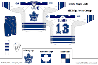
Anyhow, while we wait for all the votes to trickle in, I've got a few more concept designs to share with the class. Let's start with everyone's favorite Ontario-based team that isn't the Ottawa Senators — the Toronto Maple Leafs. A reader emailed some great designs I thought were cool and different. Behold.

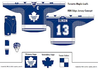
He sent a handful but I felt like these two were the cream of the crop. They're pretty sharp and they do away with that "TML" logo that fans apparently hate with a passion. Personally, I thought it worked. It gave them a 21st century feel without altering a logo that hasn't been messed with for decades.

But what do I know? I'm just that Florida guy writing a hockey blog, right?

Let's cross the lake and see what's going on stateside. I have Buffalo Sabres artwork for you. Have a look.

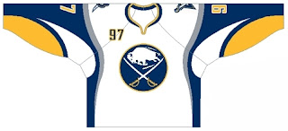
What do you guys make of this? My belief is that if you're going to use the old logo, you've gotta use the old jerseys as well. I'm not sure this mixing and matching really works. Thoughts?

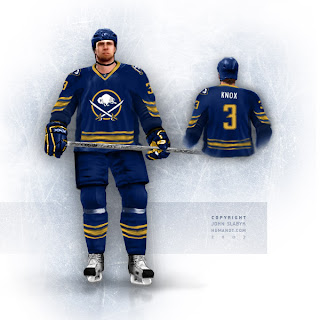
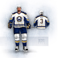
Plus, from hockey logo and uniform designer extraordinaire John Slabyk comes another look at his all too cool Blue & Gold Project on the backs of a dude in NHL 07 or something like that. It's quality work, really. You don't see that sort of thing every day.

If those were the Sabres' uniforms, stores wouldn't be able to keep them in stock, and not a single hockey fan in the greater Buffalo area would file a complaint — or at least that's my small-minded belief.

Should I stop going on about them now?

Also there's this design which makes us see why the "B" with sword through it should really be left on the shoulders.

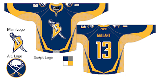
I don't hate it, but at the same time, I feel like you could do so much better with the crest.

And as always, there's much more where that came from, but you don't want to spoil your supper now. I'll hang onto it for now... save it for later. Hope you're enjoying the tournament and all the Rbk EDGE speculation.

It fills the empty hours.

Tuesday
Aug142007

Conceptualizing The Flames, Blues

It's another one of those slow news days. So to help fill the void, I have chocola— er, I mean jersey concepts. Let's start out with some Calgary Flames action.

It's pretty basic, though a lot like other stuff we've seen. My only complaint is the clashing of vertical and horizontal stripes at the base of the jerseys. You know my old line. Go all horizontal or go all vertical, but don't go both. Yeah, I've never used that line before but it's probably a good one.

Also, word is those shoulder logos with the horse dealing with some serious sinus issues are toast. (Ha.) In fact, word on the street is there may be an entirely new shoulder patch introduced this fall. We'll wait and see, of course. The official word comes down from the team on September 4 if all goes as planned.

I've also got some fan-designed St. Louis blues jersey concepts to share with you. They're pretty simple, harkening back to the old days. Nothing drastic, but I expect to see something a little different with the real Blues uniforms.

Again, we'll have to wait around for official news from the club. We don't have a hard date as of yet for the unveiling, though their first pre-season game is on September 16 if you wanted to pencil that in on your calendars.

Then I thought I'd leave you with this.

What if they changed their name to the St. Louis Whites? No, but seriously... If you feel inclined to comment, you may do so in the marked area below. Thanks again for your patronage!

By the way, I should point out that a lot, and I mean a lot of people have sent in jersey concepts over the last few days. Unfortunately, I can't post them all right away. But with any luck, if you've sent one in, chances are you'll see it on this blog one of these days. Don't lose hope.

Monday
Aug132007

The Rbk EDGE Photo Gallery!

Here's a little something I thought might be helpful. So as to be able to separate the fact from fiction, I set up a photo gallery where you can view all photos of the new Rbk EDGE uniforms that have been officially unveiled.

The Official Rbk EDGE uniform photo gallery!

At this point, only 8 teams have made their jerseys official and I'm compiling photos of these new jerseys in this gallery. If you've got any photos that I don't have in those galleries which would be worth adding, feel free to email them to nhllogos@gmail.com.

My goal is to compile a huge gallery of photos of these new jerseys. I know there are a ton out there that I don't have, including players wearing them on draft day (Bruins, Capitals, Blue Jackets), so if you know where to find any, please send images or links. Let's make this gallery the go-to place for all things Rbk EDGE!

Also, I won't post photos of any new jerseys unless we know for a fact they are the real deal. So the photos we've been seeing of potential Canucks and Islanders jerseys don't count. Let me know what you think!

Monday
Aug132007

Blackhawks Fan Art For Your Viewing Pleasure

I've got some Chicago Blackhawks concept designs to share. Let's dive right in.

Here's a set of 'Hawks jerseys in the new Rbk EDGE style. They're pretty sharp — and safe, as they're in keeping with the current design.

I like the black alternate jersey with the old logo. It's a rather nice set that I think most Blackhawks fans would have a hard time complaining about.

Personally, I've never been one to believe that Chicago has one of the best uniforms in sports (as is widely believed) and I don't think it would hurt if they went with a complete overhaul. And yes, I'm prepared to take the beating I've got coming to me for uttering such filth in an open forum.

Anyway, if someone can point out what features of this uniform make it so good, I'd be all ears. If not, then I don't know. Just enjoy these fan designs.

And these too.

I think these designs are pretty cool, mixing the old with the new. The stripes are different, but not all bad. Would Blackhawks fans object to something along these lines?

What do you guys think? Am I full of shit about the Blackhawks logo? Is it really as good as everyone says? Would you like me to stop talking about it?

Sunday
Aug122007

Thrashers Uniform News

I'm a little behind the curve on this one. The Blueland Blog at the Atlanta Thrashers' official web site posted news on the new uniforms last week. Have a read.

August 7, 2007

New Uniform News

Ben Wright
Blueland Blog

First off- my apologies for the lack of posting lately. Things have been pretty quiet on the Thrashers front, and I was on vacation. I'm back though and hopefully things will pick up soon. On to a bit of uni news.

Plenty of people seem to be wondering what the new Reebok Edge Thrashers uniforms are going to look like and multiple people have asked me when they're going to be unveiled.

Well, I have some answers, but no pictures. Despite rumors to the contrary there are no major changes planned for the uniforms. Naturally they're going to look a bit different to keep them in line with the league-wide look being rolled out by Reebok, but the logo, colors and general design are staying the same. Some of the trim and accents will change but it's not a uniform overhaul.

So when do you get to see the new threads for yourself? During training camp, which begins in mid-September (on the 13th I think, but I'll have to confirm that).

So stay patient and relax. There are no secret plots to do away the blue uniforms.


There you have it, Thrashers fans — semi-official news on your team's new uniforms. Anyone who was worried about big changes may now have their minds put at ease.

Big thanks to Mike for emailing in this information. I'm going to go ahead and place September 13 in the sidebar countdown. If the date changes, I'll update the countdown to match.

Sunday
Aug122007

Concept Art For Sens, Kings

Thanks to everyone who's placed their vote here on the first day of the Championship Tournament. Exciting stuff.

Anyway, I've still got fan artwork to share. We'll start out with the Ottawa Senators amidst all the news of their logo leaking. This concept ignores that logo (or was perhaps created prior to its leak).

It makes the current secondary logo the crest and sends the current primary to the shoulders, but beneath the shoulder elements. I'd be curious to see how something like that actually looks on a player. I think those are pretty sharp, even with the vertical stripes under the arms. Only, if it were me, I'd avoid doing vertical and horizontal stripes together. What do you guys think?

I was also emailed this concept for the Los Angeles Kings. I know they've already unveiled their new jerseys, but these aren't actual possibilites anyway, are they? It's just something fun to stare at while we wait for the hockey season to start again.

I think what the designer's done with the shoulders and sleeves is very interesting. It also seems he isn't a fan of the "LOS ANGELES" text across the bottom of the sweater. Seems a lot of Kings fans don't care much for that. I think it's unique. Is it a cool element or should they dump it?