NHL Tournament of Logos

Entries in news (596)

Wednesday
Nov072007

Connecticut Day

One last post for today. It's Connecticut Day over at the Tournament of Hockey Logos blog. Reason being the state's two AHL franchises are going head to head in the AHL Tournament of Logos today. Head over and vote!

Meanwhile, I figured I'd draw in The Nutmeg State's NHL connection — the Hartford Whalers. Got some concept art, of course.

It's a peek at what the Whalers might've looked like had they made it to the Rbk EDGE era — and hired the same designer as the Calgary Flames. Notice the shield from the state flag on the shoulders.

I do like the designer's choice of thin lines on this jersey. I bet it would look killer on the ice. Too bad we'll never find out.

Anyway, I hope you enjoyed Connecticut Day. Perhaps one day soon will be Pennsylvania Day. I've got a ton of Flyers/Penguins artwork.

Wednesday
Nov072007

Reworking The Oil

The concept art has been flooding in over the last several days, so it's time to share a bunch. We'll begin with the team whose uniform finished second to last in the NHLToL's Uniform Ranking. The Edmonton Oilers.

Starting with my personal favorite, here. They're much busier in comparison to the current sweaters, but it would be a welcome improvement. Perhaps I speak for myself, though. Let me know. I just think that the Boston Bruins hit it right on the nose with their new sweaters. Why shouldn't other teams have a shot at something similar?

Especially the Oilers.

Another sharp design that was submitted seems to be based off of the Columbus Blue Jackets. See what we're getting at here? The Bruins and Jackets finished #1 and #6 respectively, in the Ranking. That has to say something.

Finally, it's not so much a jersey concept I wanted to share, but a logo.

I don't like it as a primary mark, but certainly something similar would be nice on the shoulder as a secondary. Of course you'd have to get past the whole Houston Oilers logo in there. But a little imagination would solve that problem.

So kudos to the artists on all these designs. Really top notch work! Keep it coming, everyone!

Wednesday
Nov072007

Judge Dismisses MSG's Lawsuit

As a followup to a story I ran a couple months back, a judge has ordered the New York Rangers to relinquish control of their web site to the NHL. As expected, MSG is appealing the decision. What a bunch of whiners.

While I'll admit to the fact that the NHL's new web site system seems to be hurting the overall design of the individual web sites — and that's coming from a graphic design perspective only — as far as content, I couldn't be more pleased. Hey speaking of which, anybody interested in a team web site tournament? I think that would be kind of funny.

Let me know what you think of that in the comments. In the meantime, here's the article from the AP.

November 2, 2007

Judge refuses to block NHL from taking control of Rangers' Web site

Associated Press

NEW YORK — A judge refused to block the NHL from taking control of the New York Rangers' Web site despite claims that the league is acting like "an illegal cartel" by controlling team promotions.

U.S. District Judge Loretta A. Preska said Friday that the NHL seemed on solid legal ground when it decided to take control of its clubs' Web sites to strengthen the quality of its Internet relationship with fans and advertisers.

She said in a written opinion that her conclusion was "bolstered by the fact that MSG has shown no harm whatsoever to consumers, especially in light of the facts that the team maintains control over most of the content of the new Web site and fans can still get access directly to the Rangers site through newyorkrangers.com."

Preska also said evidence showed that fans prefer the league's new Internet strategy over one that left more control in the hands of the individual clubs.

The ruling said the league had decided it was necessary to create a league brand with centralized control of team sites to compete with other major sports entertainment providers.

Although the judge hasn't yet heard all of the evidence in the case, she refused to block the NHL in its efforts while the litigation proceeds, a process that could take months.

She said it seemed unlikely that MSG would succeed in claims contained in a September lawsuit.

In a statement, MSG promised to appeal, saying it still believed the Rangers will be irreparably harmed if the Web site is left in the NHL's hands.

"This decision is only one step in what will be a very long legal process and we look forward to having the opportunity to present the facts, which support our position," MSG said.

Earlier this year, at the start of hockey playoffs, MSG said it increased its competitive offerings by making Rangers-branded merchandise available through the Rangers' Web site rather than a catalog, and by making games available to subscribers on its Web site.

The NHL forced MSG to withdraw the plan by imposing a $100,000-per-day penalty. When the company refused to pay the fines, the league withheld $200,000 from third-party payments due MSG, MSG said.

Monday
Nov052007

Third Tourney Begins Today!

Fittingly enough, the third tournament here at NHLToL will be third jersey logos — those crests that donned the sweaters of your favorite teams. I've narrowed the pool to 16 logos, as I showed you back in September. And each will vie for the title of the NHL's best third jersey logo.

Voting begins today so keep an eye out for that first poll. In the meantime, check out the new bracket now located in the sidebar. It was created almost completely randomly (thanks to Random.org). Though I'll admit I did place the two Anaheim logos against each other in the first round on purpose.

Enjoy the tournament!

Sunday
Nov042007

Computer Issues

Hey, I know I told you guys to expect some announcements today about future tournaments, but unfortunately I've been experiencing computer troubles which I'm really not happy about. You should expect to see some news for sure tomorrow. Cross your fingers.

Sunday
Nov042007

Winter Classic Goes Retro

The NHL's official online shop suggests that the Buffalo Sabres and Pittsburgh Penguins will be donning vintage sweaters for the Winter Classic which takes place on January 1, 2008. The photos listed can be seen below.

Those are nice jerseys. See Sabres fans? This is still your real logo, regardless of what your team wears every night. It makes it more special when they save it for occasions like this. Or maybe that's just me.

For more on this story, check out Going Five Hole. My thanks go out to Sean for the tip!

Saturday
Nov032007

Johnny Canuck

Folks in Vancouver have been hard at work putting together concept art for their team. I'll share some of it with you now.

When the Canucks unveiled their new uniforms a few months ago, I was of the belief that they'd planned to introduce a completely new look and a brand that could last a very long time. Well, that's where this team seems to be really challenged. They need an identity and this logo — among the new marks unveiled this season by the club — could've have been just the thing. I really do hope it makes its way onto a jersey one day.

Even one just like this. Although it does stink of Whalerness. Maybe not so much with the silver or something. I don't know.

Or we could just go all out with the old Johnny Canuck logo.

Personally, I prefer that "V" logo. It's just killer. Oh, and where's the green? Perhaps you ought to just revert to the '80s colors.

That's a heck of a jersey. And 08 as a sweater number? Weird. This barely escaped the clutches of Freak Out Friday.

And lastly, there's this.

What say we just go nuts with the crest and wrap it completely around the sweater? That would be interesting if teams started experimenting with something like that. Remember those original Mighty Ducks third jerseys from the '90s? On second thought, maybe not such a great idea.

More later, perhaps.

Oh yeah! Don't forget to get your votes in on the Vintage Logo Tournament final if you haven't done so yet. It ends tonight!

Tomorrow I'll have lots of big announcements on TWO new tournaments beginning next week. That's right, two! Should be exciting! Be sure to check back.

Friday
Nov022007

Just To Freak You Out XIII

It's lucky number 13 tonight on Freak Out Friday. Hope you guys get weirded out by what I have to share here.

I don't quite know where to begin.

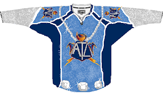
Wow, I don't know what you did to deserve that, but it must've been pretty bad. Now if you're thinking that looks somewhat familiar, consult a post from last month.

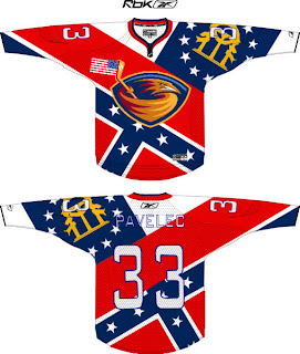
And the hits just keep coming. Flames, take a clue from the Thrashers. This is how you do it up if you really want your provincial/state flag on your jersey. The scary part is that half of it is what seems to be the Confederate flag. Yeah, 'cause rednecks and hicks just dig hockey.

All right so let's head up north where they can really claim the sport. Scary thought alert. Imagine the Rangers and Flyers swapping colors.

On second thought, don't. It's too horrible. Speaking of horrible, check out this Rangers jersey concept.

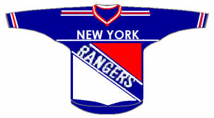
That's what scary is. I know the new EDGE jerseys are supposed to have larger crests, but somewhere a line's been crossed.

Anyway, let's head west. Here's a color combination that doesn't work on a jersey.

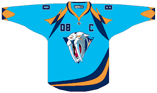
The Nashville Predators are a hockey team, not a figure skating team.

Right?

Yikes! That logo. And while we're on the topic of bad logos, consider the following.

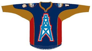
Oilers fans, you think you've got it bad now with your half-a-stripe elbows and practice-jersey looks. What if this happened? Don't even think about it too much. Your head will explode.

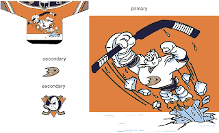
We'll wrap things up in California now, if you don't mind. And sometimes you have to reintroduce a winner — like the 1996 Mighty Ducks third jersey. Only the Ducks have new colors now.

That is something.

What we're finishing the night off with might be hard to look at. Remember the old Lightning third jerseys from the mid-90s? They had the rain pouring down, lightning bolts down the arms and — the selling point — the wild waves of the bay around the bottom. Well Sharks live in the water.

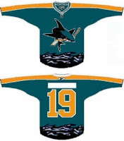
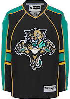
The waves have been stolen. And so has what little dignity might've been left in the new Florida Panthers uniforms when an attempt to create a San Jose concept went horribly awry. This is what happens when folks have too much time on their hands.

Well I hope you all got freaked out enough on this Freak Out Friday. If not, accept my apologies. Better luck next week. Until then, I'm waiting to see what you guys have in store for me next in terms of crazy artwork. Email it along.

Friday
Nov022007

Recolor This

Today's concept post will deal strictly with recoloring things. Yes, that's right. For instance, let's suppose the Florida Panthers had opted for the more traditional red home sweater over the blue one they actually went with.

Not bad, but despite the fact that I loath the Stinkin' Panthers, I prefer the blue. The old red sweaters were nice, but I don't care much for this one pictured here. But that's just me.

Speaking of me being a Lightning fan, someone remade the Sharks' and Habs' sweaters with Bolts colors.

I don't know. No. They'll always be a teal team. That's just who they are. Don't question it. As for the Habs, you can't have that jersey in anything but red. Even blue would be weird.

Here's something else that might make you question whether this is the Freak Out Friday post. Not quite yet. Just a misguided attempt at giving the Canucks new colors.

I'm all for the return of a green team to the NHL, but this is not how that is achieved. No, no, no. I know I'm sounding very negative right now, but just no.

Anyway, here's something I like. The Blue & Bronze Age of the Washington Capitals was my favorite. Even though it fits them perfectly, thematically speaking, the red/white/blue combo is so overused in this sport. Check out the current EDGE unis in the old colors.

It may not be the most brilliant thing you've ever seen, but come on. That's not too shabby. I like the white "capitals." Very sharp, right there, if you ask me. I'd just like to see the black jersey in blue instead. I was more a fan of the blue '90s jerseys for the Caps. I like the black one as a third jersey — not so much a primary home sweater.

And finally, we'll finish off with something a bit different. This is the Islanders uniforms recolored — but for a different team.

Wow, no. I'm sorry, but those sleeves don't look good on any team if you ask me. The more I see it, the less I like it. Granted it looks better in black and orange than blue and orange, but still, I'll pass on this one.

What do you guys think? Any winners here? Or should we go back to the paint bucket?

Friday
Nov022007

Fantasy Update: In The Dumps

I know I haven't updated you guys on the status of the NHLToL fantasy team in quite a while — not that you care — so here goes. We suck!

We're presently in 9th place in an 11-team league. Things were looking good early on but that was before the Lightning started sucking. And if you remember, I stupidly stocked the team with Lightning players. I'm going to have to rectify that because obviously having Lecavalier, Prospal, St. Louis and Kuba is just not working. A 4-0 loss to the Isles? Really? Shameful.

Anyway, I'll let you know how things go this weekend and maybe you guys can offer some advice. Who to drop, who to add, etc. Look for that by Sunday.