NHL Tournament of Logos

Entries in news (596)

Monday
Nov262007

Help Wanted: Blackhawks Logo

Hi everyone. I've hit a wall and I could really use your help finding a decent quality version of a surprisingly hard-to-find logo. The Chicago Blackhawks wear on their shoulders a logo that depicts two tomahawks crossed over a letter "C."

Actually, it looks a little something like this.

The actual logo is close to this but not quite the same. If you're as anal as I am and look really closely, you'll notice the differences I'm talking about.

Notice the serif on the "C" as well as ties on the tomahawk heads and the overall proportions of the two logos. I know the differences are so incredibly minor that it almost doesn't matter. But quality and accuracy matter to me so just indulge me a little if you will.

Stare at those two logos a while and see if you can help. My goal is to have the proper logo for the secondary logo tournament which I'm anticipating will be the next in the series here at NHLToL. Thanks in advance for all your help!

Monday
Nov262007

Art From Music City

Today's concept art is all about the Nashville Predators. Although you might not know it from where I'm starting. Remember all the noise that was stirred up over the summer regarding the possibility of the Preds being sold and relocated to Hamilton? It may be all but out of the question at this point but I've got some artwork that by itself may want to make folks reconsider.

Ladies and gentlemen, the Hamilton Predators.

I have to say that this logo looks so professional that I might have to wonder whether it's been "borrowed." (Let me know if has.) But still, I can't help but love it. And although the jersey set is a recoloring of the Washington Capitals' threads, it's no less awesome looking.

I doubt I'm alone in that opinion. What do you guys think of this concept?

Anyway, we'll move on to some more conservative concept designs. These two really do nothing more than make adjustments to striping patterns. They're nothing special but they aren't terrible.


These next two are a little more unique and perhaps more worthy of an alternate jersey than a primary.

On the left we see the old third jersey logo on white instead of gold. Personally, I was always a fan of the gold jersey that critics have called "baby puke yellow." While I think that's funny, I don't think it's all that accurate.

The design on the right is the new fossil logo on black accented with dark blue. While this design isn't as neat as it could be, if cleaned up, I bet that would look like a killer sweater.

And finally, our last Nashville concept of the night basically deals with some altered colors. How about red and gold instead of blue and silver? It's not a common color combination in the league, but I definitely think there could be worse.

As always, feel free to leave your comments below. I enjoy getting feedback from you guys.

Monday
Nov262007

ECHL Logo Voting!

The ECHL Tournament of Logos has begun. We've got 25 new logos to begin voting on. Head over to Tournament of Hockey Logos to cast your votes and before you know it, we'll have an ECHL logo champion. First up are the Columbia Inferno and Cincinnati Cyclones as part of the preliminary round.

GO VOTE!

By the way, if you haven't been following the ToHL blog, the AHL champion was recently named. The Manitoba Moose ran away with the title. Congrats to them!

Sunday
Nov252007

Rebranding The Sharks

Yesterday we got a look at some first class concept art. And afterward I promised some more from a designer we've all come to think very highly of. He's been on a mission to rebrand the NHL and teams he's already seen to include the Islanders, Thrashers, Senators and Bruins. Most recently, his work on the Panthers and Ducks has been stunning.

Now, he's taken on a new challenge. Witness the rebranding of the San Jose Sharks.

The logo set is unbelievable. It's different yet recognizable in that it's mainly an upgrade of the old logo — essentially what the Sharks did over the summer, anyway.

My personal favorite is the secondary mark. That by itself, should be the primary. The wordmark is notably nice as well, but it's the fin logo that I think is spot on. That's why the alternate jersey here is the one that gets my vote.

And that's not to say I don't love the other two jerseys. Even the lettering and numbering is pitch perfect if you ask me. This design shows that while it makes a nice accent, the orange isn't necessary at all. You can achieve an amazing look with just the teal, black and silver. We can only hope that one day any team looks as good as this.

Finally, there was a slight change the designer made before unveiling his design. Take a look.

The logo on the left is the one he ultimately went with but I certainly see the validity of the other one. It adds more color to the shark, yes, but it's not entirely necessary since the triangle behind the shark is teal (as opposed to white).

I'm very interested in seeing what you guys have to say about this latest design by GhettoFarmBoy, as he is known. He says his next rebrand will focus on the Washington Capitals. No word yet on when we should expect to see it. I, for one, am looking forward to it.

Saturday
Nov242007

The Finer Art

A lot of the concept artwork I feature here on a daily basis is created by amateurs. It's fairly obvious and I think even the designers themselves wouldn't take offense to my saying that. But every so often, I come across work that could only have been created by a professional. It's the reason I have a blog like this.

The template used for these concept designs is probably as close to perfect as we're going to get, visually speaking. I don't know the identity of the artist, but the work is stunning. I'll kick things off with my team — which I haven't really talked much about lately.

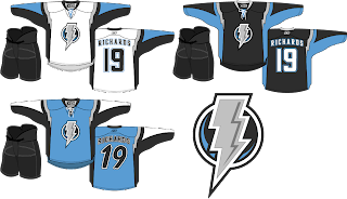
Personally, I love this idea. A new logo like this would certainly take some getting used to but the light blue on black accented by silver looks great! I'm also a big fan of the throwback numbers on the blue third jersey and the lightning bolts around the shoulders. Anyone feel like painting one of these onto a photo of a Lightning player?

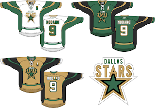
Next here we see an interesting take on the Dallas Stars' logo. I like it but proportionately it seems a bit... off. I think the city name above the logo needs to be in a smaller, wider type. Otherwise, I think the jersey striping looks fantastic and that gold third jersey would definitely get my vote.

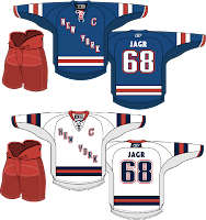
I love the striping on these Rangers jerseys, but the New York across the front isn't working for me. Swap it out with the Lady Liberty logo and I'm pretty sure nothing could compete with that look. I'm a little confused by the Maple Leafs lettering on the back of the jersey, however. Speaking of the Leafs...

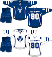
The accent striping isn't much but it adds a lot to what are otherwise rather plain jerseys. Will it happen? No. But I think all of these are interesting to consider.

Lastly, we have an Ottawa Senators concept with a complete overhaul.

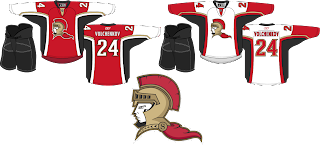
I think the logo would be better if the cape were either smaller or gone. It creates bad negative space. But once again I think the striping is excellent. Overall though, not a bad direction. By the way, I added Anton Volchenkov to my fantasy team. He hasn't really done anything for me yet.

Anyway, that's all for right now. I'll have some more rather brilliant work tomorrow as we stick to the more professional-looking designs this weekend. Hint: GhettoFarmBoy is back at it again.

Friday
Nov232007

Just To Freak You Out XVI

It's another Freak Out Friday here at NHLToL and boy have I got some weird crap today. I have to start out first with something that might cause you to fall out of your chair laughing.

The funny part is I think that's what Homer Simpson would look like if here were an Indian. Anyone agree with that?

The next image is sure to stir the pot a little bit. It's like one of Conan's "If They Mated." Albertans might not be able to take this. Imagine if the Oilers and Flames got together.

We should make a habit out of that. Pretty funny stuff.

This cracks me up. Twice in the same week, two separate people emailed me concept logos for the Montreal Canadiens — replacing the "H" with an "M."

The graphic on the right incorporates the old Montreal Maroons logo so that's kind of cool. But regardless, it's still just weird seeing that. Let's keep it in southern Canada for a moment. A few different readers felt like giving new colors to the Toronto Maple Leafs' uniform. Everything but blue.


We'll finish off this week's Freak Out Friday on a fairly obvious route.

Yes, that's the Linux penguin. Can't believe I didn't get that one sooner.

Hope those served up a good laugh, or at the very least made you smile on the inside. And don't forget to send in your Freak Out art for next Friday's post. Enjoy your weekend!

Friday
Nov232007

From The Pacific Northwest

I think I'm finally going to be able to start getting back into this again. As you guys have probably noticed, I haven't been as fully involved with the site as I was over the summer. But with all the new Rbk EDGE jerseys out there, I no longer seem to be a useful source of information.

Still, I think we've found a niche with the concept art, so as long as you guys keep sending stuff in, I'll keep posting it. Having said that, here is today's collection. (Let's clock it and see how long it takes for someone to baselessly point out how I "always" write about the Canucks. I love messing with people.)

Here's a simple redesign with green incorporated into the logo. It also takes advantage of using different logos for the home and away sweaters. And to go along with that, here's a green alternate jersey.

But an even better-looking green jersey might look more like this.

What you see there is the incredibly well-designed logo created by John Slabyk. It would certainly be nice to see a team in a green jersey. White, black, red and blue (orange and teal as well, I suppose) seem to be the only permissible uniform colors for this season.

I like the use of the "V" logo so I felt like adding these to the pile.

Worth considering, I suppose. And finally, let's just throw out everything we know and try something totally new. Grey and green.

The grey and blue look awesome together. I think that should be the color of a Lightning third jersey. (Anyone want to put together a concept for me?)

Comment now and let us know what you think.

Thursday
Nov222007

Capitalizing On Concepts

Anyone want to guess what Glen Hanlon is thankful for today? Because it's not having a job as an NHL hockey coach. Poor guy. Of all the days to get canned, you just wouldn't expect it on Thanksgiving, right? So with the Washington Capitals opting to replace their coach, I have concept art! (And it's really good stuff, too!)

We'll start out with something simple and rather obvious. Take the new secondary mark and stick it on the front of the jersey.

I'm personally of the opinion that it makes for a better primary than the wordmark. But it's not my call to make, now is it? Working off a similar tack, I could totally see this being a third jersey as part of the set above.

The red striping is a little strange, though. We might want to tone that down a bit. I like it but I don't really know what's going on. I like the next design because it uses a logo that mixes the old and new similar to what we saw in a couple of previous Freak Out posts.

Quite fascinating, really. Though this is probably more worthy of Freak Out Friday by itself, I still like it. Keeping that in mind, however, what about a similar look but with the old blue and bronze?

I think you know how big a fan I was of those colors despite the fact that I completely understand red, white and blue for the Washington, D.C. club. You might also notice that these jerseys are really just recolored Ducks sweaters. But let's finish up the post with these colors.

Other than the Lightning's, there's really no color combination I like more than this. My absolute favorite is that blue one on the right as well as the blue jersey the Caps actually wore in the late '90s. Am I the only one? (If I am, I'm all right with that.)

Hope you guys enjoyed that. I have over 100 graphics waiting to be posted at the moment, so it goes without saying I'm falling a little behind. It also goes without saying that if you've sent in something that hasn't been posted yet, don't lose hope.

Happy Thanksgiving!

Tuesday
Nov202007

Decide On The AHL's Best Logo!

If you haven't been following the AHL Tournament of Logos over at ToHL, now is the time to get involved! We're down to the final two. In the championship round it's the Manitoba Moose against the Bridgeport Sound Tigers. But only one will walk away with the victory and bragging rights as the AHL's best logo.

And as I've mentioned, the third round of the Third Jersey Logo Tournament here at NHLToL will begin tomorrow. At the moment, it's looking like we'll have a Battle of New York on our hands for that first poll. Should be interesting.

Monday
Nov192007

A Third Jersey For The Wings?

The third round of voting on the Third Jersey Logo Tournament will begin on Wednesday so keep an eye out for that. In the meantime, I've managed to break away from Super Mario Galaxy (80 stars) if for only moments to share with you some Detroit Red Wings concept art. This, of course, coming on the heels of the Motor City being named the most dangerous city in America. Kudos on the whole gas station owner feud thing.

Crazy.

All right, so moving right along into the hockey stuff now. We'll begin with what you'd probably consider your basic throwback alternate.

I don't think many Wings fans would lodge a lot of complaints over something like this. It's still got that traditional look and feel but at the same time it's something new.

For a change of pace, how about a new logo entirely? Get it en-"tire"-ly. I should stop that now.

Personally, I'm not the biggest fan but it's definitely got the old-time hockey feel.

Now, if it's something completely and totally different that you're after, look no further. I've got you covered there as well.

The designer described his work this way: "As you can see, the skyline wraps around the base of the jersey. I'm sure you're wondering about the logo. It is an image that has been familiar with Detroiters for decades. It's a statue called the 'Spirit of Detroit.' If you google it I'm sure you'll find a good photo. I think it's a great representation of Detroit that many Detroiters would appreciate."

So Detroiters, how do you feel about these? I'm interested to get some feedback here.

But just so you guys don't think I've gone completely crazy, I've got a couple of very conservative redesigns as well.

So now let's hear it. Could any of these pass muster for a potential Red Wings third jersey? Or is Hockeytown destined to never join the alternate sweater club? Post comments below.