Icethetics

via Blogger

Entries in logos (68)

Tuesday
Sep022008

Leafs Redoing Centre Ice

Just as we're wrapping up our Center Ice Tournament, we learn things will be changing pretty drastically for one team — not the Canadiens. In fact, it's their arch-rival the Toronto Maple Leafs I'm talking about.

The man with all the info — allegedly — Howard Berger had the following to say on his Hockey Buzz blog tonight.

Fans attending games at the Air Canada Centre this season will notice a pair of significant changes. The centre-ice design will now feature a giant Leafs logo enveloping the entire circle, rather than the two smaller logos that previously flanked the checkered red line. I saw the updated art-work earlier today and it looks sharp.


For those with short term memory loss, here's what was entered into the competition for the Leafs.

Yeah, not surprisingly they saw a first-round exit from the tournament at the hands of the Blue Jackets. Should be interesting to see what they do this year. But don't count on Berger to provide pictures though. He's industrious enough to "see" things but can't quite show them to us. Ah, but he is a radio man after all, right?

Tip of the hat to Alan for the link. He's asked that anyone interested throw together a concept of what this new ice design might look like. My inbox awaits.

Monday
Sep012008

New Sabres Logo On Merchandise

The guys over at 3rd Man In allegedly stumbled across some Buffalo Sabres merchandise today with the new third jersey logo on it.

They snapped a couple of pics. Here's one of them.


credit: 3rd Man In

To see the other one, check out their blog. By the way, these are not pictures of the jerseys, obviously. I think they said they were t-shirts.

I have no reason to doubt the veracity of these pictures. Notice the silver outline around all of the elements of the logo. That's really the only thing that makes it "new." Otherwise it's just the old logo from the Sabres' early days.

So it's not conclusive evidence, but one more reason to believe that 18 days from now, this is the logo we'll be seeing on the Sabres' new third jersey.

Monday
Sep012008

Making Over The Sharks

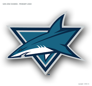
One of my favorite regulars has a new logo redesign. You've seen him give new looks to teams like the Red Wings, Devils, Predators, Senators, Flyers, Coyotes, and most recently the Panthers. Now he's taken a shot at the San Jose Sharks — who just unveiled a new look last season.

As you can see, it makes use of the Shark in the triangle. Here are a couple of secondary logo designs.

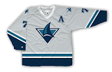
And even a couple of jerseys.

It's great work as always if you ask me. Feel free to post your opinions on these designs below.

Wednesday
Aug272008

Blue Jackets Honor Founder With Logo

The Columbus Blue Jackets have unveiled a new logo to be used this season to honor the memory of their founder John H. McConnell. It was announced on the team's official web site yesterday.

The link to the story about the new logo wasn't working for me, but this is it if you want to give it a shot.

Tuesday
Aug262008

Habs Unveil 100 Seasons Logo

I've gotten about a dozen emails about this so most of you probably know already. The Montreal Canadiens released a new 100th anniversary logo that will be used this season. The announcement was made yesterday on their official web site.

The logo is described as "using the style of numbers found on the Canadiens’ current white jersey worn on the road." It will also be used at center ice. A rendering of what that will look like is on the team's web site.

For what it's worth, the logo says "100 Seasons" right? Correct me if I'm wrong, but in the last 100 years we have had at least one year without a hockey season. Did the Habs perhaps play two seasons in one year at some point prior to the formation of the NHL?

The article makes no mention of the vintage jerseys the Habs are rumored to be wearing throughout the season to commemorate their centennial.

Monday
Aug252008

Hurricanes/Whalers Jersey Contest

This upcoming season will mark the 30th anniversary of the Hurricanes franchise — this includes their time in Hartford as the Whalers. The guys over at Hockeybums have a contest going to mark the occasion. It's something a lot of you might be up for.

They want artists to submit designs incorporating both the Whalers and Hurricanes jerseys. I'm guessing they also want some sort of hybrid logo as well to keep it from being too easy. They're also promising a "special prize" to the designer of the best jersey.

The contest runs until the start of the season.

Thursday
Aug212008

Catching Up On News

It seems I've been slacking a little this week when it comes to news coverage. I really try to stay on top of this for you guys so here's a wrap-up some of what's going on.

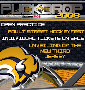
The Buffalo Sabres became the first team in my book to bring the new third jerseys into their marketing campaign. This ad began appearing on their official web site this week.

This comes after Sunday's announcement of a sweater unveiling ceremony to be held on September 20.


On Monday the AHL's Wilkes-Barre/Scranton Penguins — better known as the baby Pens to fans — unveiled their new third jersey. Yes, even the AHL is going that route this year.


No word on whether the green plaid shorts will be part of the official uniform.


The WHL's Prince George Cougars unveiled a new logo on Wednesday.


You may remember the Cougars saw a first-round exit courtesy of the Regina Pats in the WHL Tournament of Logos back in March. Perhaps this logo will give them a better shot at advancing further in the future.

Such a cute kitty.

There you have it. Sometimes I think it's just better to get it out all at once.

Thursday
Aug212008

Finding Lost Logos

Tuesday's post about blogger James Gordon finding unreleased logos in public trademark filings and an email from JP at Japers' Rink got me thinking about what other hidden gems might be out there on the United States Patent & Trademark Office's web site. Now I think "gems" is misleading because, by and large, logos that were trademarked but never used probably weren't that good in the first place.

Even one that was trademarked and will be used wasn't that good. I'm of course referring to the Kings.

That got me thinking about the one other team who is supposed to be getting a new logo for their third jersey — the Blues. And we haven't seen anything from them yet. So I did a search. Unfortunately, it seems they haven't filed yet. However, I did find one interesting wordmark.

A Blues fan would have to let me know if this was used or not at any point. But I don't remember ever seeing it. I believe it dates back to the days of the trumpet logo you see on the right. That was a secondary logo worn as a shoulder patch during the Gretzky days when the team introduced red into the uniform.

I did like that trumpet logo a lot though, for what it's worth.

Moving on now to the Capitals. Here's a logo we have seen before here.

And here's one we haven't.

This is what JP pointed out to me in the first place. Last year he wrote up a post about these two logos. He didn't like either and while I know my opinion doesn't count for anything, I have to say I really like the one on the right.

Yeah, it has text in it and all that, but if you can look beyond it's major flaw, I think it's a very balanced and well-designed logo. Shame it never saw the light of day.

And finally, I have to bring it all back to my Tampa Bay Lightning.

This logo was trademarked by the Bolts but never used — thankfully. I first saw it at Boltsmag a few years back.

If you guys find anything else of interest, let me know and I'll post it.

UPDATE (8/22 1:02 AM): All right, this is incredible. Not only were both of those Blues logos used, a reader emailed in a picture of a banner that features both on a hockey mask — together!

How cool is that?

Tuesday
Aug192008

Logos Revealed In Public Docs

A rather industrious reporter for the Ottawa Citizen may have found some new third jersey logos. In his blog Hockey Capital, James Gordon writes, "Potential new logos and third jersey centrepieces are starting to trickle out of public document filings in the lead-up to the 2008/2009 NHL season and I've posted a few here for your perusal."

The new image we haven't seen before is this one, which appears to be the Los Angeles Kings logo described by Howard Berger last month.

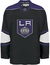
He said, "The Kings will unveil a predominantly black jersey with the letters 'LA' inside a pencil-point logo on the front." If he's right, this appears to be our winner.

This concept jersey I posted a few days later is the closest yet.

It doesn't end there. A logo he found for the Coyotes all but confirms the logos I posted here and here.

Though this is the black and white version. I really love that logo, by the way.

And for whatever it's worth, Gordon also had this logo for the Edmonton Oilers' 30th anniversary celebration.

My unending appreciation goes to Greg at Puck Daddy for the tip as well as continuing to pimp Icethetics!

Sunday
Aug172008

IHA: Special Contribution

If you're a regular reader, I'm sure you've heard of John Slabyk and The New Blue & Gold Project. I consider his concept artwork to be of the highest caliber — considering he is a professional graphic designer.

I got an email from John today. He says he's been following along with the IHA project and despite the endless amount of work he's been doing as the Art Director for Obama for America, he managed to break away when he saw the Great Lakes Division team — the Buffalo Bison.

John's asked that his design not be included as part of the IHA Project but still wanted to share it with you guys. He says he missed working with the buffaloes and felt this was a good way to keep himself sane. He says he took some liberties with the colors and I think it's for the better.

Anyway, it's always nice to see such quality artwork turn up in my inbox to share with you guys. I hope you guys like it. Feel free to leave your comments below.

On a separate note, I wanted to point out that as part of my attempt to spend less time working on Icethetics, I won't be posting logo finalists for the Pacific Division this week. However, I will still do the polls for the finalists throughout the week. They'll just be unveiled one day at a time instead of all at once.

Page 1 ... 2 3 4 5 6 ... 7 Next 10 Entries »