I know the real reason you're here checking Icethetics tonight. It's to see if I've got any new third jersey scoop. It's your lucky night. I've got some new information to share regarding what some of the yet unreleased sweaters will look like.
As always, the source shall remain anonymous — so take it for what it is. But how many times have I lied to you?
This person got a look at the jersey designs on a piece of paper and compared what he saw with what Howard Berger saw. There's some interesting stuff here.
 Is this the logo that will be on the front of the San Jose Sharks' third jersey? I'm told that it will indeed be black but instead of featuring just the full-body shark logo, it will actually be the new shield logo introduced last year — which includes the full-body shark.
My source writes, "This jersey disappointed me, it isnt just the black with the traditional shark. It is black, yes, but it uses the full body shark inside the shield design. With the orange and black script reading 'San Jose' across the top with the sun design."
Personally, I loved this logo from the moment it was first unveiled last year and would be thrilled to see it front and center on its own jersey. Is this true? I don't know. But I sure hope so.
 We're continuing to hear that the Los Angeles Kings' third jersey will in fact be black and white with this logo — in black and white, no purple. I'm a little worried it's going to look boring, but they pulled off the look well in the '90s.
That's not all...
 The Dallas Stars' third jersey will be white — basically the opposite of the regular black jersey. DALLAS will be arched above the player's jersey number in black text with a green outline instead of gold.
The interesting thing about this is that, like Toronto, wearing it at home forces the visiting team to carry twice as many jerseys with them on their road trip.

 The Vancouver Canucks will wear their secondary "stick-in-rink" logo on the front of their blue third jersey. However, this latest source claims it will actually be a white version of the logo currently used as a shoulder patch. It certainly stands out more.
My hope is that the new Johnny Canuck logo will find its way onto, say, the shoulders of this jersey. It seems all of the images being seen by our "leakers" are small and grainy making it difficult to see details — such as shoulder decoration.
 And that brings us to the Ottawa Senators. What I wouldn't give to see that team wear this logo, but there's been no word on that. If anything, it might be a shoulder patch, but this is just wishful thinking — I have nothing to back that up.
What I do have on the Sens from my source is this: "The jersey is not black, its that odd gold colour that the sens use. The word "SENS" isnt laid out in the common slanting downward fashion, its close together in white, with the red and black outlines, slightly slanting upwards (think Washington Wizards of the NBA, gold alternates). Very different from the concept illustration."
Gold, eh? That's... unusual. I'm not so sure about that but the main thing to take away from this information is that the upward slant of the text will not make it look like it says SNES as many have worried. In fact, I've put together a few concept renderings what what this may look like.
It's a simple upward slant that I've done but the actual jersey may feature more stylized or curved text. First, on a gold jersey, as this rumor suggests.

That's just standard block letter text, but they may also use something similar to the numbering style seen on their current home and road sweaters.

This serif text is also used for the C and A on the captains' sweaters. But if you want my opinion, I still think it'll be a black jersey — and this is the more likely look for the text.
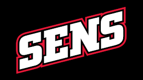
And here are a couple of other options — one including gold.


Which one do you guys like best?
 By the way, just a blog note here. I've updated the Atlanta Thrashers' third jersey logo in the sidebar. Their new sweater features the bird-head only logo on the shoulders — obviously no logo on the front as we all know.
That's all for tonight. Hope that satisfies your third jersey rumor thirst for now.
 9 Comments
  Monday · Oct 13 · 2008 | 8:39 PM PDT
  That's really as far as I plan to count. I'm sure it's getting annoying. The Carolina Hurricanes' third jersey made its debut on the ice tonight — as scheduled.
  hurricanes,
  jerseys,
  news,
news,  thirds


 I would venture to say it's relatively uncommon to find comedy in hockey jersey numbers — I'm not talking Freak Out Friday here. But the Minnesota Wild have come up with an ad campaign that I thought was funny.
  The Edmonton Oilers became the second team of the Rbk EDGE era to wear a third jersey — doing so while defeating the Colorado Avalanche tonight. There aren't a lot of pictures available right now, but here are a couple.

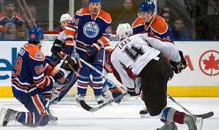
 We got our
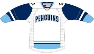
 The Worcester Sharks will don a new third jersey this year. (By the way, this is an update to the previous incarnation of this post where in the information I had was wrong.)
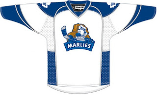
  I really don't think this one is even worth dignifying with a mention, but it's my job. The Toronto Marlies are doing exactly what
 The Philadelphia Phantoms are next on my list. I got any email from a fan saying a sweater he recently bought will be the club's third jersey.
  The Milwaukee Admirals will join the ranks of AHL teams with a third jersey for 2008-09 — going with the fashionable powder blue. Not that it matters, but I like this jersey a lot.
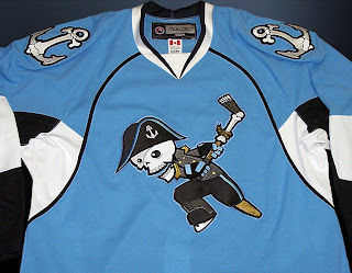
 We'll finish up tonight with the Hartford Wolf Pack. Back in March, they held a contest to have fans design the 2008-09 third jersey. Unfortunately, that page of their official web site no longer exists — but
  Is this the logo that will be on the front of the San Jose Sharks' third jersey? I'm told that it will indeed be black but instead of featuring just the full-body shark logo, it will actually be the new shield logo introduced last year — which includes the full-body shark.
 We're continuing to hear that the Los Angeles Kings' third jersey will in fact be black and white with this logo — in black and white, no purple. I'm a little worried it's going to look boring, but they pulled off the look well in the '90s.
 The Dallas Stars' third jersey will be white — basically the opposite of the regular black jersey. DALLAS will be arched above the player's jersey number in black text with a green outline instead of gold.
 The Vancouver Canucks will wear their secondary "stick-in-rink" logo on the front of their blue third jersey. However, this latest source claims it will actually be a white version of the logo currently used as a shoulder patch. It certainly stands out more.
 And that brings us to the Ottawa Senators. What I wouldn't give to see that team wear this logo, but there's been no word on that. If anything, it might be a shoulder patch, but this is just wishful thinking — I have nothing to back that up.


 By the way, just a blog note here. I've updated the Atlanta Thrashers' third jersey logo in the sidebar. Their new sweater features the bird-head only logo on the shoulders — obviously no logo on the front as we all know.