NHL Tournament of Logos

Entries in bruins (66)

Thursday
Feb212008

Some Unconfirmed Third Jersey News

I got an email earlier in the week that I was unable to post until now. It was from a reader who wrote in that a Reebok representative has apparently confirmed which teams will be wearing third jerseys next season. I'll say right off that neither I nor this reader can completely vouch for the veracity of this information, but having said that, I see no reason not to put it out there anyway as mere speculation.

The list includes the Sabres, Oilers, Flyers and Blues, which we've already heard rumors about. However, it doesn't include the Penguins who are apparently looking to don the retro jerseys they wore at the Winter Classic.

The rest of the list shapes up like this, in alphabetical order:

  • Atlanta Thrashers

  • Boston Bruins

  • Carolina Hurricanes

  • Chicago Blackhawks

  • Dallas Stars

  • Los Angeles Kings

  • Minnesota Wild

  • New York Islanders

  • Ottawa Senators

  • Phoenix Coyotes

  • San Jose Sharks

  • Tampa Bay Lightning

  • Toronto Maple Leafs

  • Vancouver Canucks

From that list, all but four had third jerseys last season. One would assume most of them would stay the same.

Boston, Toronto and Vancouver wore retro threads. An obvious choice to keep. Vancouver switched back to their original colors this season. However, the introduction of a new Johnny Canuck logo leads me to wonder whether they might head in that direction for an eventual discontinuation of the whale altogether. But that may just be wishful thinking.

Chicago, San Jose and Ottawa simply wore black versions of their standard jerseys. Seems to me they'd probably do something similar with new thirds. Also, Carolina has never had a third but black seems like a smart option. And since introducing their new colors and logo, the Coyotes have yet to try out a third. But if they do, you might see it in black as well.

I wouldn't be surprised to see the Kings and Islanders stick with last year's thirds. They utilized different colors, and a different logo in Los Angeles' case. Minnesota made their red third into their regular home sweater this year but the green may well make a comeback if they go with an alternate.

Dallas' most recent attempt at a third left a lot to be desired so we might see something completely different for them. Or we might just see a green jersey with "STARS" written across it in white. Also, Atlanta recently converted its original third to the current home jersey, so I'm not sure what to expect from them. Perhaps something in dark blue reminiscent of their early days?

And finally, there's my Lightning. Very few people liked Tampa Bay's blue third with rain drops, waves and lightning bolts on the arms from the late '90s. I was one of them. But I wouldn't expect to see anything like that if we do end up with an alternate next year. I would expect to see a nice blue sweater though.

Enjoy the speculation. As hard facts become available, you can count on me to have them posted right here at NHLToL.

So if you guys want to start coming up with concepts of what you think next year's crop of third jerseys might look like, go for it! Email them to me and they may well find their way onto the blog.

Monday
Feb112008

Poll: Bruins vs Predators


vs
Boston
BRUINS
Nashville
PREDATORS


REMEMBER: You're choosing the WORST logo!

I'm dubbing this the Battle of the Crazy Eyes and Scary Teeth! Place your vote and then feel free to leave a comment as to how you came to your decision. Tell all your friends to drop in and vote! The more voices heard, the more accurate the results!

Poll opening date
Mon Feb 11
Poll closing date
Fri Feb 15

Friday
Feb082008

Just To Freak You Out XXVI

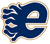
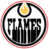
After a week off, Freak Out Friday is back in action tonight! And there's some pretty crazy stuff here. We're beginning in Alberta with a rivalry between the Edmonton Oilers and Calgary Flames.

Now, we've seen "If They Mated" concepts created simply by recoloring one team's logo with the other's colors. This goes a step beyond that. Actual time and effort was put into this. And that in itself is frightening.
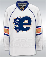
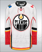
Yeah, I'll understand if you need a minute after seeing that. But hold on, now. Wait until you seem these logos on jerseys.

I really don't know what to say about that. But while we're on the topic of odd jerseys, I have these.

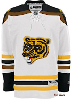
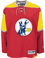
The Boston Bruins should never use this logo ever again. I understand it as something coming out of the 1970s. But we're all a little older now and just look at it. It's ridiculous. Meanwhile, the Kansas City Scouts on a Wild jersey? Just weird.

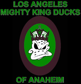
Now I've got some offbeat logos. The first is a Kings/Ducks mixture.

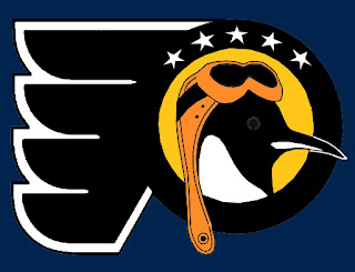
The Los Angeles Mighty King Ducks of Anaheim is pretty spectacular. But how about the Pennsylvania Flying Penguins? (No, I didn't make that up.)

Also we've got a morphed Minnesota Wild logo, making obvious use of the letters MW much to my disapproval.

It's not like I don't appreciate the work put into this, but the Wild have a pretty awesome logo as it is. To do this to it has got to be considered heresy in some manner. Which reminds me...

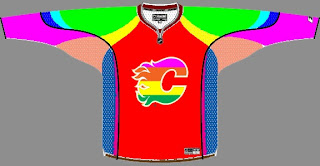
Yeah, it takes "Flaming C" to a whole new level. (No pun — or offense — intended.)

All right, yes the pun was very much intended.

Wednesday
Feb062008

Random Selections

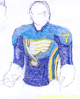
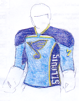
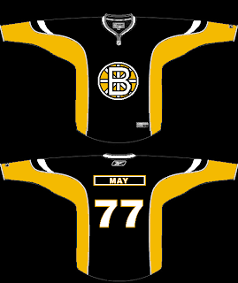
More new concept art! I'm on a roll this week! So Monday we did California and Tuesday was Vancouver. Today I decided to be completely random. And the teams that came out of the hat were the Boston Bruins, Minnesota Wild and St. Louis Blues. So we'll have fan-designed logos and uniforms for those three teams for now.

I really like the new retro-looking secondary Bruins logo. But you shouldn't do this to it.

If you think it doesn't get worse, you're wrong.

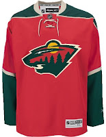
Moving away from scary things now, we have some fans' suggestions for the retooling of the Wild jerseys.

I have to say as much as I like what they have now, that one on the left is really sharp too. The green shoulders are great. I'm not sure how I feel about the circle logo on the white jersey. Feels to me like it's getting lost. And then for a complete change of pace, consider a green sweater with the circle logo.

For one thing, that's a terrible green. But I think last year's green jersey is far superior. There's not enough green in this league.

These next two sketches were designed for the St. Louis Blues on the idea of what the NHL really meant for the jerseys to look like on the players. Of course this is only feasible in cartoon land.

In any other land, it's disproportionate and anatomically impossible. Sharp work, though.

I think we'll do some more randomly chosen teams tomorrow. I've still got over a hundred items in my inbox that need to be posted. By the way, you guys are awesome for continuing to send stuff in. You don't know how much I appreciate it.

Friday
Feb012008

Poll: Bruins vs Kings


vs
Boston
BRUINS
Los Angeles
KINGS


REMEMBER: You're choosing the WORST logo!

Place your vote and then feel free to leave a comment as to how you came to your decision. Tell all your friends to drop in and vote! The more voices heard, the more accurate the results!

Poll opening date
Fri Feb 1
Poll closing date
Tue Feb 5

Thursday
Jan172008

Boston, Buffalo Fan Art

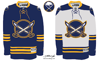
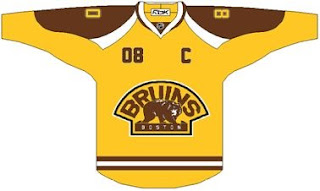
The polling in the Quest For The Worst tournament began this week with logos from the Buffalo Sabres and Boston Bruins. So, really, I should've posted this sooner. Luckily, there's no one to give me a bad grade for turning work in late.

We've seen a lot like this recently, but this is just another really nice Sabres concept that makes use of my favorite logo as well as the favorite logo of a majority of the fans on this site.

But at least that buffalo is where he should be — the secondary position, the shoulder.

As for the Bruins, a lot of folks seem to be behind whole gold and brown notion. I'd have to see it on the ice to know whether I'd be a fan or not.

And then there's a scary logo alteration that should never see the light of day — don't take your computer outside.

That's that. I've got some good stuff for tomorrow's Freak Out post. Stay tuned.

Tuesday
Jan152008

Poll: Bruins '96 vs Bruins '76


vs
Boston
BRUINS '96
Boston
BRUINS '76


REMEMBER: You're choosing the WORST logo!

Place your vote and then feel free to leave a comment as to how you came to your decision. Tell all your friends to drop in and vote! The more voices heard, the more accurate the results!

Poll opening date
Tue Jan 15
Poll closing date
Sat Jan 19

Saturday
Jan122008

Just To Freak You Out XXIII

I've been pretty bogged down with getting this next tournament ready. I really hoped I'd have it posted by now, but obviously it hasn't happened yet. Patience. In the meantime I've got some other cool stuff for you guys to enjoy.

First thing, a reader emailed in a link to a site called MG's Helmets — specifically to a page where the designer has come up with a bunch of NHL concept football helmet designs. It's quite clever actually. My favorite thing is how any references to hockey have been removed from the logos. You'll find no hockey sticks and no pucks. Haters of the "Buffaslug" might notice at a quick glance how ridiculously appropriate that logos looks on a football helmet. The only other logo that even comes close to looking good on a helmet is the Flyers.

It's just weird.

Now you're good and prepared for the freak out stuff. I would've done this yesterday, but I didn't. This one is all wacky logos.

First, the Atlantington Thrashitals.

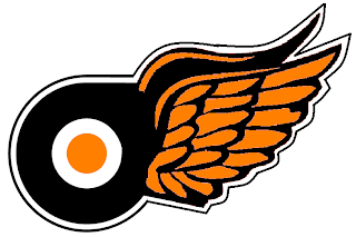
Then the Phitroit Flyer Wings. I know, creative names.

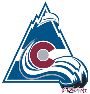
This next one here is a combination of the two Colorado clubs that have graced the NHL — the Rockies and Avalanche.

Not too horrible. I haven't quite figured out how the avalanche of snow has passed directly through the mountain, but I've found in my life it's best not to ask questions.

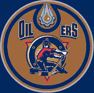
Here, I think we've got an amalgamation of just about every Edmonton Oilers logo ever used.

Learn what it means to be freaked out. Learn it well.

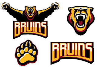
And finally, a weird generic Bruins logo design that could be used for absolutely any team called the Bruins whether they happen to be located in Boston or not.

Thanks, but I'll keep the spoked B.

Saw Charlie Wilson's War tonight. Philip Seymour Hoffman is my hero. Enjoy the other half of your weekend. The Quest For The Worst is imminent.

Friday
Dec282007

Just To Freak You Out XXI

The Freak Out series hits 21 this week — old enough to get hammered. And boy, I think some of the designers this week had to have been hammered. I mean, just look at this.

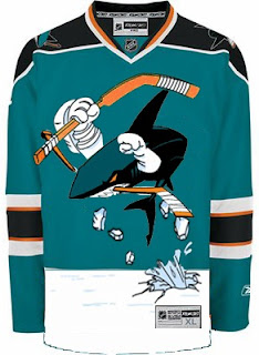
It might take a moment or two to notice that this is an "If They Mated" example. It's the new Sharks secondary logo merged with the Mighty Ducks third jersey of the mid-90s. But I love it!

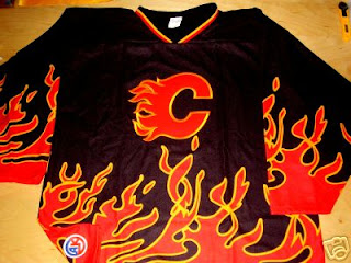
This Flames jersey is on fire! Someone on eBay is really selling it. For real.

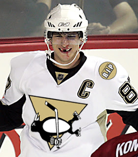
Sidney Crosby recently dropped the gloves in a rare on-ice event. This picture isn't real but it cracks me up nonetheless. There's just so much about it that's so wrong. I'm curious to see if the guys over at Pensblog have anything to say about this.

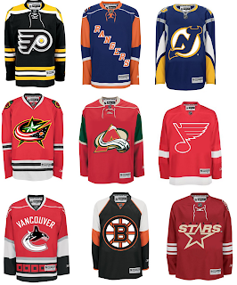
And finally, we have a plethora of "matings" here to share.

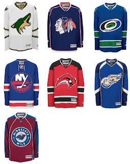
To sum things up, what you see above is the Flyers and Bruins, Rangers and Islanders, Devils and Sabres, Blue Jackets and Blackhawks, Avalanche and Wild, Blues and Red Wings, Canucks and Hurricanes (weird!), Bruins and Flyers (opposite of the first one) and Stars and Coyotes.

But wait, there's more.

This one is interesting because it's all opposites of the previous image. They are the Coyotes and Stars, Blackhawks and Blue Jackets, Hurricanes and Canucks, Islanders and Rangers, Sabres and Devils, Red Wings and Blues (what the—?), and Wild and Avalanche.

Hope you enjoyed being freaked out. Have a fantastic weekend!

Wednesday
Dec192007

Poll: Bruins vs Canucks


vs
Boston
BRUINS
Vancouver
CANUCKS


Place your vote and then feel free to leave a comment as to how you came to your decision. Tell all your friends to drop in and vote! The more voices heard, the more accurate the results!

Poll opening date
Wed Dec 19
Poll closing date
Sun Dec 23

07SCTRN | #2C | BOSvVAN