NHL Tournament of Logos

Entries in canucks (108)

Friday
Sep282007

Just To Freak You Out VIII

The Freak Out series continues this week with a brand new episode. Some of this stuff is just unbelievable.

We'll kick things off with some small but significant Atlanta Thrashers concept attempts.

I'm not sure I can find the words to describe this. The thrasher head, while being used as a major element of the crest, has also been employed as a rather horrid stripe. It points up the arm the shoulders along the sleeves and runs across the waist.

The secondary logo is used on the front of the jersey on the right side while the player number is on the left. Captains be damned. The full primary logo is also featured on the front, but not as the crest. No, you'll find that at the bottom on the left.

The crest being used features only the bird's head on an "A." But hey, at least there's three to choose from. Also notice that the panel under the arms is blue on all three.

This jersey set is an eye sore of the worst kind. But just look at the socks. I've never seen a logo on a sock. These socks have three — each! And that's just the side we can see. Imagine if they appeared on twice or even three times.

It hurts my brain to imagine what these would look like on the ice.

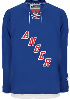
And then this. Anyone who thought the Maple Leafs introduced a rather plain jersey should see this.

And though I'm not sure who's conjuring the anger, I can only guess that it's fans who feel like they've been somehow cheated because the letters were spread vertically (not squeezed horizontally).

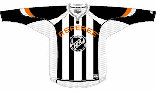
We're just now hearing of the NHL's plan to expand once again.

We don't yet know what city they'll play in, but the new club will be named the Referees. I don't know why this was made. But it made me laugh — and then it freaked me out some. Speaking of which, we've all seen the mish-mash logos created by Pfizer. Well this one was created by another artist, but it's almost equally as disturbing.

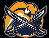
It seems some folks hate the slug so much, they feel a beheading is the only solution. Indeed.

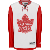
Oh, this deserves an explanation. The fervor over the Calgary Flames claiming the Albertan flag on their shoulder has spurred the Toronto Maple Leafs to go all out and convert their entire uniform into a Canadian flag. With the vintage logo, of course. No other way to go.

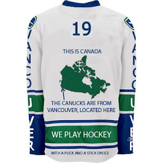
And finally, if you thought the text on the front of the new Vancouver Canucks jersey was as bad as it gets, wow. Just wait until you look at this.

I never cease to be amazed — or freaked out — by the things people send me. If you have come up with anything wacky and would like to make it a part of the Freak Out series, send it along to nhllogos@gmail.com.

I hope you all enjoyed your Freak Out Friday and are looking forward to the ninth installment coming in one week's time.

Can anyone tell me where the Canucks play? I seem to have forgotten.

Friday
Sep282007

Your Daily Dose Is Here

You know what this is. I've got today's concept art right here and there's a lot of it! And it's gonna be good. Mostly.

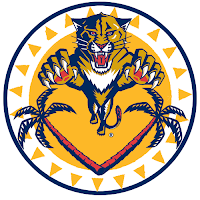
We'll start out with this Florida Panthers logo that caught my eye whilst I perused my inbox.

It's a sort of fusion between the primary and secondary logos that the designer said stemmed from an idea based off of the old Buffalo Sabres logo. But while that logo seemed to red "Buffalo Sabres" from top to bottom, this one seems to say "Panther Palm Trees."

No but seriously, it's very sharp. A little to detailed to ever see printed anywhere but here, but still nice.

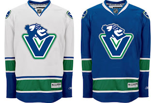
What I'm concerned about is this logo. I'm certainly more a fan of the official VC logo introduced by the Vancouver Canucks last month. They introduced so many cool new logos, though. It's hard to like the orca on the crest anymore.

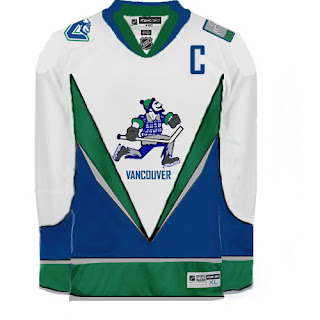
I got an email a while back, the source of which I cannot vouch for, that suggested the Canucks have planned to change their logo again in 2010 following the Olympics. This time they would feature Johnny Canuck as their primary symbol. I won't take a position on whether or not that has any validity, despite this logo just being introduced.

Anyway, perhaps a jersey may look something like this.

Although that V across the front of the jersey really scares me.

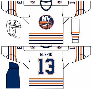
In other news, one of my things is that I feel like the New York Islander should make use of a lighthouse in their logo — if even just as a secondary. This concept borrows a recolored lighthouse logo from the mid-90s logo introduced as part of the "fish sticks" get up. That design wasn't all bad.

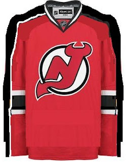
What I could live without is any changes to the New Jersey Devils' uniforms. I rated them a 5/5 in my review yesterday. Still, someone toyed with it a little.

That is something I feel would work for improving the Edmonton Oilers' sweaters, but not so much the Devils. Interesting as it is, I'd never want to see the Devils hit the ice in it.

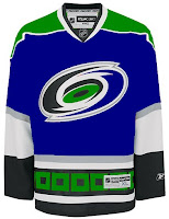
Along those same lines is this item. The Hurricanes are just one of those teams that I cannot possibly envision in any colors but black, red and silver. I just can't do it.

So this whole Hartford Whalers thing has me thrown. It's just so unacceptable, you know? Or maybe it's just me. I often tend to go against the grain. You know this already if you're aware of my feelings regarding the Blackhawks' logo and uniforms.

And that about wraps things up. If you have any comments you'd like to share with the rest of the class, please do so by leaving a comment below. If you have any of your own artwork or have stumbled across someone else's that I haven't posted, feel free to email me.

Saturday
Sep222007

Canucks, Here's How You Fix It

I'm starting another new series tonight — because you know I just love series. In "Here's How You Fix It," I'm going to post Rbk EDGE concept art designed by fans who feel their team's new uniforms are less than stellar. The reason I'm starting with the Vancouver Canucks is because of the sheer volume of work I've gotten for them.

So we'll start with the most conservative and work our way out.

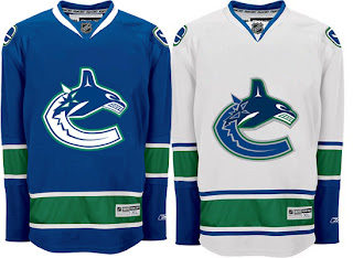
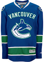
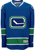
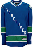
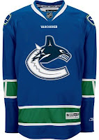
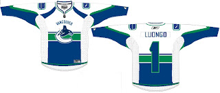
The biggest complaint these jerseys have garnered since August 29 is about the text over the logo on the chest. Along with that is the fact that the logo and jersey colors don't match. The jersey has prominent green stripes yet there's not a hint of green in the logo. This design takes care of both of those problems, it's already so much improved.

Now I say that despite being among the less-vocal group that isn't bothered by the giant VANCOUVER across the chest. So, consider leaving that — we'll just add some green to it.

Either that or move the stick-in-the-rink logo to the crest. Also a good option because now it matches the design scheme of the jersey much better.

But back to the text. What say we dump the logo all together on one sweater and go the route of the mid-90s Pittsburgh Penguins.

But if that's a bit to liberal for your tastes, there's no reason we can't just leave the logo how it is and simply shrink the name of the city. Hell, even a couple of Vs around the elbow might be all right.

Now if you really want to go wild and crazy, among the new logos unveiled by the Canucks as part of their rebranding was the one you see featured on these sweaters.

To me, that is what a logo should be. I'd venture to say it's damn near perfect for this team. I recognize not everyone will agree but that's why you can never make everyone happy with these things. Half of everybody wants to relive the "good 'ol days" while the other half wants to unload a stale image. Personally, I think this makes for a pretty good mix but what do I know?

One thing to note is that the designs above have changed nearly everything but for the striping pattern on the jersey itself. So I'll share one more concept that toys with that.

It approaches the Montreal Canadiens a very small bit, but doesn't work because of the contrast between the top and bottom. You'd never be able to read the number on the back of the sweater. The nice thing this design makes use of is smaller text above the logo on the crest.

By the way, all of these designs and many more can be found in the Concepts Gallery.

What do you guys think? Would any of these be a good fix for the Canucks' Rbk EDGE jersey? Is it irreparably broken or is great just the way it is? Comment below.

Up next: Colorado Avalanche.

Monday
Sep172007

Result: Blues vs Canucks

St. Louis
BLUES

51% 15,286 votes

Vancouver
CANUCKS

49% 14,719 votes

30,005 total votes

St. Louis Blues
Advancing to face Edmonton Oilers

Vancouver Canucks
Eliminated


Poll opening date
Sep 10 @ 4:10 AM
Poll closing date
Sep 17 @ 11:59 PM

07CHTRN | #W3B | STLvVAN

Monday
Sep102007

Result: Canucks Logo History

BEST ALL-TIME
1970

48% 7,648 votes

15,795 total votes

1978
23% 3,649 votes

2007
17% 2,745 votes

1997
11% 1,753 votes


Poll opening date
Sep 3 @ 4:18 AM
Poll closing date
Sep 10 @ 11:59 PM

07BONLH | LHVAN

Monday
Sep102007

Poll: Blues vs Canucks


vs
St. Louis
BLUES
Vancouver
CANUCKS


Place your vote and then feel free to leave a comment as to how you came to your decision. Tell all your friends to drop in and vote! The more voices heard, the more accurate the results!

Poll opening date
Sep 10 @ 4:10 AM
Poll closing date
Sep 17 @ 11:59 PM

07CHTRN | #W3B | STLvVAN

Sunday
Sep092007

Result: Red Wings vs Canucks

Vancouver
CANUCKS

55% 13,311 votes

Detroit
RED WINGS

45% 10,946 votes

24,257 total votes

Vancouver Canucks
Advancing to face St. Louis Blues

Detroit Red Wings
Eliminated


Poll opening date
Sep 2 @ 7:45 AM
Poll closing date
Sep 9 @ 11:59 PM

07CHTRN | #W2D | DETvVAN

Monday
Sep032007

Poll: Canucks Logo History


1970
1978

1997
2007


We can't start Round Three of the tournament until Wednesday while we wait for the results of the Penguins/Canadiens match. In the meantime, we have logo history polls for those days off. Today, you can vote for the Canucks' best all-time logo. We're only comparing primary marks here. We'll get to other teams in the future. The Sabres are up tomorrow.

Place your vote and then feel free to leave a comment as to how you came to your decision. Tell all your friends to drop in and vote! The more voices heard, the more accurate the results!

Poll opening date
Sep 3 @ 4:18 AM
Poll closing date
Sep 10 @ 11:59 PM

07BONLH | LHVAN

Sunday
Sep022007

Poll: Red Wings vs Canucks


vs
Detroit
RED WINGS
Vancouver
CANUCKS


Place your vote and then feel free to leave a comment as to how you came to your decision. Tell all your friends to drop in and vote! The more voices heard, the more accurate the results!

UPDATE (9/4 1:29 PM): Hi guys! Sorry I had to close the comments for this post. Like the Blackhawks/Oilers poll, things were getting a little crazy. I don't mind your having an opinion. I mind your belittling the opinions of others. You know who I'm talking about. The logic of calling someone a liar for having an opinion is lost on me. Please continue voting, but the comments on this post will stay closed at least for a little while. (It's a close one!) Thanks for visiting!

Poll opening date
Sep 2 @ 7:45 AM
Poll closing date
Sep 9 @ 11:59 PM

07CHTRN | #W2D | DETvVAN

Sunday
Sep022007

Result: Sharks vs Canucks

Vancouver
CANUCKS

53% 10,641 votes

San Jose
SHARKS

47% 9,279 votes

19,920 total votes

Vancouver Canucks
Advancing to Quarterfinals to face Detroit Red Wings

San Jose Sharks
Eliminated


Poll opening date
Aug 25 @ 7:39 AM
Poll closing date
Sep 1 @ 11:59 PM

07CHTRN | #W1G | SJSvVAN

Page 1 ... 4 5 6 7 8 ... 11 Next 10 Entries »