NHL Tournament of Logos

Entries in fan art (328)

Tuesday
Sep182007

Concepts From The Coast

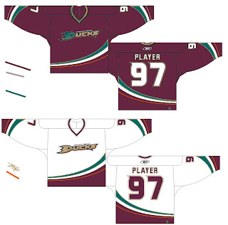
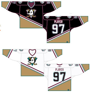
My concept art posts are making their glorious return this week with all the Rbk EDGE jerseys finally released. Today we're taking a trip out West.
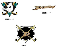
This one was interesting. It's a hybrid of the old logo with the new. I think it would be millions of times better if they just dropped the "ucks." How many times have I said that?

I mean consider how the wordmark logo actually looks on the jerseys. It's even got fewer letters than "capitals" yet it still seems smaller across the chest. I was really hoping for a change this year. Let them get the whole Ducks rebranding thing out of the way last season and then try something real this season.

I guess we can only ask for so much.

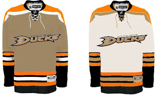
Here's something I don't love but thought it was an interesting idea. It's the current jersey with the old Mighty Ducks colors. Probably not a winner.

And then going all the way back we've got a simple recoloring of the old jersey and logo. Once again, it's not awful, but it just doesn't seem to fit.

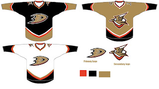
Here's the winner.

I think if it were orange, that third jersey would just kill. The Ducks could be among the best-looking teams in the league if they wanted to. But the NHL doesn't hire designers like this. That would be too much to hope for.

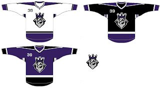
So let's move along to Los Angeles. A while back I'd written a post suggesting using the old King head third jersey logo with some modern-day recoloring. The purple beard blended in too much on the dark jersey so I wondered what it would look like in silver. And I got my answer.

I'm sorry, but why isn't that the primary Kings logo anyway? That says "kings" to me! (Not that a crown necessarily doesn't.) Oh and as a personal aside to the designer, what's the deal with stealing the Lightning's armpit stripes?

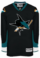
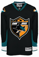
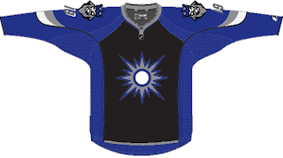
Anyway, let's head up the coast to San Jose and check out some other Lightning-related designs. One Sharks fans created these concepts based off Tampa Bay's Reebok jersey design, replacing the blue with teal.

Actually, I'm a big fan of the one on the left. The full shark makes for a much fiercer logo if you ask me — not that you were. As for the shield logo, I don't feel it makes a very good crest. It's a little much. I think it looks great on the pants and might even look nice on the shoulder — maybe for a third jersey one day.

The other thing I like is the diamond fin logo found on the shoulders of these designs. I'm a little surprised and disappointed it was left out of the actual uniform design.

What do you guys think of these? And remember, if you've made an concepts or seen any around that I haven't already posted, feel free to send them along. You can email me at nhllogos@gmail.com.

Sunday
Sep162007

Thinking About Minnesota

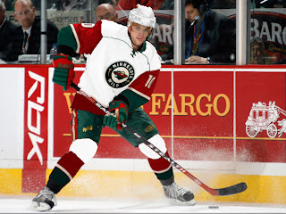
We're waiting for the Edmonton Oilers to show of their new uniforms today, the least I can do is offer up some Minnesota Wild concept art. Let's get right to it.

I don't think this design is trying to prove anything. Probably just a bored artist having a little fun. For those who didn't recognize it initially, that's the new Rbk EDGE home sweater for the Montreal Canadiens. The colors and crest have been changed. It's not bad, but I definitely think the Wild went with the right look.

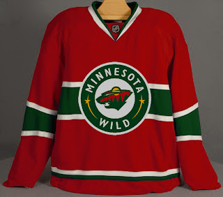
With this concept, the designer was just trying to see what the crest on the home sweater would look like on the road. Once again, I think the Wild got it right by using the large bear head logo over this circular one.

Quite honestly, I really like the Wild's logo and uniform design. Some folks have lodged Christmas-related complaints with regard to the color combination, but I find fault with that. I think the wheat color

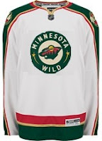
But let's mix it up a little. What if the Wild just recolored the home pattern white and called that the road jersey. Might it look a little something like this?

It just might. Anyway I've also got some concept logos that were sent to me by John.

This redesign morphed the bear head into an "M," keeping the major elements from the original. I'm a huge fan of the bear head, but this is not a terrible idea.

This logo is simply the Minnesota North Stars logo in the colors of the Wild. Personally, I think it was best like it was. But this does make me laugh.

So while we wait on the Oil, I might even have another concepts post at some point today. Hope you've enjoyed what you've seen here.

By the way, get ready as tomorrow I plan to open a poll where you all will get to decide on the subject of the next logo tournament.

Thursday
Sep132007

Random Concepts To Share

Aside from the NHL 08 news, it's been a rather slow day so it would be wrong of me to leave you without a concept post to get you through the night. But before I do that, I wanted to thank you all for continuing to visit and read this blog. Yesterday, we passed the two million hit mark. For those keeping track, it was over 1,000,000 hits in just two weeks. I'm still in shock.

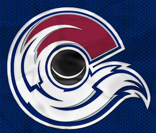
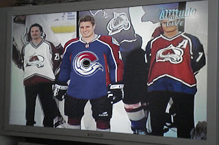
But moving along now. We'll begin with an amazingly cool concept logo which was emailed to me yesterday. It originates from the SportsLogos.net message board. It combines the tradition of the Colorado Rockies and the symbol on the flag of the state itself.

For my money, I'm sure it's just the thing hockey conservatives love. But the thing is, it's actually really good. Personally, I'm still partial to the "A" logo, but this could serve as show-stealing secondary mark for sure. I mention it because shortly after Altitude had the new Avs jerseys, somebody reworked it.

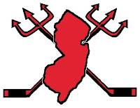
I never cease to be amused by people. Speaking of amusing — the New Jersey Devils have never had a secondary logo. Here's what one might look like.

Needs something to hold it all together, perhaps a circle or something. But I don't think it's half bad. Too boring for a primary but it's exactly what secondary marks are supposed to be.

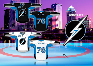
But while we're busy altering logos, I was emailed this Tampa Bay Lightning design.

While the silver and blue on black make a solid color combination, there really isn't anything to the logo. It's just... dull. I know we all like simple over busy but there's something to be said for finding a happy medium.

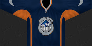
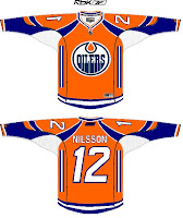
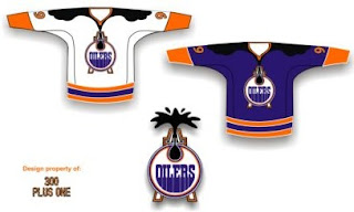
But let's not stop now. What if the Oilers were to don a redesigned logo at some point in the future? The riots in Edmonton's streets aside, it could look something like this if the right people were on the job.

I can't speak for Edmontonians, but I like it, myself. What I don't like is an orange — and I do mean orange — jersey.

Like this one.

Yes it's a little busy but I can look beyond that. What I can't get past is all that orange. I'd take a copper jersey over that. What does that say?

Anyway, that'll do it for tonight. Leave your comments below as the designers who email me often peruse the feedback on their work. I'm sure they'll be interested in seeing what you all have to say.

I'll have more tomorrow if I don't get too bogged down in the four different teams unveiling jerseys.

One last thing... HOCKEY SEASON IS ALMOST HERE!!!

Tuesday
Sep112007

Reminder: Big Day For Avs, Leafs

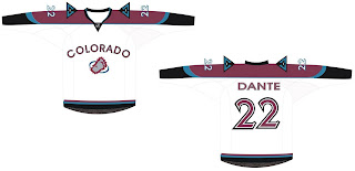
Tomorrow is going to be an exciting day for fans in Colorado and Toronto as the Avalanche and Maple Leafs prepare to unveil their new Rbk EDGE uniforms. To prepare us for the events, I have concept art — I know, your favorite!

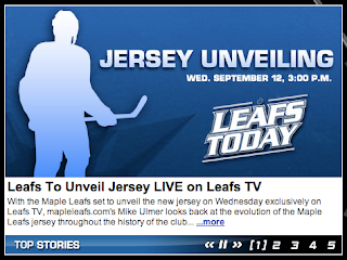
But first, some notes. The Leafs' official web site has an article discussing the long history of the sweater. Worth a read. On the home page, they're saying fans can watch the unveiling ceremony on Leafs Today tomorrow at 3 PM. I'll watch if I can and try to grab some stills for you all.

Meanwhile, the Avs haven't even made mention of a uniform unveiling on their official web site. The information came from the Denver Post. They're saying the Avs will unveil their jerseys at a press conference.

Now let's dive into the concepts. We'll start out with the Avalanche.

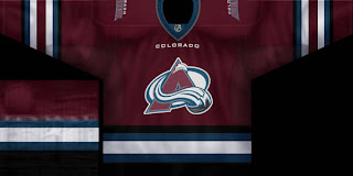
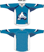
The team has said to expect only minor changes but logic would make us presume that the mountain range-like stripes along the arms are probably out with the EDGE design. I'm not the first person to suggest this. Chances are better the Avs go with something similar to last year's third jersey, retaining the primary logo as the crest. Let this serve as a good example of what that might look like.

But you came here for edgy concept art. Here's what you really want to see.

I laugh because the day I got the email with these images I was sitting there wondering what a more "traditional" Avs logo might look like. It's like the gods were answering me. It's a sharp concept but I can't see them changing the logo for another good 50 years.

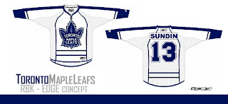
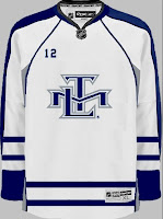
The typeface on the white jersey's chest is what I would consider to be brutal. But enough about the Avalanche, I know what you Canadians want. Let's check out some Leafs art.

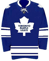
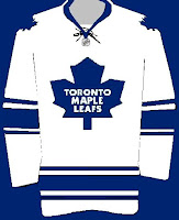
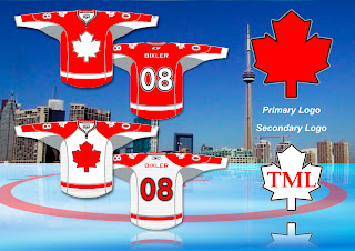
The stripes are going a little crazy here, but anyway, there it is. For something a little less drastic, I offer these.

But wait, there's more!

I know this is a risky move considering the number of Leafs fans who weren't behind the TML logo, but what about something like this for an alternate one day? I am under the impression, however, that this secondary logo will say goodbye when the new uniforms are introduced tomorrow.

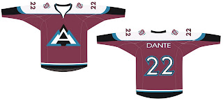
One more! Let's go back to the Avs for this because I actually want to know what you guys think of it. Under the same guise as above of simplifying jerseys with a little too much going on comes this concept.

For me it's a little monochromatic but something about it says it could serve as a nice third jersey with a little help. The white "A" really shouts out "snow-covered mountain" to me.

Anyway, one last thing on what to expect for tomorrow. Avs fans, the club has said no major changes but the zig-zag stripe along the arms may not work. We'll find out for sure tomorrow. Other than that, expect something very close to what they've always worn. No logo or color changes.

Leafs fans, expect a much simpler uniform with no horizontal stripes at the bottom. I would expect minimalist stripes and constrasting color usage similar to the alleged Stars jerseys we've been seeing recently. In other words, I'm thinking a very plain sweater — and no TML logo. I doubt we'll see any change to the leaf silhouette, but the way the article above read made me feel like anything is possible.
Finally, feel free to share you're thoughts. I read them all.

Monday
Sep102007

Looking Ahead: Third Jersey Concepts

As we all know, the NHL is abandoning the third jersey program for this season. However, there are many indications that it will make a comeback as early as the 2008-09 season. Having said that, some people are getting a jump on things. Here I have a few alternate jersey concepts to share.

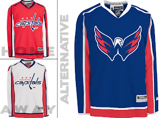
We'll start with the Washington Capitals. While the return to red, white and blue has grown on me, the wordmark logo has not. However, they've got a great shoulder logo that could use a little more mileage.

I especially like the idea of a blue jersey. Moreso than the red. Kudos to the designer on this one.

Keeping it in the Southeast Division, I've also been sent some Tampa Bay Lightning art.

Speaking as a Lightning fan, I do like the idea of a blue alternate jersey, but the logo needs the circle. What do you guys think of that? I think it looks even plainer without it.

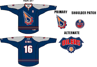
Moving on to the Northwest, check out this rather colorful Edmonton Oilers rendering.

I like the gear logo better in silver. But that's just me. Let's finish up with a look at some Minnesota Wild concepts.

I remember back in 2000 when the Wild first unveiled their logo — the crest you see on these jerseys — and I was horribly afraid the jerseys might look like this. (I was thrilled by the bear head logo.) However, I kind of like the green as an alternate for some time in the future. Might be a little much though. Thoughts?

Saturday
Sep082007

Atlantic Division Concepts

I've been going through my email looking at all the concept art I've been sent in the past several weeks. Let the Concepts Gallery serve as a small indication. Anyway, I've grabbed a couple of designs for the Flyers and Devils I thought were interesting.

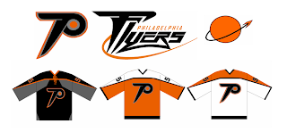
First off, one designer said, let's rebrand the Philadelphia Flyers a little. Here's what he came up with.

The designer had this to say about his creation.

The idea for the primary is just an updated Flying P - a little faster and sleeker looking than the current one. I've always been bothered that the current logo just doesn't evoke speed to me. As for the secondary, it's supposed to suggest something flying away from a planet or something.

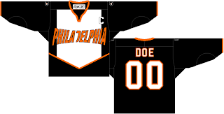
Just something interesting to share. There's also this design which has been floating around a little bit. I think the idea was to fit as many letters as possible horizontally across the front of the sweater. Mission accomplished.

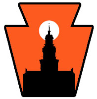
I can't see the Flyers ever wearing anything like that, though. However, something interesting that was sent to me was this concept for a secondary logo for the Flyers. Many who've suggested a secondary logo for Philly have simply gone with the Liberty Bell. What woudl you Flyers fans think of something like this?

Pennsylvania's nickname is the Keystone State. That should explain the outer shape — a keystone. What I like is the white sun in the background because the first thing I thought of was the orange circle in the Flyers' primary logo. Very clever.

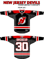
I was impressed with that. I was also impressed by a third jersey someone came up with for the New Jersey Devils.

I know the league is abandoning those this year, but I think it could work just as well as a home sweater. I've always thought a black jersey would make the logo on the chest stand out more.

But I guess we'll never know. Devils brass have stated that the jerseys will be the same as the previous design, merely adapted to Reebok's new cut. Still, I figured this was worth a look.

Expect to see the Flyers' new sweaters on September 16, followed by the Devils' a day later in their first preseason game.

Saturday
Sep082007

On A Western Swing

California is the running theme of today's concept art. We'll kick things off in the City of Angels. This first concept jersey for the Los Angeles Kings makes use of the original 1960s logo with silver replacing yellow.

Not terrible, but my personal favorite was the king face logo used on the mid-'90s third jersey. While the jersey sucked, I thought the logo was the strongest in the team's history. Once again, the gold is changed to silver producing a jersey that might look something like this.

I'm not a Kings fan, but I'd buy that jersey or one like it in a heartbeat. As a great alternate to a set like this, there's this design.

I like the silver in the beard of the king face logo on the shoulders. I think that would work better on the purple jersey above. Maybe it could be one of those logos where the colors change depending whether the jersey is light or dark — like the Flames and Canucks.

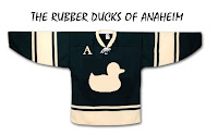
Moving along now to Anaheim, we have a Ducks jersey that isn't black.

Unfortunately, if it's gold, the logo (read wordmark) almost completely disappears. And I'm not sure it could be orange without looking like the Flyers. So black it is.

This concept might well turn out to be what the Ducks' new jerseys actually look like. I'd expect to see the team change the logo to the duck foot only, but that may just be wishful thinking.

My only other issue with this design is its lack of gold. That's an important part of this color combination and they should make good use of it.

And now we'll finish off this post with a trip up to San Jose. Got some interesting Sharks concepts to share.

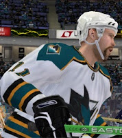
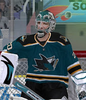
These next images are renderings from a video game — not NHL 08 — featuring a concept someone created for the Sharks. Very simple and classic. Shouldn't garner many complaints.

This cool jersey concept utilizes the shield logo unveiled by San Jose back in July. I really like that idea and it's not completely unheard of to use two different logos on NHL uniforms. Look at the new Wild sweaters.

The white one feels a little plain but not terrible.

Now Californians, let us all know how you feel about these concepts.

We've already seen the Kings' new uniforms, but we're still waiting on the Sharks and Ducks. Word out of San Jose is we should expect to see the new jerseys on September 17 while Anaheim has a preseason game on September 13. So at the latest, we'll see the new Ducks duds on Thursday if they don't unveil them sooner.

Friday
Sep072007

Just To Freak You Out... Some More!

Yes, you read that title right. Back by popular demand, I'm going to get your weekend off to a kicking start. I have the weird and crazy; a whole slew of new and wacky concept designs just meant to freak you out. So buckle in, it's going to be a long one.

I'm going to have a theme of red and black tonight. You'll see what I mean, but first I need to show you this.

From the brilliant creator of the Sabres and Canucks mish-mash logos comes this gem. True art in its rawest form. I dare anyone to attempt to improve upon that.
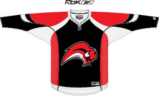
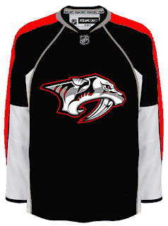
But since you can't, we'll move along. Do you like the color combination of red and black? Sure, if you're a Devils, Hurricanes, Senators or Coyotes fan. But what about Sabres, Predators and Canadiens fans? What about Leafs fans? Look on if you're brave enough.

It's a little blinding, isn't it? You might be surprised to discover that these designs all came from different people. Bad enough to have one disturbed mind out there Devil-ifying all these jerseys. There are at least four.

This Canadiens concept just scares me so I want to stop looking at it. The Sabres one just looks like a bloody slug (I knew that comment was coming so I wanted to head it off). And the Predators... well that doesn't look half bad if you ask me.

But imagine what kind of disturbed mind I must be to posting this stuff.

Wait. You need to catch your breath before you see this. Maple Leafs fans, ready your eyeballs for this one.

Wow, you're still here. I'm impressed.

All right, now I'm going to ease off a little bit. These designs are not so much horrifying as funny.

Dude, you spilled some oil on your— oh, wait... I see... yikes. Yeah. Oilers fans, I'm genuinely interested to know how you feel about this particular concept. I know it's been floating around a little, but it's just so... out there.

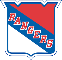
So what if the Rangers did this?

We probably ought not think about it.

Someone spent at least 30 seconds making this.

A missed opportunity, I say.

As a tribute (or not so much) to what I'm going to start calling the "VANCOUVER Incident," someone had some fun with other jerseys.

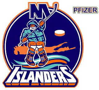
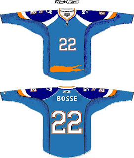
Similar work on the Sens, Isles and Jackets can be found in the Concepts Gallery. Now I'm going to wrap up where I began — Long Island. Imagine if Reebok decided the NHL should go the way of basketball.

Check out that outline of the island in place of a horizontal stripe. All is well.

Just remember, you guys asked for this. Let this be an object lesson in the notion of being careful what you wish for. Actually, if this keeps up, we'll make it into a weekly feature. So if you've made or found crazy crap like this, feel free to send it my way at nhllogos@gmail.com and who knows, you just might freak somebody out.

Friday
Sep072007

Shooting Stars... With Cell Phones

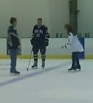
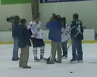
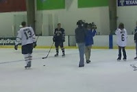
I was recently emailed a handful of cell phone photos (that we all just love so dearly) that alleged show Dallas Stars players on an ice rink during a video shoot wearing their new Rbk EDGE jerseys. I'm going to post those pictures and leave it up to you guys to make heads or tails of them. I will say this much: They bear a strong resemblance to the junior team jerseys we saw last week.


Here's some of what was told to me in the email.

... he and a friend snapped these at the star center in Frisco a few days back. They were apparently filming something about the new jerseys.

And if you can see in that blur- thats Krys Barch wearing Bill Guerin's old #13!

we cant seem to make out who the star in the dark uni is- but that short girl is Selena Rae.
And it appears to be Andy Moog out there too.

Just thought id pass this info on! Thanks!

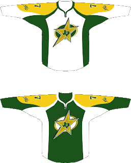
Something for Stars fans to gobble up. That's all I really have as far as news goes. However, remember the neat concept design I posted last week? (Last one on that post.)

The designer tweaked it a little and sent it to me again. And it only got better. Check it.

All but for the yellow, which needs to be more gold like in the current uniforms, you can count me as a fan for this idea.

Anyway, one week from today, the Dallas Stars will supposedly unveil their new uniforms. It's all speculation until then.

Wednesday
Sep052007

Prepping For The Pens' Unveiling

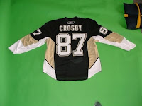
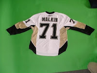
As we ready ourselves to see the new Pittsburgh Penguins uniforms, I have concepts to post. This first one is based loosely off of the alleged leaked images we got a glimpse of back in July.

Strangely enough, the photos we saw — which may or may not have any validity — did not have the gold '90s logo on the shoulders. Will the Pens be getting rid of it entirely? The team has already said to expect a new "special" patch on the new jerseys. A lot of Pittsburgh folks are theorizing that it will be a 40th anniversary logo. That makes perfect sense to me.

I'm not expecting to see anything much different from those photos. For a refresher:

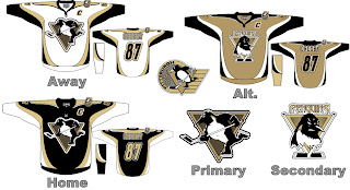
By the way, I was emailed a very cool concept design for the Pens.

Yeah. So whenever someone asks you what a "fierce" penguin looks like, show them this image. In fact, show them this image when they want to know what a fierce logo looks like. Check out the pecs on that bird. That penguin scares the bejesus out of me. Pens fans, I'd like to know what you think of that. Do you prefer your penguin or one more like this?

Anyway, enjoy your day. Like I said, I'll have photos up as soon as I can.

UPDATE (4:10 PM): You can read more about the event tonight in an article I posted last week. Enjoy!