NHL Tournament of Logos

Entries in fan art (328)

Friday
Aug312007

Mailbag: Retailers Talk Leafs

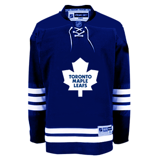
I've gotten about a dozen emails with a link to yesterday's post by Howard Berger of HockeyBuzz.com. The post is about speculation on the new Toronto Maple Leafs Rbk EDGE uniforms. By all means, it's worth a quick read. But I'll sum up here.

The Leafs will stay pretty much the same. While the design of the jersey will be slightly altered, the club will not tinker with its blue and white color scheme. Nor will the Leafs dip into their last Stanley Cup dynasty for the uniform's primary logo. It will remain as it's been since Harold Ballard re-worked the crest in 1970. The nine-point emblem (with "TORONTO MAPLE LEAFS" printed in a straight-line font) will not be replaced by the more stylish "stem" (or 35-point) logo of the 1960s ("TORONTO" being displayed in a dome-like curvature) — a time when the Maple Leafs were frequently winning championships. The stem logo had been re-introduced on the club's third jersey of recent years: the predominantly white uniform with blue shoulder piping that was a virtual copy of the jersey the Leafs wore in road games from 1963-64 to the end of the 1966-67 regular season.

He doesn't specify a source, but I'm led to believe it's a loose-lipped retailer with the scoop. Today, he added an update quoting another store owner.


"Exact same shirt as last year, minus, TML shoulder patches, bottom stripes are gone, (sleeves stripes remain). Silver twill is gone. Number font is the same as last year, block style, basically Marlies lettering — blue, white blue, and white blue white. Names remain one colour as per last year. Very, very plain."

For a visual aid to what we're talking about here, Jeff writes in: "From what I heard from a store owner, this is what the jersey should look like..."

I should also point out that the unveiling date of September 13 I have in the sidebar countdown comes from a reader citing a retail source. It all remains to be seen however and the speculation shall continue until we have official word from the Leafs.

Thursday
Aug302007

Just To Freak You Out, Part 4 of 5

My week-long series meant to freak you out a little continues today. If you thought the last three days were something, just wait until you see what I have for you today.

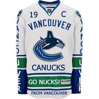
Canucks fans, a lot of you were unhappy with the new uniforms unveiled yesterday. But just remember. It could've been so much worse.

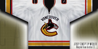
Told you. And what if they hadn't gone so far back to find vintage colors? What if they stopped in the '80s?

That's what.

Oh and I had to share this one. The Canucks seem to be all about mixing and matching. So here's what might've happened if they'd gone with this idea back in 1997 instead of the orca. A little scary but not horrible.

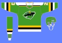
If you want to see horrible, imagine the Minnesota Wild in North Stars colors.

Try not to gouge your eyes out. It doesn't get any bigger for a reason. Quite frankly, I think the Wild have excellent colors. If you're among those who only see Christmas colors, I challenge you to find beige and yellow among the more common decorations. But that's neither here nor there.

Moving right along. While we're on the topic of throwback colors, what if the Phoenix Coyotes had gone with Jets colors?

It's a rather frightening thought. You don't know what bad is until you see and red and blue howling coyote.

But I've saved the best for last, dear friends. My pals over at ThePensBlog.com came up with a good bit of satire that pokes some friendly jabs at the Reebok folks.

You may not realize at first glance, but that's the front of the jersey, not the back. I love the giant NHL logo at the bottom. If you want to see the number, there's the damn number. Crest be damned! But don't riot yet. You haven't seen the worst part.

Now you can riot.

Have a nice night. I'll be back tomorrow.

Thursday
Aug302007

A Bunch Of Concept Logos

I get a lot of emails with concept jerseys but most of them make use of the team's actual logo. But sometimes people send in new ideas for logos. That's what this post is about.

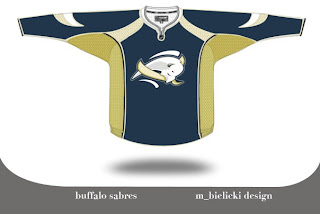
We're going to kick things off with the Buffalo Sabres. Lots of complaints have been lodged over the Sabres' new logo. There is even an entire site dedicated to the subject. Just as interesting is the now-famous design of John Slabyk. His work is nothing short of brilliant. But then someone emailed me this. And it rivals Slabyk's work on a different level.

The logo is very abstract but very unique because of it. The colors are a bit muted and I think that is actually a plus. But I feel like this is a very sharp logo. I'm curious to know what you all think of it. Please comment.

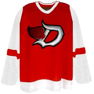
But that's not all. You probably know by now I'm not a huge fan of the Detroit Red Wings logo. I get the whole tradition/Original Six thing, but all right already. The Bruins are an original and their logos kick ass. They do. I'm not necessarily saying this is the answer for the Wings, but here's an idea.

I think the addition of black to the color scheme adds a lot to the uniform. The monochromatic red/white combo rubs me the wrong way — though I completely associate it with a scary good team. A little change never hurt anyone (except for the Islanders in the mid-'90s).

While still on the topic of the NHL's mainstays, you also probably know I'm not terribly keen on the Toronto Maple Leafs' logo. People like to say stuff like, "you don't mess with tradition" and the Leafs logo has been around forever. But the fact is, while the Leafs have been around forever, the current incarnation of logo has only existed since the 1970s. Anyway, what do you make of this?

I like the incorporation of the CN Tower, but I think this is more worthy of a secondary logo. I could see it as a shoulder patch, but not a primary for the Leafs. Thoughts?
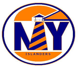
Next we have the New York Islanders. I'm always talking about how a lighthouse would serve as a good logo element for the Islanders. Here's a rather simplistic version of that idea.
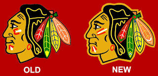
One of the most controversial notions I hold is the idea that the Chicago Blackhawks do not, in fact, have the best logo in all of professional sports. (Stop throwing rocks at me.) Here's what someone came up with to alter the Hawks' logo.

I see the differences and they make sense, but for my money, it's a lateral move. No better, no worse. Anybody else have an opinion on the logo?

One day I'd like to hear a real explanation as for why people think this logo is one of the best out there. There are too many colors in it and it's just so jumbled. A lot of you guys say simplicity rules all. That doesn't apply here. If you can educate me, leave a comment. I read them all.

Thursday
Aug302007

Get Your Pittsburgh Fan Art

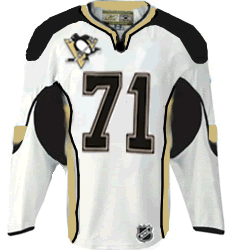
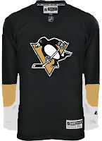
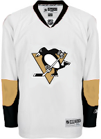
I've got Pittsburgh Penguins concept jersey designs today. So get excited. This first set here is a recoloring of the newly unveiled Ottawa Senators sweaters.

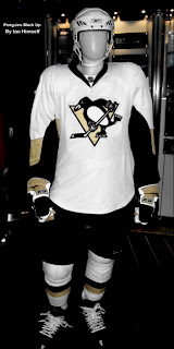
Continuing on this theme, though, someone recolored a mannequin donning that Sens jersey. Everyone seems to be concerned over the idea that Reebok has only created a handful of templates and that teams have had to choose between them. A color-by-number, if you will of the most ridiculous proportions. I don't see it that way though.

And those designs up there are rather plain. I think it works for the Sens, but not the Pens.

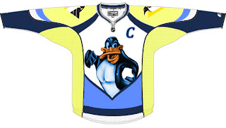
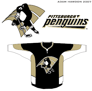
I also had something else rather unique emailed to me. Penguins fans, you know I've often talked about changing your logo — not that it necessarily needs to be. And right or wrong, you've shown that's not something you're at all interested in. But I thought this was interesting. Not sure it's better than what you have. In fact, the legs on the penguin make it look downright ridiculous.

You'll see what I mean.

Frightening stuff, right?

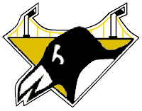
Well, on top of everything, the '90s logo which still graces the shoulder of the current Pens jersey has been much maligned. But then somebody sent me this logo design that I thought would make a pretty solid secondary mark.

Any thoughts on that? Thought it was pretty cool. Then I've been known to be wrong at times, though. I'm curious to know what those from Pittsburgh think of this idea — as too is the designer, I'm sure. Leave your comments below.

Wednesday
Aug292007

Just To Freak You Out, Part 3 of 5

So this week I'm running a series of crazy concept designs meant to freak you out a little bit. Let's get to it now.

I have to start with the colors we've all grown fond of this afternoon. Yes, you know the ones. But beware, you're about to see them on a jersey that will make you blink a few times and perhaps tap the side of your monitor. No need, though.

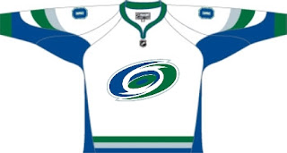
Being of generally slow wit, it took me a moment to realize that this Carolina Hurricanes jersey was being recolored based on the team it used to be. Yes, friends, the Hartford Whalers. But just look at that blue and green hurricane. Scary.

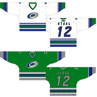
Somebody else had a similar idea. Look at that thing.

And then somebody with a twisted soul had an idea. Let's go all the way back to the New England Whalers... and kill Pucky... on a jersey... made by Reebok.

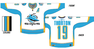
Yeah. And while we're on the topic of creatures of the deep, let's see what could've happened if certain fans had been asked to design the new uniforms and logo of the San Jose Sharks.

Huh? Wait, that one's actually kind of good. Dude, I like that logo. What is it doing here? Oh I remember. It's serving as a segue to this.

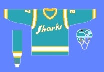
I can hear the screaming all the way from here. But before you go all thinking this design is completely without merit, don't forget about our friendly California Seals. Yes, this design is based on that old '60s uniform.

Completely and utterly crazy if you ask me. And I know no one did, but I'm sharing my thoughts anyway.

Let's roll on, now. Because before I go, I need to show you this logo someone emailed me for the Dallas Stars. Yes, the Stars need a logo redesign, but is this really the answer?

There's only one way to find out. Comment now and come back tomorrow for Part 4.

Tuesday
Aug282007

Just To Freak You Out, Part 2 of 5

I'm back with more weird and wacky designs from the world of hockey art. Prepare yourself.

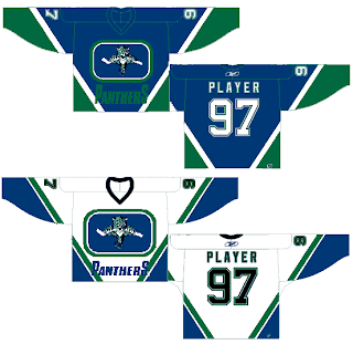
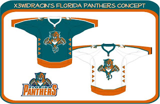
What sports franchise first comes to mind when you think Miami? The Dolphins, right? Well what made them famous? Was it their colors or the fact that football is one of the most popular sports in the U.S.? Well, the colors, obviously! So to help out the Florida Panthers in becoming more famous, one designer swapped out their colors. Take a look.

Go ahead. Rub your eyes. You aren't seeing things. Can you believe that? One incredible design after another, I tell you. Still, I can do better.

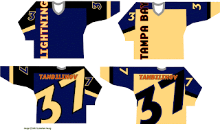
You'll have to look closely to tell, but that, my friends, is another fascinating concept for the Tampa Bay Lightning. No crest. Crazy numbers. The most original design I think I've ever seen. Here's my question: Can anybody Photoshop this jersey onto a picture of a player? Because I totally want to see how that bad boy looks on the ice.

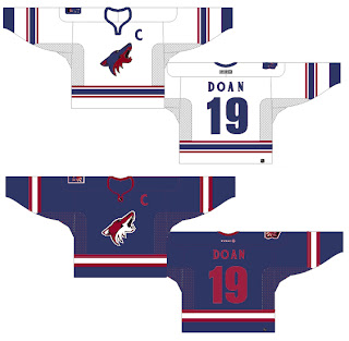
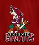
The Phoenix Coyotes had a great logo when for some reason they decided to throw it to the wolves in 2003. They dropped out what made their logo unique and colorful. Guess bland is back. Or not, so this designer thinks. Check that out. It's a wonderful combination of old and new.

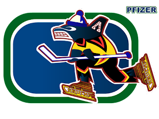
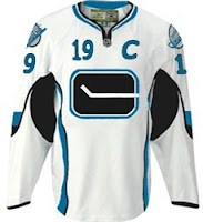
Kind of like this. And while we're on the subject of that crazy Canucks logo. What you really need to see is the fully-colored version.

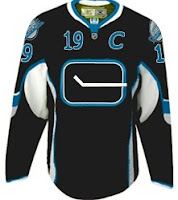
How can you improve upon something like that? It's like finding pure gold in the Black Hills. Oh, and while we're still on the topic of Vancouver — all you Canucks-haters — feast your peepers on these.

Yesterday we had black and neon green. Today we've got black and sky blue. If I haven't freaked you out enough yet today, just wait until you see this. I'm going to make this lousy post come full circle right before your very eyes. Behold.

From Panthers to Canucks. And I don't even have the words to describe it. No words would be worthy of describing it.

You'll tell your grandchildren this story. And you know it. Stay tuned. More is on its way tomorrow.

Tuesday
Aug282007

Blues Uniform Concepts

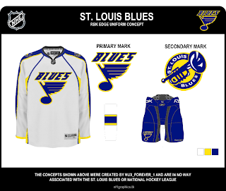
There's so many teams to choose from. I'm thinking I'll go with the St. Louis Blues next. I've been emailed some great concept art for their new Rbk EDGE uniforms. You should see them.

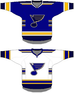
For those who fear change, this might be a good option. It's got the same colors and overal jersey design, save for the small stripes on the sides. Not much to complain about. But then by the same token, it's rather unremarkable.

If it's the retro look that suits you, perhaps this is the way to go. Simple blue and gold with the horizontal stripes we all know and love.

Again, plain and unremarkable but not necessarily bad. The Bruins went with plain and easily have one of the best Rbk EDGE jerseys at this point — and that's unlikely to change if you ask me.

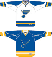
Now, if something new-fangled is what you seek, peer below at final concept I have to offer you.

I wouldn't necessarily like to see the Blues undergo a logo change, but if they had to, I'd be all for the trumpet logo. I think it's great! But then I'm a Lightning fan, not a Blues fan. However, I don't feel like the musical note logo is improved by the text above it. I'm also a big fan of the two-toned blue of the uniforms. I hope they don't lose that in the new designs.

Any thoughts? Don't forget, any concepts I post here on the blog will also go straight into the Concepts Gallery along with many other concepts I haven't posted. I add several new designs every day so keep an eye on that.

One more post planned for today then I'm calling it a night.

Tuesday
Aug282007

Something To Circle In

My headlines seem to be getting more and more obscure. I guess there's only so many times you can say "New Concept Art For [insert team name here]" before going out of your mind. Whatever. I'll roll with it.

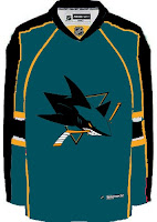
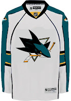
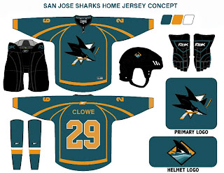
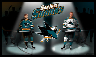
Anyway, the team to insert now is the San Jose Sharks. They unveiled their new logo just over a month ago but left us wondering what the jerseys would look like. Just one more thing to ponder this off-season. As expected, I have concept art to share.

First up is my personal favorite. If the Sharks wore something like this, they'd be among the sharpest-looking teams in the new Rbk EDGE jerseys. Boston's got some game so don't get too worked up. But these I like. The horizontal striping and traditional look totally clashes with the new-fangled, curvy-line logo but I don't know. I still like it.

This uniform set is based in large part off of the Panthers' new sweaters. I like them, but not as much as the ones above. And I really think those elbow stripes need to go all the way around the sleeve to work right. Still, not too shabby.

Nor is this. But I think this design takes most of its cues from what the Sharks have been wearing the last few years. I really did like the silver, but the orange works too. This design needs a black accent though, I think. It's very, very teal. Very teal. With some teal on it.

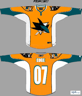
But before you go thinking that's all I have to offer, Sharks fans, wait until you see this. The addition of orange to the primary team colors has met a somewhat mixed response. Though to be honest, I have heard anyone love it so much that they'd want to see a jersey like this.

My eyes, my eyes! What a work of art. I'll tell you what makes me like it a little bit — the big shield logo on the shoulders. First of all, I like big shoulder logos. Second of all, I like that shield logo the Sharks came up with. So it's got a lot going for it in my opinion. Unfortunately, too much orange, not enough teal might well spell disaster.

Now I'm done. Take me to task with your comments.

For those who still haven't worked it out: Sharks circle their prey in the water. Get it? Something to circle in? No? Okay. It was a long shot anyway.

Tuesday
Aug282007

Concepts For Blueshirts

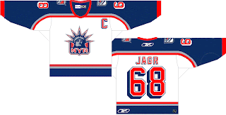
One team I haven't posted a lot of jersey concept designs for is the New York Rangers. I guess there just aren't a lot out there. Regardless, I have some today.

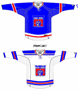
Rangers fans probably aren't loving the Flyers template in this design. I love the use of the Lady Liberty logo as a primary for the Rangers, but I think a lot of teams are so afraid of losing traditionalists with the introduction of the new Rbk EDGE jerseys, that they won't even attempt something with a little "edge" — with all the pun I could possibly intend. I think the response to that fear is to make something that looks traditional on a "non-traditional" sweater.

Well what I have to say to that is this: If your support for your team hangs in the balance opposite the uniform or colors they choose to wear, how can you possibly consider yourself to be a real hockey fan or a sports fan of any variety? It's about the game, remember? The puck gliding across the ice. The teeth-breaking body checks. The one-timers. The hat tricks. The amazing saves that precipitate no possible response other than sheer awe.

I know those thoughts have slipped through the cracks on this site because we're all so delirious from the lack of hockey this off-season — fretting the changes being imposed by a controversial commissioner — but don't forget that this site is all for fun. When I read comments here about how self-proclaimed "fans" suggest cheering on another team if their team's new jerseys suck, it just saddens me.

Anyway, look at that. I just went off on a whole thing there. Moving on. More Rangers stuff to look at!

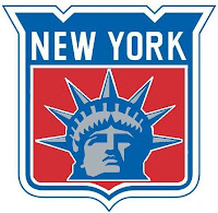
That design is actually in the Rbk EDGE cut. And the logo used can be seen at a larger size here to the left.

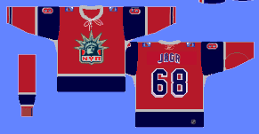
It's pretty cool but I'm partial to the NYR version. It's got a better color scheme and overall feel. This one feels like it's trying to be too retro while attempting something new.

Check out this next design.

While it may be considered blasphemy to put the Rangers in anything but blue, it's certainly an interesting concept. The first thing you might notice is its striking similarity to the Minnesota Wild's third jersey from last year.

So what do you guys think? Rangers fans, are your boys due for a change or should some things always stay the same?

Monday
Aug272007

Just To Freak You Out, Part 1 of 5

Today I'm starting a weeklong feature I hope you all will enjoy. As the title implies, the images I post here are meant to freak you out a bit so don't be surprised if you see the weird and wacky in what follows.

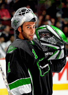
I've gotta kick it off with this photo because it's what gave me the idea for this series.

This photo comes from a bored fan at a Vancouver Canucks message board. Talk about identity crisis. How about those colors? Black, silver and neon green. Don't miss the recolored flying skate logo on the shoulder and the neon green Johnny Canuck on the side of Roberto Luongo's helmet. Stunning. Absolutely marvelous.

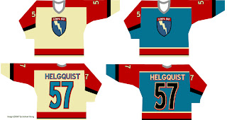
It gets better.

Now speaking as a Lightning fan, I can honestly say that is one color scheme I would have never dreamed up. It's not a horrible design on its own, but I'm afraid I wouldn't be able to recognize Vinny, Marty and Brad underneath all that... whatever it is.

But let's not stop there.

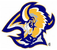
Sabres fans, have you ever considered going with a blue and gold goathead for your primary logo?

Part of me wants to think someone was just trying to prove how silly a yellow buffalo would look (see the current "Buffaslug" logo). But the part of me that attempts the use of logic fears someone honestly considered that to be a decent option.

Take me now!

If none of that has given you nightmares, then I'm not doing my job. Read on.

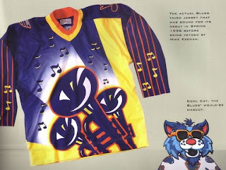
Friends, you won't believe the scariest thing about this beast. It's real. This sweater — if we can call it that without sullying the name of actual hockey sweaters everywhere — was actually produced for the St. Louis Blues. I'm not kidding. Surnames and numbers were stitched onto it. But with thanks to the holiest of gods, it was never actually worn during an NHL game.

Mike Keenan may have made some bad decisions in his life, but his refusal to allow his team to wear this monstrosity in 1996 is not among them. Can you imagine? Blues fans, you dodged a bullet and you will forever be in Keenan's debt. And do not ever forget that!

All right, now it's your turn. What do you guys think of these designs? Comment below.

I'll have more crazy designs all week. And as always, if you've seen any crazy designs or have some of your own, I'd love to see them. Email me at nhllogos@gmail.com.