NHL Tournament of Logos

Entries in fan art (328)

Thursday
Mar202008

New York Fan Art

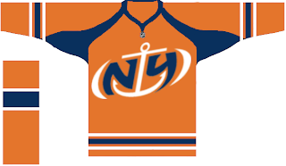
Today's concept post theme is the great state of New York. Mostly we've got Buffalo Sabres artwork, but we'll kick things off with the New York Islanders.

That's a fan-designed logo I posted a while back. I like the orange jersey.

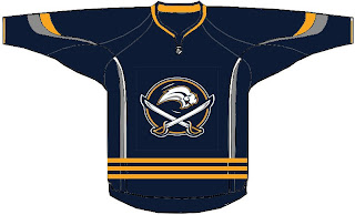
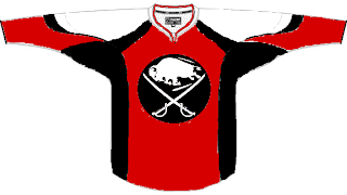
This Sabres design makes an attempt at a new logo.

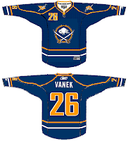
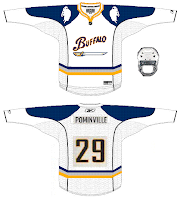
Quite unique, I must say. Also got a pair of Sabres pieces, one of which involves John Slabyk's logos.

That's all for tonight. Get your votes in by tomorrow for the goalie mask tournament. It starts soon!

Wednesday
Mar192008

Guitar Logos, Part 2 of 10

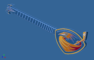
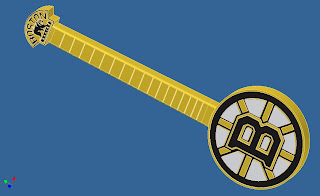
Last week I posted the first in a series of designs for guitars based on the shapes and designs of the various NHL team logos. We're going alphabetically and so began with Anaheim, Atlanta and Boston.

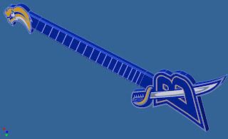
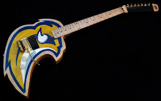
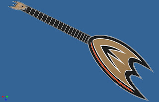
Today, we start with the Buffalo Sabres.

I think the primary would've worked better on the other end. You'll see what I mean in a minute.

The Calgary Flames is cool. But you've got a big hole under the strings and the logo on the other end is no longer used.

The Carolina Hurricanes is by far one of my favorites to this point.

And this is what I meant about the Sabres.

This design was submitted by a different reader but it's very effective. I like the hockey stick used in it. More guitars are on the way so keep an eye out for that.

This last thing is a quick note about the upcoming goalie mask tournament. I've got 66 mask graphics made so I'm thinking we'll do a two-poll preliminary round to decide which two goalies make the final cut for the 64-goalie competition. It's going to be the biggest thing we've done here yet. Can't wait to get it started!

Voting ends Friday. At that point we'll know which 32 goalies will be placed in the bracket first. I'll announce their opponents over the weekend and I'm anticipating posting the first poll on Monday.

Monday
Mar172008

Logos And More Logos

I've got some things to talk about with regard to the upcoming Tournament of Goalie Masks but I'll save that for the next post. For now, I've got concept logos, beginning with one I was sent this afternoon for the New Jersey Devils.

Looks a lot like a logo for a Japanese restaurant to me but I like it. Maybe not for a professional hockey team, but in general... I like it.

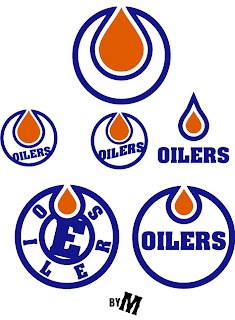
Another reader came up with a bunch of varying designs for a new Edmonton Oilers logo.

Lots of cool stuff in there. Not sure any of it is better than what the Oilers have now. Same artist simplified the look of the Florida Panthers.

They should try that on a third jersey. Sticking to the Sunshine State, I've got a couple of Tampa Bay Lightning logos to share.

If the bolt wasn't yellow and we tried a different font for the TBL, perhaps I would consider it as a secondary mark. Like that, I'm not a fan.

I've always thought about something like that. A lightning bolt between a TB. Still, it needs some beautification work or something.

That's all for now. Keep the concept work coming in. I'll have a bunch more jersey designs to post this week. Stay tuned!

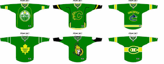
UPDATE (6:53 PM): Somebody mentioned St. Patrick's Day in the comments. Somehow I'm completely forgot that was today. I actually did have one theme concept to share. All six Canadian teams puked on by the Irish.

That's some green right there. Happy St. Patrick's Day!

Friday
Mar142008

Guitar Logos, Part 1 of 10

A reader of the blog here named Scott has started an interesting series of his own that I've decided to feature. It probably stems from a pretty good case of boredom, but nonetheless he's turning all 30 NHL logos into ... guitars. Yes, guitars. Here's what I mean.

Presenting them alphabetically, I'll be posting three at a time as he sends them.

Scott's finished nine of the 30 teams and as long as he sends them all to me, I'll share them all with you.

Should we call that one a banjo?

Up next: Sabres, Flames and Hurricanes — as guitars!

(By the way, happy Pi Day! I'm celebrating with a key lime pie. You?)

Wednesday
Mar122008

Dropping Into Carolina

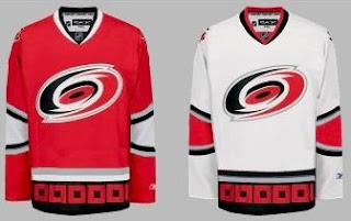
Today's concept art subject is the Carolina Hurricanes. Got a lot to share so I'll get started right away.

First up, a simplification of the current uniforms.

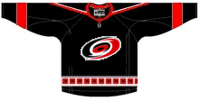
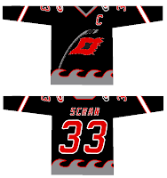
It basically drops some striping. Not much to speak of. There's also an idea for a black third jersey using the current primary logo.

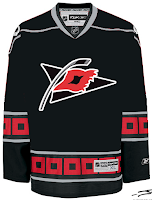
I like the triangular shoulder designs. However, a lot of the rumors we've heard suggest that the secondary logo will don the chest of a new alternate sweater.

The one on the right is funny because of the waves. Reminds me of the Lightning's sole attempt at a third jersey in the mid-'90s.

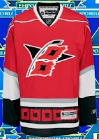
But as many have pointed out, that flag is actually a tropical storm flag. It's simpler and therefore makes a more balanced logo. Technically, a hurricane flag would look like this.

What do you think of that secondary logo?

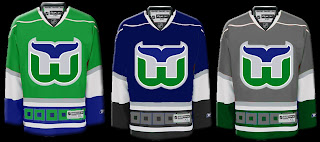
Now we'll go back in time a little to when the 'Canes were the Hartford Whalers. We've got some Rbk EDGE designs for them.

That's nice but I don't think the folks from Hartford will be able to identify well with the hurricane flags around the bottom.

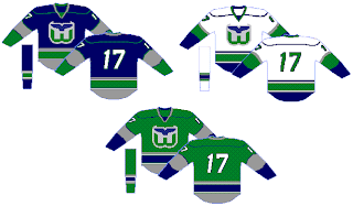
Probably a better design there. I like that green jersey a lot. Thoughts on these? Post a comment.

Monday
Mar102008

LFV Day 6: Last Day In Canada

LIVE FROM VANCOUVER!

Well, today is a sad day for me. My flight back to Tampa is tonight. I have to leave this wonderful weather (yes, I know it's raining right now) and go back to work on Wednesday. And since I've been away, the Lightning just keep losing. So this concept post is meant to honor all those teams that defeated the Bolts in my absence.

The teams I'm talking about would be the New Jersey Devils, Columbus Blue Jackets, and of course, the Philadelphia Flyers. We'll start with them.
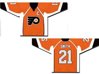
Also got a white version of that.
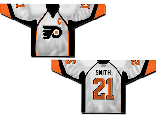
Not a bad design at all. There are also a couple of orange ones with the alternate Flyers logo.
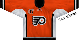
This one is based on the old New York Islanders third jersey.
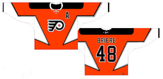
And speaking of alternate logos, here's something different.

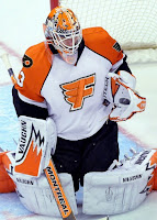
Not really sure what to say about those. Not normal but not quite crazy enough to warrant a Friday post.

We've also got a very sharp jersey set for the Blue Jackets.
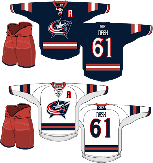
And a fan suggesting they switch from red pants to blue.

And either wishful thinking that one day a certain Sedin will find his way to Columbus or the idea that the Jackets would look better in a jersey with striping similar to the Canucks.

Moving on now to the New Jersey Devils. Here's a black concept without the circle in the logo.
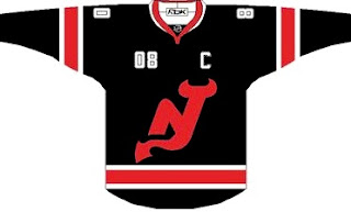
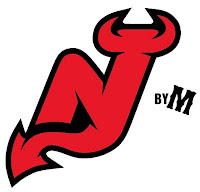
My feeling is that if you're going to dump the circle, you need to make some upgrades to the rest of the logo. Something like this might work well.
Continuing on the tack of black jerseys, there's this one.
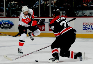
Very nice. Then there's this set.
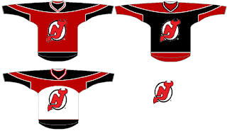
Those jerseys look like hoodies to me, though. Maybe I'm just losing my mind. And finally, here's why it's a good thing that the Devils dumped green out of the logo and uniforms.
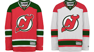
It looks bad!

And that's it for this afternoon. Gotta get things packed up and maybe take one last walk around the city before heading to the airport this evening. Bye Vancouver!

Saturday
Mar082008

Just To Freak You Out XXX

LIVE FROM VANCOUVER!

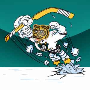
Unfortunately I didn't have time last night to post the 30th Freak Out installment. So here it is a little belated. And I've got to start out with something just downright ridiculous. As you know the Quest For The Worst ended this week with the Anaheim Mighty Ducks' third jersey logo taking the cake. It faced the Boston Bruins' secondary logo from the '70s and '80s. Imagine those two logos getting together.

Pretty horrific, eh? (When in Canada...)

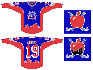
Anyway, we've got all American team artwork for this Freak Out post today, by the way. We continue on with the ultimate American team — the Rangers. Where do they play again? Could it be the... "big apple"?

It's the logo I'd envision for a team made up entirely of elementary school teachers. And skylines across jerseys never seem to work.

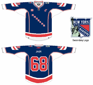
And they have a better Statue of Liberty logo than that. See previous.

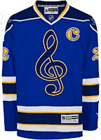
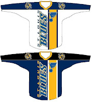
Up next: the St. Louis Blues who happen to be in town tonight facing the Canucks. Couple of really freaky concepts here.

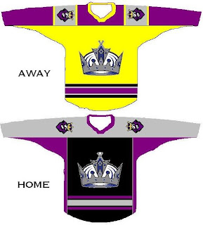
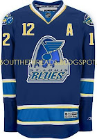
Yet another yellow jersey.

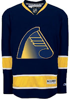
And a sweater which uses old colors and an even older logo.

I'll finish things off with a logo that I debated posting here. On the one hand it's an abstract, unique design. On the other hand, it's abstract... very abstract.

Very abstract.

And so ends another episode of the Freak Out series — live from Vancouver. I've got a couple more days left here in town. We went up to Capilano Suspension Bridge and Grouse Mountain today. Best day of the trip by far!

Friday
Mar072008

LFV Day 3: Possible Sens Preview?

LIVE FROM VANCOUVER!

My Vancouver trip is nearly half over as of tonight. Makes me kind of sad. By the way, the comments in the last post are absolutely hysterical. And I do mean that in every sense of the word. If you're looking for a good laugh, allow me to direct your attention there.

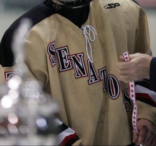
Anyway, on to the real subject of this evening's post. I got an email from a reader wondering whether we might have a preview of a possible Ottawa Senators third jersey on our hands. He sent me the photo along with the following email.

Hey Chris, hope you are enjoying your canadian getaway, lets get down to business, I happen to have a brother who has a friend who playes "AAAA" hockey at the Bantam level, and his team is the senators...interestingly enough the teams jerseys are gold with "Senators" across the front a la Rangers. Here is a picture of these jerseys, and judging from your "rumor" these might be similar to the new Ottawa jerseys. I am in the midst of putting this onto an RBK template so you can get a better look at it.


Now here's the picture he's referencing.

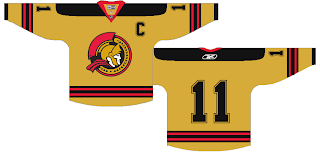
Obviously, this isn't the real thing, but perhaps it's a hint of what's to come? Only time will tell for sure, but even if you just look at it as nothing more than concept art, it still paints an interesting picture.

And while we're on the subject of alternate Sens jerseys, here's another gold one.

That's all for now. I'm going out to dinner tonight so I've got to get ready. I might have some more concept art for you when I get back.

Wednesday
Mar052008

Live From Vancouver!

I landed in Vancouver a few hours ago. I'm pretty sure I never want to leave. Anyone know if anybody's hiring or any good apartments? Anyway, I wrote this post up while I was on the plane just so I'd have something for you guys tonight. I'm pretty beat. Seven hours on a plane isn't something I'd want to do on a regular basis.

So it's all about concept third jerseys, as it happens. With the rumors swirling over what all the new sweaters might look like, many of you have sent in your work. Let's look.

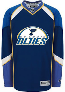
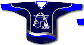
First up, the St. Louis Blues have discussed plans to introduce a navy sweater with a new logo incorporating the Gateway Arch. Well I've been sent a handful of various attempts at such a design.

That one's simple enough. Oddly, these next two are based off the Vancouver Canucks striping pattern.

Both of those are quite unique. This one as well.

One of my favorites is this one. I like how silver replaces the yellow. That's what a third jersey should be if you ask me.

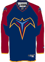
I'm not so sure about all the text on it, however. But this isn't all about the Blues. We've got the Thrashers and Hurricanes too.

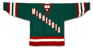
Also the Minnesota Wild.

When I first read it, I didn't like the idea, but that particular jersey design doesn't look half bad.

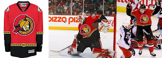
This last design isn't based on rumor so much as just wishful thinking by a Senators fan.

That's all I've got for tonight. I'll try to get something posted tomorrow afternoon, but the likelihood is it won't be until after the game tomorrow if at all. Going to see the Canucks and Predators down the street at GM Place.

Note: The time stamps will be Pacific time as long as I'm in Vancouver.

Tuesday
Mar042008

Canada IV: Vancouver

Last of the Canada posts here before I start my journey to the Pacific Northwest tomorrow. Naturally, I've got Canucks concepts.

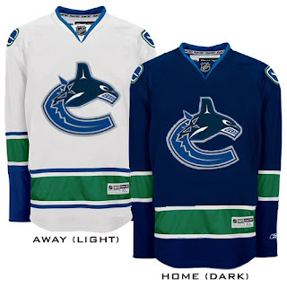
This is a nice, simple set. Same logo on both jerseys, sans the VANCOUVER across the top of the chest.

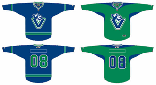
I like it but my vote still goes for the V logo that we've been getting a split response over.

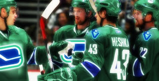
And I think I like the green one better. Speaking of green Canucks jerseys...

Yeah so that's really something else.

Sorry for the short post, but I'm ready to go on vacation. I'm sure you'll hear from me this week. If nothing else, I'll try to write about my experience at GM Place on Thursday night. I'm going to see the Canucks play the Predators. Should be a blast!

Page 1 ... 3 4 5 6 7 ... 33 Next 10 Entries »