NHL Tournament of Logos

Entries in fan art (328)

Monday
Mar032008

Canada III: Calgary & Edmonton

Just 46 more hours now until I first set foot on Canadian soil. But before I go, it's my duty to continue to share the concept art that many of you have been so gracious to send in. Continuing with the Canada theme we're visiting the province of Alberta tonight on our way to BC.

So then. The horse with the flaming nostrils. I always liked him. Here he is on red.

It suits his apparent rage. And for a refreshing change of pace, the white Flaming C on a black sweater.

Doesn't really say fire to me somehow.

Nor does it work in white. I'm sorry but I think the Flames by nature have to be a red team.

So with that in mind, here's a new idea based on an old concept.

There are also white and black versions of that design.

And this next one just looks like a hoodie to me.

To finish this out we've got a couple of Oilers concepts. The black around the arms makes this one interesting.

Needs something for contrast around the logo which is outlined in blue. And this final set I thought was really sharp. No reason a professional hockey club shouldn't look that good.

That's a nice uniform. But now I've got to put the final touches on packing, go to work tomorrow and then prepare myself for seven hours of flying across the North American continent. Fun stuff.

Sunday
Mar022008

Canada II: Ottawa & Montreal

Tonight's all about the Sens and Habs. I've been sent some really nice Ottawa concept art over the last few weeks. Also some really strange stuff. Take a look for yourself.

I really love that 2D logo. I wish the Lightning had a logo that looked that good. Here's a different set along the same lines.

The next design has odd striping patterns in my opinion.

And finally, all the talk about third jerseys brings this black version of the Sens' sweater.

The last two items are Canadiens logos. The first one's pretty self-explanatory to anyone who knows the logo history of the Montreal Canadiens.

This one would work if the Habs were to change their name to the Quebec Canadiens. Or something like that, I guess.

Tomorrow will be Calgary and Edmonton. Tuesday will be Vancouver. In the meantime, I'm almost all packed and more than ready for my vacation. I'll be in Canada in about 65 hours from now. Can't wait!

Saturday
Mar012008

Canada I: Toronto

I'm probably getting annoying with all the talk about my Canada trip, but can you blame me? I've got concept posts coming specific to Canadian clubs for the next few days leading up to my trip. (I fly out of Tampa on Wednesday morning, by the way.)

Anyhow, tonight we're getting things going with the Toronto Maple Leafs. First up is a simple design that would be acceptable as an alternate sweater.


With the same logo, but on a different tack comes this set.


That's really cool but probably somewhat unrealistic. More on the realistic side is this next set.

But most folks probably won't like the piping. However, I think the shoulder yokes make up for it.

These jerseys are nice. A lot of people will probably complain about the broken stripes around the waist.

I understand that, but it's a unique feature. What I like about the next set, which is similar to this one, are the shoulder logos.

These last two are just for fun. One designer suggests the Leafs use a version of the Marlies logo.

Probably not the best idea. And the last one recommends green for an alternate sweater.

I don't really know what to say about any of that.

But that's it for tonight. Can't wait for Vancouver!

Friday
Feb292008

Just To Freak You Out XXIX

Since I leave in four days for my trip up to Canada, I'm going with a Canadian theme here in order to freak you out tonight. So let's start with the most obvious one. The usual "If They Mated" concepts typically mix two and in rare cases three teams. One artist went above and beyond, mixing all six Canadian teams onto one jersey. The result will shock you.

I warned you. And I love how it's on the Lightning's white sweater. Creativity at its finest there, friends.

But back to more familiar territory now. Imagine the Canucks and Flames swapping colors and sweaters. Wait, you don't have to. I've got it right here for you.

The Atlantawa Thrashators, if you will.

What happened to that dude's face? Not to be outdone, ladies and gentlemen, the Edmonton Oilers.

Gotta love the oil shooting out onto the shoulders. But back to the nation's capital, for a small handful of teams the state/provincial outline works well in the logo — Lightning, Islanders and Stars to name the only ones. Here's a good example of why not everyone should try it.

Yeah, I didn't even mention the stripes. Can you believe that?

And as you know, it's difficult to pull of a yellow jersey that actually looks good. Unlike most of you, I was a fan of Nashville's gold alternate jersey but not Boston's yellow third. Weird, I know. But the Flames should absolutely not try yellow.

That's why. And if they ever decide to look for a new logo, here's what else they shouldn't try.

Balls of fire! And that is all I have to say on the matter.

And with that I'm going to go pack a bag and prepare myself for weather in which a native Floridian can only freeze. But I'll be loving every frozen second.

Thursday
Feb282008

Odd, Unique Logo Designs

Tonight's post is dedicated to those of you who've used your imagination to create entirely new logos for your favorite teams.

We begin in Anaheim with a neat logo design I featured earlier this month. Prepare yourself. It's very purple.

Next to it is a Sharks concept that probably should never been seen by anyone — ever. But I thought it could at least serve as just one more reason why teams should definitely not do this. I thought it was all right for the Stars as a one-of-a-kind sort of deal. But the all-star jerseys this year worried me.

Moving on to Canada now, here's a Canadiens sweater with an interesting new secondary logo created by a reader some time ago.

It probably needs the fleur-de-lis in white, but otherwise it's a really cool, symbolic logo.

Now to Hartford, where someone has created a new brand for a team called the Whales. (Not to be confused with the Whalers despite the logos seen here.)

Those are some pretty snazzy jerseys. (Yes I said snazzy. What?) I like the "H" logo but the "W" logo is more effective with that hidden "H."

Next is a simply Panthers design.

I'm not really a fan of letter logos in cases like this. Put the "FP" on the shoulders and the panther head on the crest, that's what I say. But what does my opinion really matter?

And finally — you know I've gotta do it — in preparation for my trip to Vancouver, here's a new logo design for the Canucks.

I hate to be mean, but I'll come right out and say I don't like it. Ever since I saw the new Johnny Canuck logo, I haven't been able to imagine another symbol that would work better for that club. Still, no idea's too dumb to put out there, right?

Don't forget to go cast a vote at ToHL for which CHL league goes first when the new tournament begins on March 14. And if you're wondering, I haven't yet decided what tournament will follow the Quest For The Worst here at NHLToL. I'll keep you posted.

Monday
Feb252008

A Mass Of Stars Art

I was looking through my inbox and you guys have been sending in a ton of Dallas Stars concept art that I've failed to get posted. So tonight is all about the Big D. There are just so many options as you'll see.

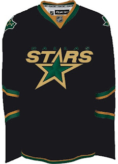
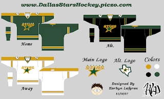
For one thing, a big complaint about the Stars' new Rbk EDGE uniforms has been the word "DALLAS" written across the front of the home jersey, of all things. A simple solution would be to put the crest back.

Now, with all the talk about third jerseys lately, perhaps that design would be better suited as an alternate in, say, green.

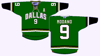
Certainly brings a lot more to the sweater. Hell, there's even gold.

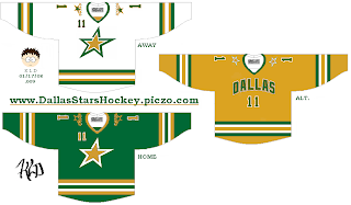
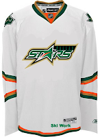
All right, yeah that's probably a bad idea. However, I'm liking the star crests on the green and white jerseys. In fact, the complete lack of black is actually pretty cool. Even something like this — which I like less — might well be worth considering.

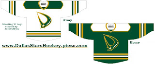
But in this reality, I don't see the black disappearing anytime soon. So how about this. Save the black for the alternate.

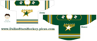
I know they've got the Florida Panthers' elbow stripes going but try to see past that. The Stars really need to return to the green sweaters. Though I know the odds of that are slim.

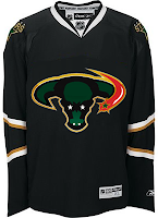
But let's depart reality altogether and start considering some "different" alternatives. Like a new logo.

I get the shooting star theme, but there are a lot of reasons why those logos wouldn't work. I'm sure you can figure them out. Still, sometimes it's fun to wonder. Here they are on a jersey.

Then there's the whole constellation fiasco. I get it but it just wasn't well executed. Once you start seeing "that" shape, you can't really see anything else.

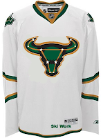
I don't think dropping the stars from the logo works, nor does turning up the horns. That's just strange. I've gotta say I do like the red, though. Red as part of that black/green/gold combo is quite unique. What about a reworked logo based on those colors?

It could use some work, like for instance I'd lose the puck, but it's something. A step in the right direction, perhaps.

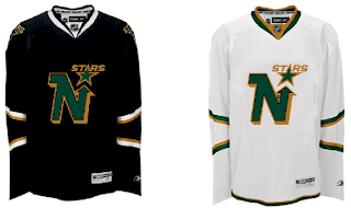
The last two items I have for you tonight are just flights of fancy for the folks missing their beloved North Stars. The old Minnesota logo on the new Rbk EDGE sweater.

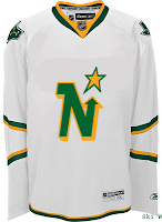
Not great. And this last one is more worthy of a Freak Out Friday post.

I think that about covers it. Stars, Stars and more Stars. By the way, just a little over a week now until my Vancouver trip. Can't wait! I'm hoping to be able to write from the road. I probably won't have much in the way of concept art for you. Maybe just stories from my experiences north of the border if anyone's interested. In the meantime, I've got to start packing.

Sunday
Feb242008

Oilers Jersey Concepts

Got a handful of Edmonton Oilers concepts to offer up before I call it a night.

That one is very traditional, this one not so much.

But I like that oilman shoulder logo. Was sad to see it go and surprised at the number of you who nominated it into the Quest For The Worst tournament. But to each his own, right? Speaking of which.

Interesting pair of sweater designs there, but not all that "traditional" and I don't think they'd garner a lot of votes from fans.

Then this last one's just weird.

I'll be back with more tomorrow. In the meantime, keep the votes coming in as we narrow it down to the finalists for the Quest For The Worst.

Friday
Feb222008

Just To Freak You Out XXVIII

This is the 28th installment of the Freak Out series and the 1,002nd post of the blog. It's Friday, everybody! And you know what that means.

I feel this needs no explanation.

Yes, it's that bad of an idea. And believe it or not, it gets worse.


I don't know how anyone could consider corporate sponsorships which manifest on the uniforms.

Anyway, there's also some third jersey fun to freak you out. If you're the Blues, I'll tell you what you don't do. You don't wear a yellow jersey.

The Blues.

And for the Canadiens, I like the red sweater with the blue shoulders, but I'm not sure the white one is the way to go here.

Also, I'll throw in an "If They Mated" logo, matching up the Kings and Sharks.

It may be a terrible idea, but it's extremely creative and I love that.

And for good measure, here's a plethora of concept art based on the notion of creating jerseys with two colors — split down the middle.

Everybody's covered and they're all worth a look, most notably the Bruins, Red Wings, Islanders, Rangers, Canucks and Capitals. That's some pretty intense craziness right there.

Have a great weekend, all!

Friday
Feb222008

1000 Posts!

That's right, this post I'm writing here is my 1,000th! I began this blog on May 9 and as of today, it now has a thousand posts. I'm very proud and as always, I'm more than appreciative of you guys for continuing to drop in. Obviously, you all are the reason I keep doing this. So as a thank you, I have some third jersey news.

Well, it's not so much news as concept art. It's all the ideas we've had for next season's new third jerseys... visualized! I'll begin with our friend Gary who's emailed in every other week or so since way back in October. He came up with designs for most of the teams we're expecting to see thirds from in the fall.

Vancouver's all right. Needs more of a forest green. Chicago, San Jose and Ottawa are pretty much what I'd expect. I like the 2D logo on the Sens jersey. Nice touch. We already know the Blues will have a new logo for their third. The desert scene didn't work out to well for the Coyotes last time so I doubt they'll try it again. And I like the idea of using the Hurricanes' secondary logo as the crest.

The Islanders and Lightning designs meet expectations, but the rest are a little out there if you ask me. I can't see the Kings bringing back the gold anytime soon. They'll probably stick with silver and black. The Stars sweater is interesting but could use some work. I like the green. Speaking of green, I can't imagine the Wild using that wordmark as a crest. I'd expect to see the bear head and a much cleaner design more along the lines of the current road jersey.

Among that list but not included in Gary's designs were Thrashers and Maple Leafs. Other readers came up with some good designs for them. First, a white version of Atlanta's home sweater.

It's nice but I can't see the Thrashers adding another white jersey — especially as an alternate. As for the Leafs, we've got a lot to consider.

When you think Toronto third, you automatically think vintage/retro/throwback. These fit that bill quite well.

Anyway, I also had a lot of submissions dealing in black. For instance, take the Senators jersey above, painted on Cory Stillman.

Also a black version of a jersey with the new Johnny Canuck logo.

And a black Stars sweater with the Texas state logo.

Personally, I'm more a fan of this green version.

And finally, we'll look at a team who hasn't said a word about a third jersey in the future, but one for which it could work unbelievably well — the Washington Capitals. Imagine a uniform set that looked like this.

Now those are some nicely designed jerseys.

Remember, if you've got some quality work you'd like me to post, send it along to nhllogos@gmail.com.

Friday
Feb152008

Just To Freak You Out XXVII

It's Friday and despite the fact that I'm waist-deep in boxes and half-dead from packing them, I have Freak Out art. And lots of it. So much so that I'm saving some of it for next week. But let's get to the good stuff.

Please don't ask me what that's supposed to be. I think I get the buffalo and the swords. But I'm not sure I understand the raccoon reference found around the eyes there. Perhaps it's just me, though.

But while we're on the topic of indignities...

No, the guy wearing the crown isn't Mark Messier. But good guess. And to the right there, the ultimate Vancouver Canucks jersey. How do you improve upon perfection like that?

Couple more oddities.

I like those colors on the Islanders jersey. And I know how you guys love the asymmetry on that thing — the original coming from the actual Thrashers jersey, not to be confused with the one on the right which is a recoloring of the Hurricanes sweater. The striping is weird. Yeah.

Sticking to the irony tack, here's an idea no one ever considered for the Anaheim Ducks.

And now you know why no one ever considered it.

We're developing of list of things the Flames need.

Also on that list: trading Jarome Iginla.

And finally, with the recent introduction of the new Stanley Cup playoffs logo, one reader got to work on new East and West logos — only what if they reverted back to the old conference names?

Despite the creativity, and I have to give a lot of credit for that, they're just messing with my brain so bad. Nice work, but über freaky!

Hope you enjoyed your Freak Out Friday. If I'm unable to update the site tomorrow, just know that's it's because I'm moving to a new apartment this weekend, not that I'm lazy. Not that I'm not lazy. It's just that's not the reason. Did you follow all that?

Page 1 ... 4 5 6 7 8 ... 33 Next 10 Entries »