NHL Tournament of Logos

Entries in jerseys (477)

Tuesday
Jun032008

Concept Art Variety Show

All right, this is new for me but I'm going themeless today. There's no underlying theme that ties all of these designs together. They're simply the ones I chose to post today.

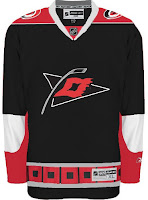
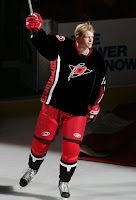
First up are the Carolina Hurricanes.

Here we have a couple of different designs. They have their similarities but overall are nothing like each other. I like the one with the red shoulders better.

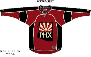
Also a pretty sharp Phoenix Coyotes concept was recently submitted.

Consider me a fan. I've been starting to see that is it possible to use the PHX logo on the front of the jersey. Didn't think it would look good at first.

That looks cool too. I especially like the non-traditional sand color for the sweater.

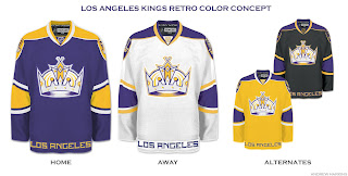
Finally, we're going all retro on you with these Los Angeles Kings jersey designs.

The yellow one makes me laugh and laugh. But shockingly, none of them suck. Maybe even the Kings have a potentially good alternate in their future.

Time will tell. Hope you enjoyed today's crop. Keep sending in your work and I'll keep posting it.

Monday
Jun022008

Reworking Logos

It's time once again for some concept art. Today we're looking at reworking various team logos. Some with good results, others not so much.

We'll start with an alternate logo concept for the New Jersey Devils. It bares some similarity to an idea created by Matt for his Rebranding the NHL series. Only this one is graphically simpler.

So that's pretty cool. We've also got an Edmonton Oilers logo here.

Nice, effective, but a complete disregard for the team's logo history and not modern enough to warrant it (like the gear logo on the old third jersey).

Got something new for the Blues as well.

Interesting turning the note into a hockey stick but the secondary is just to intricate to form a great logo. Nice idea, though.

That's a simple concept but one that need never see the light of day. I think to some extent, incorporating the state or provincial outline works but not in every instance.

We'll finish things off with some new looks for the two teams currently battling for Lord Stanley's Cup. By the way, is it just me, or does it seem like they're dragging this series out with all the days off in between games?

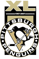
A simple flash to the past there. And with the Penguins celebrating 40 years in the NHL, one reader submitted a unique commemorative logo paying heed to the club's history.

Overall, a decent, if not above average, batch of concept art for you today. By the way, I've got a new series I'm kicking off on Wednesday. Tune in then to see what that's all about. (Just remember, I like alliteration.)

Friday
May302008

Just To Freak You Out XXXVI

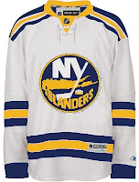
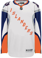
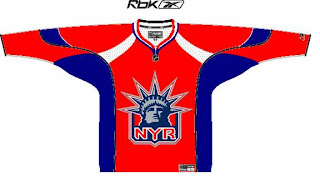
Time this evening for a Freak Out post. I know you've been waiting eagerly for two long weeks. We'll kick things off in New York. What do you say we mix all three NY clubs? And then do it all over again?

The things people come up with. Now if we head west you might find the odd Mighty Ducks jersey with interesting striping.

But staying out west things only get stranger.

I don't think I even need to say anything about that. It's just weird.

Got a couple of crazy logos to share as well. It's Phoenix — in its mythical sense, I suppose.

To finish off tonight's Freak Out Friday, we'll dive into the Stanley Cup series and look at the only two clubs still playing hockey this season.

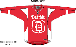
Folks often try to "update" the Red Wings logo yet it never seems to take.

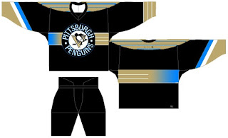
I can't imagine why. And I'm all about the powder blue Penguins jerseys allegedly making a return in the fall...

...but make up your mind at least. It's gold or it's blue. It obviously can't be both.

Join me again in two weeks for another edition and keep sending in your freaky artwork and I'll keep posting.

Sunday
May252008

Albertan Art

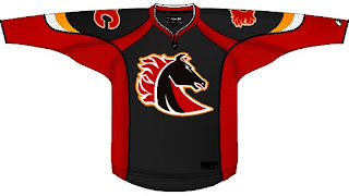
No new poll today (first time in weeks, I know). Instead I've got concept art all for our favorite two clubs from Alberta. We'll start in Calgary and work our way north.

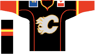
It's a flaming horse. I was a fan of the original black third jersey, but I'm not so sure on this one. Especially on a black sweater. But speaking of black sweaters, one might make for a nice, if not predictable third jersey.

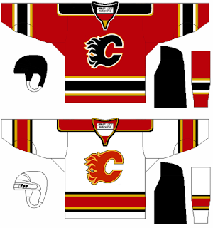
This one's even got the provincial and national flags on the shoulders. But if your tastes are more suited to the traditional striping patterns, well we've got that as well — in red and white.

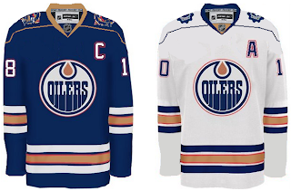
Next we head to Edmonton for a nice pair of jerseys.

The secondary on the shoulders of the white one is cool. But both of them work really well and have stripes that are actually stripes.

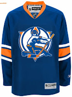
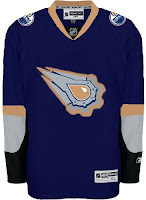
In this next set, we reintroduce the rigger in an updated version of the original logo as well as revisiting the old third jersey.

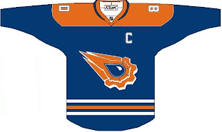
Believe when I tell you it could be worse. And if you don't, here's proof.

That thing should definitely always be silver. Never orange. Ever.

The next poll in the Goalie Mask tourney is coming up tomorrow. It's Luongo against the winner of the Fleury-Theodore match-up. At the moment, Fleury is ahead. Enjoy what's left of your long weekend — for those of you not in Canada.

Wednesday
May212008

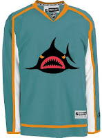
Sharks May Get Black Third Jersey

The San Jose Sharks held their "State of the Sharks" event on Tuesday night. It's essentially an informational session for fans. Sharks President and Chief Executive Officer Greg Jamison addressed the question of a third jersey for next season.
There is a good chance it will be black. It is still being decided on. I can tell you we get input from the fans, staff and the players. The players were very involved in the jerseys for this year. I think the third jersey will be very neat.

That's the same as the rumors that have been going around, so no big surprise. You can see the rest of the story right here.

Thanks to Ben in Sacramento for the tip.

Tuesday
May202008

Back To The Canucks

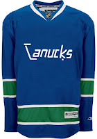
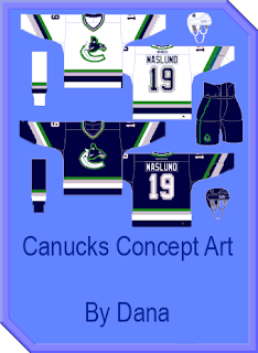
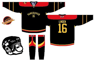
It occurs to me I haven't posted any Vancouver Canucks concept art lately. Figured I ought to rectify that.

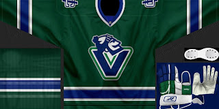
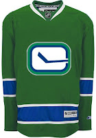
This design or a version of it has been floating around for a while as a dream third jersey for the Canucks. Unfortunately, the rumors have the stick-in-rink logo on the chest of the new alternate. On that same tack, how about another green one?

It's hard to deny they would look good in green. Or somebody would. Between the Stars and Wild, it's almost like someone in the NHL is deathly afraid of the color.

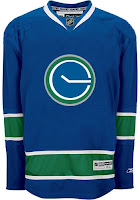
But if neither that nor the stick-in-rink is your cup of tea, how about stick-in-pond? A perfectly circular pond, that is.

There are even some folks partial to the good ol' whale — with the new colors.

Or you could just go way back and mess with everything.

I think we can safely count that one out as a potential third sweater contender.

More to come this week. And by the way, the images above, as with all images posted here, are the work of readers like you. To have your work posted on the blog for all to see, email it to me at nhllogos@gmail.com.

Friday
May162008

Just To Freak You Out XXXV

I know you've all been waiting for two whole weeks, but I'm all set just to freak you out now. And some of these should really get the job done.

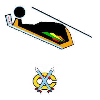
We'll begin in none other than the Windy City with a couple of logos that almost had tears coming out of my eyes I was laughing so hard.

Yeah, it's a Blackhawk and two tomahawks. I'm not saying the idea was over-the-top clever, but the execution had me on the floor.

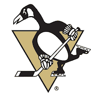
Then there's this.

Which looks a bit more like a goose than a penguin. I guess that's what they were going for.

Not entirely sure what's going on there but the guy with the stick and... the eyes... that guys creeps me out.

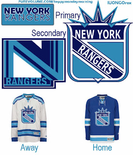
We'll transition now from logo designs to jersey artwork. First, a completely new concept for the New York Rangers.

Yeah, they're the Broadway Blueshirts all right, I suppose. Which is a good reason why this should never happen.

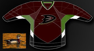
Also, a not entirely unexpected result of naming your team the Ducks could be the nickname "mallards" — a completely harmless and ridiculous looking bird, let's all just be glad they didn't go with uniform colors to match.

Because as you can see, it could have been way worse.

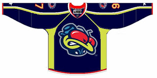
Or you could just put a bug on your sweater.

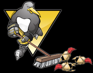
I don't recommend it. However, if you're a Pens fan, I do recommend a trip to The Pensblog for some of the most entertaining coverage of Pittsburgh hockey. Their series of site logos during this playoff season has cracked me up. Enjoy this one (unless you're a Sens fan).

Unfortunately for them, there'll be no broom-clad penguin sweeping away wings of some sort.

Hoped you enjoyed this edition of the Freak Out Friday. Keep sending in the craziest artwork you can find/make and join me again in two weeks for another riveting episode.

Thursday
May152008

Capital Conceptualizing

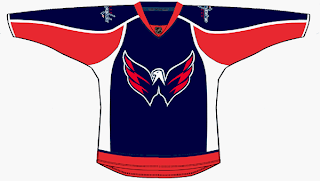
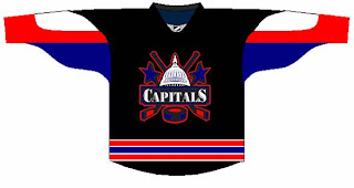
I've got some third jersey concepts for the Washington Capitals to share tonight.

The first one is based off the current uniform with colors and logos swapped.

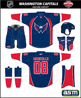
Not bad at all but I'm partial to this next design.

The striping and style fit in with the current sweaters while also being different in their own right. Really, they could do a lot worse.

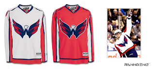
And I know a lot of people like the eagle secondary logo, so much so that they've asked to see it as the primary. Well here you go.

I think it could be smaller on that jersey, but I certainly like it better than the wordmark. The Ducks could learn a thing or two from this but we'll save them for another day.

And don't take this last item too seriously.

I was going to save it for tomorrow's Freak Out post but it fit with the Washington theme today. Anyway, check back tomorrow for the 35th installment of the Freak Out Friday.

Tuesday
May132008

Speaking Of The Sabres...

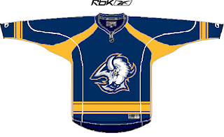
First thing: don't forget to vote to help Matt choose the color scheme for the Sabres rebranding. Second: I have Buffalo concept art to go along!

I know you guys have been eagerly awaiting the new batch of concept art and I apologize for the delay. I've been focusing my attention on the launch of Icethetics. I'm anticipating having it ready at some point in the next few weeks. At some point I should probably explain how that's going to work but that's not what this post is about.

We've got a very nicely designed blue sweater there with the old "goathead" logo on the chest. Nice color/logo mix there but probably not something we're apt to see at any point the future.

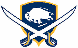
We've also got a nice shield which accents the "sabres" part of the design a little better.

And this would be a great throwback concept if Buffalo didn't already have the perfect vintage jerseys with the 1970s look.

Then, going totally off the beaten path is one of the coolest looking jersey concepts I've seen in a long time.

I know it's out there and it's contrast makes it difficult to place as a home or road sweater, but I love this idea. It's done so well. The design is based off of a logo created by John Slabyk.

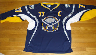
All of these make for great artwork but will likely never see the light of day. However, that hasn't stopped a few fans from making their dreams come true. Recently, if you did an ebay search, you might have come across this gem.

You could even find it in white.

I'm not sure that what you see here is available anymore or even legal under copyright laws. But it's a beautiful design and I'd be willing to bet there are countless Sabres fans who would die for that logo to don that jersey on NHL ice.

So I hope you guys enjoyed the return of the concept art. I plan to have more up this week. You guys have been submitting some really great work! And stay tuned for a Freak Out Friday at the end of the week!

Sunday
May042008

Confirmed Third Jerseys For '08

According to a Canadian retailer, 18 NHL clubs have confirmed third jerseys for the coming season. I will not divulge my source here because this is just for fun and no one needs to be losing their job over it. If you're skeptical, there's nothing wrong with that.

Anyhow, with the disclaimer out of the way, below are the teams with "confirmed" third jerseys for next season, in alphabetical order.


  • Atlanta Thrashers

  • Boston Bruins

  • Buffalo Sabres

  • Carolina Hurricanes

  • Chicago Blackhawks

  • Dallas Stars

  • Edmonton Oilers

  • Los Angeles Kings

  • Minnesota Wild

  • New York Islanders

  • Ottawa Senators

  • Philadelphia Flyers

  • Phoenix Coyotes

  • San Jose Sharks

  • St. Louis Blues

  • Tampa Bay Lightning

  • Toronto Maple Leafs

  • Vancouver Canucks

Obviously there are discrepancies here from earlier rumors involving the Pittsburgh Penguins. The last thing we heard, by way of the Tribune-Review, was that the club was seeking permission to get third jerseys featuring the powder blue design worn at the Winter Classic in January. Either they were denied by the league or the information I have here is incomplete.

Now, aside from the Pens, this list meshes perfectly with the big list I posted a month ago. I suggest reading that post for information regarding possible design rumors that have been floating around.

Rumors: The Big List | All third jersey news

If pictures become available prior to official unveilings, I'll be sure to have them posted for your perusal.