NHL Tournament of Logos

Entries in jerseys (477)

Monday
Mar312008

Rbk EDGE Being Dumped!

As you know, I hate to post rumor and gossip. I prefer actual facts to back up my information so naturally I was unsure about posting this at all. But since I started this blog, I've made contacts with a lot of great people inside the NHL and Reebok. (Honestly, how do you think I was able to get much of the information I did over the summer?)

I was asked not to write about this, but I can't do that to you guys. As NHL fans, you have the right to know. I've been told the league will be dropping the Rbk EDGE uniforms entirely next season and is cutting all ties with Reebok. Naturally, this news comes as quite a shock considering all the time and money that was put into the project in the first place. My Reebok rep called it a "failed experiment" and said the split with the NHL was "best for both parties."

What might be most surprising is the league is discussing redesigning all 30 uniforms once again! (Like once wasn't enough.) A new deal is still being worked out, but right now it appears league commissioner Gary Bettman would consider having the folks at Bravo TV series Project Runway design the new sweaters in one of next season's new episodes. Manufacturing would then be handled by Nike, believe it or not.

My source (who I unfortunately can't name due to legal issues) inside the league says Bettman is "delighted" at the prospect of getting the league this sort of national television recognition. I'm tempted to take him at his word as that sounds just like Bettman to me. Not surprisingly, this is going to make the NHL look like a complete joke on the national stage.

Personally, I really think they should have just stuck it out for at least one more season. Sure, the Rbk EDGE system had its issues, but so do most new things. On the other hand, the prospect of new uniform designs is kind of exciting. But we just went through it last year. This is just overkill and rather annoying.

Finally, I just wanted to take the time to thank you guys for continuing to visit the blog. Without you, I certainly wouldn't be where I am. News regarding these uniform changes will supposedly start trickling out as the playoffs wind down. Looks like we'll be doing the uniform re-design watch for yet another summer.

I'll post more information on this as I get it.

UPDATE (4/2 2:12 AM): Happy April Fools' Day! I love you guys!

Sunday
Mar302008

Fan Art To Finish Your Weekend

I think I promised you guys a concept post before the weekend was out, so here it is. I've assembled some of my favorite designs from my stash. There's a lot of quality work, so let's dive in.

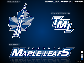
First, an interesting new look for the Toronto Maple Leafs.

I'd like to see the jerseys that go with it. If nothing else, the production value is through the roof on this one.

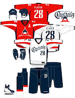
But if you want to talk excellent concept logos, look no further than this one for the Washington Capitals.

I admit I had to stare at it a while, but there it is, a "W" and a "C." And I don't know why it took us so long to realize that if you put those two letters together the right way, it forms a star! However, I'm not sold on the wordmark. I get the whole Declaration of Independence thing (been watching John Adams today), but for a sports team it's not a good idea.

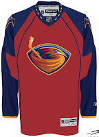
I like that Thrashers jersey as well. With much thanks to Jacob at We're Revolting! for that one.

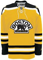
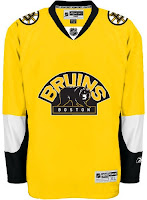
You guys always give me trouble for my aversion to yellow jerseys, but I've come across a bunch that I actually like — despite their resemblance to what I can only assume is Hillary Clinton's favorite suit.

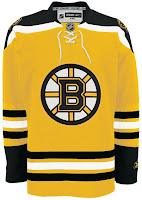
Well, it's the Boston Bruins of course. Can any other team really do a yellow sweater?

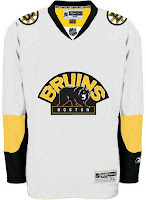
This second set wouldn't work because yellow is still a light color. It wouldn't work as a dark home jersey. However, I am intrigued by the use of the secondary logo with a black background and yellow text.

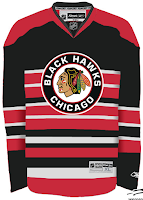
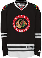
Up next are the Chicago Blackhawks.

All those stripes do weird things to my brain. And there's not enough contrast in the other one. But I don't know, either could work as a temporary third jersey.

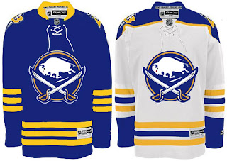
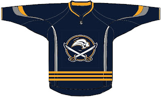
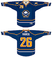
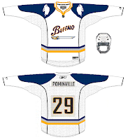
Finally, it's the Buffalo Sabres.

It's a nice logo on a traditional uniform design. I think you'd be hard-pressed to find nay-sayers.

That's good for now. Stay tuned for new polls going up tomorrow both here and at ToHL. Here, we'll have Cam Ward and Josh Harding going head to head and for the WHL Tournament of Logos, it'll be the Calgary Hitmen and the winner of the Americans/Thunderbirds poll which closes tonight.

Friday
Mar282008

Just To Freak You Out XXXII

Can you believe this is already the 32nd installment of the Freak Out series? Who knew it would go this long? What's interesting about this week's post is what comes at the end and the fact that it's real and not concocted in the freakish mind of one of the many readers of NHLToL. No, it's quite real and that's what freaks me out the most.

But first, let's talk third jerseys. We know they're making their big comeback next season after having taken a year off. We'll begin in Vancouver.

But wait, there's more!

And I'm sure this was just a case of colors lost in translation.

Doesn't make me feel any better. I'm all right with the purple on the Kings' uniforms because it's partnered with black and silver.

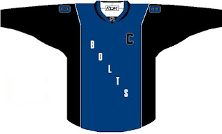
Here's a Lightning jersey even I wouldn't consider buying.

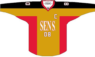
And a Sens sweater absolutely no one would.

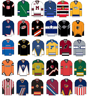
But hold on, why one team at a time? Let's go for all 30 all at once.

A good try to be sure, but I'm afraid a few too many of these missed the mark in terms of what one might consider, you know, aesthetically pleasing. (What the hell kind of sentence was that?)

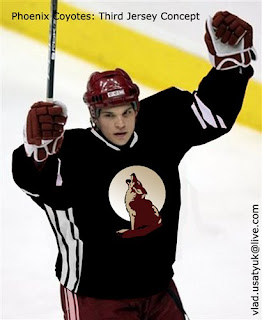
It's worse when you make it look real by painting it onto a player.

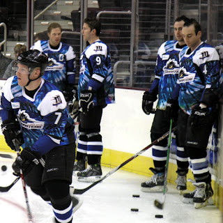
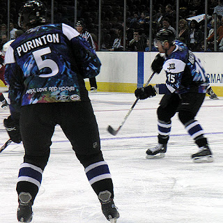
And now for the little thing I was teasing at the beginning of this post. I know it's not NHL, but I'm making an exception. The AHL's Lake Erie Monsters, this season, actually wore jerseys that... I'm sorry, there's no other way of putting this. They were tie-dyed. Behold the horror.

Because one photo wasn't enough...

Peace. Love. And hockey.

And now I'm just going to go put forks in my eyes. Until tomorrow, friends.

Thursday
Mar272008

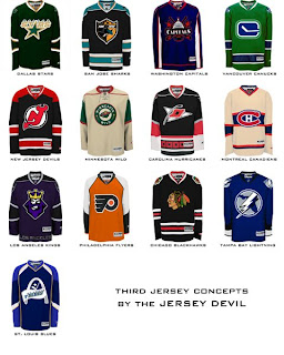
Third Jersey Ideas

I haven't written a concept art post since the weekend so I think we're due. But it's going to be a short one. One reader came up with 13 different jersey designs he'd like to see implemented for various teams at some point in the future.

I told you it'd be short, but we've got 13 different teams covered. Hope you enjoy it.

We've got a Freak Out Friday post coming tomorrow and hopefully some more concepts for the weekend. I've been keeping pretty busy with the Goalie Mask Tournament. Voter turnout is great so far. Keep 'em coming!

Saturday
Mar222008

Just To Freak You Out XXXI

I began the last Freak Out post with a similar image, so this is not a repeat. Look closely.

Yes, the duck is wearing himself on his own jersey. This is like some sort of weird fractal, right?

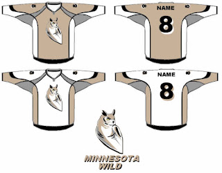
Anyway, we've also got an odd Minnesota Wild concept that scares me.

There's a reason teams choose bright colors. I can't remember what that is at the moment.

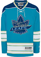
Got some stuff for Toronto and Montreal.

Does that Leafs logo look familiar to anyone? I've always thought the Habs should try blue — but on the jersey, not the logo.

And then of course we've got a string of "If They Mated" concepts for some of the clubs that found new homes in the '90s.

The Hartford Hurricanes?

The Quebec Avalanche?

The Winnipeg Coyotes?

No, no and no. Lastly, I've got a little something to celebrate St. Patrick's Day albeit a bit after the fact.

He's got shamrocks on his shoulders! You guys absolutely slay me.
Friday
Mar212008

Flyers Leak Thirds?

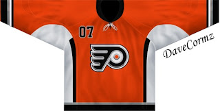
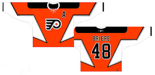
Got a bunch of emails today from readers under the impression that possible photos of the Philadelphia Flyers' new third jersey have leaked. And you know how I love rumor mongering. Still, I'll indulge.

From these horribly lo-res pictures (I'm assuming taken by a cell phone from the late '90s), they look a lot like what we were hearing — vintage look in orange. It's hard to say but I'll try to provide better photos when I see some.

In the meantime, speculate away!
By the way, if you're looking for the Freak Out post, give it one more day. I've got lots of good stuff but it'll have to wait until tomorrow.

Friday
Mar212008

We Need A Bigger Boat...

...to hold all these concept graphics.

You know... because there are so many today. Ha ha. Ha.

Ha.

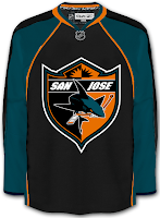
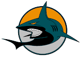
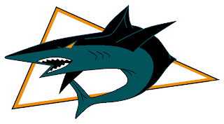
Okay I'll stop. Really, though, lots of San Jose Sharks artwork for you this afternoon. It's my attempt at winning you back after two posts in a row to which many of you responded negatively. And I'm sorry about that. I'm a man of the people and I hear what you're saying. You're saying you want something better. I'll do what I can.

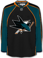
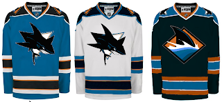
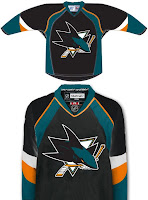
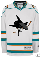
I love that shield logo. (So much I'd consider marrying it if that were legal in my state.) But I also like the teal sleeves on the black jersey in general. I'd call it a serious contender for a third jersey design but then again that's not my decision to make.

There are other options.

I like the all black shark but the contrast isn't there. You need contrast to have a good logo. (I might be lying about that.)

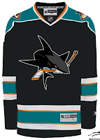
The design on the right shows how things could work if we drop the orange. Personally I'm a fan. It adds a little something, but then you're talking to a guy who can't fathom yellow (or red for that matter) being introduced into the Lightning's logo — a topic I assure has been discussed in the past.

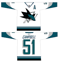
But getting back to the contrast thing. You could fix that problem with grey instead.

It's really not a bad idea but spare me the piping on the white jersey. At least let it serve as a border to something but don't just go willy-nilly putting it anywhere and everywhere.

Am I writing too much? Logos! That's right, I have more.

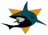
It's hard not to like that one in the circle. I'm less impressed by the triangle. Still, if you wanted to throw out the rules of visual balance altogether, try to endure this.

Though as I joke, I mean nothing bad toward these designs. They're all good. Obviously I didn't post everything I had but I felt these would represent the cream of that particular crop.

I'm interested now to see how you guys react. I think I can only write so many more bad posts before you all come to the realization of the scam I'm running and jet for the nearest exit. (Kidding, of course.) Bantering is difficult when you're all by yourself.

What do you guys think of the San Jose Sharks, anyway? Cup contenders or are they destined to the fate of the Ottawa Senators? (Don't get me wrong, I have nothing against the Sens but those guys absolutely implode come April.)

Thursday
Mar202008

New York Fan Art

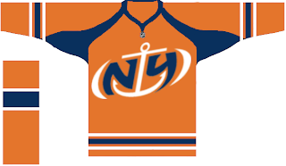
Today's concept post theme is the great state of New York. Mostly we've got Buffalo Sabres artwork, but we'll kick things off with the New York Islanders.

That's a fan-designed logo I posted a while back. I like the orange jersey.

This Sabres design makes an attempt at a new logo.

Quite unique, I must say. Also got a pair of Sabres pieces, one of which involves John Slabyk's logos.

That's all for tonight. Get your votes in by tomorrow for the goalie mask tournament. It starts soon!

Wednesday
Mar122008

Dropping Into Carolina

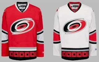
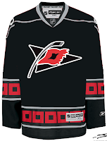
Today's concept art subject is the Carolina Hurricanes. Got a lot to share so I'll get started right away.

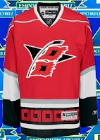
First up, a simplification of the current uniforms.

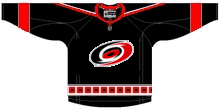
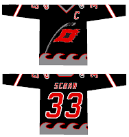
It basically drops some striping. Not much to speak of. There's also an idea for a black third jersey using the current primary logo.

I like the triangular shoulder designs. However, a lot of the rumors we've heard suggest that the secondary logo will don the chest of a new alternate sweater.

The one on the right is funny because of the waves. Reminds me of the Lightning's sole attempt at a third jersey in the mid-'90s.

But as many have pointed out, that flag is actually a tropical storm flag. It's simpler and therefore makes a more balanced logo. Technically, a hurricane flag would look like this.

What do you think of that secondary logo?

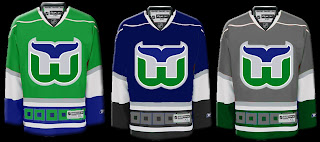
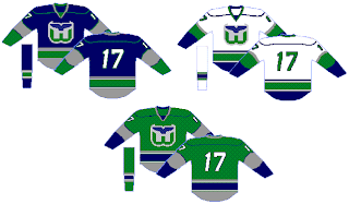
Now we'll go back in time a little to when the 'Canes were the Hartford Whalers. We've got some Rbk EDGE designs for them.

That's nice but I don't think the folks from Hartford will be able to identify well with the hurricane flags around the bottom.

Probably a better design there. I like that green jersey a lot. Thoughts on these? Post a comment.

Monday
Mar102008

LFV Day 6: Last Day In Canada

LIVE FROM VANCOUVER!

Well, today is a sad day for me. My flight back to Tampa is tonight. I have to leave this wonderful weather (yes, I know it's raining right now) and go back to work on Wednesday. And since I've been away, the Lightning just keep losing. So this concept post is meant to honor all those teams that defeated the Bolts in my absence.

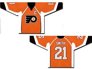
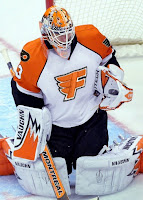
The teams I'm talking about would be the New Jersey Devils, Columbus Blue Jackets, and of course, the Philadelphia Flyers. We'll start with them.

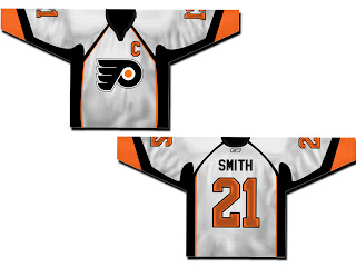
Also got a white version of that.

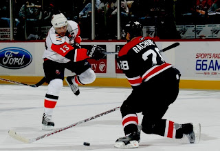
Not a bad design at all. There are also a couple of orange ones with the alternate Flyers logo.

This one is based on the old New York Islanders third jersey.

And speaking of alternate logos, here's something different.

Not really sure what to say about those. Not normal but not quite crazy enough to warrant a Friday post.

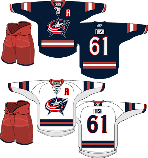
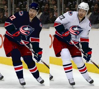
We've also got a very sharp jersey set for the Blue Jackets.

And a fan suggesting they switch from red pants to blue.

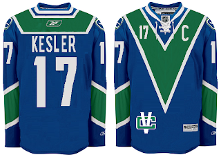
And either wishful thinking that one day a certain Sedin will find his way to Columbus or the idea that the Jackets would look better in a jersey with striping similar to the Canucks.

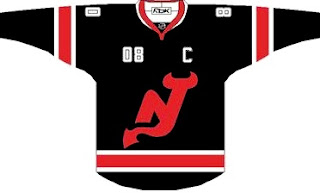
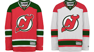
Moving on now to the New Jersey Devils. Here's a black concept without the circle in the logo.

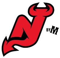
My feeling is that if you're going to dump the circle, you need to make some upgrades to the rest of the logo. Something like this might work well.

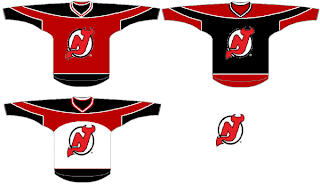
Continuing on the tack of black jerseys, there's this one.

Very nice. Then there's this set.

Those jerseys look like hoodies to me, though. Maybe I'm just losing my mind. And finally, here's why it's a good thing that the Devils dumped green out of the logo and uniforms.

It looks bad!

And that's it for this afternoon. Gotta get things packed up and maybe take one last walk around the city before heading to the airport this evening. Bye Vancouver!

Page 1 ... 2 3 4 5 6 ... 48 Next 10 Entries »