NHL Tournament of Logos

Entries in jerseys (477)

Friday
May022008

Just To Freak You Out XXXIV

Time again for me to try to freak you out with some of the crazy stuff people send to me. We've got a theme for this one, though.

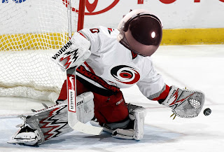
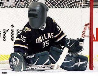
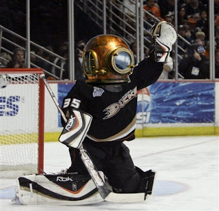
As you know, we're currently in the midst of the Tournament of Goalie Masks. It's pretty cool and it's made a lot of people look at goalie masks in a different way. I'm not really sure how to describe these next couple of graphics. They're not so much concept art as... freaky.

Yeah, that's an astronaut's mask on Cam Ward.

Right, a welder's mask on Marty Turco.

Ah, and a diver's mask on Jean-Sebastien Giguere. That's just trippy. Wait it gets worse.

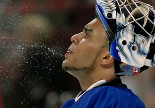
Stare at this a little while.

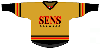
I'm pretty sure a bunch of Leafs and Sens fans just swore off this blog. It's just so... freaky.

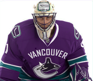
Speaking of which, ever wondered if Luongo can pull off purple?

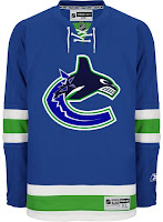
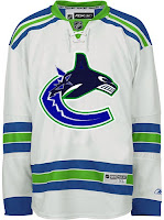
Yeah, he can't. I've got an "If They Mated" concept for the Canucks, though.

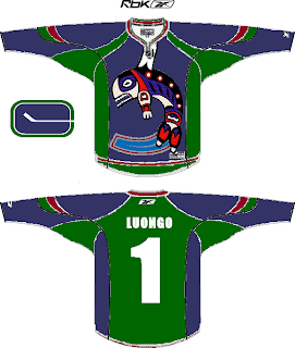
I like the Rangers' jerseys with the red in them. But now let's get really nuts. If you want First Nations art, why don't you just go all or nothing?

And the answer comes back plainly enough.

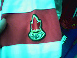
We'll stay in Canada as we finish things off this week.

It's an actual maple leaf. Inventive.

That's all. As I mentioned before, I'm probably going to be making the Freak Out Fridays into an every-other-week feature simply because I'm not getting enough stuff sent to me to do it every Friday. But I enjoy these posts when I can write them and I know you guys do too.

Enjoy your weekend and stick around for more news about the changes going down here at NHLToL. Our birthday is just a week away!

Thursday
May012008

Kings Getting New Thirds In November

Got an email from a reader this afternoon regarding a new third jersey for the Los Angeles Kings. Blogger Rich Hammond has word that the new sweater will be introduced in November incorporating "several looks from the past." Apparently all season ticket holders will receive one. You can read more at Inside The Kings.

Thursday
May012008

NHLToL & GhettoFarmBoy Joining Forces!

The big changes here at NHLToL are beginning. Today I'm announcing that this blog is partnering up with popular NHL concept artist GhettoFarmBoy (whose real name is Matt) to bring you some of the highest quality fan artwork around.
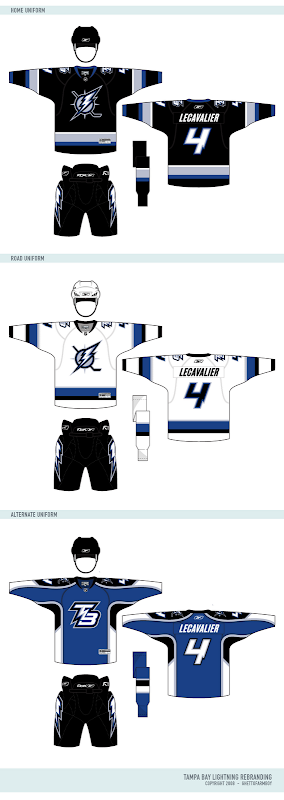
A lot of you have been big fans of his work for a long time and as of today, this blog is your official source for all of his work. I'm also using this post to unveil his most recent NHL rebranding set, featuring my team, the Tampa Bay Lightning.

But first, a message from Matt himself.

First off, I want to thank all the loyal readers who have for followed Chris's blog as well as my concept series. And of course, I would also like to thank Chris for running such a great site. I'm really going to enjoy being his partner in crime...

The reason I started the Rebranding the NHL series was to give the fans of NHL teams the logos and uniforms they deserve. I remember starting RtNHL shortly after the Buffalo Sabres introduced the "buffaslug", even though almost the entire fan base wanted a return (or something similar) to the retro identity. I wanted to see if I could do better job than the people doing the rebranding, and well, the rest is history...

By making this series an interactive fan experience, it allows RtNHL to fulfill it's purpose: give the fans what they want. Now, fans can guide the rebranding to what they would like see. You (the fans) will be able to choose which team to rebrand, the colors, the logos, almost anything!

But it doesn't stop there. Through all of Dave's hard work, you will soon be able to use my rebranding series in EA Sports NHL series. So not only will you be able to dictate your team's rebranding, but you can also play as you team with your logos and uniforms! You become, in a way, the owner of your team, which is actually true in som regards, because without you, there wouldn't be an NHL to begin with...

So be sure to stop by, participate, and voice your opinion!

Matt


Now check out the logos.

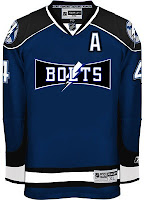
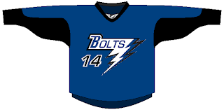
And the jerseys are killer.

I wish the Bolts could look this good. I especially like the blue third jersey.

What else is on the horizon?

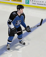
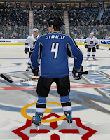
In his note, Matt mentioned that our friend Dave will be making these designs available to use in video games. Here are some samples of what that will look like.

I'll have more to come on this.

Also, I'm working on some other stuff as well. The blog is going to undergo a facelift. But before that, it's going to get a completely new identity. "NHL Tournament of Logos" just doesn't accurately describe this blog anymore. We've become so much more than that. In fact, there isn't even a logo tournament going on right now. Plus, the site's becoming well known for the concept art you guys send in. We need a title that's more appropriate and you guys are going to decide on it. If you have ideas, hold onto them. I'll be asking for submissions soon.

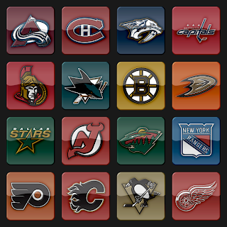
Plus, I'm going to start incorporating a new logo set that's vastly different from what is used now. You can see a sample below. I hope you guys like it.

Post your thoughts below and stay tuned over the next few days as I make more announcements.

Wednesday
Apr302008

Stars And Sharks Fan Creations

I've got a little bit of concept art for you today. We're doing the Sharks and Stars in honor of their current playoff series. (Though it may not last too much longer if the Stars have their way.)

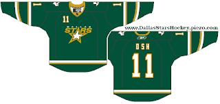
This first Dallas jersey is a green third that would fit in seamlessly with their current set.

Then we have a full set with a green home sweater and a black alternate.


The alternate looks great with the green shoulder yoke.

And lastly, we've got a San Jose fan design attempting to emulate the pre-Rbk EDGE design scheme.

By the way, I know a number of you have been asking about the Freak Out Friday series. It's not over, I think it's just going to be less frequent. I'm not getting as much crazy artwork as I used to so we're probably just going to have it every other week. Not to worry though, you'll be able to get your fix this Friday. Lots of great stuff on the way!

Oh and be sure to drop in tomorrow to check out the big announcement.

Thursday
Apr242008

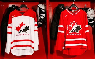
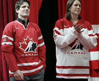
New Canada Sweaters Official

Just following up on yesterday's scoop regarding a new look for Team Canada here. Seems it's official now.

They're being called "retro-futuristic" if that's even possible and TSN has more on the story.

Go online and buy yours now.

IceJerseys.com

Hope all you Canadians like them.

Wednesday
Apr232008

Primarily Pennsylvania

Did you see what I did there? I'm a day late on the joke, but still. To thank all you Pennsylvanians for going out in record numbers to perform your civic duty, I have concept art tailored especially to you.

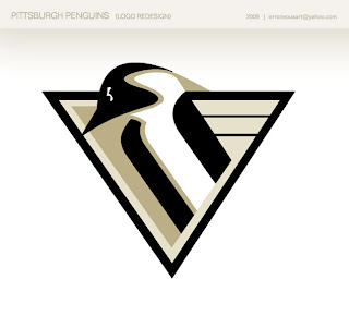
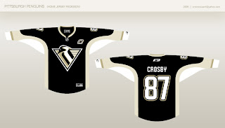
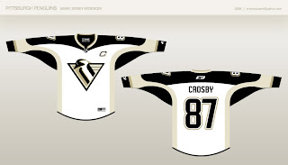
We'll begin with a cool new logo redesign for the Penguins.

It's a really sharp logo that pays tribute to the past in a big way while also bringing something new to the table. There are also jerseys to go with it.

The black one doesn't do much for me, but oddly enough, the white one blows me away. I think it's the shoulder striping.

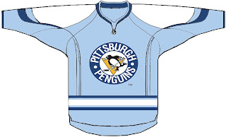
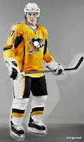
A likely third jersey candidate for the Pens going into next season is a version of the powder blue sweater they wore for the Winter Classic.

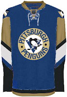
But stepping outside of that for a moment brings us some interesting designs. This dark blue strikes me as slightly strange, however.

And remember the days when gold was actually yellow (though no one wanted to admit it)? Well there's a little more where that came from.

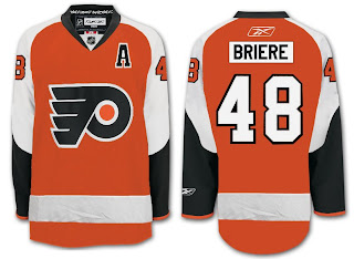
We'll wrap up our Pennsylvania trip in Philly. Not much to speak of with this.

But one designer came up with a notion of what might well be a good candidate as an alternate for the Flyers next season.

They could do worse.

Wednesday
Apr232008

New Look For Team Canada

A reader emailed in to say that apparently Team Canada will be unveiling a new look next month. CBC has the story if you're interested. I'll post pictures here when it happens so keep checking back.

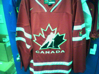
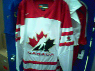
UPDATE (3:13 PM): Shortly after I posted this information I got an email with "leaked" in the subject line which always makes me wary. But if for no other reason than to cover all my bases, I figured I'd post these pictures and see what you guys make of them. This isn't something I'm following very closely, not being Canadian myself (though if wishing made it so), but perhaps some of you might have answers.

Post your comments and conspiracy theories below.

Friday
Apr182008

Just To Freak You Out XXXIII

Hell has frozen over!

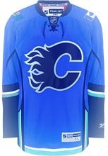
Indeed, the Freak Out Friday has returned. After two weeks off, it's been resurrected. All the talk last month about the league returning to the third jersey program next season has died down, but folks are still trying to come up with the best solution to this alternate sweater issue. The ones that fail tend to end up here.

See what I mean? What happened with the D there? And don't get me wrong, I like that blue for my Bolts, but I can't imagine having that written on the front of the jersey. There's more.

Same goes for the other team that joined the league the same year as Tampa Bay.

I know these are designs based on previously discussed rumors, but I always thought they were too horrible to actually see.

I've got some other stuff too — like a new alternate logo for the Blue Jackets.

And a sweater to boot.

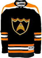
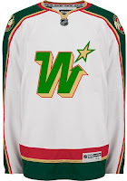
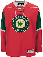
But my favorite pair of sweaters for this week's Freak Out are based on the Minnesota Wild and the previous NHL club that occupied the state.

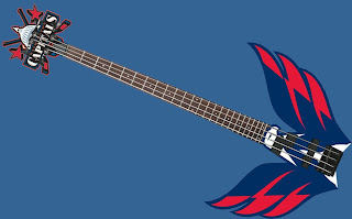
And finally, I know you guys hated the guitar thing, but someone else made this one and I thought it was kind of interesting.

So keep the crazy artwork coming in each week if you want me to be able to continue this series. I'm counting on you! Yes, you! And that's that for this week. Hopefully I'll return next Friday with a brand new batch of insanity.

Wednesday
Apr162008

Desert Art

The last time I posted any good Phoenix Coyotes artwork was... well, it was never. I've never posted any good Phoenix Coyotes artwork and for that I am ashamed. That streak ends this afternoon.

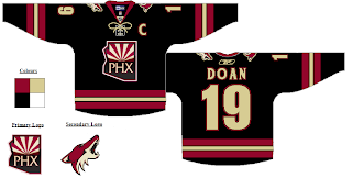
If there was ever a reason for the 'Yotes to don a black third jersey, this would be it.

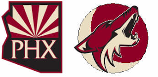
I never would've thought that PHX logo would look good as a crest. Proved me wrong, right there. Here's what made me think that in the first place.

Yeah. Don't worry, though, I'm not wasting it. We've got some decent Freak Out stuff for Friday too.

Below is a simple redesign concept with the old moon logo I liked a lot.

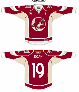
This does make me miss the PHX logo, though. However, the Coyotes still wear that moon logo on their pants. But what if we combine it with the current primary?

And then slap it on a jersey?

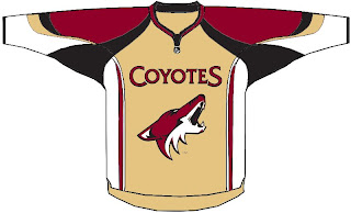
Lastly, we get a look at the reason why text needs to stay off the front of jerseys.

That's all I've got for you today. Tune in next time for more fan made concept art. You know you love it. In the meantime, keep voting on the NHL's best goalie masks! Despite being just over halfway through the first round, we're actually making some headway. We'll have a winner before you know it.

Something BIG is coming... May 1, 2008!

Monday
Apr072008

Pre-Playoff Concept Art

The Stanley Cup playoffs kick off on Wednesday night. Tomorrow I figure I'll post my predictions and so forth for anyone who might be interested. In the meantime, I've got concept art for you tonight. Not a lot but just a few things I thought were especially interesting.

First, a big set of third jerseys. Pretty much every team with rumors floating about. And then a special treat.

I told you it was a lot.

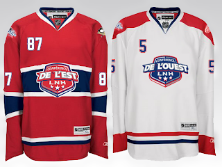
Then, with the recent surfacing of the 2009 All-Star Game logo, one reader came up with a concept for a Habs-based jersey design.

In French, no less.

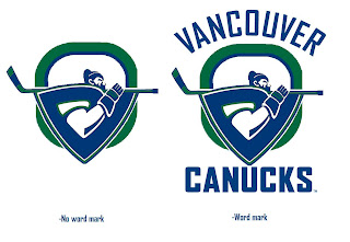
And finally, a Canucks concept I thought was interesting given the current logo tournament going on at ToHL.

Obviously a take on the WHL's Giants.

Enjoy your night and let's get set for some playoff hockey! My favorite time of year!