NHL Tournament of Logos

Entries in lightning (75)

Tuesday
Feb122008

And Because I Can't Resist...

Normally I wouldn't take quite so much pleasure in this, but because of the rash of mockery-laden emails I receive every time a Canadian team beats the Lightning, I'm making an exception. The Montreal Canadiens are in Tampa right now to play the Bolts. Apparently they got in some time early yesterday. And a couple of players allowed themselves enough time to start a ruckus.

A Montreal Canadiens player was arrested and charged with felony grand theft for — wait for it! — stealing a woman's purse at a night club!

I don't know what goes on in the City of Saints, but come on, purse-snatching? Really?!

February 12, 2008

Associated Press

TAMPA, Fla. — Ryan O'Byrne and Tom Kostopoulos joined their Montreal teammates for practice Monday, hours after being arrested outside a Tampa nightclub.

Police said O'Byrne, a 23-year-old rookie, was accused of stealing a woman's purse. Right wing Kostopoulos, 29, was charged with resisting an officer.

O'Byrne was charged with felony grand theft and released after posting $2,000 bail. Kostopoulos faces a misdemeanor count of resisting an officer without violence and was freed on $500 bail.

"You wish these things didn't happen, but once things happen, trying to go backwards isn't a possibility, so we move ahead," Canadiens general manager Bob Gainey said after practice at the St. Pete Times Forum, where Montreal faces the Tampa Bay Lightning on Tuesday.


I really want to hear the story behind this because you know it's a good one.

And for the record, my Bolts have won three of the last four games against Canadian clubs. (I'm trying to block out the 8-4 loss to Ottawa.)

Thursday
Feb072008

Poll: Lightning vs Whalers


vs
Tampa Bay
LIGHTNING
Hartford
WHALERS


REMEMBER: You're choosing the WORST logo!

Place your vote and then feel free to leave a comment as to how you came to your decision. Tell all your friends to drop in and vote! The more voices heard, the more accurate the results!

Poll opening date
Thu Feb 7
Poll closing date
Mon Feb 11

Sunday
Jan272008

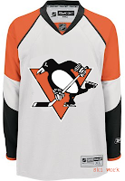
Poll: Lightning vs Penguins


vs
Tampa Bay
LIGHTNING
Pittsburgh
PENGUINS


REMEMBER: You're choosing the WORST logo!

Place your vote and then feel free to leave a comment as to how you came to your decision. Tell all your friends to drop in and vote! The more voices heard, the more accurate the results!

Poll opening date
Sun Jan 27
Poll closing date
Thu Jan 31

Friday
Jan182008

Just To Freak You Out XXIV

Can you believe yet another Friday is already upon us? I've had a long day (which began with me waking up at 1 AM) so forgive me if I make this a quick one. Just trying to freak you out a little.

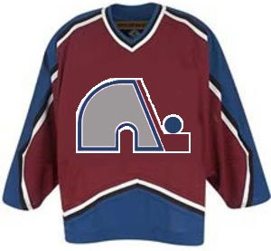
Last week's theme was crazy logos. This week's theme is crazy jerseys. For instance, what if when the Quebec Nordiques moved to Denver, they opted not to change their name or logo — just their colors?

Yep, that would've happened. Good guess.

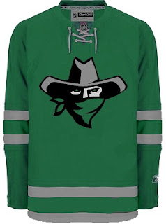
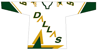
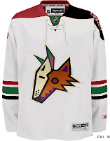
I think this next one was submitted as a Dallas Stars concept, but I don't really get it.

Are all Texans also banditos? On second thought, don't answer that.

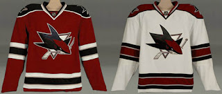
This next one is a little disturbing.

Blood in the water.

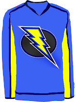
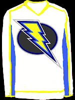
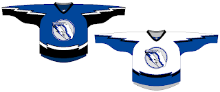
I posted a concept Lightning logo a couple weeks ago. Here are the jerseys that go with it.

I'm still not a fan.

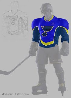
Giant hockey player... smash!

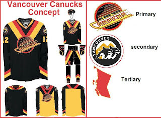
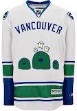
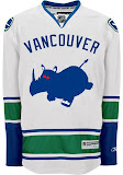
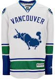
And what sort of person would I be if I didn't work in some Vancouver Canucks art? (Yes, arguably the most well-represented club on this blog much to the dismay of a handful of you.)
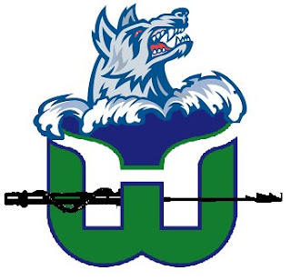
The weird thing is I sort of like the whales. Here's what I really don't like.

And finally, I've got this logo that serves as a great followup to last week's insane logo fusions.

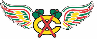
There's why the Chicago Blackhawks and Detroit Red Wings will never merge. The logo just wouldn't work as you can plainly see.

So it turns out this post was a little longer than I planned. I impress myself. By the way, at some point this weekend I hope to update the Concepts Gallery as I have over 100 images waiting to be added. I'll let you know when I get it done.

Hope you enjoyed the 24th Freak Out post. See you again right here next week!

Friday
Jan042008

Just To Freak You Out XXII

I can't believe how long this series has lasted. At 22 and still going strong, what follows is another edition of Freak Out Friday. Where do I begin?

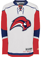
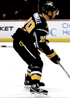
I think I'll start with a play on the Winter Classic which took place this week. It's an "If They Mated" featuring the two teams involved in the big outdoor game.

Curiously though, while the designer went with the original Sabres logo, they opted against the original Penguins colors.

Now is where I really get into the scary stuff, so be warned.

Though well executed, that can't be a good idea. Speaking of which...

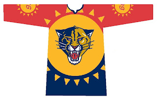
Let the eye-gouging begin. It makes great use of the Panthers' colors but what is with all the suns? We get it they're the Florida Panthers!

Here's what we need.

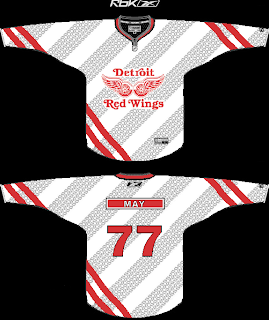
Because nothing says we're getting rolled over like a jersey with tire tracks. A sentiment less suited for the Red Wings (first place) and more so for the Lightning (last place) who can't seem to remember how to win games. But I'm not bitter.
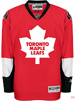
Speaking of the lackluster Lightning, the one color I hope is never incorporated into the Bolts' identity is yellow.

Did I mention how I hate the yellow?

And finally, it appears that not a lot of effort was put into this, but I thought the logo was funny enough to revisit.

Keep the crazy artwork coming so I can continue to frighten and freak out the readers here at NHLToL. Enjoy your weekend!

Friday
Dec142007

Just To Freak You Out XIX

Finally, Freak Out Friday is back on Friday! And boy is this one a doozy. You won't believe some of the whacked out craziness your fellow readers have come up with this week. Let's start with an eyesore I probably never should've posted at all.

Yeah, there's no excuse for that. Speaking of inexcusable, here's a rather scary concept of a Tampa Bay Lightning logo.

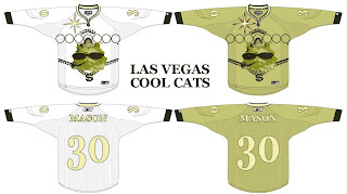
Oh wait, it gets better. You know how Las Vegas has been involved in all the buzz about a possible future expansion of the NHL? Here's what they shouldn't do when it comes to naming the team and designing a uniform.

And then as always, we have our "If They Mated" blends. First, we have Pennsylvania's teams...

...and then all three New York clubs.

Plus as a special bonus, someone redesigned the Sabres' pants. But you know what I say? If the Lightning can have lightning bolts down their legs, than why can't the Sabres have swords?

Oh, and I mentioned the Penguins a second ago. I need to post this just so it's out there. I'm all for the retro blue jersey for the Winter Classic, but let's not go too far. Here's something to avoid at any cost.

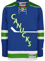
And finally, I can't determine whether the designer of these hates the new Canucks jerseys, or loves them. You be the judge.

Hope you enjoyed your week — or at least your Friday. Christmas comes in just 11 days and you know what that means!

See you right here for another Freak Out post next Friday! And remember you can send in your concepts for consideration to nhllogos@gmail.com. I look forward to seeing them!

Sunday
Dec092007

Poll: Blackhawks vs Lightning


vs
Chicago
BLACKHAWKS
Tampa Bay
LIGHTNING


Place your vote and then feel free to leave a comment as to how you came to your decision. Tell all your friends to drop in and vote! The more voices heard, the more accurate the results!

Poll opening date
Sun Dec 9
Poll closing date
Thu Dec 13

07SCTRN | #1B | CHIvTBL

Sunday
Dec022007

Just To Freak You Out XVII

Welcome to the belated 17th installment of the Freak Out series. Time's been getting away from me the last few days so I apologize for the delay. Anyway, this week's art has a very specific theme. I asked for you guys to send me stuff of the "If They Mated" variety and some of you actually responded.

We'll start with a couple of logos I thought were "special."

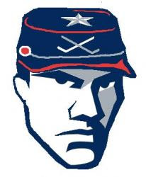
If you're staring at that and just can't place it, look no further than the Ottawa Senators. You'll recognize his cap from the Columbus Blue Jackets' shoulder patch. That one just cracks me up every time I look at it. It's like the guy took the day off to go to a baseball game but he still can't seem to wipe that constipated look off his face.

The next one goes out to all my Connecticut readers.

It's a combination of the Hartford Whalers and Hartford Wolf Pack. And the more astute among you might notice the nod to the New England Whalers. That's three leagues covered in one logo. Impressive.

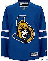
So going back to Ontario now, try to imagine what would happen if the Leafs and Sens (perish the very thought) were to swap uniforms and colors?

Don't send me hate mail. I'm illiterate anyway.

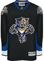
And now for a rivalry absolutely no one could care less about.

Personally, I'm disgusted by this but it does make me laugh a little. What's with the black tongue on the panther? Someone should tell him to stop chewing on his pen.

This here is more of a fusion of past Coyotes jerseys. We've got the old colors on the new uniform. How many of you like me would prefer to gouge out your own eyes before watching a team wear a jersey with two different color shoulder yokes? That's got to be breaking some sort of law.

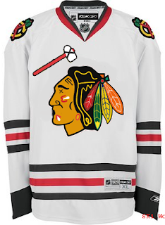
Speaking of law-breaking, remember the scary Blackhawks logo I used to kick off last week's Freak Out post?

Somebody glued it on a jersey. D'oh!

And then I thought this was mildly amusing if nothing else.

But this is what happens when you guys stop sending in the really good stuff. Hope you enjoyed another week's worth of Freak Out art. Hopefully I'll be back with more on Friday. Enjoy what's left of your weekend!

Saturday
Nov242007

The Finer Art

A lot of the concept artwork I feature here on a daily basis is created by amateurs. It's fairly obvious and I think even the designers themselves wouldn't take offense to my saying that. But every so often, I come across work that could only have been created by a professional. It's the reason I have a blog like this.

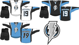
The template used for these concept designs is probably as close to perfect as we're going to get, visually speaking. I don't know the identity of the artist, but the work is stunning. I'll kick things off with my team — which I haven't really talked much about lately.

Personally, I love this idea. A new logo like this would certainly take some getting used to but the light blue on black accented by silver looks great! I'm also a big fan of the throwback numbers on the blue third jersey and the lightning bolts around the shoulders. Anyone feel like painting one of these onto a photo of a Lightning player?

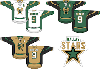
Next here we see an interesting take on the Dallas Stars' logo. I like it but proportionately it seems a bit... off. I think the city name above the logo needs to be in a smaller, wider type. Otherwise, I think the jersey striping looks fantastic and that gold third jersey would definitely get my vote.

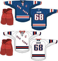
I love the striping on these Rangers jerseys, but the New York across the front isn't working for me. Swap it out with the Lady Liberty logo and I'm pretty sure nothing could compete with that look. I'm a little confused by the Maple Leafs lettering on the back of the jersey, however. Speaking of the Leafs...

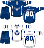
The accent striping isn't much but it adds a lot to what are otherwise rather plain jerseys. Will it happen? No. But I think all of these are interesting to consider.

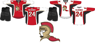
Lastly, we have an Ottawa Senators concept with a complete overhaul.

I think the logo would be better if the cape were either smaller or gone. It creates bad negative space. But once again I think the striping is excellent. Overall though, not a bad direction. By the way, I added Anton Volchenkov to my fantasy team. He hasn't really done anything for me yet.

Anyway, that's all for right now. I'll have some more rather brilliant work tomorrow as we stick to the more professional-looking designs this weekend. Hint: GhettoFarmBoy is back at it again.

Saturday
Oct272007

Red & Black

We've got a color theme for this concept post. Check it out.

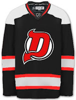
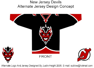
The most obvious place to start is the New Jersey Devils.

They both offer unique ideas for an alternate jersey. I don't think we'd really want to see the Devils in anything but red on a regular basis. Very interesting how these two different artists came up with something so similar yet so different.

But for something completely different, look no further.

That's a pretty scary logo. Looks like somebody's tattoo.

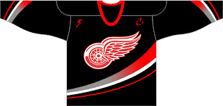
And here's a team you don't often associate with black.

The ironic part is the Ducks' template on a Red Wings jersey. Just so many things wrong with that. I know the Red Wings are sworn enemies of third jerseys, but I think they should try one out some day. Maybe not this design, though.

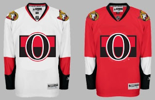
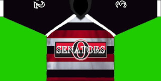
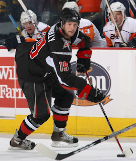
Another black and red team is the Ottawa Senators. Here's an example of what they shouldn't do with a third jersey. Ever. And here's another.

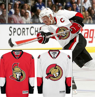
Now here's something that would work — even as a full-time road jersey. This 2D Senators logo is quite possibly better than the primary. It's unfortunate it's nowhere to be seen on their uniforms. Rumor was that it would be featured on various bits of team merchandise. If anybody owns anything with that logo, send me some photos.

And while we're on the topic of doctored photos of jerseys, more and more I'm in favor of the black/red/silver color scheme for the Buffalo Sabres — who are presently being conquered by my Lightning (that goes out to all my email hecklers).

Yeah, it's true. My Sabres-fan readers have taken to email trash talk. Well we'll just see how that goes, won't we? It's 2-0, not five minutes into the second period. Hope you're watching.

UPDATE (9:33 PM): Sadly, I may have spoken too soon with regard to the game. It's now tied.

UPDATE (10/28 8:17 AM): Stupid overtime.