NHL Tournament of Logos

Entries in lightning (75)

Wednesday
Oct242007

Couple Of Quick Concepts

Hmm. That may be misleading. I don't know how "quick" the concepts are, necessarily, but you should get through this post quickly. I'm keeping it short.

First, a New York Islanders logo I think is awesome!

I may stand alone in loving it, but so be it. My only suggestion for improvement would be to rid it of the text. Maybe save that for a secondary mark or something. But I like the lighthouse tack. I know certain "Islanders fans" are opposed to it, and being a Lightning fan, I'm sure I don't have the proper standing to say, but I just can't help myself.

And speaking of the Lightning...

You had to see that coming. First off, wow! That is an amazing looking sweater. That's how you make blue work as a Bolts jersey color. Save this and make it a third jersey. Don't want to wear it out by wearing it every night! I'd buy this one too.

That's all for today. Short and sweet. I'll attempt to have some more up tomorrow.

Saturday
Oct202007

Just To Freak You Out XI

Finally! I know I failed you guys yesterday in that Freak Out Friday never came to pass. But perhaps you'll allow me to get away with a Freak Out Saturday. The Everblades game aside, yesterday was a very busy day for me. Not to mention Blogger has been having issues with image uploading, an important piece of this puzzle. Anyway, here goes.

We'll kick things off with the team whose logo was named the champion here at NHLToL — the Montreal Canadiens. Some very strange artwork has made its way to my inbox — and now to your computer screen.

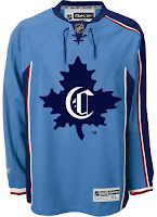
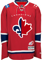
The concept on the left makes use of a little-known logo that the Habs wore back in 1910, prior to the formation of the NHL. As you can see it's on a Thrashers home jersey, which is weird, for more reasons than the light blue. The one on on the right is just as intriguing if not more so. It's a half maple leaf, half fleur-de-lis. And check out the Flames-influenced shoulder patches. The 100-year logo at the bottom is what puts it over the top. Well, then there's that logo of course. And the team name above it.

There just aren't any words for that. Nightmares.

Speaking of nightmares, the Nashville Predators have been trying to get more folks in the building this season so as to avoid something like this from happening.

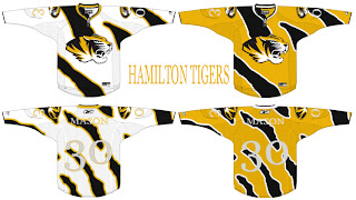
Somebody really wants a hockey team in Hamilton? Raise your hand if you think that's going to happen. Now keep your hand up if you think they'd wear a jersey like this. Put your hand down. You're looking at a computer screen.

Before I leave Canada, I just got this one emailed to me today. It may be a little harsh that I'm sticking it in the Freak Out post, but it scares me just a little.

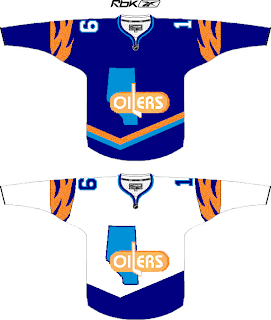
I realize I suggested attempting to work Alberta into the logo, but I'm not sure this is the winner. I do like the wordmark part (not as a primary!), but the province is weighing the whole thing down on the left side.

Wow I just had a weird visual. Imagine going on one of those insane diet pills. Maybe they get the formula wrong and you only lose weight on your right side. Sorry, just freaked myself out there. What's going on with me tonight?

Anyway, I know the new Washington Capitals secondary logo has been a big hit, but here's exactly how not to use it.

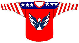
That's so bad I almost want to see what it would look like on a player. Damn.

Since we're on the subject of really bad, we'll top things off tonight with my team.

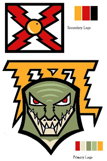
I was seriously considering posting this and trying to make you guys guess what team this logo concept was designed for, but I'm not sure you'd ever figure it out. I think the secondary logo is meant to resemble the state flag of Florida. Hmm. But as for the primary, I have no clue what's going on there. However, I have woken up in the middle of the night in a cold sweat with this as the last visual in my brain.

As we inch ever closer to Halloween, the freak-outs seem to be getting more freaky. Thanks to everyone who's sent in work!

And if you have any of your own or have spotted anything crazy out there on the web, feel free to email it to me at nhllogos@gmail.com and I may make it part of next week's Freak Out Friday. (And I plan to actually post it on Friday this time.)

Saturday
Oct062007

Bolts Add Numbers At Home

I made reference to this in the Rbk EDGE Review for the Tampa Bay Lightning, but I thought I'd do a separate post to keep everyone up to date.

After the jerseys were unveiled initially, the Lightning were the only team to have numbers on the front of one jersey but not the other. In this case, the white road sweaters had them but not the black ones. Seems the team has changed their mind though. The numbers are now on the front of the black jerseys too.

You can see that in this picture from Thursday's opening night game against the New Jersey Devils.

Speaking as a Lightning fan, I kind of like them as a design element by themselves. With the white shoulder yoke gone, the jerseys would've looked very plain up there for guys who don't have an "A" to wear. Anyway, just thought I'd share that.

Thursday
Oct042007

How I Feel About Brodeur

I don't know if any of you read my previous blog, Cathode Rays & Power Plays, but I wanted to carry something over from it. (I'm not going to link to it because I don't update it anymore.)

I covered last year's playoffs and every chance I got posted a picture of Devils goalie Martin Brodeur with a puck in the net behind him. It's not that I hate him or anything — well, maybe it is — but I thought I'd continue the tradition over there of posting my favorite pictures of him.

That just makes a person feel good, doesn't it?

Not that you were wondering, but Vinny Lecavalier scored on him twice last night in the Bolts' 3-1 in the season opener. GO BOLTS!

All right, now, just so you guys know, I'm not meaning to be a complete ass here. Just thought it would be funny. I have loads of respect for Brodeur as a goaltender, but he's always been a Lightning killer and so it just brings me so much joy when my Bolts can get a puck by him.

Friday
Sep282007

Rbk EDGE Review: Lightning

Part 5 of 30. All 30 NHL clubs have unveiled new jerseys under the new Rbk EDGE Uniform System for the 2007-08 season. Here at the NHLToL, we're going to review every one of them. Read up and then rate the new sweaters. We'll do a full ranking after completing all of the reviews.

Rbk EDGE Uniform System

Tampa Bay Lightning


New Uniforms

Old Uniforms

The Unveiling
Saturday, August 25. The Lightning unveiled their new uniforms to fans at ICEfest held at the St. Pete Times Forum in Tampa. Among those players in attendance were Chris Gratton, Filip Kuba, Johan Holmqvist and Marty St. Louis donning their new jerseys.

Home vs. Road
Home: Black. Road: White. The two sweaters are essentially mirror images of each other in terms of overall design and both feature secondary logo patches on each shoulder.

The black home jerseys feature white cuffs with thin blue piping at the wrist. A blue stripe around the arm rounds up on the inside to the armpit. The collar is blue and the primary logo serves as the crest.

The white road jerseys feature black cuffs with thin blue piping at the wrist. A blue stripe around the arm rounds up on the inside to the armpit. The collar is blue and the primary logo serves as the crest.

In The Details
The same shoulder patches featuring the secondary logo are found on both shoulders of each sweater. The block style numbering and lettering have been retained. The white sweaters feature the jersey number on the front right shoulder. The black ones do not. The unique thin stripes found under the armpit have been carried over from the old style jersey. Another noticeable change was to the pants where the lightning bolt now sits on a blue stripe.

New & Old
The Lightning were one of seven teams to introduce new logos. Aside from that, the overall jersey designs saw drastic changes. The shoulder yokes found on both sweaters are now gone, making the jersey a solid color throughout. In addition, the horizontal stripes at the waist are gone and the sleeve stripes have been greatly altered.

Standard FAQ
Numbers on the front? Yes.
Laces at the collar? No.

UPDATE (10/5 2:01 AM): Originally, the Lightning were only going to be wearing the number on the front of the white jerseys. Apparently that's changed as they wore the numbers on the front of the black jersey in the regular season opener. So the information here has been changed to reflect that both jerseys now have numbers on the front.

NHLToL Editorial by Chris
I should first say that with the Lightning being my favorite team, I may come off as biased. But this is the opinion area after all. As a Lightning fan, I've always thought our uniforms were dull and second rate. I can now proudly say we've taken a huge leap forward. I don't know if I can honestly say I believe the new sweater stands up to the likes of some of the others, but I'm very impressed. My favorite aspects include the increase in the use of blue in the uniform and the removal of the shoulder yokes. A fact worth noting that I own a black Rbk EDGE premier jersey and I love it. 4/5


Buy your new Lightning jersey!

Wednesday
Sep262007

Mailbag: Silly Bolts Concepts

It occurs to me I haven't written a Lightning posted in a while — six days to be precise. It's all right though because some folks have been creating some crazy Tampa Bay concept art. These were emailed to me this past week and they're worthy of the Freak Out series, but I just could bear to wait any longer to post them.

This first one is a rather simple concept. The team is called the Lightning. So let's put some lightning on the jersey.

I wasn't amused. More like horrified. But it was a good effort. Though I've never seen black or blue lightning bolts in my life. Perhaps 23 years in Florida isn't enough.

Then, along the lines of sharks and panthers biting through hockey sticks comes this idea.

What worse is that this was stolen from my own design — the only one I've ever made for this site. It's frightening, really.

By the way, I hope you all understand I'm not trying to be mean. It's just a team that's close to my heart. Anyway, that's all I got. If you've come up with anything or seen anything that hasn't been posted already, please send it along. I'd love to see it.

Thursday
Sep202007

My Jersey Has Arrived!

What kind of person would I be to spend months writing about the new Rbk EDGE jerseys and not purchase one myself? Well, in fact, I pre-ordered my new Tampa Bay Lightning jersey the very day they were unveiled. It was sitting in my mailbox when I got home this afternoon.

And here it is!

Let me just say that it is very nice.

It's just like all the pictures and things I've been recording all summer. Though to be fair, these pictures are my first real exclusive contribution to the blog. And here's a close-up of the new collar style.

It's so cool to finally own one. It's just a shame I probably won't make it to any games this season.

The only small thing that disappointed me a little about my replica is the shoulder logo. It's not embroidered, but is rather a faux leather-like piece that is stitched on. The good news is that nothing is ironed on.

Anyway, it's really cool and I'm wearing it to work tomorrow! Everyone should get a good laugh out of that.

UPDATE (2:25 PM): Some valid questions were asked in the comments regarding how my new jersey fits. So this picture to the left shows you.

I'm about 5'11" and pretty thin. I ordered a medium jersey and it fits perfectly, as you can see. I couldn't be more thrilled with that.

Like most people, I wasn't sure what size to order at first, but I figured I could exchange it if I absolutely had to. And medium seemed like a smart choice.

So there you go. Probably go with a large if you're taller or just like a jersey that's a little bigger.

Let me know if you guys have any other questions about it. Now that I own my own jersey, I can actually answer them.

Sunday
Sep162007

Result: Lightning Logo History

BEST ALL-TIME
2007

74% 6,546 votes

8,807 total votes

1992
26% 2,261 votes


Poll opening date
Sep 8 @ 7:40 AM
Poll closing date
Sep 15 @ 11:59 PM

07BONLH | LHTBL

Saturday
Sep152007

Bolts' New Pants

This may not be of any real interest to anyone who isn't a Tampa Bay Lightning fan, but to those who are, here's a look at the new pants being sported by players during training camp at the Ice Sports Forum in Brandon.

In what seems to be an effort to add more blue into the uniform, the Lightning bolt on the pants — which I'm so glad they kept — now has a blue stripe beneath it.

Incidentally, the new Lightning home jersey I ordered online three weeks ago just got shipped today! I can't wait for it to get here!

Thursday
Sep132007

Random Concepts To Share

Aside from the NHL 08 news, it's been a rather slow day so it would be wrong of me to leave you without a concept post to get you through the night. But before I do that, I wanted to thank you all for continuing to visit and read this blog. Yesterday, we passed the two million hit mark. For those keeping track, it was over 1,000,000 hits in just two weeks. I'm still in shock.

But moving along now. We'll begin with an amazingly cool concept logo which was emailed to me yesterday. It originates from the SportsLogos.net message board. It combines the tradition of the Colorado Rockies and the symbol on the flag of the state itself.

For my money, I'm sure it's just the thing hockey conservatives love. But the thing is, it's actually really good. Personally, I'm still partial to the "A" logo, but this could serve as show-stealing secondary mark for sure. I mention it because shortly after Altitude had the new Avs jerseys, somebody reworked it.

I never cease to be amused by people. Speaking of amusing — the New Jersey Devils have never had a secondary logo. Here's what one might look like.

Needs something to hold it all together, perhaps a circle or something. But I don't think it's half bad. Too boring for a primary but it's exactly what secondary marks are supposed to be.

But while we're busy altering logos, I was emailed this Tampa Bay Lightning design.

While the silver and blue on black make a solid color combination, there really isn't anything to the logo. It's just... dull. I know we all like simple over busy but there's something to be said for finding a happy medium.

But let's not stop now. What if the Oilers were to don a redesigned logo at some point in the future? The riots in Edmonton's streets aside, it could look something like this if the right people were on the job.

I can't speak for Edmontonians, but I like it, myself. What I don't like is an orange — and I do mean orange — jersey.

Like this one.

Yes it's a little busy but I can look beyond that. What I can't get past is all that orange. I'd take a copper jersey over that. What does that say?

Anyway, that'll do it for tonight. Leave your comments below as the designers who email me often peruse the feedback on their work. I'm sure they'll be interested in seeing what you all have to say.

I'll have more tomorrow if I don't get too bogged down in the four different teams unveiling jerseys.

One last thing... HOCKEY SEASON IS ALMOST HERE!!!