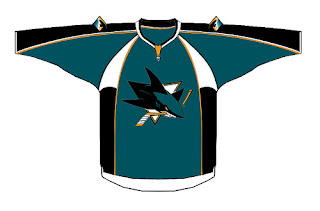
This has been a big day what with the unveiling of the new San Jose Sharks logo. As a reminder, that new logo will take effect in the tournament beginning with the Sharks' next match which is August 9. Now, with things winding down it's time for an update on where we are in the tourney.
The Late Leaders


With just one game to play in the final two weeks of the tournament, the Devils have a commanding lead over the league with 32 points. The Avalanche follow with 26, just ahead of the Hurricanes with 25. The Wild and Panthers each have 23 points followed by the Predators with 20. The top 8 rounds out with the Flames and Canadiens who currently sit with 18 poins. Most notably are the top 3 teams, each of who have swept 7 matches — that's exactly half of all their games in the tournament. These are impressive logos. Keep them in mind next time you're designing a logo for your fantasy hockey team. What's weird is how many of those teams use red as their primary color. Hmmm.
If The Playoffs Were Tomorrow...
We're winding down in the competition here so you can almost tell who will likely be in the Championship Tournament. If you need a refresher on how to determine who moves on to the next tournament, read this.
EAST


The Flyers and Devils are still at the top of the Atlantic Division while the Canadiens and Senators continue to ride the top of the Northeast. The Hurricanes and Panthers still sit atop the Southeast as well, so the East is still looking pretty much the same as it did two weeks ago. As for the wild card spot, the Thrashers have a 5-point hold on that with 17 points. So if the playoffs began tomorrow, the following teams would move on from the Eastern Conference: the Flyers, Devils, Canadiens, Senators, Hurricanes, Panthers, and Thrashers.
WEST


The Predators and Blue Jackets are leading the Central Division. High atop the Northwest are the Avalanche and Wild. And leading the Pacific Division are the Kings and Sharks, each with 17 points. The top 2 teams in each division of the West have changed since two weeks ago, in stark comparison with the East. Claiming the wild card spot with 18 points would be the Flames. The Blue Jackets and Kings have knocked the Blues and Stars out of contention since two weeks ago. If the playoffs started tomorrow, the following Western Conference teams would be eligible: the Predators, Blue Jackets, Avalanche, Wild, Kings, Sharks, and Flames.
But of course, it's not over until it's over. This is a marathon tournament and there is still a ways to go. But if you're team hasn't made a good showing by now, the chances of catching up are slim with only a handful of matches remaining.
The Good, The Bad...


Shockingly, at this stage of the tournament, there are still two teams who have yet to lose a match. The Hurricanes and Wild remain undefeated and could theoretically finish their schedule that way. That's how you know a good logo — when none of the others can beat it. Not surprisingly, none of the teams remain winless at this point. But there are a handful who have won only once. The Islanders, Maple Leafs, Oilers and Ducks each have just a single tally in the W column. Shame about that.
...And The Ugly


This tournament awards points to teams even when they lose a match. If you lose 2-1, you still get that one point. But if you lose 3-0, you obviously get no points. The Ducks still have the league's worst logo, despite having picked up three points in the last two weeks. The Penguins and Maple Leafs aren't doing much better sitting with just 6 points after 9 and 11 matches, respectively. The Oilers and Islanders are the only other teams who haven't broke double-digits in points. The Oilers have 8 and the Islanders have 9, each in 11 matches. Those logos are pretty basically bottom-of-the-barrel at this point with very bad odds of nabbing a playoff spot. Maybe a redesign will give them a better chance next time around.
Late Summary
The Southeast and Central Divisions appear to be the strongest, as they're the only two in which all five teams have hit double-digits in points. I'd almost be willing to bet on a Hurricanes vs. Wild final if the playoff tournament worked that way. I really am led to wonder whether whther it will come down to this two based on their performance so far.
What we'll have to wait on, though, is how these teams perform against the opposing conference. It's an exciting time right now. It almost reminds me of the feeling I get in March when the real season is winding down. I can't wait for the playoffs!
I'm thrilled to report that over the past several days, traffic here on this blog has skyrocketed in a way I never would've imagined. Just a few weeks ago I was averaging 60, maybe 70 hits a day. But late last week, some of you who've visited the site posted links on several hockey message boards around cyberspace. I hit a record of 758 hits in one day last week. Then just yesterday, an all-time high was reached at 2,716. Can you imagine?
Since Friday, the NHL Tournament of Logos has been averaging 2,000 hits a day thanks in large part to the news I've been keeping up with regarding new logos (Sharks) and uniforms as the league makes the switch to the Rbk EDGE jerseys this fall. Regardless of why you're visiting, I'd just like to thank everyone who's stopped by. And if there's anything you think I can do to improve the blog, please don't hesitate to let me know.
What's To Come?
I posted a poll in the sidebar asking if visitors to the blog would be interested in participating in the next cycle of the tournament. I recently surpassed my goal of getting 100 votes, more than 90 of which answered "yes." So when this tournament ends, stick around if you want to be involved in decided the best of the NHL's logos. Because after all, who really cares about my opinion anyway? It should be decided by you all!
 Monday · Jul 30 · 2007 | 9:56 AM PDT
  2 Comments
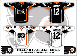
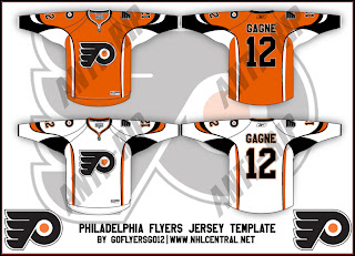
 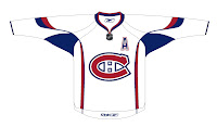 And while we're looking at fan-designed jersey concepts, I've got one for Montreal Canadiens fans. Like many others, it's based off of this year's all-star jerseys so the real deal probably won't look anything like this. The one thing I wouldn't be surprised to see is the giant logo on the front. That seems to be a theme among all the jerseys that have already been officially unveiled.




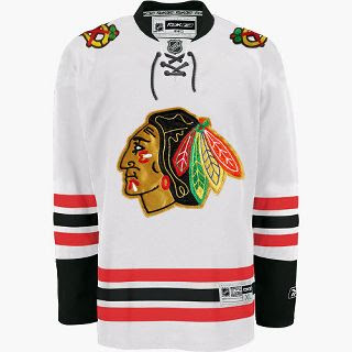
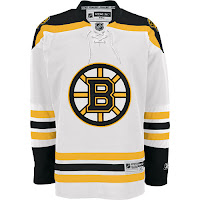
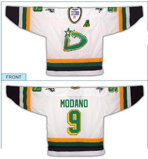
 According to an administrator on the Dallas Stars' official message board, we can expect to see their new Rbk EDGE jerseys on September 14. So I've added that date to the countdowns in the sidebar. Thanks to Josh for the tip!


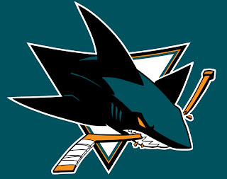





 The San Jose Sharks will be next to unveil a new — or rather, "updated" — logo for the new season. The news was posted on their web site today. The official unveiling will take place two weeks from today on July 24. Of course I'll have full coverage as usual. Read the press release below.
 Well, we'll just have to see if it's new. According to St. Petersburg Times Lightning beat writer Damian Cristodero mentioned the other day in the paper that the Bolts will be unveiling a "modernization" of the logo "some time this summer." No word yet on when, but I'm pretty excited.