NHL Tournament of Logos

Entries in new logos (52)

Sunday
Aug262007

You Know The Drill; More Canucks Leaks

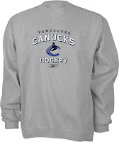
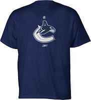
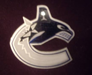
It seems like the neverending story with the Vancouver Canucks. Now just three days out from the official unveiling — which will take place on Wednesday at GM Place — more items have been leaked bearing the alleged new logo. See for yourself.

The funny thing is that each logo is colored differently leading me to wonder whether the new Canucks uniforms will feature different logos for the home and road jerseys. The logo with the white "ice" shows up better on a dark background while the logo with blue "ice" stands out more on a light background.

Anyway, we'll find out from the team itself at long last on Wednesday. But you know me, if more stuff gets leaked prior to that, you know I'll have it here for you. Enjoy what's left of your weekend!

Saturday
Aug252007

Lightning Unveiling Video

This video was posted in the comments of today's earlier post. It shows the big unveiling of the Lightning's new jerseys.

The Lightning players you see modeling the home black jerseys are Chris Gratton (#77), Filip Kuba (#71), Johan Holmqvist (#40) and Marty St. Louis (#26). Those donning in the white road sweaters are local TV personalities.

Wearing #8 is NewsChannel 8's Jennifer Leigh. In #9 is Bay News 9 anchor Jen Holloway. Tampa Bay's 10 sports anchor Justin Allen is donning #10. FOX 13 news anchor Kelly Ring is wearing #13. And #28 is being worn by ABC Action News anchor Brendan McLaughlin — in case you were wondering.

Man, I wish I could've been there.

Saturday
Aug252007

Lightning Unveil New Logos, Uniforms!

The Tampa Bay Lightning officially unveiled their new logos and uniforms today outside the St. Pete Times Forum at IceFest. Take your first look now!
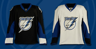
My first impressions: I love them! Well done, my Bolts! I'm buying one the very second they're available. I'm so thrilled with the logos and jerseys. The black one is amazing. Looking at it, I'm so glad they didn't go with blue.

The greatest thing, in my opinion, is the continuation of the stripes found under the arms. See what I mean below.
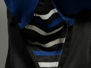
Those stripes have been one of the major elements of the Lightning's jerseys since their inception in 1992. The way I understand it, Phil Esposito — who designed the original uniforms and logos — said the stripes would serve as a nod to fans for years to come and that every time a player raised his arms to celebrate a goal, we'd be reminded. It culminated with a Stanley Cup championship in 2004 and in every photo of a player raising the Cup, you see those unique stripes.

What do you guys think of that? As a lifelong Bolts fan, I'm thrilled over that feature being kept on these new jerseys.
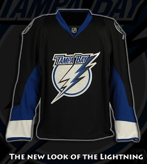
As far as the logo, I'm all right with it. I'd rather the "TAMPA BAY" be gone entirely, but it's a big upgrade from what we used to have. Overall, I'm happy with what I've seen here.

UPDATE (1:59 PM): The St. Peterburg Times Bolts blog Lightning Strikes had this picture of Filip Kuba in the new jersey — our first photo of a player actually wearing it.
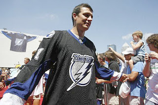
UPDATE (2:55 PM): Forgive me if I'm going overboard with Lightning stuff today, but we've all got our favorite teams right? Today is our day. I've come across a few more pictures worth posting here.
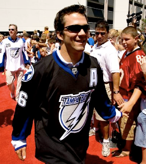
Above, you see Marty St. Louis walking down a red carpet amongst a sea of excited Lightning fans. Below is a group of people including Lightning players Chris Gratton, Filip Kuba, Johan Holmqvist, and St. Louis (in black). I haven't figured out who the rest of them are — except for the guy on the right in the white jersey. That's local news anchor Brendan McLaughlin I believe. He's wearing 28 because that's the channel number of his TV station — the one where I used to work, as a matter of fact.

As a side note, the Lightning's official site mentioned that the road jerseys would feature the number on the front shoulder. These photos indicate that as well. For more photos, check out my official Rbk EDGE photo gallery.

Friday
Aug242007

Your Daily Dose Of Canucks

You'd think my favorite team was the Vancouver Canucks the way I post about them. (Actually, the Lightning are as you know and I have lots for them later on today!) Anyway, I think it's just that Canucks fans are the most curious about their team's new logo and uniforms based on their decades old identity crisis.

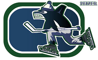
Epitomizing that identity crisis is the mish-mash logo I posted on Tuesday. But the designer of it made some adjustments and improvements in coloring. I think they're worth a look so I thought I'd post that.

Drool over that, Vancouverites! And try and convince me you wouldn't give your left nut to have your team wear a jersey with this on the crest. Anyway, in all seriousness it's a very clever design. Whoever designed it needs to work for Conan O'Brien.

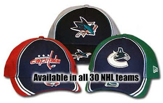
In addition, the Hockey Hall of Fame web site apparently leaked the new Canucks logo on a hat.

While the primary logo seems to lack green, it certainly seems to be a part of the overall team colors. It also appears we should expect the old stick-in-rink logo on the shoulders as a secondary.

That's all for today. Until the next time, enjoy this look back at the history of the Vancouver uniform, courtesy of Canucks.com.


Wednesday
Aug222007

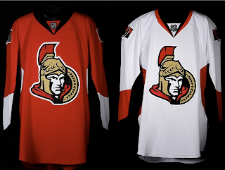
Senators Unveil New Uniforms!

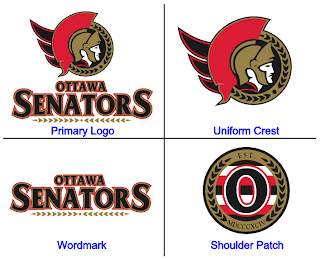
The Ottawa Senators' new Rbk EDGE uniforms are here! Please view!

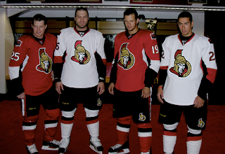
But wait, it gets better. Want to see Chris Neil, Brian McGrattan, Jason Spezza and Chris Kelly posing for a photo in their new threads? Look no further.

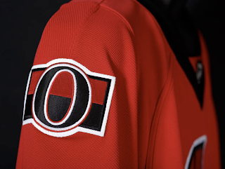
That's really all I got. The Sens unveiled their new sweaters at Scotiabank Place in front of the media and fans. Count them as the tenth team on the list. Before I go, I'll leave you with a close-up of the new shoulder logo.

Enjoy your night and be sure to check out my official Rbk EDGE gallery for all the photos I can find of these new jerseys!

Tuesday
Aug212007

Flames To Wear Alberta On Sleeve?

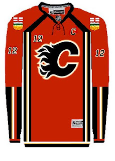
Just wanted to keep everyone up to date on a rumor that's been floating around regarding the Calgary Flames new duds. It's been widely reported that the horse head logo with the flaming nostrils will bite the dust in favor of a new secondary logo. Some believe that secondary logo will prominently feature the flag of Alberta in a shield sort of style.

For an example, check out this fan concept that was emailed to me recently.

The designer used the Albertan coat of arms as a jumping-off point in coming up with this idea. Some people wonder whether this would stir up unhappy feelings in the Edmonton Oilers, also based out of Alberta.

As an interesting corollary, the Oilers are also reportedly dropping the secondary logo they've used for the last decade. Word is, the oil man on the shoulder will be gone. Are plans in the works for a new Alberta-related secondary for them too? Should be interesting.

Any Albertans out there? What do you guys think of all this?

UPDATE (5:58 PM): Unfortunately I made the mistake of pitting Flames and Oilers fans against each other. I don't know what I was thinking. Just to avoid things getting out of hand, I'm shutting down comments on this post. Thank you to those of you who posted comments with civility in mind (apologies for closing them down). To the rest, I can live with a few jabs back and forth in good fun, but I won't tolerate attacks of any kind. We're all just trying to enjoy ourselves here.
Monday
Aug202007

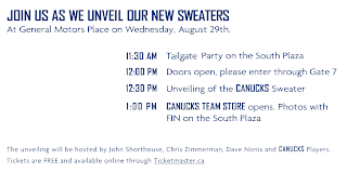
It's Official! Canucks Unveiling Unis August 29

Canucks fans, you've waited what must've felt like a lifetime for official word from your team and now it's here.

The Vancouver Canucks have announced that they will be unveiling their new Rbk EDGE uniforms on August 29 at GM Place. And based on that picture of Roberto Luongo, they look very white.

The date is already in the sidebar, but now it comes officially from the team which is what we've been waiting for. Should be an exciting day. As the graphic says, the uniforms will be unveiled at 12:30 PM so as soon as images are available, I'll post them here. We're expecting to see something similar to the alleged leaks that I've posted — likely the orca logo recolored to green, blue and silver a la the old days.

In the meantime, the announcement is on the team's official web site. Enjoy!

Saturday
Aug182007

Canucks Logo Leaked Via Stickers?

Apolgies for the late posts today. Went to the movies this afternoon. Superbad was hilarious.

I got emailed a photo claiming to be that of sticker produced by the Vancouver Canucks bearing the alleged new logo. I should clarify. The sticker wasn't claiming anything so much as the sender of the email. Anyway, for your viewing pleasure:

For a better look at it, I was also sent this rendering of the logo. I really like it better with the green, but who am I to say, really? The question is what do you guys think? Is the blue/black/silver combo too Lightning? (It is for me.) Do you like it better than the blue/maroon/silver combo of the last decade?

I also want to be clear on the fact that I can't vouch for the veracity of this photo. Just know that it was something emailed to me and that the Canucks will supposedly make their official announcement regarding new uniforms and logos on August 29. We'll all be watching and waiting.

Thursday
Aug162007

Bolts Promo New Logo, Uniform

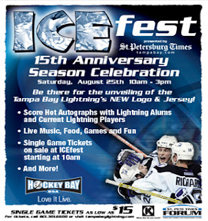
The Tampa Bay Lightning have officially announced on their web site they will be holding ICEfest on August 25 where they will unveil the new logo and uniforms.

I believe this is the first time the team has actually referenced a new logo — even though we've apparently already seen it. But not to worry, despite the fact that I now live 120 miles away from Tampa, I'll be there next Saturday to get video and pictures of my own to bring back and post right here. Can't wait!

Wednesday
Aug152007

Revisiting The Senators

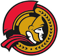
On Monday, we got a preview of the Ottawa Senators' new logo set courtesy of Canada's government trademark web site. They were black and white on the web site, so we had to imagine how the coloring might work (at least for the secondary mark).

The image I posted had the outer circle in gold. Here's how they might look in red or white.

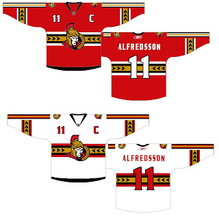
As for the primary logo, one fan ran with that on a jersey concept. See below.

Not sure how I feel about the striping across the chest. Certainly an interesting choice, though. Thoughts on that?

For the part of you that persistently resists change, one fan designer altered the new logo to mix in some of the old.

Truthfully, I'm not a fan. Until we get to the shoulder patch. I think that is pretty cool. I like the old-time stripes and the contrast in that logo, which you'd think would be hard to achieve, is excellent.

Sens fans, what do you make of all this here? Good? Bad? Ugly?