NHL Tournament of Logos

Entries in news (596)

Friday
Sep282007

Archive: Changing Logos

You guys may have noticed that the sidebar has been getting rather clogged in the past several weeks. In an effort to start cleaning it up without losing all of the information completely, I'm going to begin archiving certain things.

The first to be removed from action is the Changing Logos element. It's no long needed. We all know by now which teams have changed their logos. So for posterity, here it is.

Thursday
Sep272007

EDGE Makes Flames Sweaty, Too

I recently posted an article from the Pittsburgh Post-Gazette about members of the Penguins whining over certain aspects of the new Rbk EDGE jerseys. Well now, according to the Calgary Sun, the Flames have jumped on board.

Randy Sportak wrote this article on Tuesday. You can read it below.

September 25, 2007

New duds judged a dud

By Randy Sportak
Calgary Sun

Traditionalists still call a hockey uniform a sweater.

Having now sampled the new, high-tech togs unveiled by all 30 NHL teams this year for a handful of pre-season games, Flames players are understanding why the word sweat is in sweater.

"My undershirt is just soaked," said forward Owen Nolan. "I find I'm changing them in between periods and a lot more frequently than before. I feel like I'm working out in a sauna."

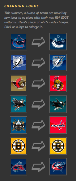
The new uniform system unveiled by RBK has benefits. Sweaters are lighter, are apparently more wind resistant and repel moisture.

However, while moisture doesn't soak in from the outside, it doesn't release from inside the uniform. That means players are becoming saturated in their own sweat.

"With the other ones, you had holes and got more of a breeze in there — maybe that's why you got that drying out effect," said blueliner Cory Sarich. "These seem to heat you up more because there's not that two-way air flow.

"Besides, the jerseys don't feel much different than the old ones. I don't know if they've accomplished what they want. From talking to guys, I don't feel they're making a difference on the ice."

Moreover, players around the league are complaining their gloves are becoming so full of sweat they have to change them constantly.

Also, their skates are filling like buckets, and that's not a piece of equipment they want to change mid-game.

The complaints don't end there, either.

To be form fitting over equipment, the sweaters are made of a stretchier material. Uniforms are tied down in the back to prevent an opponent from pulling it over their head in a fight, but it's now possible to 'jersey' somebody in a brouhaha.

"I know with the old ones, my sweater could only be pulled about halfway up my neck, but these come up over my head," said Warren Peters, one of the few Flames to drop the gloves this pre-season. "It's like they're elastic."

Forward Eric Godard hasn't been in a scrap yet, so he hasn't experienced the impact first-hand.

"The old jersey trick has been around a long time," he said. "Usually in a fight, I'm not worrying about the jersey. I worry about the other guy. If I start getting beat up, then I'll be saying, 'It's not fair.' "

And then comes the aspect considered most controversial about the new uniform. Some players prefer the uniforms being tighter, but the majority are partial to the old unis. In the development stage, RBK worked with player input, but still skaters feel restricted.

"I feel skinnier, but that's not the look I'm going for," Sarich said. "It takes me longer to get my sweater on because the shoulder pads and the elbow pads get tangled up in the sleeves."

"They're really tight," Nolan said. "I used to wear a really loose shirt because I want the freedom."

But, nobody's expecting the league to go back to the old ways, so it's best to accept it.

"You're soaked. But whatever sells jerseys, I guess," said defenceman Anders Eriksson. "Anyway, just give me a jersey, and I'll work with it."

Besides, seeing as the sweaters are supposed to be 9% more wind resistant, players must be 9% faster.

"Oh yeah, can't you tell?" Eriksson laughed. "I almost feel slower because everybody was telling me I was gonna be faster."

So essentially, the moral of the story is you cannot please everybody all the time. Hopefully we all knew that already, though.

Thursday
Sep272007

Oilers, Here's How You Fix It

The Fix It series trudges on tonight as we consider improvements to the new Rbk EDGE NHL uniforms. I told you yesterday that you'd be in for a treat on this one.

As far as I'm concerned, the Edmonton Oilers have gotten stuck with one of the worst new sweaters in the league. That's a personal opinion, but I stand by it. Many have complained that the Rbk EDGE jerseys look a lot like practice jerseys. I disagree with that statement as a generalization. But here, I find it appropriate.

I have several designs to show you and I'll save the best for last. We'll start out by making some very slight alterations that would improve the jerseys on a major scale.

By simply extending the stripes on the sleeves to wrap completely around the elbows and adding a shoulder patch — one borrowed from last year's third jersey — you already end up with a sweater that doesn't look quite so blank. It's disappointing to see that the Oil couldn't manage something as easy as this on their own.

Then we have another design very similar to this but with a brand new shoulder patch.

I think that's a very interesting logo and with a little work, it could be great. I also truly believe that fixing the elbow stripes and adding something to the shoulders is all this jersey needs to really make it shine.

But speaking of shining, this is what you've been waiting for. Personally, I feel like it's one of the best Edmonton concept designs I've seen this summer.

The pattern was borrowed, obviously, from the Florida Panthers' new duds, but these colors are what Oilers hockey is all about. Imagine Gretzky and Messier wearing this. You almost can't help it. I am very impressed with this design, but as a Bolts fan I'm not sure I really have a say. I'll leave it to the rest of you now to decide. Especially Oilers fans.

Tell us how you feel about these fixes in the comments.

Up next: Washington Capitals.

Thursday
Sep272007

Jersey Concept Art Galore

Busy day today. Shame I'm only getting to my first post at 5 PM, but some days, that's the way it goes.

Always gotta kick things off with some good concepts. So let's dive in with the Boston Bruins.

I like these logos much better on a yellow jersey than the old bear head. Although, I say that now but to be fair, when it came out I thought it was pretty damn cool.

I also like the striping patterns on both jerseys. When the third jersey program is reinstated next fall, I hope the Bruins consider something like this. It's very sharp.

Then, one thing a lot of people have been contemplating is what the Atlanta Thrashers would look like if the road jersey matched the home jersey.

Perhaps it would look like this. That's really nice, if you ask me. I really love the asymmetry of that light blue jersey. The city down the arm looks great and it's so unique to this team. I'm really impressed and I only wish the Lightning had thought of it first.

One reader also emailed me a handful of concept designs. I wish I had larger images, but this is what was sent.


My favorite in that set is the Kings but I think the red Blue Jackets sweater is ironic and very sharp. Not a fan of the black Wings jersey and the blue Isles jersey reminds me of the Lightning's old black sweaters with the white along the shoulders.

Now it's time for your input. Let us know what you think in the comments below.

Wednesday
Sep262007

Poll Removed Temporarily

Dear NHLToL readers,

It's a really sad and pathetic thing when a handful of arrogant and uneducated people decide they have to ruin something that was only meant to be fun. I'm appalled by what happened with the Canadiens vs. Blues poll last night.

For anyone who is unaware, I've taken taken it down today indefinitely. In checking the results when I woke up this morning, I discovered almost 60,000 votes had been cast while just over 30,000 hits were logged on the site itself during the day. If you're thinking that those numbers don't match up, you'd be right. I've tried really hard to avoid this but since I know what was going on was a sham, I am unable to continue with the poll right now.

I will, however, still continue to write this blog and post other polls, but I don't feel it would be right to continue with the tournament at this time. I hope to reopen it soon and avoid a repeat of yesterday's events.

Now I'd like to address those responsible: I'm sure you think you're just the coolest right now. I would imagine many other people, myself included, would disagree. It was a childish and immature stunt that I hope will not be repeated. Everyone here knows this tournament doesn't have any real meaning. If that was your point, way to state the obvious. Congratulations.

All I was merely trying to do this summer was offer a simple respite to those waiting for hockey season to start up again. We're all hockey fans here and it seemed like this would be something fun to pass the time. So I set up this hole-in-the-wall blog and started posting polls. I'm saddened that you refuse to take it for what it is.

I would ask you to please avoid the temptation to do the same thing when I re-post this poll in the future. I don't know why you did it. I don't care. I would just like it to stop. It's entirely unnecessary.

If you would like to address me personally, you can email me at nhllogos@gmail.com.

Thank you.

Chris
NHLToL

Wednesday
Sep262007

Yahoo! Pick Of The Day!

I'll tell you when you know you've made it as a blogger. It's the day you become a Yahoo! Pick. Well guess what site is the Pick of the Day for today.

I can hardly believe it! Huge thanks to whoever is responsible for that!

To those of you visiting for the first time via Yahoo!, may I recommend you cast your vote in the poll that will determine the best logo in the NHL. And I hope you enjoy your visit!

Wednesday
Sep262007

Want To Be An NHLToL Expert?

I've been getting emails lately with some really great suggestions on ways to improve the site. One thing that was brought up that I really like the sound of is bringing on experts to discuss logos for future tournaments. I'm still developing ideas.

One possibility is doing an expert run logo tournament. The experts would weigh the pros and cons of each logo, determining a winner in each match-up along the way to determining a champion. Another would be simply assembling a panel of experts who would share their educated opinions on a given poll prior to the opening of voting. I feel like a lot of readers would be interested in this. Am I off the mark here? Would that be something you guys would like to see?

So, assuming this is something we may do in the near future, I'd like to start hearing from folks who would consider themselves "experts" in the fields of graphic design, logo design, marketing, art or any other related area. I don't have any set criteria or application process in mind at the moment, so just email me and briefly tell me why you should be considered. I'll probably ask you a few questions and we'll see where we stand.

And remember, I'm always open to suggestions on the site. If you think of anything that might improve the NHLToL, you can reach me at nhllogos@gmail.com. I look forward to hearing from you!

Wednesday
Sep262007

Ducks, Here's How You Fix It

We're working our way through the less accepted jerseys that have been introduced at the hands of Reebok this offseason. Today we're addressing the Anaheim Ducks, specifically.

One of my pet peeves is wordmarks passing themselves off as logos. So you can imagine my disdain for the Ducks' new logo when it was introduced last summer. Now it's the smallest crest on any of the new Rbk EDGE uniforms (Dallas' home sweater doesn't count because that's another animal altogether). So here's a simple fix.

How hard would that have been? Really? So disappointing.

But let's just say for the sake of argument that this suggestion is too drastic. What about this?

It's very subtle, but adding that black oval behind the wordmark does wonders for it. If you ask me, it doesn't do enough, but it's definitely better.

Am I way off base here? Ducks fans, do you approve? If you have any suggestions yourself, email me and you might just see it posted here one day soon.

Coming up next: Edmonton Oilers. And Oilers fans, you aren't going to want to miss it. Man, did your club miss the boat on this one. Knowing you guys the way I do, you're going to love it.

Wednesday
Sep262007

Mailbag: Silly Bolts Concepts

It occurs to me I haven't written a Lightning posted in a while — six days to be precise. It's all right though because some folks have been creating some crazy Tampa Bay concept art. These were emailed to me this past week and they're worthy of the Freak Out series, but I just could bear to wait any longer to post them.

This first one is a rather simple concept. The team is called the Lightning. So let's put some lightning on the jersey.

I wasn't amused. More like horrified. But it was a good effort. Though I've never seen black or blue lightning bolts in my life. Perhaps 23 years in Florida isn't enough.

Then, along the lines of sharks and panthers biting through hockey sticks comes this idea.

What worse is that this was stolen from my own design — the only one I've ever made for this site. It's frightening, really.

By the way, I hope you all understand I'm not trying to be mean. It's just a team that's close to my heart. Anyway, that's all I got. If you've come up with anything or seen anything that hasn't been posted already, please send it along. I'd love to see it.

Wednesday
Sep262007

Concepts For Logo Upgrades

All right, if you've been reading for a long time (or even a short time), you probably know about my distaste for the logo many consider to be among the best in sports. That of the Chicago Blackhawks. I just don't see the allure.

You might find it surprising that I don't stand alone. In fact, in the past I've even posted changes folks have made to the logo. Well, I have another one. I still don't love it, but with a little work, I'd call it a big step in the right direction.

Then I thought this one was kind of funny. Not crazy enough to freak anybody out, but definitely different. Imagine the Phoenix Coyotes using both logos together with their current color scheme.

Okay so maybe it is a bit scary. What's not scary is this New York Islanders concept. I don't know. It just feels like such a special thing when you run into a concept this well-designed. Dump the text out of that logo and you've got yourself pure gold.

I like these jerseys so much. Even using the current logo on the shoulder is a great touch. Hell, I could even live with this lighthouse logo as a secondary. But I really do think the Isles should reintroduce something of this nature. I just feel like a lighthouse would make such a great logo for the Isles.

And finally, we go completely off topic here. This is a fan made logo redesign for the AHL's Milwaukee Admirals.

Thought it was pretty decent. It feels a little familiar to me, like I've seen it somewhere before. But that could just be my brain playing tricks.

What do you guys think? Feel free to drop a line in the comments.