The Freak Out series continues this week with a brand new episode. Some of this stuff is just unbelievable.
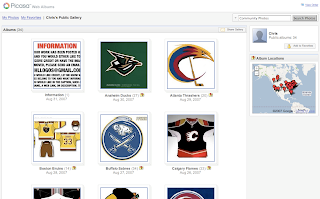
We'll kick things off with some small but significant Atlanta Thrashers concept attempts.
 I'm not sure I can find the words to describe this. The thrasher head, while being used as a major element of the crest, has also been employed as a rather horrid stripe. It points up the arm the shoulders along the sleeves and runs across the waist.
The secondary logo is used on the front of the jersey on the right side while the player number is on the left. Captains be damned. The full primary logo is also featured on the front, but not as the crest. No, you'll find that at the bottom on the left.
The crest being used features only the bird's head on an "A." But hey, at least there's three to choose from. Also notice that the panel under the arms is blue on all three.
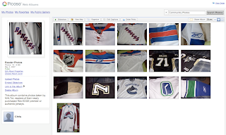
This jersey set is an eye sore of the worst kind. But just look at the socks. I've never seen a logo on a sock. These socks have three — each! And that's just the side we can see. Imagine if they appeared on twice or even three times.
It hurts my brain to imagine what these would look like on the ice.
And then this. Anyone who thought the Maple Leafs introduced a rather plain jersey should see this.
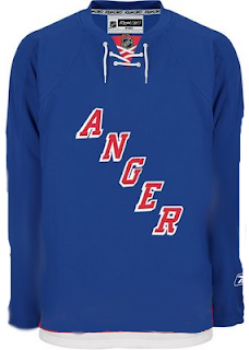
And though I'm not sure who's conjuring the anger, I can only guess that it's fans who feel like they've been somehow cheated because the letters were spread vertically (not squeezed horizontally).
We're just now hearing of the NHL's plan to expand once again.
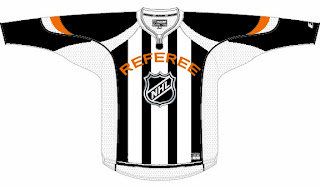
We don't yet know what city they'll play in, but the new club will be named the Referees. I don't know why this was made. But it made me laugh — and then it freaked me out some. Speaking of which, we've all seen the mish-mash logos created by Pfizer. Well this one was created by another artist, but it's almost equally as disturbing.
It seems some folks hate the slug so much, they feel a beheading is the only solution. Indeed.
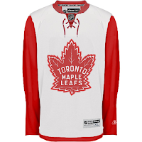
Oh, this deserves an explanation. The fervor over the Calgary Flames claiming the Albertan flag on their shoulder has spurred the Toronto Maple Leafs to go all out and convert their entire uniform into a Canadian flag. With the vintage logo, of course. No other way to go.
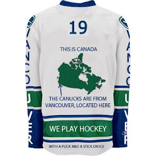
And finally, if you thought the text on the front of the new Vancouver Canucks jersey was as bad as it gets, wow. Just wait until you look at this.
I never cease to be amazed — or freaked out — by the things people send me. If you have come up with anything wacky and would like to make it a part of the Freak Out series, send it along to nhllogos@gmail.com.
I hope you all enjoyed your Freak Out Friday and are looking forward to the ninth installment coming in one week's time.
Can anyone tell me where the Canucks play? I seem to have forgotten.


 3 Comments
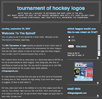 Hi everybody! As you may know, I've had plans in the works to set up a site where we can hold tournaments for other hockey leagues such as the AHL and ECHL. Well the wheels are in motion. Introducting the Tournament of Hockey Logos!


 We finally have an answer to the reason for the delay in the New York Rangers adapting their web site to the new NHL.com format. According to CBC Sports, MSG has sued the NHL claiming violated antitrust laws by monopolizing control of team promotions.