NHL Tournament of Logos

Entries in news (596)

Wednesday
Oct032007

Maple Leafs, Here's How You Fix It

The Fix It series has worked its way into the double digits today. In this episode, we explore ways of improving the Toronto Maple Leafs' brand new Rbk EDGE uniforms.

No question, the biggest complaint has been its simplicity and the fact that while wearing the home uniform, a player is nothing more than a giant blue blob. One minor change some feel might rectify this is adding the same double-stripe found around to the elbows to the waist.

If that's not entirely to your liking, however, I've got more. No, your eyes aren't playing tricks on you. These are the new Phoenix Coyotes jerseys recolored to blue and featuring the Leafs logo. If you look closely at the shoulders you'll see the remnants of the "PHX" patch.

But isn't that a sight to behold? Something about them just makes those jerseys look quite nice in my eyes.

And then if that still isn't your cup of tea, perhaps you enjoyed the new Vancouver Canucks sweaters. Perhaps Toronto could go that route.

Or perhaps not. That scares me a little bit. So let's pretend you never saw that one.

That's all I got. Up next: Nashville Predators.

Wednesday
Oct032007

Fan Art For Ducks, Stars, Coyotes

I've been getting some really awesome concept art sent to me lately so let's dive right into some of it, starting in alphabetical order with the Anaheim Ducks.

If this had been sent to me sooner, it would've been part of the Ducks, Here's How You Fix It post from a week ago. That team would look so good in this jersey and I'd eat all my words.

Then I was sent another set that I'm having some difficulty with.

That was making my head spin a little. So as to save me from having to explain it, a description straight from the horse's mouth:

I really wanted to pull together the Ducks' history in the jerseys. I tossed around a lot of ideas but landed on this set of home/away and two alternates. The home and away follow the current script years in Anaheim and I took a page from baseball for having different scripts for home and away. The home jersey features the 04-06 Anaheim script with Ducks in place of Mighty Ducks. The road is basically the current road jersey with an updated name font, captain's "c" and the script/oval logo. Both home and away jerseys feature and interlocking "AD" shoulder patch in the team script as well as front laces.

For the alternate I just changed the current sweaters up a bit but the new shoulder patch, front laces, a recolored Disney logo, and Anaheim, and Ducks wordmarks on the bottom of the home and road jerseys respectively. Just something a little different.

I like the jerseys independently of each other, but together they don't make a good set. I've heard of teams using different logos for their home and away sweaters, but never completely different color schemes. I think your team starts losing its identity when that happens.

I've also got a Dallas Stars concept that puts the state of Texas right on the crest. Not a bad idea, but it should be the white logo. It needs more contrast.

And finally, someone went a little nutty with the look of the Phoenix Coyotes. It's a harsh mix of the old and new.

I'm not really sure I have the words to describe it. Perhaps you do so feel free to leave a comment.

Wednesday
Oct032007

Some Unusually Familiar Concepts

I got a funny email yesterday. Check out these. See if you notice a pattern.


I don't feel a need to explain or comment on them really. They sort of speak for themselves. Pretty clever, if you ask me. What do you think of them?

Wednesday
Oct032007

Reebok Fixing EDGE Issues

An article on TSN's web site was emailed to me and I thought it would be worth sharing. Apparently, Reebok is responding to the moisture issue players are having with the new EDGE jerseys. In short, the wick-away technology is doing a fantastic job of keeping water out of the uniform, but also trapping sweat inside which results in very wet skates and gear.

October 2, 2007

New sweaters here to stay

Darren Dreger
TSN.ca

NHL players will tell you the practice and preseason version of Reebok's sweater design needs work.

The NHL has recognized the issues and Tuesday morning in a conference call with Reebok the league was assured alterations will be made.

The biggest issue focused on the water resistant coating on the fabric of the sweaters. It was designed to keep moisture out.

It did that, but also trapped the moisture in which led to soggy equipment and unhappy hockey players.

To correct that problem Reebok says it has developed a treatment that permits sweat to escape through the fibers, yet still manages to stay reasonably dry.

This new sweater is being shipped to teams around the league, with the Pittsburgh Penguins and Reebok's spokesman Sidney Crosby likely to debut the modifications as early as Friday.

Despite the public outcry from the game's fighters, the NHL doesn't see the need to alter the design to accommodate their needs, other than to further investigate whether the sweater's tie-downs have to be improved.

The belief is most fighters cheated in the past, utilizing the loose fit to get their arms free, or to shake-off binding elbow pads.

That can't happen anymore and the NHL has no intention of changing how the sweater is tailored.

The coordinating socks on the other hand have been replaced in hopes the issue of tearing that some players experienced in the preseason, has been corrected.

The message to all players from the league and the manufacturer is, it's a work in progress and patience is required.

Further modifications are likely, what isn't likely is the NHL turning back and abandoning a deal that pours millions into league coffers.

Very interesting. I think it's great that they're addressing this problem so quickly. What do you guys think about Reebok now? At least they're listening to the players.

Tuesday
Oct022007

In The Pipeline

I get emails on a daily basis with excellent ideas on ways to further this blog. Plus every so often, some of my own ideas spring up on me. And there are a handful of them that I'd like to move forward with in the future. So I'm using this post to publicly keep track of what's under development for NHLToL as well as the new ToHL.

NHL Tournament of Logos

Upcoming Logo Tournaments
The next three logo touranments I have planned are Vintage Logos, Secondary Logos and Third Jersey Logos. Right now, you guys are voting on what the next one will be. And at the time of this writing, Vintage has a slight edge over Third Jersey. So that's the more immediate future. Each of these tournaments will last roughly four to five weeks.

On days off from regular polls, while we wait for the next challenger to move ahead, we'll do bonus polls just like in the Championship Tournament. We've been doing Logo History polls which take feature only the primary logos in a team's past against its current mark. During the next tournament, my plan is to have logos from relocated teams square off. For example, Coyotes versus Jets, Avalanche versus Nordiques and Hurricanes versus Whalers. The plan is to get through as many as possible.

In the future, we can also hold votes on primary versus secondary as well. My other thought is that if we ever run out of ideas of things to vote on (not likely) we could just pick a year and take all the logos that were used in that season and hold a year-specific logo tournament.

Rbk EDGE Uniforms
As you know, the new Rbk EDGE uniforms have been a big point of interest for me on this blog. I'm in the middle of writing a series of reviews for all of the new sweaters. When that is complete, we'll tally up the final votes and see how the jerseys rank with each other. I'm also putting together a bunch of easy-access information on the new jerseys which I'll tell you more about soon.

Another interesting idea would be a Uniform Tournament. You all would be able to vote on the best of the new Rbk EDGE uniforms. And by the same token, we could also do a throwback tournament where you vote on the best of the old uniforms as well.

Center Ice Logos added 10/3
Just remembered another idea I'd been thinking about. And I'd like to do this one soon depending on what you guys think. We can hold a Tournament of Center Ice Logos. In every arena across the league, the center ice logo is portrayed just a little bit different. We can find out who has the best one.

Goalie Mask Voting
I know it's called this NHL Tournament of Logos, but I think this site is about more than logos. One thing that a lot of people have suggested is voting on various goalie masks from around the league. Some of the designs are very creative and are worth taking a good look at, if you ask me. I'm collecting pictures at the moment, but some time before this hockey season is over, I would very much like to do a Goalie Mask Tournament.

Another great suggestion I've gotten is doing a Goalie Mask Concept Gallery where you all could design masks and submit them. Let me know if that's something you're interested in and perhaps I'll move forward with it. (10/11)

NHLToL Web Domain
One small thing that I'm considering is getting the blog it's own domain such as nhltol.com or something of the like. You'd still be able to access it at nhllogos.blogspot.com, but what would you guys think of that? And what address should I try to get? As a side note, if I did that, I'd ask for donations as I've yet to put a single penny into making this site. No sense in starting anytime soon, right? Of course, it would be up to the readers.

Tournament of Hockey Logos

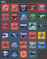
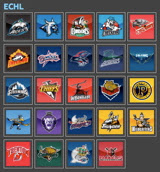
AHL or ECHL? Or AHL vs ECHL?
The two biggest and most popular minor leagues are arguably the AHL and ECHL. Therefore, they'll be up first. At the moment, I'm holding a poll over there for folks to decided which one will be first. The AHL is running away with it after over 1,000 votes. You still have two weeks to vote, however.

Plus, once both tournaments have ended, we'll have a poll between the best AHL and best ECHL logo. We could even set up an entire bracket of individual match-ups of AHL versus ECHL logos. But first, I'd want to get to some of the other minor leagues.

Other Leagues Under Consideration
There are many minor and junior leagues out there, some with great team logos. I'd like to cover as many as possible. Among those I'm considering:
CHL - Central Hockey League
OHL - Ontario Hockey League
QMJHL - Quebec Major Junior Hockey League
WHL - Western Hockey League
BCHL - British Columbia Hockey League
EIHL - Elite Ice Hockey League
USHL - United States Hockey League
NAHL - North American Hockey League
IHL - International Hockey League (current IHL and defunct IHL)

And there's no reason why we can't do any other defunct leagues or teams as well. If there is anything else not on this list that you think should be considered, please let me know.

Concept Logo Tournament
One of the things we do a lot here is concept art. Everyday, I get new emails with concept art designed by readers. And every day I try to post a few items. Well one thought for a competition is to do a Concept Logo Tournament. We'll take the best concept logos from every team and see which one comes out on top.

Rec League Tournaments
We could even collect logo submissions from recreational leagues and high school teams. That would make for an interesting tournament because the majority of the voters would have no emotional connection to the teams and could vote free of fan bias.

College Uniform Voting
A great idea that was suggested is a College Hockey Uniform Tournament. We could have votes on logos, but a lot of them are very institutional and might not stand up to certain kinds of competition. Still, the uniforms might be fair game.

I know all that up there is a lot to consider, but it just means that these two sites have potentially big futures ahead of them. And as long as you guys keep coming back to vote, I'll keep thinking up polls to let you vote on.

The biggest thing I need to mention in this post is that I want your input! I'm making this site for you guys so if there's something you want to see that I haven't posted here, please drop me a line. I'm open to doing all sorts of things but I can't think of everything myself. So review each category above and if you see something you think you can improve upon or if there's something I haven't covered, feel free to contribute.

I look forward to hearing from you guys!

Tuesday
Oct022007

Stars, Here's How You Fix It

Now that I'm posting the ninth part of this series, I think I should note that, by and large, I'm a big fan of all the new Rbk EDGE jerseys so don't let the fact that I'm posting so-called "fixes" make you think otherwise. I just think it makes for an interesting feature to ponder what might have been.

That said, let's see what we can do about the Dallas Stars. I think the home black jersey — which now features the city name as its crest — is very cool and unique. I like it if only because no one else has done it.

I think this is probably the easiest and most obvious fix — essentially the white jersey in black.

It uses the primary logo on the crest and the secondary logos on the shoulders along with a bit of piping at the bottom of the sweater. The current black jersey has the word "DALLAS" arched above the jersey number on the front and the primary logo on the shoulders. It's also solid black all the way to the bottom.

Personally, I like the real one better.

Moving along, we have a completely different design. Imagine more green and more apparent striping.

Obviously that's not a home-and-away set as neither is white, but it would make a good home-and-alternate set. While I do like the new black jerseys, I was always a fan of the Stars wearing green. Seems like teams aren't liking that much these days as the Wild also recently ditched their green sweaters.

So if green's not your thing, what about gold?

While it's a decent concept, I don't think it would translate well to a uniform. I can't imagine that looking very good on the ice.

How do you feel about it? Do the Stars need to rethink their new duds? Or will keeping the jerseys make them look like studs? Har.

Coming up: Toronto Maple Leafs.

Tuesday
Oct022007

What A Wild Work Of Art!

You know, surprisingly, it has been a lot of work getting the new site up and running in the last few days. If you haven't seen it yet, check out the Tournament of Hockey Logos blog, the spinoff to NHLToL. If you're a minor league hockey fan, head over there and vote for which league will get the first tournament — AHL or ECHL.

Now onto today's news — or something like that. Two months ago I posted a really cool secondary logo someone designed for the Minnesota Wild using the outline of the state itself. Well another one was sent to me and I think it's even better!

I can't get over how many talented people read and contribute to this blog. It's really a great thing. That logo matches so well with the primary while at the same time maintaining its own identity. That is very impressive work and I'd like to be the first to say so.

On a separate yet Wild-related note, several fans have suggested the team return to green home jerseys and keep the red for an alternate sweater. So here's what the current home jersey would look like in green.

It certainly is unique and not all that bad, if you ask me. Yet for some reason this one conjures up Christmas for me — unlike the red one. So I'm posing the question to you all. What do you think?

Beyond that, what do you think of that logo? Impressive work isn't it? I look forward to reading your comments as always.

Monday
Oct012007

ToHL Inaugural Logo Pools Posted


Just in case you guys haven't been keeping an eye on the new Tournament of Hockey Logos blog, I thought I'd make a quick mention of it here.

I've posted the logo pools for the AHL and ECHL today, which you can see here to the left.

Once again I just wanted to point out that I'm not as well-versed in the minor leagues as the NHL, so if I've got any incorrect logos or anything, please don't hesitate to let me know. My aim is accuracy here.

Voting will start on that site on Monday, October 15. The two weeks will allow time for folks to cast their ballots and choose AHL or ECHL as the inaugural tournament for the new blog. So check out the logos and cast your vote as to which one is going first.

Then keep checking back for updates leading up to the first poll being posted two weeks from today.

Hope everyone enjoys voting on the minor league logos. Some of them are pretty awesome — and some of them, not so much.

As always, please drop me a line if you have any suggestions on ways to keep improve these two sites. Thanks!

Monday
Oct012007

Flyers, Here's How You Fix It

I think many Philadelphia Flyers fans would argue specifically that if it needed changing, the only thing that would be necessary is an orange jersey instead of a black one. Having said that, the Flyers have already announced plans to introduce an orange third jersey next season.

Still, one fan emailed me this suggestion that extends the sleeve panel down past the elbow and shrinks the stripe around it. Have a look for yourself.

It's a minor tweak that, in my eyes doesn't really look that much different.

On a totally separate note, another fan emailed in an interesting concept that looks at altering the captains' letters.

Any thoughts? I'd love to hear them. Comment below.

By the way, apologies for the limited posts today. I've been a bit under the weather and I'm going to be needing to get to bed soon. Coming shortly will be the uniform review for the Columbus Blue Jackets.

Next up: Dallas Stars.

Sunday
Sep302007

Sharks, Here's How You Fix It

Speaking personally, I'm a fan of the San Jose Sharks' new logo and uniforms. So I don't see a need for "fixing" it necessarily. But others have complained that the modern logo design clashes with the more traditional jersey design.

One alternative to the stripes they currently wear would be something more along the lines of what the Florida Panthers do. I guess those designs match a little better. But for my money, I'd go with white piping over the orange on the home sweater.

Other complaints deal with not being able to move past orange gaining more prominence on the jerseys. Here's a solution.

I like this one because it looks like there are shark fins under wavy water on the sleeves. I think it works a little better on the white. But here's hoping the Sharks consider something of the like for a future third jersey. Speaking of the whole "fin" element, here are a bunch of ideas, seen with orange versus silver.

What I really like is the black jersey. Perhaps that would serve as a better third jersey as it has the last few years for the Sharks. But what do we think of it with the current striping pattern?

I know I said I like how the San Jose sweaters are now, but I'd be lying if I didn't say these were pretty awesome too. I guess it's hard to go wrong with the Sharks. So if they need fixing, there are plenty of ways of doing it.

Next up: Philadelphia Flyers.