NHL Tournament of Logos

Entries in sabres (87)

Tuesday
Oct162007

Fan Art For Sabres, Devils

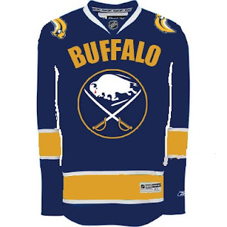
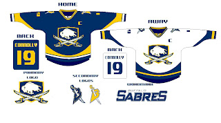
Got some good stuff to share today. We'll start with some improvements on a Buffalo Sabres concept logo I posted over the weekend.

The logo has been altered slightly and overall looks much better. The response to this over the weekend, however, has me concerned for a number of Sabres fans who won't even attempt to accept this logo in any way. I think this is better because it hides the fact that the buffalo has no legs — the primary reason for its being dubbed the "slug."

So I pose this question. A lot of people around the league have responded negatively to the use of the giant text on the front of the Vancouver Canucks' sweater. Would you guys (Sabres fans) still want to go back to the '70s logo if it meant having the name of your city floating above it?

Which element is more important to you? I'm curious to read your responses so please comment!
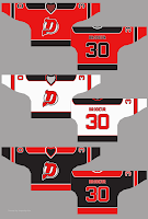
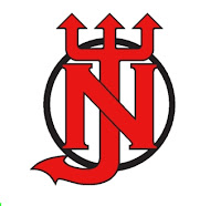
Next is a concept I came across recently for the New Jersey Devils. It toys with the idea of an alternate logo — though we all know Lou Lamoriello would never have it.

I think it's really cool but I'm not sure a change like this is required. I do think that black jersey would be interesting though, perhaps has an alternate in the future?

The same designer also came up with another logo concept.

The current one is definitely better.

Leave your reactions to these concept designs below if the spirit compels you. I look forward to reading your thoughts.

Monday
Oct152007

Poll: Sabres vs Nordiques


vs
Buffalo
SABRES
Quebec
NORDIQUES


Round Two has now begun! Place your vote and then feel free to leave a comment as to how you came to your decision. Tell all your friends to drop in and vote! The more voices heard, the more accurate the results!

Poll opening date
Mon Oct 15 @ 12:33 PM
Poll closing date
Fri Oct 19 @ 11:59 PM

07VNTRN | #2A | BUF70vQUE

Sunday
Oct142007

Redesigning Boston, Buffalo Unis

Good afternoon, everyone. First off, apologies on the late posts today (including the new poll), but you'll understand once I explain. See, my girlfriend and I bought a Nintendo Wii today.

Enough said. That should explain everything.

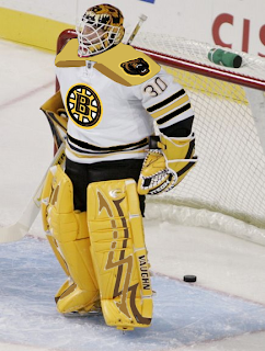
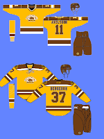
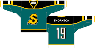
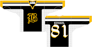
Now onto today's concept art. We'll start with the Boston Bruins, who I believe, already have perfect jerseys. However, I posted some pretty cool concept art a couple of months ago.

The other day I got an email from a reader who shows us what that idea might look like on a player.

I'm not completely repulsed by it. I like what they have now, but this isn't horrible. I sort of like that bear on the shoulder. Not so much with that spoked "B," however.

This concept is along the same lines. I like the idea of brown and yellow for a potential third jersey, but they'd definitely need to use the new secondary logo with it.

That's just my opinion. But I really do think they need that yellow third jersey hanging around for the future.

I don't know about the brown pants though. It might look good or it might be a big mistake. I'd have to see it on the ice first.

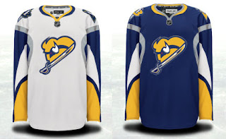
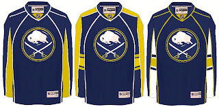
Anyway, here's something I really like for the Buffalo Sabres.

I think it needs a little sprucing up, but it's really sharp! I don't care for the horizontal stripes on this sweater, but that logo could work very well if the organization is insistent upon this particular type of bison.

It's a little too monochromatic the way it is now, but with a little color we just might have a winner.

Do you have an opinion on any of these designs? Well, you know what to do with it.

Friday
Oct122007

Rbk EDGE Review: Sabres

Part 19 of 30. All 30 NHL clubs have unveiled new jerseys under the new Rbk EDGE Uniform System for the 2007-08 season. Here at the NHLToL, we're going to review every one of them. Read up and then rate the new sweaters. We'll do a full ranking after completing all of the reviews.

Rbk EDGE Uniform System

Buffalo Sabres


New Uniforms

Old Uniforms

The Unveiling
Saturday, September 15. The Sabres didn't hold an unveiling event for their uniforms as the design wasn't changed from the previous version. But they went on sale to the public in the HSBC Arena in Buffalo on this date.

Home vs. Road
Home: Blue. Road: White. The two sweaters are essentially mirror images of each other aside from the sleeves and feature secondary logo patches on the shoulders.

The blue home jerseys feature a very unique striping pattern. A twisted silver stripe rides up the sides and around the shoulders beneath the logo patch. White, horn-shaped stripes wrap over the elbows and yellow paneling wraps under the arm down the cuff. The collar is silver with yellow trim and the primary logo serves as the crest.

The white road jerseys feature a very unique striping pattern. A twisted silver stripe rides up the sides and around the shoulders beneath the logo patch. Beneath the stripe on the arms, the sleeves are blue. White, horn-shaped stripes wrap over the elbows and yellow paneling wraps under the arm down the cuff. The collar is silver with yellow trim and the primary logo serves as the crest.

In The Details
The blue stroke around the logo on the white sweater is much thicker than on the blue one. Also the colors are swapped on the shoulder patches. The blue jersey features a yellow "B" while the white jersey features a blue one. The same numbering and lettering style has been retained.

New & Old
The new sweaters are primarily the same as the old as they were apparently designed last year with the new Rbk EDGE style in mind. The only difference would be the slight alteration to the stroke on the road jersey logo and the league-wide addition of the NHL shield to the collar.

Standard FAQ
Numbers on the front? Yes.
Laces at the collar? No.

NHLToL Editorial by Chris
Since I'm neither a product of the 1970s nor a fan of the Sabres, I never really liked their original logo that much. However, while I respected their choice to honor tradition and return to those colors last year, I was disappointed. Being a huge proponent of the red and black years, I often hoped to see them one day go with the red third jersey full time as that one actually had — of all things — sabres on it. The team is from Buffalo, not called the buffaloes, so let that be indicated in a secondary manner. I liked everything about those red jerseys and while saying so might put me in the minority, that's how I feel. The "slug" was not the right move. And while they may not agree with my particular opinion, just ask any Buffalo fan and they'll tell you so. This is pretty bad. 2/5


Buy your new Sabres jersey!

Friday
Oct122007

Just To Freak You Out X

It's like watching a trainwreck. It's horrible, but there's just something about it that prevents you from looking away. There's all manner of scary stuff out there and now I'm bringing some of it straight to you on another Freak Out Friday. Here goes.

I wouldn't be able to live with myself if I didn't start with this one.

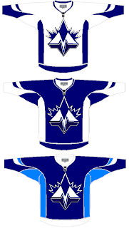
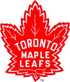
It shouldn't take you more than a second to realize the designer was trying to offer us something different for the Toronto Maple Leafs.

Leafs fans, I really want to hear from you on this one.

We've got a brand new logo with a very prominent "M" worthy of perhaps a place like Minnesota — or Montreal! And that leaf! Don't look it in the eye or it will cut you. Deep.

Even the second shade of blue worries me some. I'm not sure how I'm supposed to feel about this, but let's just say it's not great.

Anyway, I'd like to move along now because I can't take looking at this anymore. There's a point when doing this to a team like the Leafs starts to hurt.

Once again, Leafs fans, please comment.

Speaking of prominent letters in place of actual logos, I've got a pair of concepts from each coast.

Cleverly, though, we can't know exactly what these letters stand for as alliteration was employed to mask it. Is the "S" for San Jose or Sharks? And is the "B" for Boston or Bruins? Perhaps, the ultimate question is why dump perfectly good logos for these two teams in favor of members of the alphabet?

Even more disturbing is that "S" keeps reminding me of the Minnesota North Stars. Make it stop.

Each of those were delivered to me with a road sweater design to match. I wouldn't do that to you, though.

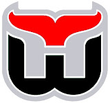
Here's what concerns me, though. I've been send a number of logos which have been converted to red and black for no apparent reason. Do any of these work?


It may be that the blood-in-the-water shark is the scariest one. I do see what's going on, though with the Hurricanes colors on the Whalers logo and the old Sabres colors on the new logo — but that doesn't make it any better.

I'm still worried about the killing to follow.

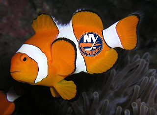
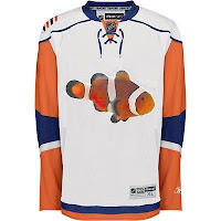
I'll wrap things up today with the thing that might frighten you the most. Did you ever get to feeling like that Rbk EDGE New York Islanders jersey reminded you of something? Perhaps you couldn't quite put your finger on it. But maybe it evoked feelings of being lost. In the ocean.

One reader thought so and sent in this.

If you wanted to know what they were thinking when designing the new Isles uniforms, now you do. Don't you wish you didn't?

So there it is. Another in the Freak Out series is behind us. I'm looking forward to next week. In the meantime, I await your crazy concept art. You can send it to me at nhllogos@gmail.com.

Wednesday
Oct102007

Result: North Stars vs Sabres

Buffalo
SABRES

59% 1,461 votes

Minnesota
NORTH STARS

41% 1,028 votes

2,489 total votes

Buffalo Sabres
Advancing to face Blackhawks or Nordiques

Minnesota North Stars
Eliminated


Poll opening date
Sat Oct 6 @ 9:00 AM
Poll closing date
Wed Oct 10 @ 11:59 PM

07VNTRN | #1A | MNSvBUF70

Saturday
Oct062007

Sabres, Here's How You Fix It

Apologies for the late posts tonight. I've been working on something I'll tell you more about later. But at the moment, I'm watching the Lightning game via NHL.tv since I no longer live in the Tampa market (sadly). I'm debating whether to go ahead and buy the Center Ice package.

Anyway, that's not what this post is about. We all know the Buffalo Sabres' new uniforms need fixing. I mean it kind of goes without saying. And I think we all know exactly how.

As any Sabres fan knows, John Slabyk's work epitomizes exactly what needs to be done for this team. There should be no question, yet for some reason these designs have yet to hit the ice. What are you guys waiting for anyway?

Anyway, here are a couple of other options borrowing from the designs of some of the other new Rbk EDGE sweaters.

Not sure how I feel about the chest piping, though. I think if you're going to go with a traditional-style logo, you should have the jersey match it. My exception to that rule is the San Jose Sharks.

I also just got sent this design which I really like, as well.

The artwork needs a little cleaning up, so try to see past that. But here we see how to use the buffalo and sword elements without just arbitrarily placing them inside a circle.

But I know there are a lot of Sabres fans reading here, so I'm really interested to see what you guys think your team needs to be wearing. The floor is yours.

Saturday
Oct062007

Poll: North Stars vs Sabres


vs
Minnesota
NORTH STARS
Buffalo
SABRES


The Vintage Tournament is kicking off today! It's going to be a good one. Remember, polls in this tournament will only be open for five days so get your votes in now!

Place your vote and then feel free to leave a comment as to how you came to your decision. Tell all your friends to drop in and vote! The more voices heard, the more accurate the results!

Poll opening date
Sat Oct 6 @ 9:00 AM
Poll closing date
Wed Oct 10 @ 11:59 PM

07VNTRN | #1A | MNSvBUF70

Friday
Oct052007

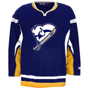
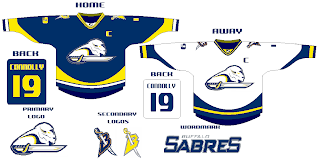
New Sabres Logo Concept

Got some interesting artwork from a reader trying to redesign the Buffalo Sabres logo. Personally, I think John Slabyk has the perfect design which could never be improved upon — but then my opinion isn't the only one that matters. Shockingly.

Seriously, though, check this out and see what you think.

He even put it on a jersey for us.

Leave your comments as I'm sure he'd like to hear what you think.

UPDATE (5:14 PM): By the way, just so as not to confuse anyone, Slabyk did not design the logo posted here. This was sent in to me by a reader of the blog. Just wanted to clear that up.

Friday
Oct052007

Just To Freak You Out IX

It's time for another Freak Out Friday! Let's not waste time.

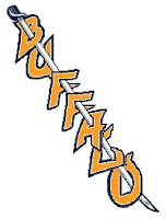
I've had this Buffalo Sabres concept for some time now. I think the idea is that this text would run down the front of the jersey, just like the Rangers.

Cracks me up though. But, hey, nothing says "Buffalo" and "Sabres" more than the city on a skewer. Anybody else getting hungry?

No? Just me?

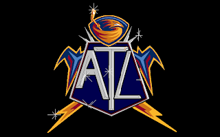
Moving right along then to one of the scariest bits of artwork ever to grace my inbox.

Aptly titled Thrash Bling, this image frightens me to my very core. What you can't say, though, is that it isn't creative. The things people come up with.

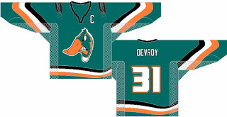
I think the Anaheim Ducks missed an opportunity.

That is one pissed off duck. I think someone splashed him.

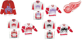
You might have to enlarge this next one to grasp its full scope.

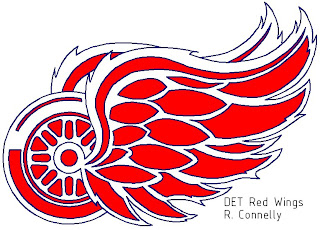
I get the octopus thing, but where does it stop exactly? I'm voting for the purple one. Speaking of scary Detroit Red Wings art, look at this.

I mean it's not half bad as far as that goes, but yikes! I think the wings are swallowing the wheel. Poor wheel.

Apologies for the short post this week, guys, but it was a slow week in terms of "freak out" art. Hopefully you guys will send in more for next Friday's installment. Until then...

Freak.

Out.

Page 1 ... 3 4 5 6 7 ... 9 Next 10 Entries »