NHL Tournament of Logos

Entries in sabres (87)

Friday
Dec142007

Poll: Canucks vs Sabres


vs
Vancouver
CANUCKS
Buffalo
SABRES


Place your vote and then feel free to leave a comment as to how you came to your decision. Tell all your friends to drop in and vote! The more voices heard, the more accurate the results!

Poll opening date
Fri Dec 14
Poll closing date
Tue Dec 18

07SCTRN | #1G | VANvBUF

Friday
Dec142007

Just To Freak You Out XIX

Finally, Freak Out Friday is back on Friday! And boy is this one a doozy. You won't believe some of the whacked out craziness your fellow readers have come up with this week. Let's start with an eyesore I probably never should've posted at all.

Yeah, there's no excuse for that. Speaking of inexcusable, here's a rather scary concept of a Tampa Bay Lightning logo.

Oh wait, it gets better. You know how Las Vegas has been involved in all the buzz about a possible future expansion of the NHL? Here's what they shouldn't do when it comes to naming the team and designing a uniform.

And then as always, we have our "If They Mated" blends. First, we have Pennsylvania's teams...

...and then all three New York clubs.

Plus as a special bonus, someone redesigned the Sabres' pants. But you know what I say? If the Lightning can have lightning bolts down their legs, than why can't the Sabres have swords?

Oh, and I mentioned the Penguins a second ago. I need to post this just so it's out there. I'm all for the retro blue jersey for the Winter Classic, but let's not go too far. Here's something to avoid at any cost.

And finally, I can't determine whether the designer of these hates the new Canucks jerseys, or loves them. You be the judge.

Hope you enjoyed your week — or at least your Friday. Christmas comes in just 11 days and you know what that means!

See you right here for another Freak Out post next Friday! And remember you can send in your concepts for consideration to nhllogos@gmail.com. I look forward to seeing them!

Monday
Dec102007

Connected By Blue

So what do all of tonight's jersey concepts have in common? The color blue. That's it.

We'll begin with the Buffalo Sabres and a design that despite its stripes is actually rather cool.

Yeah, the striping does ruin it though, doesn't it? I like the logos and the colors (though I'd go with a white circle on the blue jersey) but I don't really understand the weird stripes. In case you can't really make it out, the logo on the shoulders appears to be the buffalo from the original '70s logo sans the swords beneath it.

These two deal with some simple modifications. The white Leafs jersey with the blue stripes leaves me wondering whether this would be a home or away jersey. It seems to have too much blue to be a road sweater yet it has too much white to be for home games. The Isles jersey, however, is a nice adjustment. Not great. But better.

Here are a couple of dark Thrashers jerseys. Your pick as to which is home and with is an alternate.

And finally, I promised a Blues fan I'd get this one posted tonight.

You know what to do now. Comment away. I'm interested in seeing what you guys have to say about these.

Saturday
Dec082007

Just To Freak You Out XVIII

It's time for another belated edition of the Freak Out series. Hopefully I'll get over this cold soon. It's making me very unreliable here at NHLToL. And it's supposed to be Freak Out Friday, right? Anyway, let's dive in.

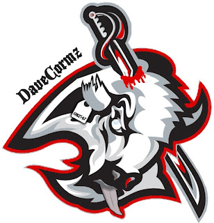
Wow, that was awfully violent. Who's hungry for buffalo tongue?!

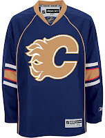
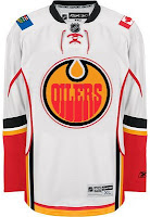
I got a ton of submissions this week for the "If They Mated" category. And these are all about rivalries.

I don't even know what to say about this. Except that once again, don't send me hate mail as I am excessively illiterate and wouldn't understand it anyway. Also I didn't make these.

Perhaps slightly less inflammatory are these.

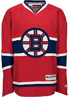
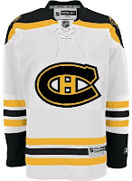
Everything's gone haywire. But wait it gets better. Sure anyone can mix two teams in a blender, but it takes a special kind of talent to do three.

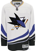
Presenting the Anaheim King Sharks. Let me break it down for you. You've got the Sharks logo in Kings colors on a Ducks jersey. Can't get much more to the point than that.

While we're still on the topic of ridiculous jerseys, do you remember the crazy Red Wings design I posted a while back. (It's the second one down in that post.) Were you wondering what it might look like on Dominik Hasek? Wonder no more.

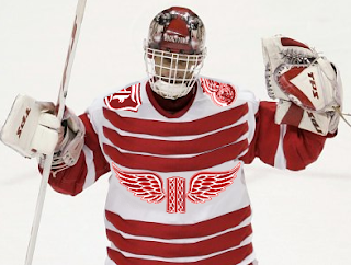
Don't know what he's so happy about. Hideous if I do say so.

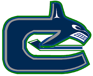
Here's a scary merging of the current and original Canucks logos.

Whales that play hockey. I love it.

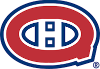
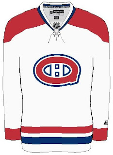
To finish up this morning's post, I've got a couple more whacked out logos. I'm pretty sure these come from a Quebecois looking to break away from Canada. It's like if Texas decided it wanted to be its own country. I laugh. But then I am a lousy Floridian who knows nothing of the politics of Canada. Look!


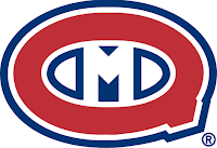
But wait, there's more!

So what do you guys think?

Oh and I'm just warning you now that any comments with discussion of politics will be promptly removed. Go elsewhere for that.

In the meantime, I hope I managed to freak you out a little. Until next time.

Thursday
Dec062007

Poll: Sabres vs Avalanche


vs
Buffalo
SABRES
Colorado
AVALANCHE


Here we go. It's the start of yet another logo tournament at NHLToL. Time for you guys to decide which team has the best secondary logo. We'll kick things off with a two-part preliminary round, starting with the Sabres and Avalanche.

Place your vote and then feel free to leave a comment as to how you came to your decision. Tell all your friends to drop in and vote! The more voices heard, the more accurate the results!

Poll opening date
Thu Dec 6
Poll closing date
Mon Dec 10

07SCTRN | #0A | BUFvCOL

Wednesday
Nov212007

Poll: Sabres vs Rangers


vs
Buffalo
SABRES
New York
RANGERS


The third round of voting has begun! Place your vote and then feel free to leave a comment as to how you came to your decision. Tell all your friends to drop in and vote! The more voices heard, the more accurate the results!

Poll opening date
Wed Nov 21
Poll closing date
Sun Nov 25

07TJTRN | #3A | BUFvNYR

Wednesday
Nov142007

Poll: Mighty Ducks vs Sabres


vs
Anaheim
MIGHTY DUCKS
Buffalo
SABRES


Place your vote and then feel free to leave a comment as to how you came to your decision. Tell all your friends to drop in and vote! The more voices heard, the more accurate the results!

Poll opening date
Wed Nov 14
Poll closing date
Sun Nov 18

07TJTRN | #2A | ANAvBUF

Saturday
Nov102007

More On The Sabres, Pens Topic

Since we're on the subject of the Buffalo Sabres and Pittsburgh Penguins today, I thought I'd share a few concept designs I thought were especially cool.

I'd consider the Sabres to be one of the best-looking teams in the league if they wore something a little like this. For one thing, the logo actually has sabres in lieu of a buffalo. Always a welcome change of pace if you ask me — you know, the whole thing about having a logo that actually represents the name of your team.

That being said, it should have a buffalo logo on the shoulder. My vote is for the white one you see in the vintage logo. Wrap a red outline around that buffalo and stick it to the shoulders and you've nearly got your winner. The other big change I'd make is to change the circle behind the swords to red. Either that or make the dark sweater red instead of black. Too much blending in there.

With those changes, I'd almost buy one myself and I'm not just saying that.

As for the Pittsburgh Penguins, this would be an improvement. This logo needs a bit of work, but it's got a ferocity lacking in the skating penguin. It's even got a nice shoulder patch with that hint of vintage. Any thoughts on this?

Or perhaps we could inject a little more of a retro feel.

Not only does this design reintroduce the blue sweater, but the designer even went so far as to add the city crest to the shoulders — taking a page out of Calgary's book. But actually, I don't hate it. My only hope is that the gradient thing is just for this graphic and wouldn't have any part of an actual jerseys.

We can dream, can't we? Anyway, leave your thoughts below. I'd like to see what the consensus is on all of this. It's pretty drastic compared to a lot of the work I post on a regular basis. And as always, my thanks to the artists.

Saturday
Nov102007

Another Look At The Retro Winter

I keep getting emails from you guys about the news that the Sabres and Penguins will be donning retro uniforms for the Winter Classic on New Year's Day. Don't get me wrong, I appreciate you guys sending in information, but I did address it last weekend.

Regardless, I thought I'd write up another post considering the league has now made that official — which wasn't the case on Sunday. Here are some images that the clubs posted on their web site this week.

The deal is that Reebok is apparently making them in the same "cutting edge" materials used for the EDGE jerseys.

As you might've noticed, the teams will be wearing their old 1970s logos and uniforms. Most notably, the Pens will be donning blue for the first time since 1980. Should be a fun game to watch, no doubt, if for no other reason than the throwback uniforms.

So anyhow, there it is. It's official. The Buffalo Sabres and Pittsburgh Penguins will wear retro sweaters for the Winter Classic.

By the way, in case you were wondering, the week of this game, be sure to stop by NHLToL as you'll be able to vote on the two logos being used on these jerseys. So stay tuned for that.

Friday
Nov092007

Just To Freak You Out XIV

It's the end of another work week and we all know what that means — Freak Out Friday! A series, which by the way, has become very popular. So as long as you guys keep sending in crazy crap, I'll keep posting it every week. I'll start things off tonight in New York.

I felt I couldn't properly begin a Freak Out Friday without involving the Buffalo Sabres somehow.

See? This is what happens. What is that anyway? Somebody call Paul Bunyan. We found his ox. Yay.

Easily the most maligned logo in the NHL, imagine the "Buffaslug" on what's been one of the most maligned jerseys here at NHLToL. How much do you guys love this concept right here?

Not that much? Just when you thought it couldn't get any worse. Anyway, while we're on the subject of the Atlanta Thrashers, see if you can endure this monstrosity.

I know that wasn't easy, but don't worry, it's over now. Let's not let this happen again, all right?

Gradients on jerseys is a personal pet peeve of mine. Who was it that thought these looked good?

Oh yeah, those guys did.

Have you ever tried to use red, blue and black together? Here's why you don't.

And here's another reason.

Finally, I'll leave you this evening with one simple concept and a profound statement.

Only you can prevent forest fires.

Until the next time, try not to freak out too much.