NHL Tournament of Logos

Entries in sabres (87)

Wednesday
Nov072007

Poll: Flames vs Sabres


vs
Calgary
FLAMES
Buffalo
SABRES


Place your vote and then feel free to leave a comment as to how you came to your decision. Tell all your friends to drop in and vote! The more voices heard, the more accurate the results!

Poll opening date
Wed Nov 7
Poll closing date
Sun Nov 11

07TJTRN | #1C | CGYvBUF

Tuesday
Nov062007

Third Jersey Concepts

In honor of the new Third Jersey Logo Tournament, I've got a fitting theme for today's concept art post. Check it out.

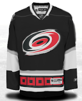
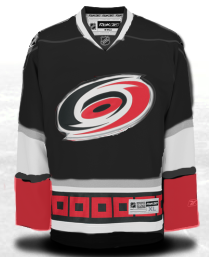
One cool suggestion for a Hurricanes alternate sweater could be achieved by going all black. I say change the black sweater cuffs to red and you've got yourself a winner. As for the Habs, this may not be perfect, but it's pretty damn close. I'm a big fan of this design. I'm curious to see what it would look like on the ice.

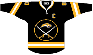
But back to black third jerseys, consider these.

I actually like this. But I was a big fan of the black and red days of the Sabres. They never looked better — especially in those red third jerseys.

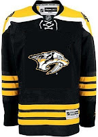
And what about the Predators? Obviously, this design was created entirely based off of the Bruins' new sweaters, but it's not bad. I sort of like the 3D sabre-toothed tiger head, myself. But my preferences have never really been on par with most people. And I'm okay with that.

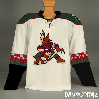
Finally, based off the idea of teams going with a retro look for alternate jerseys, how about something like this for Phoenix?

It's not like I hate the current look of the Coyotes, but I always thought they looked awesome in brick red and green. You have to admit, though, this jersey is pretty sharp looking.

But you probably disagree with me about something. Tell me about it below in the comments.

UPDATE (6:36 PM): Well our lovely designer Michaela got right on it with my suggestion to add red to her Canes concept above. Check it out.

I think it looks great with that small touch. Thoughts on that?

Sunday
Nov042007

Winter Classic Goes Retro

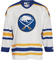
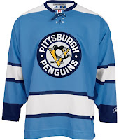
The NHL's official online shop suggests that the Buffalo Sabres and Pittsburgh Penguins will be donning vintage sweaters for the Winter Classic which takes place on January 1, 2008. The photos listed can be seen below.

Those are nice jerseys. See Sabres fans? This is still your real logo, regardless of what your team wears every night. It makes it more special when they save it for occasions like this. Or maybe that's just me.

For more on this story, check out Going Five Hole. My thanks go out to Sean for the tip!

Sunday
Nov042007

Result: Sabres vs Whalers


SABRES & WHALERS NAMED CHAMPIONS!


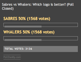
Congratulations go out to both the Buffalo Sabres and Hartford Whalers vintage logos! In an unprecedented event, voters at the NHL Tournament of Logos were evenly split on which logo they felt was best. After 3,136 votes, both logos finisehd with 1,568 each.

On a personal note, I'm shocked by the tie. I really didn't expect it. Although it makes sense to me that it happened in a championship round before any other round. I want to thank everyone who voted and participated in this poll.

And just to address the "controversy" — which is becoming a disturbing commonplace among some of you guys (I know, you can never please everybody) — nobody got "robbed." The polls are set to close automatically. Also if you check the original post, there is no longer a scheduled closing time of 11:59 PM as there used to be. I addressed that a while back. So just because the poll didn't close at 11:59 PM your time doesn't mean it didn't automatically close when it was supposed to.

Starting to love controversy, by the way. Maybe I"ll work that into the title of the blog. The Controversial NHL Tournament of Logos! Nice ring, but probably a bit too many syllables. Looking forward to the next tournament. Expect an announcement this afternoon!

Tuesday
Oct302007

Poll: Sabres vs Whalers


vs
Buffalo
SABRES
Hartford
WHALERS


This is the deciding round for the Vintage Logo Tournament. Who's it going to be? Whalers or Sabres? Which is the best vintage logo in the NHL?

Place your vote and then feel free to leave a comment as to how you came to your decision. Tell all your friends to drop in and vote! The more voices heard, the more accurate the results!

Poll opening date
Tue Oct 30
Poll closing date
Sat Nov 3

07VNTRN | #4 | BUF70vHFD79

Saturday
Oct272007

Red & Black

We've got a color theme for this concept post. Check it out.

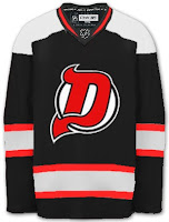
The most obvious place to start is the New Jersey Devils.
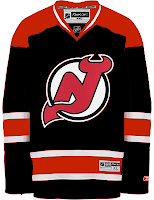
They both offer unique ideas for an alternate jersey. I don't think we'd really want to see the Devils in anything but red on a regular basis. Very interesting how these two different artists came up with something so similar yet so different.

But for something completely different, look no further.
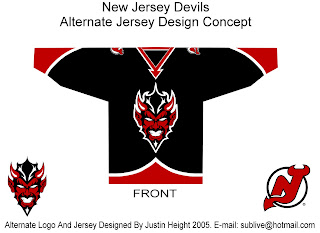
That's a pretty scary logo. Looks like somebody's tattoo.

And here's a team you don't often associate with black.
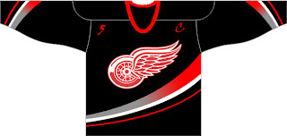
The ironic part is the Ducks' template on a Red Wings jersey. Just so many things wrong with that. I know the Red Wings are sworn enemies of third jerseys, but I think they should try one out some day. Maybe not this design, though.
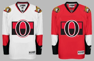
Another black and red team is the Ottawa Senators. Here's an example of what they shouldn't do with a third jersey. Ever. And here's another.
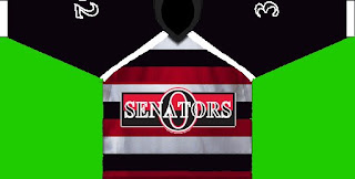
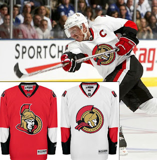
Now here's something that would work — even as a full-time road jersey. This 2D Senators logo is quite possibly better than the primary. It's unfortunate it's nowhere to be seen on their uniforms. Rumor was that it would be featured on various bits of team merchandise. If anybody owns anything with that logo, send me some photos.
And while we're on the topic of doctored photos of jerseys, more and more I'm in favor of the black/red/silver color scheme for the Buffalo Sabres — who are presently being conquered by my Lightning (that goes out to all my email hecklers).
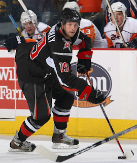
Yeah, it's true. My Sabres-fan readers have taken to email trash talk. Well we'll just see how that goes, won't we? It's 2-0, not five minutes into the second period. Hope you're watching.

UPDATE (9:33 PM): Sadly, I may have spoken too soon with regard to the game. It's now tied.

UPDATE (10/28 8:17 AM): Stupid overtime.

Thursday
Oct252007

Everybody Loves Buffalo

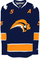
This should be a strange enough topic for a concept art post. You'll see what I mean in a second. First, here's a jersey for the Buffalo Sabres I think is way better than what they have. I say that not being a fan of the current blue and gold color scheme.

Stop throwing things at me.

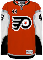
So anyway, here's what I was really getting at. People keep sending it concept art based off of the Buffalo Sabres "template," so to speak. Check out this Flyers jersey.

To be fair, it's a pretty cool design. For a jersey everyone hates, there sure are a lot of folks interested in using it for their own team. And I'll tell you what else. I'm curious to see how into this you guys are. Let's see if we can do one for every team in the league!

And if someone wants to scour through the Concepts Gallery to find any others, we'll start keeping a list. I just think it's kind of funny. And I'm sure there are Sabres fans reading here, just giddy over the idea.

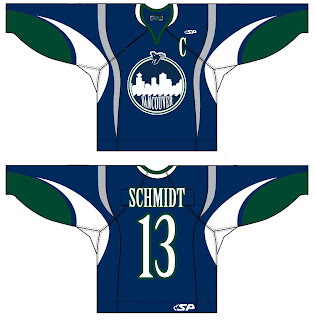
Here's a Canucks jersey design.

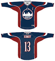
Interesting new logo concept, right? Well there's more where that came from.

Maybe a nice secondary? Not sure about using it for the crest.

All right, I await your Sabres-based concepts, everyone. Don't let me down.

Wednesday
Oct242007

Poll: Sabres vs Jets


vs
Buffalo
SABRES
Winnipeg
JETS


Place your vote and then feel free to leave a comment as to how you came to your decision. Tell all your friends to drop in and vote! The more voices heard, the more accurate the results!

Poll opening date
Wed Oct 24 @ 2:56 PM
Poll closing date
Sun Oct 28 @ 11:59 PM

07VNTRN | #3A | BUF70vWPG79

Monday
Oct222007

Double Up!

We're doubling up on the concept art tonight. Check it out! We begin in Buffalo with the Sabres.

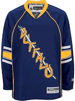
On the left appears to be a recolored Canucks jersey. Not sure why the artists decided to put upside down buffaloes on the shoulders. But I'm sure the traditionalists will enjoy seeing the '70s logo element on this jersey. Unfortunately, the "slug" is still there.

On the right is an element we've seen before. I posted the crest you see here in a Freak Out post from a few weeks ago. I wondered what it would look like on a jersey. Wonder no more. Unfortunately, this concept is based on the new Oilers jersey. And a yellow collar? That's pretty nutty. This might've been worthy of the Freak Out series itself!

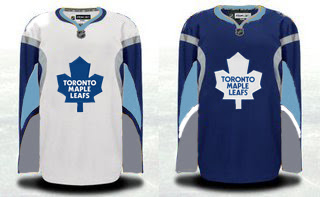
Speaking of freaky Sabres artwork, check out this Maple Leafs concept.

That's just weird, isn't it? Although the splash of color for the Leafs isn't completely unwelcome if my opinion counts for anything (and it doesn't). A simpler solution to the Toronto simplicity problem could be below.

I kind of like that outlined leaf. Not sure about the collar here or the shoulder piping.

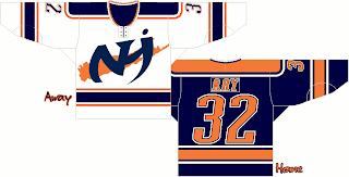
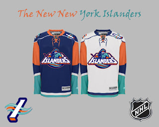
But going back to New York now, I've got a pair of Islanders designs.

Pretty cool logo. Anyone think this jersey could work as an alternate at some point in the future? It does have a very distinct Oilers feel to it, but that could be fixed by swapping the orange and blue.

And finally, a little something out of the ordinary.

For as much as folks hated the "fish sticks," this is a much better-looking jersey than the current one — at least so says I. However I did like the old lighthouse logo more for the shoulder patch. I just really like that color combination more than anything. In fact, while we're at it, why not go with the lighthouse logo across the chest?

Anyway, what do you guys think of all these? Let me know below with your comments.

Saturday
Oct202007

Result: Sabres vs Nordiques

Buffalo
SABRES

54% 1,261 votes

Quebec
NORDIQUES

46% 1,064 votes

2,325 total votes

Buffalo Sabres
Advancing to face Jets or Rockies

Quebec Nordiques
Eliminated


Poll opening date
Mon Oct 15 @ 12:33 PM
Poll closing date
Fri Oct 19 @ 11:59 PM

07VNTRN | #2A | BUF70vQUE

Page 1 ... 2 3 4 5 6 ... 9 Next 10 Entries »