Freak Out Friday is finally back! After taking six weeks off, everybody's favorite series is making its' big return today. For those of you who just joined us in the last six weeks, take a look at some past Fridays. Some of the best ones were on the old blog. Basically, I take the opportunity every couple of weeks to showcase some of the weirdest and craziest concept art that turns up in my inbox.
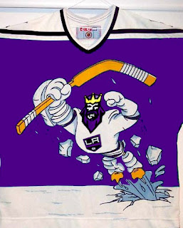
Now, we're starting back up with an easy one. What did we last make fun on Freak Out Friday and what do we make fun of the most? Could it have been the Mighty Ducks' mid-90s third jerseys? What if they mated with the Kings?
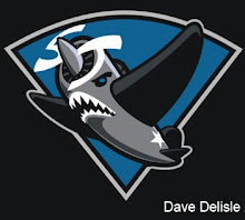
Sticking with California for a moment, imagine if the Sharks went in an entirely different direction with their logo design.
That's not even the best one, and you'll notice that the majority of today's Freak Outs come by way of David Delisle who, while doing excellent work, sure ends up with some odd stuff.
Last month I featured a blog that was holding a competition to design the best Hurricanes/Whalers hybrid jersey for the franchise's 30th anniversary.

That's so scary it's actually good. And to all of you who think the Hurricanes' logo looks like a toilet flushing... this logo brings back memories of when my first goldfish died.
The Flames will be our next topic of discussion.
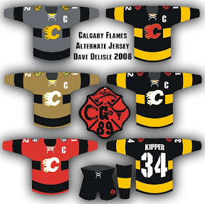
Check out that logo in the middle. The more astute among you will notice some things hiding in plain sight. The less astute will just be amused by this.

The Blue Jackets are next on our hit list. All this time and no one's ever made a concept showing jerseys that look like blue jackets. Until now.
How would that not get your team laughed off the ice?
Finally, a combination of odd designs by our new buddy Dave.

Yes, we get it. There are a lot of cabs in New York. By the way, the record needle on the end of a hockey stick is pretty funny.
One more thing, which isn't related to hockey but still funny. Kurt Snibbe of ESPN.com's Page 2 had some fun messing with NFL logos last week. I highly recommend a look even if you don't like football.
And that's all there is for this 42nd edition of the Freak Out Friday. I hope to be back in two weeks with a new crop of the ridiculous so make sure you guys keep them coming.


 10 Comments
 They beat me to the punch. On their official web site, the Montreal Canadiens are holding a poll, asking you to vote for your favorite of the six newly unveiled Centennial Jerseys.
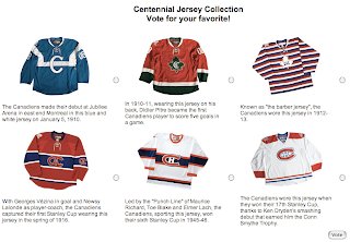
 Charlie from


 No, the Detroit Red Wings are not changing the nameplate lettering on their jerseys. This is something we seem to go through every year around this time.
 Back in July, I
 The Ottawa Sun, who I was


 Today, the St. Louis Blues became the fourth team to unveil their third jersey for the 2008-09 season.


 The St. Louis Blues news keeps coming. According to the team's official web site, it's official. The Blues


