Icethetics

via Blogger

Friday
Aug082008

IHA Poll: Houston Comets


Cast your vote and leave a comment about your decision. If you chose a non-finalist, tell us which one. Then tell all your friends to drop in and vote! The more voices heard, the more accurate the results!

Starts Fri Aug 8
Ends Mon Aug 11

Below are a handful of the logos that were submitted but not selected as finalists. If you think one of these should be the Houston Comets logo, select "non-finalist" in the poll and tell us your pick in the comments.


Thursday
Aug072008

Overnight Art: California Style

It's late and I feel like you guys got shortchanged today with only an IHA Poll being posted. So I'm sitting here and I feel like writing up a pretty big concept art post — all about California. We'll start in Anaheim.

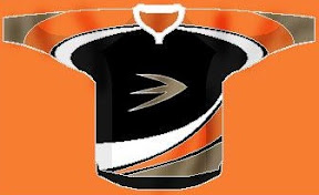
Here's an unusual idea for the Ducks — get rid of everything in the logo except for what's inside the D.

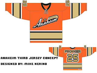
Or, to be more conservative, I've got an orange third jersey that's pretty sharp.

And an orange third jersey based on a purple one from the old days.

We could just go an entirely new route and find ourselves with a unique, new logo.

But maybe we'd better not. Continuing our California trip, let's head to L.A.

Same logo, two drastically different uniform designs. This next one loses the color altogether with a callback to the Kings' Gretzky days.

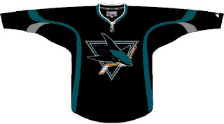
Now we head north to San Jose where we start with a new logo for the Sharks.

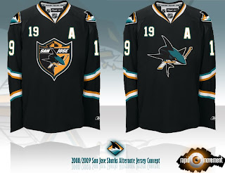
Notice the complete lack of orange. I always thought it was a nice accent. But that's why we have the one on the right. Though comparatively, those sweaters are a bit boring.

One designer suggested the team keep the shark of their current logo with the triangle of the old days.

And this last one was forwarded to me, I believe, from a message board somewhere. If anyone's got the link, I'd be happy to add it. (Update: See the original post at HFBoards.com.)

I like both but the shield logo is my personal favorite.

Happy now? Go get some sleep. (And if it's morning where you are when you're reading this, have a nice day.)

Thursday
Aug072008

IHA Poll: Edmonton Seahawks


Cast your vote and leave a comment about your decision. If you chose a non-finalist, tell us which one. Then tell all your friends to drop in and vote! The more voices heard, the more accurate the results!

Starts Thu Aug 7
Ends Sun Aug 10

Below are a handful of the logos that were submitted but not selected as finalists. If you think one of these should be the Edmonton Seahawks logo, select "non-finalist" in the poll and tell us your pick in the comments.


Wednesday
Aug062008

Rebranding The Stars, Revisited

I've got new artwork from Matt today and an update on his next rebrand.

Two weeks ago he added the Dallas Stars to his Rebranding the NHL series. One major factor in his design was dropping one of the primary colors — green. He even explained why but that doesn't mean green wouldn't have looked good on the uniforms.

Here's a different take on the uniforms of his latest rebrand.

The St. Louis Blues are next on Matt's list. He's planning to have it done soon and has offered up a few tidbits about what to expect from it. He calls the new primary logo a "tasteful, vintage style" modernization of the Blue Note the club has worn for more than 40 years. He is, however, working on two additional original logos so you will get something new.

I know I'm looking forward to seeing what he comes up with.

Wednesday
Aug062008

Wallpaper Wednesday VIII

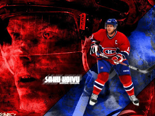
All the third jersey news caused me to skip last week's Wallpaper Wednesday but it's back now with some really great artwork to adorn your computer. Last time, we finished things off with Saku Koivu. Well I liked this one so much, I'm starting with him today.

Here's Alex Ovechkin — I believe we've had him featured in this series a few times before.

Got a logo-based wallpaper for the Senators.

Not too sure why Crosby's so prominent in it though, even if he is face first on the ice.

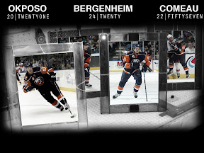
I've been sent several Islanders wallpapers. These were some of the best ones — Bruno Gervais and Trent Hunter.

This one highlights the future of the Isles.

And finally, this one speaks for itself.

Back next week with more.

Wednesday
Aug062008

IHA Poll: Denver Mountaineers


Cast your vote and leave a comment about your decision. If you chose a non-finalist, tell us which one. Then tell all your friends to drop in and vote! The more voices heard, the more accurate the results!

Starts Wed Aug 6
Ends Sat Aug 9

Below are a handful of the logos that were submitted but not selected as finalists. If you think one of these should be the Denver Mountaineers logo, select "non-finalist" in the poll and tell us your pick in the comments.


Tuesday
Aug052008

Jerseys For Your Tuesday

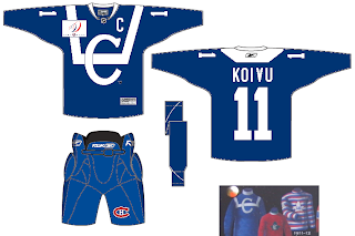
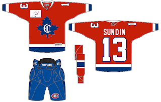
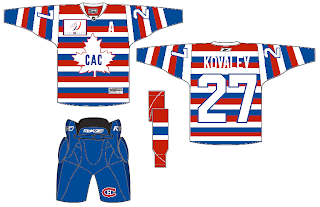
I've had a few jersey concepts sitting around that I thought I'd share this afternoon. I wanted to start with the Montreal Canadiens — who, according to a few sources will have a number of vintage sweaters throughout the season to celebrate their centennial. Using some past looks, one designer came up with this three.

Solid if not a bit boring.

Notice the name on the back of that one.

And those stripes are making me hallucinate.

Moving to the west now, we've got a cool concept for the Stars.

Seems that Bruins jersey would work for just about any team with a little recoloring. And while we're on new colors, when Matt did his Dallas rebrand, a couple of people brought up the idea of using Cowboys colors. Here's how that might manifest itself.

It's not bad but a little to close to my Lightning, you know?

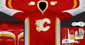
And speaking of the Lightning, they're currently facing the Flames in the Center Ice Tournament — last day to vote on that poll, by the way! Here's a Flames concept jersey with their original colors and an interesting new alternate logo on the shoulders.

It's not the outline of Alberta I'm impressed by, but the small flame within it. Anyway, keep the concept art coming. We've also got a Wallpaper Wednesday tomorrow. Get excited!

Tuesday
Aug052008

Project: IHA Pacific

First, if you have no idea what the Icethetics IHA Project is then click here to get caught up.

You've seen the Atlantic, West and Northeast Divisions. Now we're headed to the Pacific. Remember, your job is to take the name and colors and create an identity for a hockey team from scratch. You can do it!

As I said last week, the response from artists has been phenomenal. You guys have come up with some great logos as you've seen with the first two divisions. This week we're voting on West Division logos. The week after will be this division so that gives you about two weeks to work on your concept designs.

Now here are the new teams!

IHA: PACIFIC DIVISION


LOS ANGELES SAINTS / Los Angeles, California
gold (C3AD49), green (388C38) and black (202020)


PORTLAND REBELS / Portland, Oregon
green (066641), orange (EE780E) and white (F0F0F0)


SAN JOSE EXPRESS / San Jose, California
red (BE1B1B), yellow (E5CF17) and black (202020)


SEATTLE METROPOLITANS / Seattle, Washington
purple (65009A), blue (135791) and white (F0F0F0)


VANCOUVER DYNAMO / Vancouver, British Columbia
blue (7093DB), grey (999999) and black (202020)

I've supplied colors in hexadecimal format. Should you need RGB conversion, here's a decent resource. By the way, you aren't tied to the exact colors here. Feel free to alter them a little if need be. But please shy away from the standard colors like total black or total white or total red. Remember, be different! As similar as it might be to the NHL, it's not the NHL!

GUIDELINES
Once again, follow these guidelines when submitting your original IHA artwork:

  • Don't steal artwork. I'm still surprised I have to say this but a number of people submitted logos from professional teams. This is supposed to be where you let your own creativity shine through. Send in something original!

  • Submit three (3) logos: primary, secondary and wordmark. Use a white background. If your logo requires a white outline (think Lightning or Capitals), then use a gray background with the white outline included.

  • Submit vector art if possible. I will accept .ai, .psd and .pdf files. If you cannot submit vector art, you must be able to provide high quality raster art in .jpg or .png files. No .bmp files, please.

  • Try to stick to the assigned colors. Change them only if you deem it necessary and then explain why you made the change. Remember, the "fans" chose these colors and they're who you're working for in the end.

  • Email them to nhllogos@gmail.com with IHA in the subject line. Please include your first and last name (it will not be posted). Please also submit your nickname which will be public if you don't want your real first name used.

  • By submitting your own original artwork to the email address above, you agree to grant permission of its use for online or print publication by Icethetics. Do not watermark your logos or they will not be considered.

  • And finally, be prepared to accept feedback and criticism of all kinds!

As always, you can email me questions directly or post them in the comments area. Start designing your logos! I look forward to seeing what you all come up with!

Tuesday
Aug052008

IHA Poll: Dallas Patriots


Cast your vote and leave a comment about your decision. If you chose a non-finalist, tell us which one. Then tell all your friends to drop in and vote! The more voices heard, the more accurate the results!

Starts Tue Aug 5
Ends Fri Aug 8

As promised, below are a handful of the logos that were submitted but not selected as a finalist. If you think one of these should be the Dallas Patriots logo, select "non-finalist" in the poll and tell us your pick in the comments.

Monday
Aug042008

Ducks Confirm No Third

You know, with all the talk about which teams are getting third jerseys this season, I guess it makes sense to mention confirmation of those that aren't.
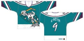
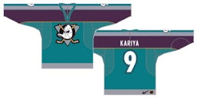
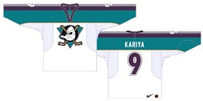
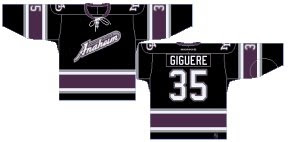
According to Curtis Zupke from the OC Register, Ducks management says they will be one of handful without one. It's funny because, 1) they could use one, and 2) history shows Anaheim has been one of the most prolific clubs in terms of thirds. A quick look back at the last 12 years turns up four different alternate sweaters for the Ducks alone.


credit: Andrew @ NHL Uniforms.com

It's worth noting the gradual increase in quality here over the years from something that should never have been worn in an NHL game to something that I wish was still around.