Icethetics

via Blogger

Sunday
Jul272008

Center Ice Bracket Is Here!

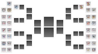
The Center Ice Tournament bracket is ready to go. You can already see it in the sidebar. Or see a larger image below. Clicking on either bracket will take you to the full version.

I've made some adjustments as you'll notice. My favorite is no more pop-ups. I never did like that. I've also changed the layout of the bracket to help with the amount of space it takes up. Hope you guys like the changes. I know in the past I haven't been the best at keeping the bracket up to date but I'm going to try to turn over a new leaf with this tournament.

In case you missed it, further details can be found by clicking here. The tournament begins on Monday!

Saturday
Jul262008

Blues, Blackhawks & Blue Jackets

Hope you guys are psyched for the Center Ice Tournament. I've been busy getting that prepared but in the meantime I did promise you concept art. Today's theme is the Central Division.

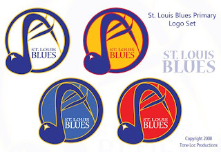
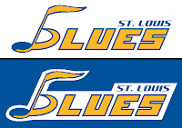
First up, the Blues — in an assortment of different colors.

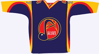
These logos have a very different feel to them as well because of the hand-drawn look. The NHL has never really done anything like this. Also, there's a jersey to go with them.

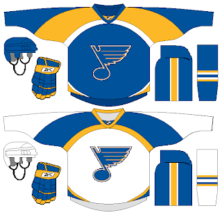
But back to a more simplistic approach, what about a striping pattern on the jersey that alludes to the Gateway Arch?

Here's an interesting wordmark.

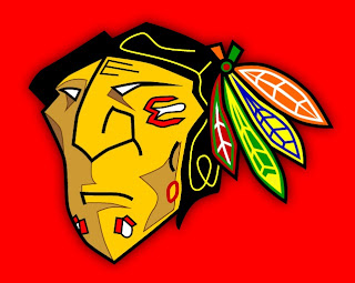
Next is my favorite subject, as you know, the Blackhawks. The designer tells me he came up with this logo around the time the Senators first introduced their 3Dish logo. You give the Indian head a quarter turn and he might look something like this.

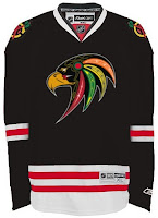
I like it a lot — maybe not as a logo, but just in general. Plus, remember this logo? Somebody put it on a jersey.

Not bad at all.

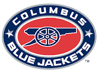
We'll finish things up here with the Blue Jackets. Here we're replacing the hat with a cannon on the secondary logo.

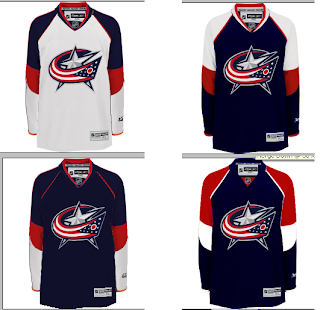
And here's a variety of color patterns for Columbus' jerseys.

Nothing really jumps out at me (in fact, it took me a minute to notice they were all different).

Don't forget, tomorrow you'll get your first look at some of the logos designed for Project: IHA. I can't wait to post them and get your feedback. Plus the Center Ice Tournament bracket will make it's debut. So there's a lot you won't want to miss.

Saturday
Jul262008

Center Ice Tournament

It's been a long time since we've had a full-fledged logo tournament underway here or on NHLToL. In fact, in the 26 days Icethetics has been up and running, we haven't had a single one aside from finishing up the CHL tournament. So today I'm announcing the first tournament here on Icethetics — it's the Center Ice Tournament.

Your vote will help determine which NHL arena has the best center ice design. The criteria you use to cast your vote is entirely up to you. You just have to pick which one you like better for whatever reason you choose.

There are 30 teams and each one will be included in the tournament. This means two teams will get first-round byes. They have been randomly selected as has the bracket which you will get a peek at tomorrow. But all 30 graphics are ready to go and in no particular order, here they are.


The original ice graphics were created by CanuckFanatic92 at hockeydownloads.com.

They are as close to accurate as I could find. They generally reflect last year's designs so this is what you'll be voting on regardless of whether anything has changed for next season. I recognize that teams celebrating special anniversary or hosting the all-star game tend to use special designs but I'm going with just the standard looks here. If you notice any major inaccuracies, best to point it out right away, though I can't say for sure whether I'll be able to make any changes.

BRACKET You'll get your first look at the new bracket tomorrow and the tournament will begin on Monday. It's going to run basically the same as any other tournament we've done in the past. I think it's been a fairly effective system and you guys already know how it works so what's the sense in changing it?

POLL LENGTH The only major adjustment will be to the number of days a poll remains open. It was previously five days but I'm now cutting that to four. The majority of the votes are cast within the first two or three days anyway.

SCHEDULING A new poll will be posted every day in the first round. For later rounds, polls will be scheduled so that they can be posted on consecutive days. We will have a few days off between rounds as the tournament progresses, but I prefer not to have days off within rounds, if possible.

LAYOUT The individual polls will also have a new layout. If you've voted recently on the CHL championship poll you'll know what I'm talking about. The logos will now be arranged vertically and alongside the radio button you use to make your selection. The logos will also appear in random order when you load the page.

If you've got any questions about this tournament, feel free to ask by emailing me or leaving a comment. Remember, I'll reveal the bracket tomorrow and the voting will commence on Monday. And just because I enjoy teasing you, I'll tell you which poll will be first: Predators vs Bruins.

Friday
Jul252008

Reasons To Visit This Weekend

I have a busy weekend planned here at Icethetics. Below are just a few of the reasons you should be sure to visit over the next few days.

CENTER ICE TOURNAMENT
I'll be officially announcing the new Center Ice Tournament along with all that that entails. You'll get a rundown of how this tournament will work — it'll be somewhat different than in the past. You'll get to preview all 30 new center ice graphics which I feel fit nicely with the new look of the blog. And most importantly, you'll find out when the voting will begin!

PROJECT: IHA
The IHA logo design project has been going great! You guys have been sending in some amazing artwork. This weekend I'll be unveiling the finalists for the Atlantic Division team logos. I'll also outline the process for how we'll come to a determination for each team's logo set, when the voting will start, and what's ahead.

CONCEPT ART
I'll have concept art galore to share for the Blackhawks, Blues, Coyotes and others plus a lot of great ideas for third jerseys based on some of the many rumors that have been floating around. You won't want to miss any of it!

Friday
Jul252008

Thrashers Up In The Air

I've been getting a lot of emails about the Atlanta Thrashers' alleged unveiling of their new third jersey at tomorrow's Select-A-Seat event. So I thought I should make a general clarification of my position on this.
First, the emails I've been getting basically say that an administrator on the Thrashers' official message board is denying any possibility that a third jersey will be released/unveiled/exhibited in any way at the event tomorrow. It should end there. He's obviously connected to the team whereas Icethetics is not.

And I was all set to remove the countdown from the sidebar until I re-read the email that went out to Thrashers fans last week. I wrote about it last Thursday. Even if it does turn out that the Thrashers will not show off their new third jersey this weekend, there's supposedly something going on that I'm sure will be of interest to Icethetics readers.

The email states as follows:

Members of the Thrashers Blue Crew and ticketing staff will be on hand to help direct you to available seats in great locations and give tours of the team locker rooms. In addition, fans will have the opportunity to see a new look for the Thrashers. Kids inflatables and special $1 concessions will be available on the concourse, and parking will be free at the Centennial Parking Deck when you present a printed out version of this message.


Notice the highlighted part. Some are under the impression that "a new look" could mean a new perspective of the game, that is, from a different seat within Philips Arena. But because of the "in addition" part, I'm tempted to believe it must have to do with something else.

"A new look" could also be interpreted as the new players the Thrashers acquired over the offseason, but it's awkwardly worded for that. So it seems to me that this must have something to do with logos or uniforms. I could be way off base here and as such, I'm qualifying the countdown. It now says they'll be unveiling "a new look" tomorrow.

Any Thrasher fans attending, I'd love an email after/during the event with regard to what this is all about. If it turns out to be nothing, then so be it. I'll have unintentionally gotten your hopes up for nothing. And for that, all I can say is... oops.

Friday
Jul252008

Freak Out Friday XL

This is the 40th installment of the Freak Out Friday series. And the Roman numeral for 40 suggests I'd better have an extra-large helping of freaky hockey artwork this week. Let's hope I can deliver.

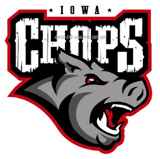
The biggest real-life freak out of the last couple weeks has been the public unveiling of the Iowa Chops along with their new logo. But someone's made an improvement.

(Apologies for the low image quality, but this is what was sent to me.)

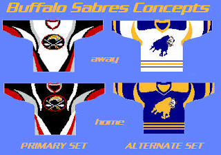
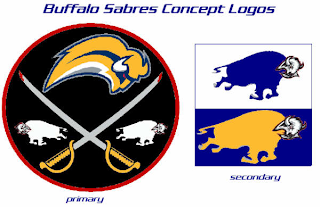
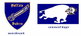
It seems that with the Buffalo Sabres, when it comes to fan made concept art, you either love it or hate it. I wonder what you guys will think of these.

But wait, there's more.

There have even been jerseys designed for them.

And more along the lines of Matt's recent rebrand of the Stars, check this out.

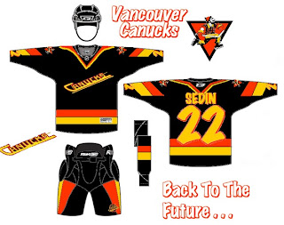
Something else I got this week that made me chuckle were concepts for the Vancouver Canucks.

Don't get me wrong, I appreciate the effort someone put into this but wow, you can't help but shake your head in amazement.

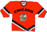
Here's a concept jersey for the Chicago Blackhawks.

Don't shoot the messenger.

Sometimes folks send in team-branding concepts that miss the mark a little.

I can only imagine the nightmares the children of Cleveland would have to endure.

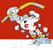
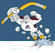
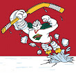
Speaking of nightmares, if you recall about a month ago I started a series within a series for the Freak Out Friday. One reader created 30 logos based around the Mighty Ducks' third jerseys from the mid-90s — one for every NHL team. Last week I posted the Atlantic Division and the week before was the Ducks' own Pacific. Today we're going to the Northwest.


Be sure to notice the half-stripes on the Oilers logo. Yes, all of these are based on last year's new Rbk EDGE jerseys.

And that's all folks. We're back with another Freak Out Friday in two weeks — assuming you get all your ridiculous artwork sent in! My big thanks to everyone who's submitted work — good and bad alike!

Thursday
Jul242008

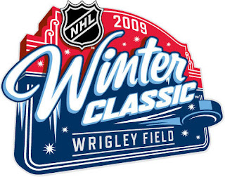
Winter Classic Logo Unveiled!

The Winter Classic 2009 has a logo!


credit: Wikipedia

Look familiar? I'm really liking the vintage looks for the Winter Classic logos. This is a trend that's worth keeping. What do you guys think of the new logo?

Big thanks to Mike for the find!

Thursday
Jul242008

Rumored New Looks For Fall

I ran across a post on the Canucks' official message board with some interesting information. It actually links back to NHLToL but that's not the interesting part. Apparently there's someone claiming to have had a look at new NHL logos for use this season. You can see the original thread here or catch the highlights below.

First of all, Boston, St. Louis, Nashville, and Florida have all changed to the same yellow Pantone color. The sharks also changed their teal. I think that is all for color changes.

Now for the more exciting stuff...

Boston: new wordmark in the same font as the B in the primary logo.

San Jose: Added a secondary logo with the letters SJ and the old unused shark fin logo from last year at the bottom.

Phoenix: Pretty much all new logos except for the primary, including a new full body coyote as a secondary.

Buffalo: Added a slightly redesigned version of the classic logo with the new navy blue. I looked at the two logos more closely together and it is pretty much the same with a Very minor tweak in the sword handle, and the addition of silver outlines around everything. It also has the red eye.

Vancouver: Added the Johnny Canuck logo with his head in the V back to their identity.


As with anything, I can't vouch for the information myself, but I read it and thought you guys might be interested — whether it ends up being true or not. However, my guess is most of it is on the level.

If I get any confirmations or looks at these logos, you can expect to see them posted right away.

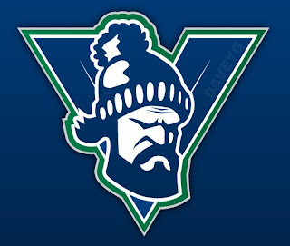
Interestingly, but unrelated, in the same thread was an amazing concept logo I just had to post. You guys know how much I like the Canucks' new V logo. Well someone on that site created one that's even better! It's got a roughness and an edge to it that's lacking in the original logo.


credit: DaveyG @ Canucks.com Message Board

I'm sure most of the Canucks fans here have already seen that, but to anyone who hasn't, what do you think?

Thursday
Jul242008

Improving On The Chops

Two weeks ago I posted the new name and logo for the AHL's Iowa franchise — the Iowa Chops. While the name remains an abomination, someone actually came up with a decent concept logo.


This is a great example of how you can create a great logo even when saddled with a crummy name and overused colors. Too bad it will never see the front of a jersey.

For reference, this is what the Chops are actually using.

Thanks to Charlie for the tip!

Wednesday
Jul232008

Rebranding The Stars

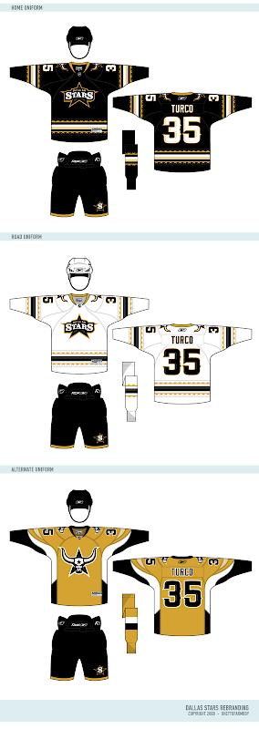
Your favorite Icethetics partner artist is back tonight with another concept for his series, Rebranding The NHL. I know you're excited! Matt is taking his shot at the Dallas Stars and it's quite likely one of his best yet. But first, read his explanation in his own words.

After my exhaustive research into the Dallas Stars, many of the Stars fans really like their new uniforms. So taking cue from that, I ended up removing green from the color scheme. Why? Because the time has finally come to put the North Stars days away for good. This is the Dallas Stars. Minnesota has their new team. Time to turn the page in Stars history and embrace their home.

The goal of this new identity is to embrace the new "Lone" Stars. The completely custom wordmark is styled after an old saloon sign. The new secondary logo is a much better attempt to symbolize Texas than the failed "Mooterus" from a few years ago. The striping on the home and away feature barb wire lining the jersey, and the alternate jersey design resembles the horns of a steer...


So here are the logos he created for the Stars.

As usual, it's truly great work and that secondary logo is just downright scary. Like a lot of you, at first I was concerned with the lack of green. But after reading Matt's explanation, I think it's perfect. A true, individual branding for a great team.

Naturally, he's done uniform concepts to go with it.

I'd buy that gold jersey in a heartbeat.

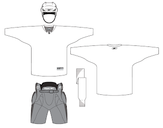
But for all the fans of Matt's work, he's donated a neat little surprise for. A lot of folks have asked about getting a copy of Matt's uniform template. He's now generously offering it for the first time. Enjoy!

So what's next? Matt tells me he's hard at work on a new rebranding of the St. Louis Blues. But he's a little stumped. He says, "The only thing is I have no idea how I can give them a better identity than the Blue Note. So I would like to call out to all Icethetic-ites for aid in coming up with ideas for Blues logos..."

For one thing, he needs help determining a secondary color. And who better to ask than the awesome readers of Icethetics? In the sidebar is a new poll where you can voice your opinion. Choose between navy blue, yellow and red to go with the primary color of blue.

And if you have any brilliant ideas for a new direction for the Blues' logo, you can post them here in the comments or contact Matt directly by emailing him at gfb_designs@yahoo.com. Voice your thoughts and get ready for an exciting new look for the Blues!