NHL Tournament of Logos

Entries in sabres (87)

Monday
Mar032008

Rumors On Alternates

I've gotten several emails about a message board post propagating rumors about the new crop of third jerseys to be introduced for the 2008-09 season. With few reports being confirmed by the actual teams, I thought these might at least be interesting enough to discuss here. They may even produce some new ideas for concept art.

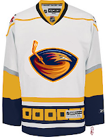
Atlanta Thrashers
Word is the new sweaters will incorporate more maroon like the original dark jerseys. I don't know if this means the sweater itself will be maroon or rather navy more along the lines of that original jersey.

Boston Bruins
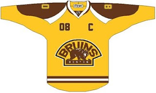
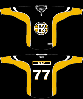
We've actually seen the black jerseys already which will feature the BRUINS version of the secondary logo found on the shoulders of the current jerseys. The jersey features the primary logo on the shoulders. Of the two "finalists" we saw, one includes a gold stripe around the bottom while the other does not.

Buffalo Sabres
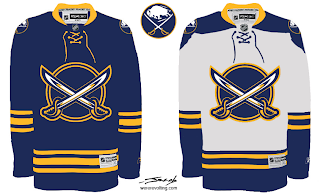
This isn't really news, but the Sabres will supposedly return to the blue vintage sweaters like the ones they wore last year. We've heard that there's the possibility of some slight alterations, but I wouldn't expect much.

Carolina Hurricanes
Rumor has it the new 'Canes third will be black with the secondary logo on the front. You know the one with the tropical storm flag blowing in the wind. Sounds pretty good. I'd like to see a mock up. One would also expect to see the primary logo on the shoulders.

Chicago Blackhawks
Supposedly, the 'Hawks will resurrect the black sweater they've been wearing as a third jersey for years. No surprises here but I can't say I wouldn't be disappointed if they didn't attempt to make a few tweaks to it.

Dallas Stars
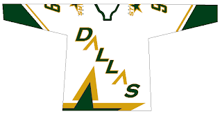
Interestingly, rumor suggests that the new Stars alternate will be a white version of the current black one. You know, with DALLAS written across the front. I'm a fan of one jersey like that. But let's not start in with turning the NHL into the NBA.

Edmonton Oilers
We're being told it's a vintage design with laces at the collar. That sounds absolutely amazing, especially when compared with the travesty visited upon the Oil this season. But this could just be wishful thinking.

Los Angeles Kings
We're speculating that the Kings will return to the purple sweater from last season with the coat of arms logo. Of course the author of the rumors being discussed here suggested the jersey may be black. We'll have to see, but my money's on purple.

Minnesota Wild
You'd think they can't go wrong with a green sweater, but then word is it will have MINNESOTA plastered across the front a la the New York Rangers or Colorado Avalanche. That may not sound impressive, but the Wild have a history of creating vintage-looking thirds that are really killer. I'll hold my judgment until I see it.

New York Islanders
Evidently we should expect a vintage design. Something I'm surprised they didn't go with when unveiling their new Rbk EDGE sweaters over the summer. I'm not really disappointed the orange won't be making a comeback.

Ottawa Senators
I hope this rumor isn't true. Apparently they're going with a gold sweater — you read that right — with SENS written across the front. I don't know if this is more in the vein of the Stars or Rangers. Time will tell. But just let it not be gold. I wouldn't even wish that on the Stars.

Philadelphia Flyers
The team has already told us to expect an orange sweater. What they didn't mention is whether it will be an altered version of the current design or a vintage throwback. Rumor suggests the latter.

Phoenix Coyotes
Opting for a new alternate logo, it sounds like they may be going with a full-body coyote on the front of a black sweater. I think a black jersey will go well with the brick/sand color combination. This one I'm looking forward to seeing.

Pittsburgh Penguins
The team has all but confirmed already that they'll go with the same design they wore for the Winter Classic two months ago. You can't really go wrong with that one. Vintage quality at its finest.

San Jose Sharks
We're likely looking at a black version of the current uniforms. I know a lot of folks dislike the orange. I personally don't mind it. However, how cool would it be if they went with a black/grey/white jersey with some teal piping/lining? And I'll go ahead and put my vote in for the full-body shark like you see on the shoulders of the current sweaters.

St. Louis Blues
We know all about St. Louis already from the team higher-ups. They're talking about a navy sweater with a brand new logo featuring the Gateway Arch. In fact, I have some great concepts to share later with this logo alteration in mind.

Tampa Bay Lightning
The rumors I'm reading scare me because, as a Lightning fan, I'd hate to see this happen. Supposedly the new third will be navy (so far so good) with BOLTS written across the front (there's where you lose me). Sounds an awful like what's going on with the Senators. Read above.

Toronto Maple Leafs
Likely a white vintage design will make its way onto the backs of Leaf players. Probably with the old leaf logo as well. This wouldn't surprise me and sure wouldn't disappoint. Looking forward to it, as a matter of fact.

Vancouver Canucks
It's rumored that a vintage design — I'm guessing blue — is in the works. I like the stick-in-the-rink jerseys as much as anybody, but I would not be surprised to see a completely new design with the newly introduced Johnny Canuck logo. It's a chance that's too good to pass up for a team in the midst of a serious identity crisis.

By the way, that leaves 11 teams without third jersey rumors here. In case you're wondering, those teams not accounted for are the Devils, Rangers, Canadiens, Panthers, Capitals, Blue Jackets, Red Wings, Predators, Flames, Avalanche, and Ducks (who frankly, could really use one).

That's all I've got for you tonight. I've got concept art based on the rumors for the Wild, Blues, Flyers and others, but I'll save that for later on. I'll try to get it posted this week while I'm on my trip.

In the meantime, allow your imaginations to run wild and, you know, feel free to play around in Photoshop and send me whatever you come up with. I can post it here and who knows, maybe you'll even guess correct.

Thursday
Feb212008

Sabres Getting A Third?

A reader sent in this link to a story about the uniforms for the Winter Classic. In it, Buffalo Sabres Managing Partner Larry Quinn suggests that the team will be wearing a retro third jersey in the future. He doesn't say specifically it would be worn next season but we do know several teams will have thirds beginning in the fall. I'm going to go ahead and add it to the sidebar with an unspecified date.

Friday
Feb152008

Just To Freak You Out XXVII

It's Friday and despite the fact that I'm waist-deep in boxes and half-dead from packing them, I have Freak Out art. And lots of it. So much so that I'm saving some of it for next week. But let's get to the good stuff.
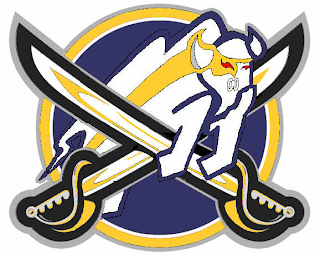
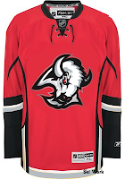
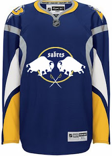
Please don't ask me what that's supposed to be. I think I get the buffalo and the swords. But I'm not sure I understand the raccoon reference found around the eyes there. Perhaps it's just me, though.

But while we're on the topic of indignities...

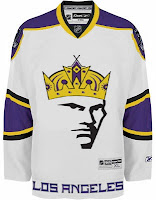
No, the guy wearing the crown isn't Mark Messier. But good guess. And to the right there, the ultimate Vancouver Canucks jersey. How do you improve upon perfection like that?

Couple more oddities.

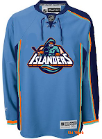
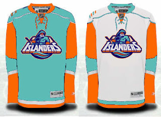
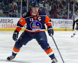
I like those colors on the Islanders jersey. And I know how you guys love the asymmetry on that thing — the original coming from the actual Thrashers jersey, not to be confused with the one on the right which is a recoloring of the Hurricanes sweater. The striping is weird. Yeah.

Sticking to the irony tack, here's an idea no one ever considered for the Anaheim Ducks.

And now you know why no one ever considered it.

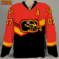
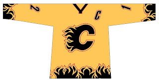
We're developing of list of things the Flames need.

Also on that list: trading Jarome Iginla.

And finally, with the recent introduction of the new Stanley Cup playoffs logo, one reader got to work on new East and West logos — only what if they reverted back to the old conference names?

Despite the creativity, and I have to give a lot of credit for that, they're just messing with my brain so bad. Nice work, but über freaky!

Hope you enjoyed your Freak Out Friday. If I'm unable to update the site tomorrow, just know that's it's because I'm moving to a new apartment this weekend, not that I'm lazy. Not that I'm not lazy. It's just that's not the reason. Did you follow all that?

Saturday
Feb092008

New York, New York

I covered the New York Rangers in a concept post on Thursday so I thought I'd take care of the rest of the state this evening.

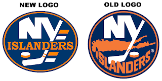
We begin with graphic I just received today, actually. It's a concept for making some adjustments to the Islanders' logo.

It's certainly cleaner but I don't care much for the oval shape. The circle is definitely the way to go. Anyway, here's something I probably should've included in yesterday's post.

So many horrible colors all touching each other.

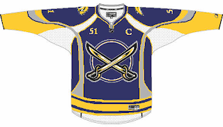
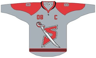
Now across the state to Buffalo. This is a Sabres jersey featuring actual sabers on the front.

We've seen stuff like this before, but never with such "unique" striping.

And obviously this just shows what you can do if you recolor a Flames jersey and drop the '90s Sabres logo on it.

By the way, the third round of the Quest for the Worst begins tomorrow. And I have finally updated the bracket to reflect second round match-ups.

Thursday
Jan312008

Poll: Sabres vs Scouts


vs
Buffalo
SABRES
Kansas City
SCOUTS


REMEMBER: You're choosing the WORST logo!

The second round is now underway! Place your vote and then feel free to leave a comment as to how you came to your decision. Tell all your friends to drop in and vote! The more voices heard, the more accurate the results!

Poll opening date
Thu Jan 31
Poll closing date
Mon Feb 4

Thursday
Jan172008

Boston, Buffalo Fan Art

The polling in the Quest For The Worst tournament began this week with logos from the Buffalo Sabres and Boston Bruins. So, really, I should've posted this sooner. Luckily, there's no one to give me a bad grade for turning work in late.

We've seen a lot like this recently, but this is just another really nice Sabres concept that makes use of my favorite logo as well as the favorite logo of a majority of the fans on this site.

But at least that buffalo is where he should be — the secondary position, the shoulder.

As for the Bruins, a lot of folks seem to be behind whole gold and brown notion. I'd have to see it on the ice to know whether I'd be a fan or not.

And then there's a scary logo alteration that should never see the light of day — don't take your computer outside.

That's that. I've got some good stuff for tomorrow's Freak Out post. Stay tuned.

Monday
Jan142008

Poll: Sabres '06 vs Sabres '96


vs
Buffalo
SABRES '06
Buffalo
SABRES '96


REMEMBER: You're choosing the WORST logo!

We're kicking off the Quest For The Worst tonight with the Buffalo Sabres. Fans have lamented each new logo since 1996 from "The Goathead" to "The Buffaslug." Time to decide which is worse.

Place your vote and then feel free to leave a comment as to how you came to your decision. Tell all your friends to drop in and vote! The more voices heard, the more accurate the results!

Poll opening date
Mon Jan 14
Poll closing date
Fri Jan 18

Friday
Jan042008

Just To Freak You Out XXII

I can't believe how long this series has lasted. At 22 and still going strong, what follows is another edition of Freak Out Friday. Where do I begin?

I think I'll start with a play on the Winter Classic which took place this week. It's an "If They Mated" featuring the two teams involved in the big outdoor game.

Curiously though, while the designer went with the original Sabres logo, they opted against the original Penguins colors.

Now is where I really get into the scary stuff, so be warned.

Though well executed, that can't be a good idea. Speaking of which...

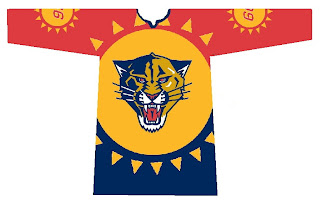
Let the eye-gouging begin. It makes great use of the Panthers' colors but what is with all the suns? We get it they're the Florida Panthers!

Here's what we need.

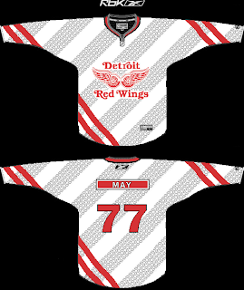
Because nothing says we're getting rolled over like a jersey with tire tracks. A sentiment less suited for the Red Wings (first place) and more so for the Lightning (last place) who can't seem to remember how to win games. But I'm not bitter.

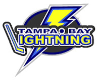
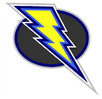
Speaking of the lackluster Lightning, the one color I hope is never incorporated into the Bolts' identity is yellow.

Did I mention how I hate the yellow?

And finally, it appears that not a lot of effort was put into this, but I thought the logo was funny enough to revisit.

Keep the crazy artwork coming so I can continue to frighten and freak out the readers here at NHLToL. Enjoy your weekend!

Tuesday
Jan012008

Winter Classic, Part II

The first period has just ended as I'm writing this with the Pens up 1-0. Pretty good game. I have some complaints about the NBC broadcast, but I'll get into that in the next post. Right now I've got a few Buffalo Sabres concepts to share to complement yesterday's Penguins art.

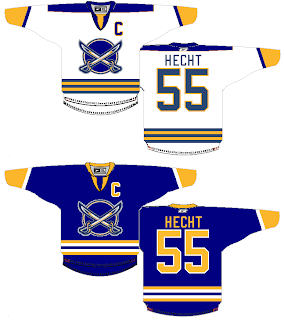
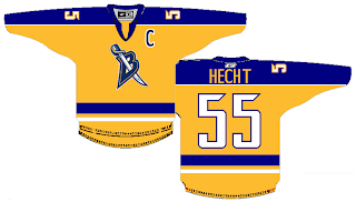
I'd be remiss if I didn't start with a blue/gold color scheme. This is a nice set because it actually features sabres on the front of the shirt. Weird. The yellow sweater below belongs to this set as an alternate.

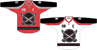
This next set is from the red/black era but it features the same logo as above.

Same deal with the alternate. Though I don't think a grey jersey is a very good idea.

And finally, this one is just for fun. Rather reminiscent of a certain energy drink logo, is it not?

Enjoy the rest of the game everybody!

Friday
Dec282007

Just To Freak You Out XXI

The Freak Out series hits 21 this week — old enough to get hammered. And boy, I think some of the designers this week had to have been hammered. I mean, just look at this.

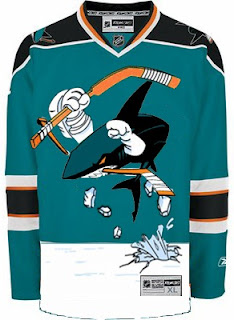
It might take a moment or two to notice that this is an "If They Mated" example. It's the new Sharks secondary logo merged with the Mighty Ducks third jersey of the mid-90s. But I love it!

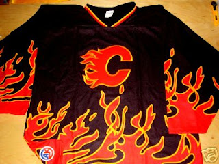
This Flames jersey is on fire! Someone on eBay is really selling it. For real.

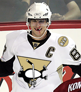
Sidney Crosby recently dropped the gloves in a rare on-ice event. This picture isn't real but it cracks me up nonetheless. There's just so much about it that's so wrong. I'm curious to see if the guys over at Pensblog have anything to say about this.

And finally, we have a plethora of "matings" here to share.

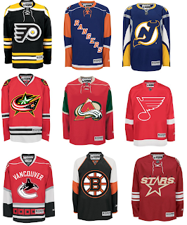
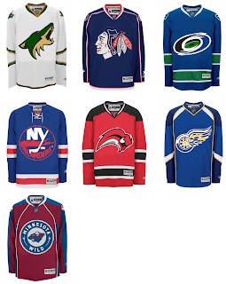
To sum things up, what you see above is the Flyers and Bruins, Rangers and Islanders, Devils and Sabres, Blue Jackets and Blackhawks, Avalanche and Wild, Blues and Red Wings, Canucks and Hurricanes (weird!), Bruins and Flyers (opposite of the first one) and Stars and Coyotes.

But wait, there's more.

This one is interesting because it's all opposites of the previous image. They are the Coyotes and Stars, Blackhawks and Blue Jackets, Hurricanes and Canucks, Islanders and Rangers, Sabres and Devils, Red Wings and Blues (what the—?), and Wild and Avalanche.

Hope you enjoyed being freaked out. Have a fantastic weekend!